Why did you choose Ballard to help create your premier line of home accessories?
I’ve never had a chance to create all the accessories and smaller things that I think really make a room special and give it that layered feel. And as a collector and designer, I often find unique pieces that people want and then I can never find them again. So when Ballard came to me to discuss styling for the catalog, we started talking about product ideas – I didn’t realize how many I had! Now, working with Ballard, I can bring those ideas to life.
Why are accessories so important?
Accessories are like jewelry for the space and where I find the real joy in designing. They’re what create style and a personal environment. By doing all these different lines of accessories with Ballard, I’m giving people the opportunity to hand pick from many different things, so they can really can make it their own.
You’re known for your unique eye. How does your style complement Ballard’s?
When I first moved to Atlanta, I met the original owner, Helen Ballard, and found that we were attracted to so many of the same things. I’ve always had this deep love of French and European continental styles. So as a designer, I can bring to Ballard a real focus on beautiful, functional pieces that mix in well with the foundation Ballard has already begun.
You wear a lot of hats, including that of artist. Where does the art come in?
When I’m designing an interior, I’m always looking to put together a composition. It’s all about layering. You start with the architecture of the space or what I call the “envelope.” Then you choose a few key pieces. I always tell clients to include something they really love, even if it seems not to fit at all. Layering in those found objects is what gives a home personality and makes it come alive. Sometimes, I think that’s where people stop and don’t get the space finished.
How did you decide what to include in your collection?
When Ballard and I decided to work together, I came up with four different categories that everything seem to fit into naturally: La Bohemian, French Industrial Chic, Dressage and Atelier. Those are my creative anchors and I’ve found that I can put lots of things into all of them. As the line evolves, the pieces I design for Ballard will fall into one of those concepts.
How has the design process been for you so far?
One of the things I love about working with Ballard is knowing that everyone here is committed to achieving a certain level of quality and affordable price point. My products won’t come out all at once, so the process keeps building on itself. A lot of things I’m bringing into the line are pretty classic and, hopefully, you’ll want to keep them forever. So getting the details right is extremely important. We want to create things that you’ll be even happier with when they arrive than when you first saw them in the catalog.
What have been the biggest challenges?
I love collecting lots of different things, so one of the biggest challenges in doing a line of accessories like this is the editing process. But the people at Ballard are very creative and excited about pushing through those challenges to make it all happen.
For instance, we were working on a lamp design and couldn’t quite get the finishes right. Then I found these little scent bottles in Paris at a random shop. They were those most beautiful colors of ceramic – pale cream, pale blue, the palest of pinks and taupe. I brought them to my next meeting with Ballard and said, “These are the finishes I want to have on my lamps.” Before I had left for Paris, we weren’t sure if were doing a lamp at all. Ballard committed on the spot and said, “We’re going to do all of them.” That kind of creative synergy is very exciting.
This office makes you want to be there and somewhere else at the same time.
I found these amazing vintage maps at a flea market that were used to teach world geography to school kids. They were kind of tattered and faded, but we were able to reproduce them on canvas with fabulous coloring. They make great art pieces because maps appeal to so many people on so many levels. Of course, we’ll be adding a map of France to the collection very soon.
You placed your three mirrors above, rather than at eye level.
Doing multiples are fun because they create a pattern. The original was a found object that worked great as a mirror, but also as a texture and layer. The pattern and zinc patina make this piece a little more decorative, so it also works as an accessory.
The pendants over the desk give the room a real role-up-your sleeves feel.
The originals probably came out of an old schoolhouse. They have this wonderful ribbed glass and it’s that texture that I think gives them a lot of personality. And since the desk is in the middle of room, they’re really a functional alternative to a traditional desk lamp.
People rarely lust after desk accessories, but they may have to make an exception here.
I’ve always had a love for Hermes – the stitched leather and all that detailing. But I could never find scissors and staplers that I would want to have out on my desk, so we put these together for our Dressage collection. I especially love my magnifying glass because we’re always using it to study the tiny details in shelter magazines. And when you consider the price points, these pieces look even better.
The ice bucket doesn’t have ice in it.
I have ice buckets all over my house that I rarely fill with ice. I use them for accessories on the desk or for flowers. This one has a beautiful leather handle as well to match the desk accessories.You love shelves, don’t you?Today, people want to have things out in the room for convenience, but you want it done in an orderly way. We worked really hard on the finishes for this shelf, so it looks very much like the antique I’ve had for many years. You can hang it as an accessory and, at the same time, have it be functional.
How do you use color and pattern in a bold, exciting way without it overwhelming?
You keep the key pieces neutral. In this room, I’m showing alternate whites with a sisal rug. White beds, white table, a white lamp and white brackets. The green color and pattern are layered in with upholstery, so you’re only committed to it for right now. In three years, you may want orange. And reupholstering is one of the most inexpensive ways to update your environment.We used the green print on standing panels behind the white bed, then made a duvet cover and pillow out of the same fabric. And really, that’s all the color on the bed. So in terms of the investment, it’s an affordable way to make a big statement in your bedroom. And I love having the companion print on the little armless chair. It makes it a fun accessory piece that has lots of impact without taking over.
Why did you choose a gourd shape for your first Ballard lamp?
I had a small, vintage gourd lamp and loved the shape, so we made two larger sizes. The finishes came from those little scent bottles I found in Paris. What I really like about this lamp is that it can go with any style, from traditional to contemporary. It’s so transitional.
Your botanical prints look just right for this room and also in the hall.
Often, people might have one original piece of art they’ve picked for themselves and I like to mix prints in with it. These botanicals can go in so many places. And they look different depending on which part of the house you hang them in.
Bulletin boards were at the top of your to-do list for this collection. Why?
I love to collect things and put them on bulletin boards. Ballard has always done them, and over the years, I’ve ordered a number of them. So we worked really hard on these – two great sizes, both with sisal. One is the traditional camel colored sisal and one is bleached with a light silver frame.
And the Quatrefoil Tags?
They were inspired by something I saw in a little shop in France. The owner was using simple pieces of zinc with twine to label the merchandise. You can use these tags with your own chalk to label all sorts of things – baskets, bottles – you name it.
The colors in this room are soft and very inviting.
I love the architecture of this space, so I wanted the pieces to be simple and strong to complement it. That’s why I covered all the seating in my classic linens. The colors are pale and subtle. And because they’re made with a heavy 14-ounce natural linen, they feel extra thick and drape beautifully.
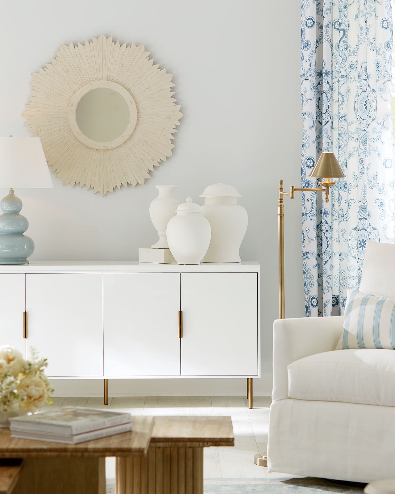
Your eye goes immediately to the sunburst mirrors above the fireplace.
I have a huge collection of vintage sunburst mirrors and I love using them in random places. The carved textures and classic shape are fun and whimsical, and yet look very stylish.
What about the other accessories?
I’ve always loved architectural forms and you can use these anywhere to add interesting dimension. The vase has a big round top, so the flowers kind of spread out. I’ve always had problems finding the right size baskets, and these are big enough to hold lots of stuff. The candle base is based on an antique of mine and I think it turned out amazingly well.
What’s the story behind your Zinc Harvest Basket?
I found the original in an antique shop and have always hung it on the wall as an object. I used it once at my beach house, and when we sold that house, I brought it to home to Atlanta. You can set it on the floor and put drawings in it or fill it with logs. I love it hanging because it’s such a beautiful shape and has this wonderful orange interior and zinc finish.
And the wall hooks?
The hooks are really part of my dressage look. They’re actually named after an English riding bit. I used them here to hold the rolled maps, but you can see how many different ways you could use them.
This room is a feast for the eyes. There are collections of great objects everywhere.
One of the new products that I’m so excited about are the dishes. They’re a little bit more casual and have a beautiful, perfect white color. The shapes look hand thrown, but they’re also very tailored, to give them that nice balance. I’ve used vintage antlers on lots of different projects and have spray painted them white when it fit the room. We selected the best ones from a private collection and molded mine from those. The matte white finish brings out all the incredible details.
I wanted brackets that weren’t so big in scale, so you could use them as part of a grouping. These are in natural wood and white. All we did was lean the dishes on the brackets, but you can see just how effective doing quantities can be.
I found this whole collection of antique lamp slips in France. Originally, they were used to cast ceramic lamp bases. I bought them all and we modeled my collection from those. They’re not intended to be used as vases, but simply as beautiful art objects.
This space has a very organic feel.
People are using their houses differently today and the spaces interact differently as well. This area is really a front entrance, so I used the daybed as a comfortable bench. You can drop your things on it as you enter the house and can have a table beside it. It’s almost like creating another room. We blew the botanicals up really big for lots of impact, but in keeping with the natural feel. I love the casual mix of linens, neutrals and finishes.I can’t tell you how hard it is for me to find the perfect vase. So we did this great shape in three sizes. It makes flowers look the best because the top flares out, so the stems fall into a natural arrangement.
Anyone that knows me knows how much I love my Eiffel Towers. I keep this one behind my desk, so I can pin all my favorite objects on it. It’s like an Eiffel Tower bulletin board.
We made these little carriage lanterns for tea lights. I have the antiques sitting on my desk and everyone that comes into my office picks them up and wants them. Our version looks look exactly the original – we didn’t even change the size. It looks great sitting on a table or just as an object.
So now that your first accessories are here, how are feeling about it all?
I’m even more excited about working with Ballard now than when we started. Everyone here is sensitive about the quality and design focus. And we’re only putting things out that we all feel really, really good about. I can see myself becoming an integral part of Ballard’s future. For me, it’s a perfect fit.
Inspired Interiors by Suzanne Kasler
Suzanne uses a neutral palette, spiced with hits of color and haute couture details, to create layered interiors that are elegant, yet warm and inviting. This interior design book shows you how to do what Suzanne does so beautifully.
- 224 pages
- Lavishly illustrated
- Showcases wide range of Kasler projects
- Loaded with inspiring design ideas


adela Hodson
I love what you are doing. Please help me with my home decoration .Thank you Adela H.
Mary F Shreve
On 9/17, I ordered the Dressage desk stapler and bucket and gave them to my son for his birthday. I also ordered the leather stirrup clock, but was told it would be on backorder. I was disappointed, but figured I could give it to him for Christmas. I called today to check on it and was told it wouldn’t be sent before December 31st!!! Needless to say I am very frustrated! Is there any hope I could get it sooner?????
Ballard Designs
Susan: You are right on target with your choices. We love what you are doing. The Sand Velvet is a great compliment to the Scandicci Print, and the addition of the Lorenzo Charcoal gives the whole thing color and texture. Another good choice for a velvet for the Hudson Settee is our Camel Velvet. It brings out more of the golder tones. Either way, we think you can’t miss! Just make sure to order swatches so you can see the colors and textures up close and personal. Let us know if we can help with anything else.
The Style Studio Team
Susan
I just purchased 2 Grammercy chairs and 2 Courbe cube ottomons in Scandicci Gray along with a “center” tufted ottoman in the gold pommeroy and want a settee to compliment it. I noticed you have a velvet called “Sand”. Optimally, the Hudson settee design is the perfect fit. Would the “sand” velvet compliment this arrangement?
Also, I absolutely love the petite “X” bench and have been thinking about that in Lorenzo grey. I’m recently married and trying to merge styles and am lost in the process!
Jamie Ourso
I have a question regarding the fabric linen color “Flax.” It appears to look like a natural kaki color in the catalog. However, looks white online. Please advise on what color it actually is. Also, would this be a good fabric to use on a headbaord, such as one of the ones from Ballard Designs?
Ballard Designs
Jamie: The Suzanne Kasler Flax Linen is a grayed-down khaki color. We think it is a good idea for you to order a swatch so you can see it in person. The fabric has a wonderful woven texture and would look fab on a headboard!
The Style Studio Team