meet the designer

Susanna Salk grew up in Essex, Massachusetts and got her B.A. in English at Vassar College and then moved to Manhattan where she helped launch Elle Decor as Interior Design Manager. She later became a Contributing Editor.
In 2003, she joined House and Garden Magazine, where she was, until its closing, Special Projects Editor.
Today, Salk appears regularly on NBC’s “Today Show” to discuss design style for the home. She is also a Contributing Editor to 1stdibs.com, and ivillage.com.
Salk is the author of Assouline’s “A Privileged Life, Celebrating WASP Style,” as well as “Weekend Retreats” and the bestselling “Room for Children: Stylish Spaces for Sleep and Play,” (both by Rizzoli.) Her next book-“Home Sweet Home” (Rizzoli, Fall 2011) celebrates the international interiors shot by renowned photographer Oberto Gili.
She is putting the finishing touches on “Be Your Own Decorator and Be Inspired By the Greats,” to be published by Rizzoli in 2012.
Salk lives in Connecticut with her husband and two boys.
Visit her at www.susannasalk.com, or email her.
Talk with Susanna Salk
You’ve probably seen her talking about style on NBC’s “Today Show,” followed her on ivillage and or read one of her best-selling books. Susanna Salk delights in design and believes that with the right inspiration, anyone can learn to be her own decorator. Before becoming a full-time author and design guru, Susanna helped launch Elle Décor and worked as an editor at House & Garden. Her books include “A Privileged Life, Celebrating WASP Style,” “Weekend Retreats,” “Room for Children: Stylish Spaces for Sleep and Play” and “Home Sweet Home” (Rizzoli, Fall 2011) celebrating international interiors shot by renowned photographer, Oberto Gili. Next year, Susanna will launch her newest book, “Be Your Own Decorator and Be Inspired by the Greats,” to be published by Rizzoli.
For her debut as a guest designer for Ballard, we asked Susanna to bring her fresh and fearless decorating style to three spaces: the Entry, the Living Room and the Home Office.

Ballard Designs: Before we talk about the rooms you’ve decorated for us, let’s talk about your new book coming out next year: “Be Your Own Decorator and Be Inspired by the Greats.” We love the title – being your own decorator is what Ballard is really all about.
Susanna Salk: I wanted to empower people. There are a million design books out there by fabulous designers, but the problem I have with those is that it’s only one book by one designer. If you don’t love that look or it’s not for you, you’re kind of stuck. For my book, I wanted to gather together all the rooms that I love by virtually every top designer in the world and divide it up by chapter – whimsy, rule-breaking, color – so you can go into a chapter looking for ideas and find 30 to 40 different images to inspire you with captions from the designers about how they did it and why they did it. It’s all about plagiarizing – that’s the best part of decorating. You can take what other people do and work it into your own life and your own budget. I do it all the time in my own home.
So many people are afraid of decorating because they’re afraid of breaking the rules. I’m hoping that with my book and the video we’re shooting for Ballard (see it online/need link here), I can drill into peoples’ heads that if you love it and you’re fearless with it, your room will look great. It will!
BD: Before you became an author yourself, you spent years as an editor at some of the world’s top shelter magazines. How does that affect your work as a designer?
SS: Being an editor first influenced my design in a million ways, most importantly through all the exposure. After you’ve looked at a so many different images of so many great houses, you get a gauge of what turns you on and what you respond to much faster than people who don’t have that luxury. So I encourage people to build a style file, which our editor-in-chief always recommended to our House & Garden readers. You can pull pages from anywhere – a fashion magazine or an ad from a movie – it doesn’t have to be a room image. You’ll see what makes you respond and what your style is. You need to amp up your exposure – get design books and read the style blogs. You have to expose your eye a lot to understand what works and how.

The Entry
BD: Now let’s talk about the Entry you designed for us. The first thing that jumps out is the use of pattern.
SS: One of the most important things I’ve learned from the great designers is that pattern on pattern works. It makes the room look more interesting. Most people think that when you have a small space like this entry, you should keep it plain. No, you should do just the opposite. Juice it up, make it jewel-boxy, make it interesting – that’s what brings the room to life.
An entry hall should be glamorous and highly personal, whether you live in the city or country. I can’t tell you how many entries I’ve seen that are just collectors for junk – old this, dirty that. Your entry is your calling card to the world. For example, my husband had these very blah doormats in our mudroom that were boring gray wool to catch all the mess. I said, “I’m not looking at that everyday. It’s so depressing.” So I got an outdoor rug from Ballard with a pattern on it and I put it inside.
I’d rather pick a rug that has some personality like I did in this entry. So what if it gets a little banged up after a couple of years – get a new one! They’re not expensive. Don’t settle for bland. Mixing the pattern with the chairs makes the space come alive. The Parsons Chairs from Ballard are fabulous for an entry because they have high backs, which work great with higher ceilings.
BD: And you’re not afraid to mix patterns.
SS: I love how Ballard has fabric by the yard – I think Ballard has one of the strongest online programs out there – and that there aren’t a million choices to overwhelm you. There are 20 or 30 well-edited choices, so you’ll find something you love and definitely, go for bold. Don’t shy away from a fabric pattern ever. I’ve never seen even the most outrageous pattern look bad in a room.
BD: You chose the Sylvie Console, which has an Asian flavor, to go between the Parsons Chairs.
SS: I wanted to make the room feel like it had layers accumulated over time. And that bamboo piece looked like it might have come from your great aunt’s summerhouse that you inherited. It had sort of a quirky charm to it and it’s a great size for an entry. Putting a boring table in there that’s purely functional would bring the whole space down. Every element has to have an interesting vibe to it without sacrificing function and every element in this entry is functional and good-looking. I love how the console looks like it’s from another era, and therefore, makes it look different from the other pieces.
BD: You’ve also added lots of fun textures to the wall.
SS: Always add a touch of whimsy to a room, something to make you smile. I thought the Bird Hooks did just that. And the Rosette Fragments added balance and gave the room dimension. Everything in this room looks like a found it on some great trip and brought it back. How you do that is by not playing it safe. Keep the vibe going on the walls with collections of treasures.
People make the mistake of putting one thing, then a different thing, then another thing – you want “power pairs.” Put one thing in and another one just like it next to it. That’s why I love those (need print name here) Prints. I believe in that concept so strongly – it works every time.

The Living Room
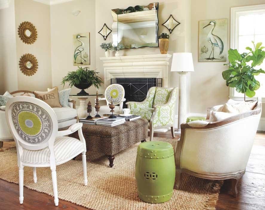
BD: Now this is a living room you can really live in. And the first thing you notice is the fresh green color.
SS: Ballard has that beautiful green in a lot of things and I think when you mix that green with the yellows, golds and beiges here, you can’t go wrong. Green is a color that makes you feel good – it’s warm, but not too casual. I wanted this living room to feel casual, but also chic, and I think this color combination makes that happen.
BD: You’ve repeated the green motif throughout the room.
SS: Often, I’ll get that color reinforcement when I look at a fabric pattern. I see three colors together that I love in a fabric, pull them out and I say, “Hey, I’m going to use those three colors in a room.”
I saw the medallion fabric first, and loved it so much, I wanted to use it on the Louis Chairs. Then I decided to use it as the color inspiration for the rest of the room. Not to match it, but to use as a general cornerstone. That’s what I advise everyone to do. Find something you love and if your mood is affected in a positive way by the pattern, then imagine how good you’re going to feel when you’re in an entire room surrounded with that coloration.
BD: You used two different fabrics on the Louis Chairs. That’s something most of us would be afraid to try.
SS: The patterns go together without going too much. I know people would be nervous about doing that, but I only did it because I saw two patterns mixed in another Ballard room, loved it and decided to do it myself here. It brings vivacity to a chair and makes you smile. You can see right there that a stripe and another pattern absolutely can work together.
Those chairs are quite traditional looking, and by doing that “wink-wink” different pattern, it makes them feel modern and fresh. I feel like we are in a new age where antique looking shapes really can get a new life by combining the traditional lines with a whimsical fabric. There’s nothing more exciting than doing that with a chair.
I picked that fabric for the armchair because I’m crazy for Ikat. Again, it’s taking a more familiar shape and shaking it up by putting it with a pattern. I didn’t worry whether that green matched the green in the other fabric. It doesn’t have to match exactly and that’s what keeps the room from looking like a hotel lobby.
BD: You picked up your green in the Garden Seat, too.

SS: Garden seats are the unsung heroes of every room. I have three in my house. I love them to sit on, put books or to put a lamp on. Get two and balance out your room. They don’t take up a lot of room. Instead of putting little mismatched end tables beside your sofa, buy two of those and it will look so much better.
BD: And right in the middle of it all, you placed a leopard ottoman – another fearless choice.
SS: I consider leopard a funny neutral because it’s brown and beige. It’s its own pattern, but it goes with every other pattern. So if you love leopard the way I do, treat it like a neutral because it goes with a lot of things without taking itself too seriously. This was a large room, so we couldn’t do something bland. What if I had done a beige ottoman here? Wouldn’t that have been boring? I needed to give it some texture. Maybe another pattern would have been too much, but that’s why I chose the leopard.
BD: You’ve used a lot of your “power pairs” in this room – the candle sconces, the prints, the sunburst mirrors.
SS: I was inspired by a room Bunny Williams did for a show house I visited. It was very large, yet it felt so interesting because there were little whimsical surprises in it. But it was also balanced. If I had done too many different things in this room, they would have felt isolated. You would see that thing and that thing and that thing. Pairs balance out a room.
BD: And rather than a single piece of art, you chose the Victoria Mirror to go over the mantel.
SS: I can’t tell you how many rooms I go into and I feel like something is missing and it’s a glamorous mirror. I’m talking about the most simple entry hall in the country or a huge living room in Atlanta. It doesn’t matter. A glamorous mirror makes any space better.
I needed something on either side of that mirror so it wouldn’t feel lonely – something visual and bold – and those bird prints did the trick. When we put the birds up and the mirror, I thought maybe we didn’t need the sconces too, but decided they added texture. Don’t be afraid to go a little over the top. And I love the way they echo the mirror with the glass.
Those starburst mirrors were placed after everything was in the room. Most people normally buy a little at a time, get nervous and stop before the room is really finished. You have to give yourself permission to keep going. That wall would have looked too lonely with nothing on it, but if I had put something too different there, it would have isolated the wall.
BD: It’s hard not to notice the finials on the ottoman. That’s an interesting place for a collection.
SS: I wanted to give a little surprise, a little bit of personality. The ottoman was so big, I felt like it wouldn’t take away from its function by adding the finials. They help keep your eyes from getting bored without it feeling overcrowded. I think details like the finials make a room go from just being pretty to being interesting and personable.

BD: You’re a big believer in accessories.
SS: It’s those little details that go a long way to making a room feel special. People tend to clutter up their rooms with junk, but it’s so much better to take away things you don’t love and just add in a few details you love like those finials. But make sure they’re a collection. What would not look good there would be different kinds of things on the ottoman. Take away many different things and insert like things.
BD: And accessories are lot less expensive than changing your furniture.
SS: A great designer once said, “No matter what you put up on a shelf or wall, if it’s many of one kind, it will look important.” For example, I went to a discount store and saw these great little wooden bowls for $2 each. I bought seven of them and put them all along my mantel. I have nothing else on my mantel, so they look important and great. It doesn’t have to be expensive.

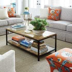
BD: You used the Pedestal Bowl as a plant stand and it makes statement all by itself.
SS: Touches like the Pedestal Bowl make those dead corners of the room come alive. I bought two for myself. That kind of container lifts an ordinary plant into looking like something special. You can also put lemons in it. It’s so easy to say, “I don’t need that.” Of course you don’t need it, but it’s those kinds of pieces that stand the test of time and elevate a room from ordinary to stylish.
If you don’t have the budget to invest in expensive furniture right now, spend $500 to get three or four of things to take your room from good to great. What really makes this room interesting are the little fun touches. You can actually elevate a room very quickly and easily without doing anything to your existing furniture. How I wish people got that! That’s what I’ve learned from designers and why I’m doing my book. I saw over and over great rooms that were great because of the little details, not because of the big ones.
BD: The Braided Jute Rug you used isn’t expensive and it’s a more casual choice than you would expect for a living room.
SS: We all have a prejudice against jute rugs because we imagine them to be harsh and not fancy enough or soft enough for a living room, but the reason this one works here is because there are many other elegant touches on top of it that lift it up. And it’s soooo soft. That’s why pictures are so important. You don’t know if mixing in a rug like that would work unless you saw a picture of it somewhere – like Ballard.

The Office
BD: Wow. There aren’t a lot of colors in this space and maybe that’s why the ones you chose are so striking.
SS: I was inspired by a very famous designer named Mary McDonald. Her office at home, although not identical, had turquoise walls with black and white accents. So I used that as my security blanket. I picked that color using the Benjamin Moore color app and it was scary, that blue, but boy did it make the room sing when we put it on! It made this office feel like a haven. I really believe that home offices shouldn’t look too corporate. Offices are not just places where we get work done. They’re places where we can dream, be inspired and create. And that’s what this office is all about.
There are only three colors in the room – turquoise, white white and black black. That’s why it works because it’s done in a triangle of three colors. I was gutsy enough to do that because I saw someone else do it.
BD: We love the way you used our Corkboards – like framed art.

SS: Let’s say you don’t have the budget to buy expensive art for your walls. What do you do? Especially for a home office, what could be better that using a corkboard? Especially these because of their “residential-ness” – they don’t look corporate. And I took those frames as kind of my inspiration for the whole office. Remember, don’t use just one. Wouldn’t it look bad if the room just had one? It would be half as impactful. I always recommend getting one more of something than you think you need. I put them all around like an arc over the desk and filled them with cutout images from fashion magazines and used books you can find online for $5. It’s like a rotating gallery and really makes it feel like “your” room.
BD: This office has a definite personality you can sense.
SS: I always say that a good room is one that you can go into, then go into a crowded bar, and be able to pick out the owner of the room just by having seen it. Don’t you think that having seen this office, you’d know who that woman was that worked in it?
Look at images of the designer, Mary McDonald. She’s the kind of person I was thinking of as I was doing this room. She’s very pretty and glamorous with long black hair and wears big vintage jewelry. And she has this great horsy laugh. Isn’t that the kind of person you would think worked in this office? She’s always dressed to the nines, but not afraid to work in bare feet. And she has her pug dogs all around her on the ground.
BD: Tell us about the chairs you chose. They are really center stage here.
SS: Two Gramercy Chairs anchor the room and I wanted to match the desk chair to the wall. I only thought of that because of the picture I had of Mary’s office – she did that. And that gave me the confidence to do it here. The white chairs are for visitors. Color highlights the owner’s chair. It’s very inviting, but it’s very clear about who sits where.
BD: And tucked behind the desk, you have three classical Medici Capitals.

SS: I’m showing those on the “Today Show” in a couple of weeks. Those are another example of the importance of accessories. What’s wasteful is spending money on one or two pieces and the rest of the room is just ignored. The Medici Capitals are like earrings for the room and complete the outfit.
The most successful rooms are ones that are thoroughly decorated. That doesn’t mean expensively or fussily. But it does means that even a table where you can put your purse down has to have some oomph and personality. It can be quiet, but it has to have some design to it.
When your eye becomes accustomed to looking for little details and touches, you’ll always demand that those details have some style. I find that when people comment on things in my own home, it’s always on the least expensive details. In my living room, I put down an inexpensive rug that you would never have noticed if it were surrounded by other rugs. But when it’s in the context of other nice things, everyone wants to know where I got it. It just proves that it’s the juxtaposition of things against other things that bring a room to life no matter their cost.
Learn more about Susanna at www.susannasalk.com



Susan R
I would just like to inquire, does Ballard do any kind of advertising by way of loaning furniture for staging very special homes that are for sale?
Sheila
What is paint color in Suzanne Kasler room with antlers on wall?