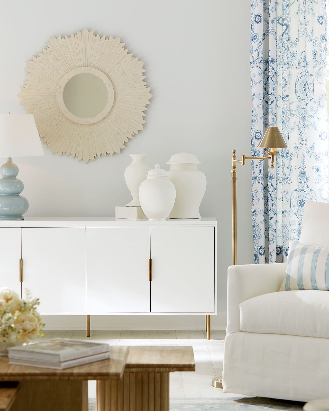
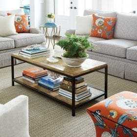
Using bold colors – especially greens and blues – can be a little scary. So we asked our friends at Traditional Home to pick their favorite paint colors. Then we used them as our inspiration to take several rooms from staid to stellar. You’ll find TH’s reasons to love it on each paint chip.

our favorite blues

Ralph Lauren “Reflecting Pool”
This deep blue craves metallic accents and simple trim. Try “Reflecting Pool” in your dining area paired with a dramatic chandelier and patterned draperies. The color will spark conversation and sweep guests off their feet. -Interior Design Assistant, Clara Haneberg

Farrow & Ball “Pitch Blue”
This is the color of my master bedroom, and I’ve never tired of it. The blue is not too blue, deep with a lot of gray that adds depth and richness. “Pitch Blue” teamed with my crisp, all-white bed linens is an edgy version of the conventional blue-and-white. And since it leans toward gray, “Pitch Blue” acts as a neutral that works with any bold accent color. -Senior Style Editor, Krissa Rossbund

Darryl Carter Colors “Grantham Blue DC10” from Benjamin Moore
I’m a pushover for whisper-soft robin’s-egg hues like Grantham Blue. On dining room walls it’s a quiet backdrop for my collection of Blue Willow china and antique flow-blue plates. With subtle sky-gray undertones, it also would be perfect for a porch ceiling. This warm blue sets a serene mood and looks fabulous with crisp white, deep periwinkle, and purple accents. Hello hydrangeas! -Senior Architecture Editor, Amy Elbert

Benjamin Moore “Hale Navy”
I love this moody navy blue from Benjamin Moore. Designer Jan Shower’s saturated the walls and ceiling of a library in the dramatic hue-partnering it with acid-green leather chairs, but you could also glam it up by pairing it with a vibrant canary yellow. -Senior Design + Lifestyle Editor, Jenny Bradley

Behr Paints “Enduring”
After living with white walls in our master bedroom for too many years, I decided to give the color wheel a spin and landed on (and have fallen in love with!) “Enduring.” Blue has long been a favorite color of mine, but this shade takes the hue to another level for me. Its deep, almost smoky personality envelops the room with a serene, peaceful presence and gives me that “Aaahh, now it’s my time to unwind!” feeling whether day or night. -Executive Editor, Marsha Raisch
Click here to shop Ballard products in these favorite colors.
our favorite greens

Valspar “Tea Stain 6001-A”
The oh-so-subtle Valspar Tea Stain green on walls envelops rooms with warm earthy comfort (just like a cup of hot green tea) and complements my antique pine furniture and ginger-colored toile fabrics. Trim in Betsy’s Linen 7005-16 and a repurposed bench painted in Glowing Green 5007-A completes the cozy back-to-nature look. -Senior Architecture Editor, Amy Elbert

Benjamin Moore “Fresh Dew”
I love colors that change depending on how sunlight hits the room. In my home office, which receives no direct sunlight, I went with a barely perceptible celery green. No one walks in the room and sees green. “Fresh Dew” feels fresh and light and creates a calm, soothing space to work. Because the room is fairly dark, I went with a very soft, light shade. -Senior Antiques + Art Editor, Doris Athineos

Ralph Lauren “Sage Sweater”
This pale yet punchy green brightens up bedroom walls. Use the shade on just one wall to add instant depth and personality to your space. -Interior Design Assistant, Clara Haneberg

Pratt & Lambert “Scarab #19-14”
This vibrant shade of green adds life to a 3-season porch and creates an ambience that is both cheerful and restful. White lacquered furniture and black accents adds crispness and contrast to the jewel- toned walls. It’s a happy shade reminiscent of summer and gardens, even when the landscape outside is snowy. -Research Editor, Janice Currie
Click here to shop Ballard products in these favorite colors.


