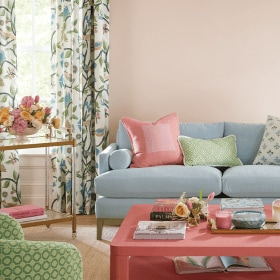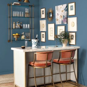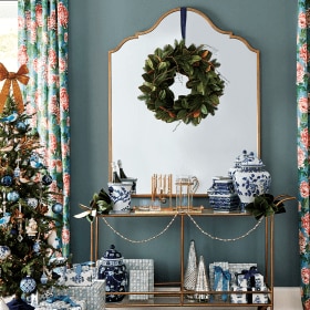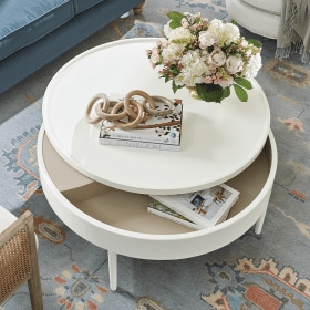
Never underestimate what a little bit of paint—and your imagination—can do for a space. It can make a dreary room upbeat, a small room live large and a cavernous room cozy. And if you’re on a budget, paint is a great way to update your space without spending a lot of money.
Painting a room usually involves four walls and white trim, right? This time, think outside the box. There are so many ways paint can add impact. Check out some of our ideas for inspiration.
Create architectural interest
If you love a color, but can’t commit to painting an entire room with it, do try this at home. Our lavender treatment adds visual texture to a blank wall. The white base coat literally frames the focal color, so it’s a fun way to highlight a piece of art or create a gallery wall. (See our painter’s tape tip below.)

Go monochromatic
Wrap yourself in coziness with a rich color on your walls, such as an espresso brown or a deep blue. Go ahead, paint it all the same color, even the trim. Painting over the wall details, such as window trim, chair railings and decorative molding creates a clean composition that doesn’t distract the eye. The walls become a monochromatic backdrop for art, furniture and other décor in the room.

Paint a pattern
Break up the monotony of a plain wall with sophisticated stripes. The designers at the Southern Living Idea House went one step further and painted a tone-on-tone buffalo check pattern. Just remember, vertical stripes create a sense of height while horizontal stripes stretch out a wall, causing the whole room to appear larger. (See our painter’s tape tip below.)

Shrink a room
High ceilings? Paint the ceiling a darker shade than the walls to visually lower the ceiling and create a cozier, more intimate environment. We tried this trick on the 9-foot high ceilings of the Bosch Model Home to great results. To lower those ceilings even more, you can bring the ceiling paint down on the walls no more than one foot. This look works especially well if you’re using a high-contrast color.
Create a sense of depth
Paint an alcove, the back of a bookcase, kitchen cabinet backs, an open closet or a small pass-through space such as a hallway a darker (or brighter) shade than the surrounding color for visual punch. The extra color will add a sense of depth while highlighting accents in the room.
Painter’s tape tip: If you’re painting lines on a wall, you need to ensure they’re even and straight using measuring tape, a level and a pencil to lightly mark off the lines. Then you’re ready to mask off the lines with the tape. To ensure perfectly crisp lines, you can brush a light coat of clear matte medium acrylic (available at art supply stores) or your base coat color over the lines first to fill in the areas where it might bleed through. Remove the tape as soon as the paint is set. And in case you’re wondering how we got those curved inset corners on the lavender focal wall, we used paper plates!
For even more ideas and inspiration, check out our Paint Ideas board on Pinterest.


Jessica
Hello, what color was used in the September catalog on page 19?
Caroline @ How to Decorate
Hi Jessica,
The paint color is Benjamin Moore’s York Gray #CW-45.
Hope that helps!
The How to Decorate Team
Tina
What is the color on page 2-3 in the Feb 2013 catalog? My painter is coming in two days!
Karen
Tina,
That is Benjamin Moore #1239 Rural Earth.
Sara
What is the name of the paint color on pg 8 & 9 of the March 2012 catalog?
Silvy
Can you please tell me the color and brand of the paint that was used in the Late Fall 2012 catalog on pages 26-27? Thank you!
Laura
Could you tell me what color/brand paint was used in your November 2012 catalog on page 76?
Jaskiran
Can you please let me know the paint color on page 11 (Entryway) of the August 2012 catalog? It is the same color on page 67 of the Late Fall 2012 catalog. I need to paint next week. Thanks!
Jenn M
how did they create the scallop like edge on the lavender wall?
Lisa
What is the name of the paint color on page 23 of the March 2012 catalog?
Thanks!
rebecca
Can you tell me the color of paint used on page 52 in the top left corner of the late fall catalog? thanks!!
Ballard Designs
The paint is from Benjamin Moore and it is called Night Sky #1567.
The Style Studio Team
Samantha
What is the paint color on page 19 of the September 2012 catalog?
Ballard Designs
The paint color is from Benjamin Moore – Lenox Tan #HC 44.
The Style Studio Team
Kathy
What paint color is used on page 65 of August 2012 catalog? Where on Ballardstyle.com are the paint colors listed? Thank you.
Ballard Designs
The paint color is from Benjamin Moore – Lenox Tan #HC 44.
The Style Studio Team
Whitney
What is the paint color on p. 27 of the September catalog?
Nancy
I love your ideas and everything in your catalogs! What is the gray paint color shown on page 80 in your September catalog?
CJ Hartland
I love the mossy green color on page 33 of the summer 2012 catalog. Could you please let me know the paint color and brand?
Rose
I also love the paint colors used in their catalog. I recently requested a free copy of their Casa Florentina catalog, which generated an emailed thank you. On that thank you, you’ll find the names of the paint colors simply by going to the box ” read our blog style studio”. Next, go to the catalog paint color swatches to find the paint color you love. Now your rooms can look as fabulous as the Ballard Designs catalog!
Debbie Beutler
I should also ask what brand of paint was used and color?
Ballard Designs
The color of the walls is called Stormy Skies #1616 and is by Benjamin Moore.
The Style Studio Team
Debbie Beutler
I’m looking at your August 2012 catalog. What color paint was used on page 11, entryway room?
Debby Malley
What is the paint color on the wall on page 43 of the August 2012 catalog?
Ballard Designs
The paint color is called Mill Springs Blue #HC-137 by Benjamin Moore.
The Style Studio Team
Carrie Smith
I am so inspired by your catalog! Speaking of inspiration…what color paint was used on pg. 47 in your Late Summer 2012 issue? Thank you!
Ballard Designs
The color is Northwood Brown #1000 by Benjamin Moore.
The Style Studio Team
Kelly Ross
What is the color on the walls in the Valeria Bedroom?
Ballard Designs
The color is Philipsburg Blue #HC-159 by Benjamin Moore. As with any paint, purchase a sample so that you can paint a large square so that you can view it in your home.
The Style Studio Team
Marilyn Flowers
What is the wall paint color of Ballard Designs August issue on P. 48?
Thanks!
Alyssa Yates
I love your catalog! What is the paint color on pages 44-45 in August 2012 catalog. Thanks!
Rhonda pohlen
what paint color is used in the august 2012 catalog pages 20 and 21? thank you!