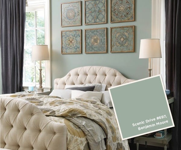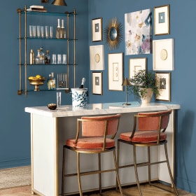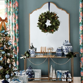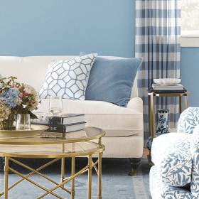
Providing the paint colors used in Ballard Designs catalogs can be difficult, because we constantly shoot at actual homes that have been painted by their owners. However, our team of stylists has chosen paint colors that are as close to the actual wall colors as we could find. These colors will blend with our furniture, accessories and fabric.
As with any paint, various light conditions can affect how the color will look in your environment. We recommend purchasing a small paint sample. Paint a large square, let it dry and look at it in both the day and at night (paint color changes as light changes). This method is inexpensive and will save you from making a much bigger and more expensive mistake. Also note that printed colors will not match paint chips exactly, so always try a sample on your wall before you start your project. For simplicity, we use Benjamin Moore paint matches. Most paint stores are happy to match any color that you bring them.
We hope that you enjoy reviewing the colors chosen. We think the colors will give you a great background for your Ballard Look.


Related: How to Paint a Room


Danny
What other wall colors compliment Scenic Drive #697?
Stephanie Hron
Would it be possible to get the wall paint color from ” summer favorites 2014″
Page 66? It is a warm beige but does not look like it has a lot of yellow in it! I really love this color and the entire room!
Thanks so much
Caroline @ How to Decorate
Hi Stephanie,
Is the room you’re thinking of a bedroom with accents of lavender? If so, we recommend trying Benjamin Moore’s Timid White (#OC-39). Just be sure to test out the color in your space by painting swatches on the wall before you make your decision. Some paint colors look different in different spaces!
Happy Decorating,
The How to Decorate Team
Robin Nickles
Can you tell me the paint color of the wall and fireplace on the cover of your Holiday Decor 2013 catalogue? Thank you so much!
How to Decorate Team
Hi Robin,
The paint color in that room is Peale Green (HC-121) by Benjamin Moore.
Best,
The How to Decorate Team
Kimberly
I would like to know the blue paint color on Page 38. I think it was in the Jan-Feb issue. Please help!
Miriam
Kimberly: Try Scenic Drive #697 by Benjamin Moore … but be sure to test a spot first since the catalog printing can affect how the paint color looks. Style Studio Team
Lisa
Can you please tell me the color of the paint on pages 80-81 in the February, fall in love with color catalog?
Jane
The wall color is called Scenic Drive #697 from Benjamin Moore.
The Style Studio Team
Janet
I didn’t see where Niki was answered as to what paint color on Page 4-5 is. Did I overlook that?
Ellen
How about the color on page 65? Is that scenic drive as well? Love that for my home office!
Niki
Hi! I’m totally in love with the room color on pages 4-5 of the Early Spring catalog. Can you please tell me what that is? Thank you!!!
Jane
The paint color is called Sea Spray #941 from Benjamin Moore. As with any paint, we always recommend that you paint a sample of the color as the catalog printing can be very different from the actual paint color.
Happy Decorating,
The Style Studio Team
Jane
The color on pages 4 & 5 is called Sea Spray #941 by Benjamin Moore. As always, please paint a small area to check the color.
The Style Studio Team
Rebecca
I have white bedding with navy/white pillows with cherry furniture. I’m choosing paint now to go with white trim.What is the paint color on p. 43 and p.45 in the Early Spring 2013 catalog? Also any suggestions on paint colors I might look at? I really like navy but not sure I want it on bedroom walls.
Ann
Hi, what color is shown on page 77 of the Early Spring 2013 catalog? I have a brown color in my sitting room and all the furniture is brown, I need something to lighten up that room. thanks!
Christi
Could you give me the paint color in the picture on page 15 of the early spring 2013 catalog that is showing item J -the fringed burlap panel? Thank you!
Jane
The color is from Benjamin Moore. It is called Gray Wisp #1570.
Susan
Hi- ! How about the paint color that is featured on the cover of the Spring 2013 catolog? Is that rural earth as well?
Thank you!
Jane
The color is called Iron Gate #1545 by Benjamin Moore.
Tina
What is the paint color on pg 2-3 in the Feb. 2013 catalog?
Karen
Tina,
That is Benjamin Moore #1239 Rural Earth.
Kristen
How would rural earth look with brown furniture?
Karen
Kristen,
It would be very monochromatic. If you have our February catalog, check out page 89. It has brown furniture with that wall color – it’s sort of a more distressed furniture but it will give you the idea.
Donna
I painted my kitchen a similar green. It was originally chosen by the incredible decorator who lived here before me. As I am a “neutral loving girl,” I was hesitant and kept wanting to paint up my usually grays, off whites, beiges…you get the picture. I am so happy that I stepped out. I love it…happy, cheerful, different…if/when I grow tired of it, I all just repaint. I don’t see that happening in the foreseeable future. Lesson learned: It’s just paint; try it you’ll like it.
Susan
I am trying to match/coordinate a color to go with the geneve rug in spa. would scenic drive 3697 be a good choice?
Jane
Scenic Drive will certainly blend with the Geneve Rug in spa. Add some accents in the borwn tones and you should have a winner!
Jane
Style Studio Team
Heather Murdock
could you possibly tell me the paint color for the Piedmont room on page 80 of the September 2013 catalog?