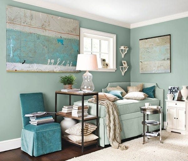

Take one look at our catalog or website and you can see how much we love Adele Sypesteyn’s abstracts and horse photography. We sat down with Adele to discuss her inspiration and her work.
Ballard Designs: Let’s talk about your abstracts first – they’re full of wonderful layers and textures.
Adele Sypesteyn: I grew up in New Orleans and always found inspiration in the deeply weathered walls. You can take a photograph of a section of wall and see layer upon layer of markings, erosion and age. I love architecture, so just being surrounded by the rich patina of those walls really inspired me.

I do multiple layers of finishes and markings, not even knowing what’s going to show through in the end. I love the surprise of discovery once I’m finished. One of the best things I hear from people who own my work is that they continue to see things they didn’t initially see. It holds your interest for a long time. It’s not just an image, but there’s this mark here and this mark there, so there’s a continuance of intrigue and discovery.
BD: The colors in your abstracts are quite different from your well known white series. Tell us about that transformation.

AS: I used to work with a lot of white and more neutral colors. But I moved to Los Angeles three years ago, and just felt this burst of color with yellows, blues and greens. The color of the water and the sky and the sunshine here — it’s so gorgeous and it started to reflect in my work. Being in LA really has changed my palette. I’ve moved away from architectural based imagery to more landscape influenced imagery.
BD: How did you get into horse photography?
AS: I have a gallery in Telluride and horses are a big thing there. I love their essence: there’s a mystique and mystery about their power and the aura of their being. It’s like an ancient animal in present day. I knew I wanted to experiment with different genres, so I decided to challenge myself with horses.
I spent a few years painting them and drawing them and nothing clicked. I’ve always done photography and I love to blow images up to get this sense of intimacy that you just don’t get when you see something from afar. So I started photographing horses, especially white horses, because I love everything white. I wanted to do something large and oversized, so I would capture a piece of the horse, like the face or the tail, to reveal the power.
And instead of just doing photography, I wanted to do something special that no one else was doing, so that’s when I incorporated the techniques I use in my abstracts—the layered, textured washes and markings. So it’s really a mixed media.
BD: You have an interior design background. Has that influenced your work?
AS: Yes, it was just a natural instinct that came hand in hand. Part of how the painting started originally is because I wanted something to put up in my living spaces, so I started doing my own artwork. I started getting requests from friends and family that wanted art for their space. The same approach I use for interior design I take to my paintings: composition, color theory, lines, what makes something feel large or small. My style of interior design has always been clean, kind of like my white paintings, and with a pop of color.
BD: We hear you have been a big fan of Ballard for years.
AS: Yes! Ballard has long been my favorite catalog. I’ve bought many, many things from Ballard through the years and have spread the word far and wide. Much like my art, I love to combine contemporary elements with more traditional design. It’s the meshing of those two styles that has always drawn me to Ballard. So when I was asked to be represented in the catalog, I was thrilled. I think it’s a perfect fit.
BD: We do, too!


Kimberly Wolfman
Can you tell me the paint color on the wall. I am doing a bedroom for my daughter who love the beach and water. she is 22 . looking for that color. Thank you.
Caroline McDonald
Of course! It’s Benjamin Moore’s Scenic Drive #697. Happy decorating!