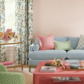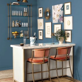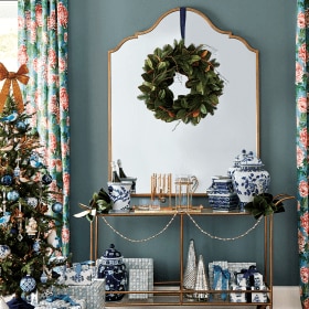
Providing the paint colors used in Ballard Designs catalogs can be difficult, because we constantly shoot at actual homes that have been painted by their owners. However, our team of stylists has chosen paint colors that are as close to the actual wall colors as we could find. These colors will blend with our furniture, accessories and fabric.
As with any paint, various light conditions can affect how the color will look in your environment. We recommend purchasing a small paint sample. Paint a large square, let it dry and look at it in both the day and at night (paint color changes as light changes). This method is inexpensive and will save you from making a much bigger and more expensive mistake. Also note that printed colors will not match paint chips exactly, so always try a sample on your wall before you start your project. For simplicity, we uses Sherwin Williams paint matches below. Most paint stores are happy to match any color that you bring them.
We hope that you enjoy reviewing the colors chosen. We think the colors will give you a great background for your Ballard Look.


Browse more paint color ideas from our catalogs, or find paint color inspiration on our Pinterest boards.


Heather
I painted my formal living room Benjamin Moore’s Tyler Taupe and the adjoining hallway Benjamin Moore’s Oat Straw. I go back and forth trying to decide if this color makes the living room look too dark. It’s a very deep mustard color. What other color would work well with Oat Straw and brighten the living room? There are two French doors facing westward so the room is dimly lit throughout the day. My furniture and rug colors are chocolate brown, lime green, reddish burgundy, with caramel-colored accents in several of the fabrics and gold, black and mahogany wood furniture. The rug has a large floral print with all these colors including a lighter greenish gray, too. The walls are two-story high with deep crown molding at the top and bottom. I am open to bold shades and taking design risks. My house is a classic, graceful Southern home. I want to use a color that will update the palette of my current colors.Thanks for your help!
Caroline @ How to Decorate
Heather,
We know how tricky it can be to pick our coordinating paint colors! Benjamin Moore has a great tool on their website that shows other coordinating paint colors that can be super helpful. If you look at Oat Straw, they recommend a color called Rock Candy #937 that we think would be a great neutral to pair with Oat Straw and also brighten your living room like you want. It also has a touch a green in it that we think will coordinate with the gray-green in your rug. But as always, be sure to test large swatches on your wall before deciding on a color.
Best of luck!
The How to Decorate Team
Sheila
What is a good wall color to use with the Ballard burlap panel window treatments? I am trying to redecorate using neutrals (drop cloth slipcovers, burlap panels, hardwood floors) and I am struggling with the best wall color to go with my furnishings. Also, the beige vs greige war is confusing me. Decisions, decisions. . .
Miriam
Sheila: For a medium tone, we recommend Sherwin Williams Kilim Beige # 6106. In the Sherwin Williams paint chips, going a shade lighter or darker will still work beautifully but it depends on your desired final results. Whichever shade you select, remember to first paint a test area on the wall so you can see how the color works within your space. Style Studio Team
Lori Larkin
Can you tell me the paint color used on page 75 of the Summer favorites 2013 catalog?
Miriam
Lori: Sherwin Williams-Waterscape SW6470. Be sure to paint a test spot first because the catalog printing sometimes changes the way a paint color looks. Style Studio Team
tracie
I’m looking for the paint color for the Casa Florentina bed in the distressed gray over white. Do you know what Benjamin Moore color would be a good match?
Miriam
Tracie:
A similar color is a paint by Sherwin Williams called Balanced Beige – SW 7037. Even though this is a beautiful substitution, keep in mind it won’t be the exact color since the Casa Florentina finishes are hand applied, by artisans, one layer at a time. The Style Studio Team
Tammi
I’d love to know the paint color used in the office shown on pg. 97
Miriam
Tammi,
Could you describe the office on that page a bit more, we are trying to locate the color for you. The Style Studio Team
Tammi
Walls are a soft creamy yellow/cream, black office furniture, blue & white striped upholstered chair with a cream side chair in the background.
Miriam
Tammi: Many times our photo locations are already painted. Try Sherwin Williams Macadamia SW 6142 as a color copy for this paint. Don’t forget to first paint a test on the wall since the catalog printing can alter how a paint color looks. The Style Studio Team
Alice
I would love to know the color that was used for the living room on pages 62-63 in the Summer Favorites 2013 catalog. My daughter would like to use that color scheme for her bedroom. Thanks!
Miriam
We have that color showing as a Benjamin Moore – Buttermilk 919. Be sure to try a test on the wall since the catalog printing can affect the color of the paint.
The Style Studio Team
Shannon
I would also like to know the neutral color used on page 79. I need a neutral to tie Mexican tile floors, wood plantation shutters and black furniture together in a family room…yikes!
Miriam
Shannon, this color is Benjamin Moore – Elephant Tusk OC-8.
Shannon
Wouldn’t you know that is the exact color of my current living room!! Hahaha! I guess my taste has not changed much…
Miriam
Remember to always paint a sample on the wall first. This will allow you to observe the paint in the changing light. Also, the catalog printing sometimes changes the look of the paint color – The Style Studio Team
Marian
What color is used in the living room on pg 50?
Marian
Sorry, summer favorites 2013
Miriam
Marian, the color on this page is a lovely color from Sherwin Williams called Otter-SW6041
Sharon
What is the wall color in the bedroom – summer favorites, 2013 – p 51?
Miriam
We have the paint color for p. 51 showing as Sherman Williams Otter – SW 6041
-Style Studio Team
Denee
What is the paint color for the living room on page 92, love it!
Miriam
The delicious color on page 92 is Mink SW 6004 from Sherwin Williams!
Debbie
What is the paint color for the living room on page 85?
Miriam
This fabulous color is from Sherwin Williams and the color name is Biscuit – SW6112.
Lauren
What is the beautiful neutral paint color on pages 78-79 (the main room shown)?
It’s the perfect warm neutral! Thanks
suzanne
I also love this neutral color. Any feedback as to the name/brand?
sharon
I love the wall color in the living room photo; however, I picked up the Hazel color swatch from Sherwin Williams and it looks nothing like the color shown here! Is it possible the color is mis-labeled here?
Joan
all the paint at Ballard Designs is from Benjamin Moore, not Sherwin Williams.
Jane
Not all of our paint is from Benjamin Moore – We use many different paint sources!
The Style Studio Team