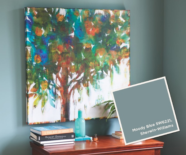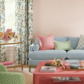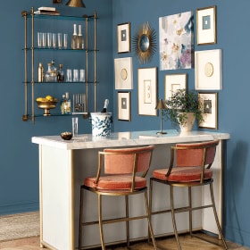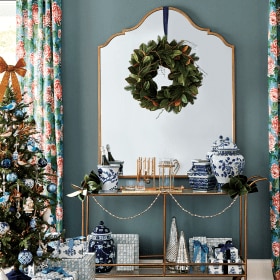
Providing the paint colors used in Ballard Designs catalogs can be difficult, because we constantly shoot at actual homes that have been painted by their owners. However, our team of stylists has chosen paint colors that are as close to the actual wall colors as we could find. These colors will blend with our furniture, accessories and fabric.
As with any paint, various light conditions can affect how the color will look in your environment. We recommend purchasing a small paint sample. Paint a large square, let it dry and look at it in both the day and at night (paint color changes as light changes). This method is inexpensive and will save you from making a much bigger and more expensive mistake. Also note that printed colors will not match paint chips exactly, so always try a sample on your wall before you start your project. For simplicity, we uses Sherwin Williams paint matches below. Most paint stores are happy to match any color that you bring them.
We hope that you enjoy reviewing the colors chosen. We think the colors will give you a great background for your Ballard Look.


Browse more paint color ideas from our catalogs, or find paint color inspiration on our Pinterest boards.


Jimmie A Thomas
They are different shades of gray.
Jimmie A Thomas
Wanted to know paint colors used on page 30 and 70 in your August 2016 catalog.
Caroline @ How to Decorate
Jimmie,
The bedroom on page 30 is Benjamin Moore’s Gray Owl, and the living room on page 70 is Benjamin Moore’s Amber Slate. You can find all of the paint colors from the August catalog here: https://www.ballarddesigns.com/howtodecorate/2016/07/august-september-2016-paint-colors/
Happy Decorating!
Beth
Will you please tell me the paint colors on the walls on pages 39 and 89 of the Late Summer 2013 catalog?
Miriam
Beth: For page 39 … try Sherwin Williams Lakeshore #6494 and for page 89 … Sherwin Williams Raindrop #6485. Remember to paint a large test area first since the catalog printing sometimes affects the way a paint color looks.
Beth
Thanks so much for the information
Karen
Miriam- I love it in the catalog- of course all the rooms have bright white trim. Our great room is trimmed in wood (I guess its a medium oak color), do you think the amazing gray would look good with the wood? I would like to paint the kitchen the same color and we have hardwood floor and med. wood cabinets. Thanks for your opinion!
Miriam
Karen: The best way to determine if the color is going to work well in your space is to paint a piece of poster board or foam core board with the paint color. Hold it up to the trim in both rooms during different times of the day. Good luck!
Karen
What color is the room painted on page 98 and the top of page 99.? I love it with the chair and it looks like it would coordinate with blues and reds as well. It is in the May 2013 catalog.
Miriam
Karen: Sherwin Williams – Amazing Gray SW 7044 is a warm gray that changes in different kinds of lighting. We suggest painting a test first since the catalog printing can affect how the color looks. Style Studio Team
Miriam
Michelle,
Try a color by Sherwin Williams called Muslin SW 6133. Remember to paint a test on the wall as the catalog printing sometimes changes the way a paint color appears. The Style Studio Team
Michelle
Please provide the paint color for the room on page 58 of the May 2013 catalog. The room has the Reynolds Bench in a soft blue and the sofia chairs in natural flaxen.