
Decorating Dilemmas is a weekly column in which our stylists answer your design questions, so you can tackle your home decorating project with complete confidence.
Hi Style Studio,
I’m having a hard time coordinating my kitchen and breakfast nook. I like the bold print on my chairs mixed with the antique finish of our breakfast nook table but I also like the look and warmth of the leather counter stools. I don’t know what to do as far as wall decor, window treatments, wall color or accent pieces.
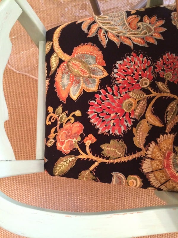
The fabric has a navy background. My dishes and some of my serving pieces are a light green/mint color. I love the looks Ballard designs creates and want to incorporate this into my design.
Thanks!
Kelly

Dear Kelly,
Thank you for your dilemma. We have a few suggestions to help you finish your kitchen and breakfast area. Let’s start with a rug. We chose our Braided Jute Rug which will add some texture to the room. Our Fringed Burlap Panels in Natural should blend well, but try hanging them close to the ceiling near your crown moulding.
As far as artwork, we love our Patchwork Prints in Red, placed vertically on either side of the windows, and on the left wall in the breakfast room, our Alexander Martinot Clock will look great. On the wall behind the sink, we chose our Vintage Wine Label Prints.
If you wish to paint, we chose Benjamin Moore’s Pearl Harbor -2165-50. Just make sure that you paint a large swatch to make sure this paint will work!
We do hope that our suggestions help you to complete your KItchen and Breakfast Room. Don’t forget to send pictures when you are done!
Happy Decorating,
The Style Studio Team

Do you have a decorating dilemma? Send us your own questions here.


Melinda
Hey Kelly, at first after I read the the presented solution my reaction was like yours. It seems random and like it didn’t resolve your questions. And maybe they were in a big hurry and didn’t think it through. However, as I thought about it perhaps it actually is good.
The rug they recommend has a lot more texture than your rug so I think it would look more luxurious. However, I see a high chair so, to be honest, I think yours is a better choice for now for clean-ability. The curtains would be nice. If you can even open your curtain rod a little wider so that the windows aren’t blocked at all, I would do that.
Now with regard to all those wall hangings. Seems goofy. But really, as you pointed out in your request, your green chairs and navy fabric have nothing in common with the leather stools. Its really a mismatch. I do this all the time (3 very different/incompatible chairs in my living room right now, but I like them all for a different reason). So perhaps what the designer was trying to do was put something else in the room to grab your attention and therefore diminish the distraction caused by the existing different furniture. I’ve seen this done lots of times and it makes the room look pulled together while each individual piece is what you love. Also, the red they selected may seem out of place, but really that’s what your two rooms have in common: the red undertones in the leather and the red flowers in the fabric. And those Patchwork Prints, even in red, have a lot of green in them which you like. I say give it a try – you can always return them if it doesn’t kick your rooms up a notch.
Paint last since, as you said, its similar to your existing color. It seems you were really hoping for blue/green, but I’m not sure it would work well. SW has a beautiful color called Quietude that’s very popular right now. But it seems to look good with large doses of white which you don’t have. Perhaps if your table or cabinets were white?
Anyway, Kelly, this is just some food for thought – I have no idea if its right or useful. Your house is lovely. Good luck.
Kelly
Disappointing suggestions. The room is already essentially that color, there is already a jute rug on the floor and you suggest adding prints and a clock that add red to a blue, green and brown palate-no way. With all the blue and green decor Ballard offers, I’m surprised you couldn’t come up with something better. Was really looking forward to seeing what you’d suggest but this was terrible.