
Whether Spring has sprung where you are or you’re still waiting for the sun to come out, the time has come to spruce up your space for warmer months. Inspired by the spaces in our Spring 2014 catalog, we’ve broken down exactly how to get the look of four of the rooms you’ve seen in our pages!
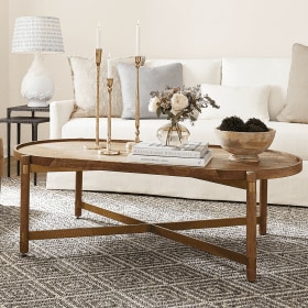
Coral & Mineral (above)
In the living room above, we brought in happy shades of coral (our favorite!) and tempered them with cool mineral for a perfectly balanced combination. Our picks for fabrics include our Holland Apricot fabric, Suzanne Kasler’s Signature 10oz. Linen in Mineral, our Merrick Coral fabric, and our ever-popular Athena fabric in Mineral. Pair these fabrics with accessories in complementary hues, and even the most neutral space will be transformed for a new season.

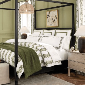
Lavender & Linen
To echo the softness of Spring, we infused this bedroom with planes of lavender, balanced with neutral patterns. We chose our Demere Stripe in Natural, Suzanne Kasler’s Signature Linen in Lavender, our Hayland Natural Fabric, as well as our Emerson Stripe fabric in Lavender. To give the space a more relaxed feel, we brought in little hints of nature, like with our Dareau Woven Lampshade, a bench with a woven seat, and a natural fiber rug.

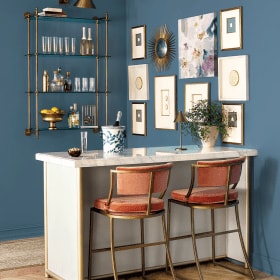
Spa & Gold
To up the ante on pieces in our all-time favorite hue, spa, we injected this space with glimmering gold. Warm velvet curtain panels have a glamorous luster about them, as do hints of gold in accessories, accent furniture, and even art. Our fabric choices for this color palette are our Kea fabric in Sand, our Signature Velvet in Spa, our Signature Velvet in Sand, and our Haviland fabric in Spa.

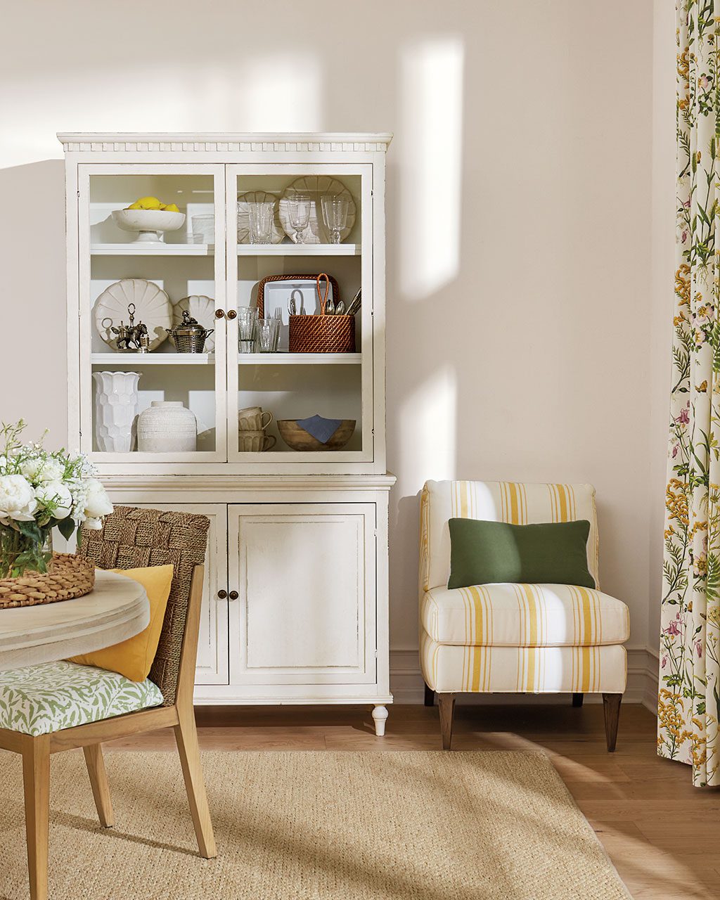
Sandalwood & Lime
Accents of green give this living room a fresh-for-Spring look. We started with a neutral palette, like our Demere Stripe in Flax, our Trilby Basketweave in Natural, and our Vintage Ticking Stripe in Sandalwood, but of course had to bring in a little color with our Matisse Ikat fabric! Accessories are fantastic way to give any room a certain vibe, and for that garden-inspired look, we used a preserved boxwood topiary, a garden seat in a bright hue, and pillows and art with botanical motifs.
For more decorating inspiration, browse our Pinterest boards for ideas, or visit our photo gallery to see all the gorgeous rooms found in our catalog.


Lindsay
Hi. Could you please tell me the name of the wall color in the Sandalwood and Lime color palate? Thanks!
Annika Dupree
Lindsay,
The wall color from this palette is called “Going to the chapel” #1527 and is from Benjamin Moore.
Katelyn
I love the first color pallet- could you please tell me the name of the paint color is in the first picture? Thanks!
Caroline @ How to Decorate
Katelyn,
It’s Benjamin Moore’s Going to the Chapel!
Caroline
Hi where does the rug in the spa and gold picture come from?
Caroline @ How to Decorate
Caroline,
That’s our Devlin Tufted Rug.
Mandi
I love the coral and mineral design, I was wondering if you could tell me where to find the coral throw.
Caroline @ How to Decorate
Mandi,
Sadly, that throw blanket has been discontinued! But our Classic Herringbone Throw in Papaya has a VERY similar color and would definitely work well with all of the fabrics and accessories in this room.
The How to Decorate Team
Holly
Can you please tell me where the floral prints came from? Thanks!
Caroline @ How to Decorate
Hi Holly,
The prints are Ballard Designs Sunrise Floral Art.
Happy Decorating,
The How to Decorate Team
Elizabeth
love the Coral & Mineral room. Assuming the ottoman is covered in the same fabric as the sofa, but what did you use on the skirt with the border around the bottom?
Caroline @ How to Decorate
It’s our Hayes Tufted Ottoman in Suzanne Kasler’s Linen Blanc.
Stacey
I love the light blue chairs in Coral & Mineral, can you please tell me the name of this color?
Caroline @ How to Decorate
Stacey,
The fabric on the chairs is Suzanne Kasler’s Signature 13oz Linen in Mineral.
Happy Decorating!
The How to Decorate Team
Kalai
Hi there,
Absolutely love the colour palettes. I have a few big pieces of furniture in small space and believe that it would really work. I like the sandalwood and lime but wanted to know if the introduction of a bit of spa and perhaps a hintof gold would be too much? Thanks Kalai
Caroline @ How to Decorate
Hi Kalai,
Adding touches of spa and gold would be a beautiful addition to this color palette. Go for it! It sounds like you are going to have a lovely space on your hands.
Happy Decorating!
The How to Decorate Team
Lauren B
where can i purchase the ceiling light in the spa & gold palette ?
Caroline @ How to Decorate
Hi Lauren,
That is the Laurenza 12-Light Chandelier from Ballard Designs.
Happy Decorating!
The How to Decorate Team
Robin
I’m in love with the velvet color on the chairs in the Spa and Gold photo; it’s exactly what I’m looking for. It’s been labeled as Spa but the color in the picture looks quite a bit darker than the Spa velvet swatch I have – it really looks closer to the Teal velvet to me. Does the Spa velvet show up darker in photos than in real life or is it possible it’s been mis-labelled on the photo? Thank you!
Caroline @ How to Decorate
Hi Robin,
The fabric on the chair is indeed Signature Velvet in Spa. You’re right it does look a bit darker in this photo than our typical spa fabric. Because of the nature of velvet, sometimes the nap makes it look darker.
Hope that helps,
The How to Decorate
Tara
Hi,
I love the coffee tables in Lavender & Linen and Spa & Gold. Where can I find them? Thanks!
Caroline @ How to Decorate
Hi Tara,
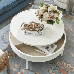
We’re thrilled to hear you love these pieces! The ottoman/bench in the Lavender & Linen space is the white Dorchester Bench with a farmhouse cushion, and the coffee table in the Spa & Gold room is our Olivia Cocktail Table in Antique Brass.
Hope that helps!
The How to Decorate Team
Lauren
what trim color did you use in these color palettes?
Caroline @ How to Decorate
Hi Lauren,
We use Benjamin Moore’s Simply White #OC-117 as our trim colors.
Hope that helps,
The How to Decorate Team
Barbara Holcombe
Would you please tell me about the natural looking rugs you used in several rooms. What is the material and color?
I get so frustrated when decorating photos are shown. The descriptions of rugs are usually overlooked and they are so important, I think, to pull together a room!
Thanks!!
Caroline @ How to Decorate
Hi Barbara,
Thanks for your comment. We agree that rugs are very important for pulling together a room! The rug in the Coral & Mineral room is the Suzanne Kasler Twill Bordered Sisal Rug in Spa, the rug in the Lavender & Linen room is the Braided Jute Rug, and the rug in the Spa & Gold room is the Devlin Tufted Rug. Hope that helps!
Happy Decorating,
The How to Decorate Team
Tracy
I love the soft green club chairs with nailhead ! Please share the style and brand. Beautiful room!
Caroline @ How to Decorate
Hi Tracy,
Thanks for your comment. The chair in this space is our Ballard Designs Travis Club Chair and Ottoman with antique brass nailheads. In shown in this photo in Suzanne Kasler Signature 13oz Linen in Mineral. Hope that helps!
Happy Decorating,
The How to Decorate Team
Joanna Felten
Please, what fabric is the Eton sofa (Whoops, I think it’s called the Eton sofa, better look that up!) in the first picture covered with? It goes so well with the coral and mineral colors. Love that whole room!
Caroline @ How to Decorate
Hi Joanna,
Thanks for your comment. We’re so happy to hear that you like this space! In the photo above, our Eton Sofa is covered in our Suzanne Kasler Signature 13oz. Parchment Linen. Hope that helps.
Happy Decorating,
The How to Decorate Team
Cheryl
What is the rug pattern in the sandalwood and lime color palette?
How to Decorate Team
Hi Cheryl,
Thanks for your comment. The rug in that space is our Tahira Rug in Ivory. Hope that helps!
Happy Decorating,
The How to Decorate Team
sara
Hi there,
Wondering where the wire chandelier featured in the ‘Sandalwood and Lime’ layout came from.
Thanks
Sara
How to Decorate Team
Hi Sara,
That’s our Cosette 10-Light Chandelier. You can find it on our site, here: https://www.ballarddesigns.com/cosette-10-light-chandelier/209470
Happy Decorating,
The How to Decorate Team
Kim-in-the-Cove
Love the spa and gold combination — well, really ALL of the color combinations — but I have a lot of dusty aqua in my decor with neutrals and am just beginning to experiment with a little gold. It definitely adds a modern vibe plus its warm. 🙂
How to Decorate Team
Hi Kim,
That sounds gorgeous! We definitely love the idea of mixing gold with your aqua accents, and really gold can go with any color combination.
Thanks so much for your comment.
Happy Decorating,
The How to Decorate Team