

Because we shoot in real homes, we are not always at liberty to paint the walls. In those cases, we have chosen paint colors that best match the wall color in the photo. Please be aware that color may vary due to various light conditions, finish and other factors. Therefore, it’s always a great idea to test a paint sample on your wall first. We use Benjamin Moore paint, but most paint stores can match any color.
Sunny skies, a warm breeze, and maybe the sound of waves crashing outside? All of these can only mean one thing, summer has arrived! This year, we couldn’t help but be inspired by the waterfront that so many of us are drawn to during this time of year. As a result, you’ll see lots of nautical-inspired spaces, breezy neutrals, and ocean hues on the pages of our Summer catalog.


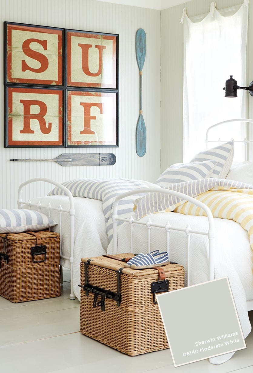
Browse paint colors from past catalogs, or find more decorating inspiration by visiting our Pinterest boards.



Cynthia
Hi there! Where can I find the white relief prints that are over the bed in the useful gray room?
Caroline McDonald
Cynthia,
These are our Coretta Wood Plaques. So glad you like them!
Jessica
Where do I find the bedding in the Moderate White picture?
Caroline McDonald
Jessica,
Unfortunately the bedding in that space is discontinued, although we do still have a limited selection of the pieces in that collection.
We do have lots of other striped bedding collections though. You might like our Gigi Striped Tassel Bedding which has a casual, beachy vibe like the Riviera Linen Bedding. So glad you like these pieces, and thanks for visiting our blog.
Caroline
Kelly
Can you tell me what bedding is in Mountain Air room? Thank You!
Kelly
and rug?
Annika Dupree
Kelly,
Unfortunately, we no longer have that rug available on our site. However, we have a similar striped rug currently offered called the”Vineyard Striped Rug”. You can find it here:
Annika Dupree
Kelly,
Unfortunately, that bedding is no longer available. However, we do currently offer a similar style, the Annabel Heirloom Patchwork Quilted Bedding, which you may like better.
Jess
Do you know where I can find the bedding set in the useful gray picture?
Caroline McDonald
Jess,
I can help with that! This is a combination of our Ava Block print bedding and our Audree Pom Pom bedding.
Glad you like this space,
Caroline
Kristina
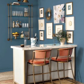
Hi I would love to know where I can source the white shelf tower in the photo with the Benjamin Moore Newburyport Blue paint on the walls.
Much appreciated
Caroline @ How to Decorate
Kristina,
Unfortunately that tower shelf is no longer available. We do have a similar one though — our Grand Tour Etagere in whitewash.
Happy Decorating!
Sasha
Hi, where can i find the white chair/ottoman AT THE END OF THE BED in the sherin williams useful grey picture?
Caroline @ How to Decorate
Sasha,
That’s our Reynolds Bench with Aged Brass Nailheads in Suzanne Kasler’s 13oz Signature Linen, Blanc.
So glad you like it!
Angela
Thanks so much! And one more: In the Surf Picture, where would I find those nautical sconces? Thanks!
Caroline @ How to Decorate
Angela,
Unfortunately those sconces are no longer available. I’m so sorry!
Denise Lores
Hi, where is the chandelier from that is in the bedroom with the Sherwin-Williams useful gray color?
Caroline @ How to Decorate
Denise,
This is our Lourdes Chandelier.
Angela
Love the curtains in the “SURF” bedroom photo — where can I find those?
Caroline @ How to Decorate
Angela,
Those are our Linen Sheer Tie Top Panel curtains.
Katelyn
Hi there! In the above picture with the Sherwin Williams Useful gray paint color – I love the curtains! I’ve never seen them hung like that before! Could could you tell me where the curtain and hangers are from?
Caroline @ How to Decorate
Katelyn,
Those are our Linen Sheer Tie Top curtain panels in natural. They’re hanging from simple bronze hooks you could find at any hardware store. We love hearing that you like this look! Thanks for taking the time to comment.
The How to Decorate Team
Andrea
Hi
Just found this site. Where can I buy the “SURF” artwork in the photo?
Thanks
Andrea
Caroline @ How to Decorate
Andrea,
Those are our Alphabet Block Letters in Red.
Glad you like it!
Carolyn
Where did the bedding come from in the Sherwin Williams #7050 useful grey picture?
Caroline @ How to Decorate
Hi Carolyn,
This is our Ballard Designs Ava Block Print Bedding in Gray, with our Audree Pom Pom Quilt in Gray.
So glad you like this space!
Rachel
Could you please tell me where the bedding and the deep blue chair are from in the first picture? The chair color looks as if it matches the NewburyPort Blue perfectly!
Caroline @ How to Decorate
Hi Rachel,
The fabric on the chair is Suzanne Kasler’s 13oz Signature Linen in Indigo. The bedding is Suzanne Kasler’s Greek Key Bedding in Indigo.
Hope that helps!
The How to Decorate Team
Donna
Where did you get that white tufted headboard in Sherwin Willams 7050 Useful Gray photo? I love it! Is it leather or faux leather?
Caroline @ How to Decorate
Hi Donna,
Thanks for your comment. That headboard is the Ballard Designs Giselle Tufted Headboard. I believe in this photo, it’s upholstered in Suzanne Kasler 13 ounce Signature Linen in Blanc.
Hope that helps!
The How to Decorate Team
jennifer
Does anyone know where the baskets at the end of the bed came from?
Caroline @ How to Decorate
Hi Jennifer,
Thanks for your comment. The baskets at the end of the bed in the last photo in this post are the Ballard Designs Travelers Chests in Large. Hope that helps!
The How to Decorate Team
Jennifer
I’m confused.
Above, you stated that the wall color in the late summer catalog on pages 56/57 and 77 were all BM Moonshine. However, the color on 56/57 is clearly different from page 77. Could you please check again for the paint color on page 56/57? Page 56 has the following items for sale: Belgard Media Console, Custom Soliloquy Glicees, Valletta Candle Sconce, Ananda Serving Table, Shipwreck Urn, Fiona Pendant, Abeille Side Table and Lauren Rug. The color is depicted on a paneled wall.
Thank you.
Caroline @ How to Decorate
Hi Jennifer!
Thanks for your comment. You’re right, it is very confusing! We even confuse ourselves sometimes. Throughout the summer, we have several different catalogs with the many of the same rooms in those different catalogs. The pages are shuffled around in the different catalogs, so on page 77 of the July catalog, the room is the same room that is on page 103 of the Late Summer catalog. Same room, two different catalogs, two different page numbers. Does that make sense?
So, the room you’re wondering about from Late Summer 2014, with the items you listed above on the paneled wall, that is Benjamin Moore’s Moonshine (#2140-60). But you’re correct, it’s not the same wall color as on page 77 in the same catalog (Late Summer 2014). But on page 77 of the July 2014 catalog, it’s the same paneled wall.
I’m so sorry it’s so confusing! Hope my explanation clears it up a bit!!
Best,
The How to Decorate Team
Carolyn
Where is the bedding and bed from in the surf picture. Love this look! Light and airy. Perfect for three little boys!
Caroline @ How to Decorate
Hi Carolyn,
Thanks for your comment. We’re thrilled to hear that you like our Riviera Linen Bedding! We love your idea of using it in a room for three little boys. Hope that helps.
Happy Decorating,
The How to Decorate Team
Lori
Hi How to Decorate Team:
In your catalogue with the blue and white umbrellas on the front, there is a bedroom featured on page 42. I just love it. Can you please tell me the paint color for the walls? Thank You.
Caroline @ How to Decorate
Hi Lori,
We suggest Valley Forge Tan #AC-35. As always we suggest painting a few swatches on your wall before making your final decision. Depending on the lighting in your room and the furnishings, paint colors can read very differently from space to space.
Best of luck!
The How to Decorate Team
Heather
Hi,
Where is the “surfs up” picture from??
I’m decorting my sons room in surfer theme and this picture would be perfect
Caroline @ How to Decorate
Hi Heather,
Thanks for your comment. We’re so thrilled to hear that you like this space! The typography art in that space is from Ballard Designs, you can find them here.
Happy Decorating,
The How to Decorate Team
pat bush
Just received my catalog, could someone tell me the color of the wall on page 23?
Caroline @ How to Decorate
Hi Pat,
Thanks for your comment! You can find all of the paint colors from our Fall catalog here. Hope that helps.
Happy Decorating,
The How to Decorate Team
Dawn
What is the paint color for the bedroom on page 67 of the new August 2014 catalog.
Thanks so much!
Caroline @ How to Decorate
Hi Dawn,
Thanks for your comment! You can find all of the paint colors from our Fall catalog here. Hope that helps.
Happy Decorating,
The How to Decorate Team
Amy
What is the gray and white bedding used in the ‘Useful Gray’ photo??
Caroline @ How to Decorate
Hi Amy,
Thanks for your comment. That is our Ava Block Print Bedding in Gray paired with our Audree Pom Pom Quilt in Gray.
Happy Decorating,
The How to Decorate Team
Debbi
I love the paint color on page 92 of the Late Summer 2014 catalog!! Can anyone tell me the name. It looks like just what I’m looking for.
Caroline @ How to Decorate
Hi Debbi,
Thanks for your comment. We suggest Mountainscape (#870) from Benjamin Moore. As always we suggest painting a few swatches on your wall before making your final decision. Depending on the lighting in your room and the furnishings, paint colors can read very differently from space to space.
Best of luck!
The How to Decorate Team
Keisha
Hello,
Could you please tell me what color you used on page 103 of the late summer 2014 catalog. I love this color, looks versatile. Thanks!
Caroline @ How to Decorate
Hi Keisha,
That’s a gorgeous room, great choice! Try Benjamin Moore’s Moonshine (#2140-60). As always we suggest painting a few swatches on your wall before making your final decision. Depending on the lighting in your room and the furnishings, paint colors can read very differently from space to space.
Best of luck!
The How to Decorate Team
Sara Hanson
Hi! I was wondering if the design team could you tell me the color on page 56 in your latest catalogue? It’s a shot in the bottom left hand corner of the page where the valletta candle sconces are mounted onto a paneled wall? The same color/wall continues onto the next page with another picture of a white sofa placed in front of the paneling? Thanks so much!
Caroline @ How to Decorate
Hi Sara,
Thanks for your comment. We recommend Benjamin Moore’s Moonshine (#2140-60). As always we suggest painting a few swatches on your wall before making your final decision. Depending on the lighting in your room and the furnishings, paint colors can read very differently from space to space.
Best of luck!
The How to Decorate Team
Carol Collins
Luv, luv, luv the paint color from page 103 of your late summer catalog that I received today. Could you tell me the paint brand and color?
Thanks
Caroline @ How to Decorate
Hi Carol,
Thanks for your comment. We recommend Benjamin Moore’s Moonshine (#2140-60). As always we suggest painting a few swatches on your wall before making your final decision. Depending on the lighting in your room and the furnishings, paint colors can read very differently from space to space.
Best of luck!
The How to Decorate Team
Dianne Bivens
Can someone tell me what the paint color is on page 88 of the Summer 2014 catalog?
Caroline McDonald
Dianne,
What items are in the room?
Erica Flynn
Hi there,
Could someone be so kind as to please list the paint color used on page 77 of your July 2014 catalog?
Thanks!
Caroline @ How to Decorate
Hi Erica,
That’s a gorgeous room, great choice! Try Benjamin Moore’s Moonshine (#2140-60). As always we suggest painting a few swatches on your wall before making your final decision. Depending on the lighting in your room and the furnishings, paint colors can read very differently from space to space.
Best of luck!
The How to Decorate Team
Bonnie
What is the paint color on page 47 of the current catalog? Its a pale yellow.