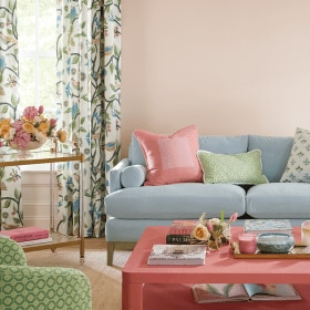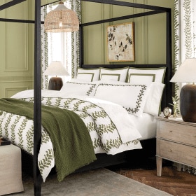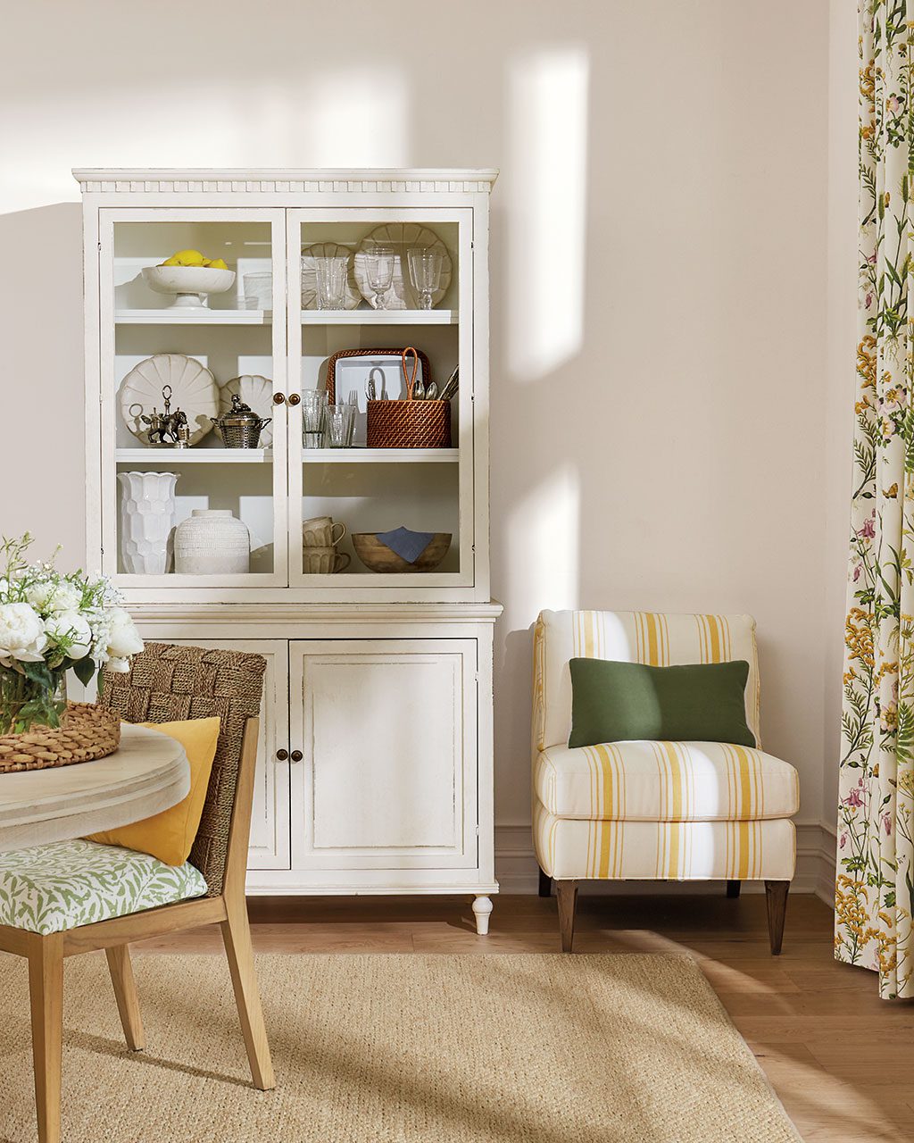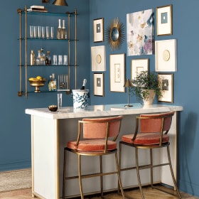

Because we shoot in real homes, we are not always at liberty to paint the walls. In those cases, we have chosen paint colors that best match the wall color in the photo. Please be aware that color may vary due to various light conditions, finish and other factors. Therefore, it’s always a great idea to test a paint sample on your wall first. We use Benjamin Moore paint, but most paint stores can match any color.
This holiday season we were focused on creating cozy spaces that feature all of the things we love during the holidays — glitter, glamour, rustic touches, and hints of red. To set off all of these accents we chose lots of moody grays and taupes, and a healthy dash of creamy white.


Find our best tips on choosing paint colors, or browse paint colors from past catalogs or decorating inspiration by visiting our Pinterest boards.
Did you like this post and find it helpful? Rate it below and share your thoughts in the comments!


Randi
Love this post so much. Where might I find that white office desk? Please share, thanks!
Caroline McDonald
Randi,
This is our Whitley Desk. So glad you like it!
Zeynep
Hi! Could you tell me where the white desk is from in the second picture where the office is in white, blue and gold combination?
Caroline McDonald
This is our Whitley Desk. So glad you like it!
J
Hi, what a great site! May I ask where the cabinet is from in #1538 please? Thanks!
Caroline McDonald
J,
This is our Verona 1-Drawer Lateral File. Glad you like it!
Rita
Hi- can you tell me where to purchase the desk chair featured?
Caroline McDonald
Rita,
Which desk chair? There are several in this post!
Stacey Staples
This is such a wonderful site. Thanks for all the good advice. I live in a 1830 federal and have a farmhouse feel to my decor. I am redoing my 12 year old daughter’s bedroom that has painted floors and I am trying to decide on floor and wall colors. She wanted a very light turquoise/aqua wall color and off-white creamy floor (BM Simply White), but I am worried about coverage and if it would be hard to keep them clean. Basically, I just want a clean, crisp feel that would be appealing to the masses. We are toying with the idea of putting the house on the market in the Spring, so I want colors that would universally be liked. Thanks for your help!!!
Kathleen
I want to repaint the inside of the house and I’m trying to find a creamy white or a very subtle soft gray tying to achieve a French county feel with blue, yellow and red accents. Any suggestions?
Caroline @ How to Decorate
Kathleen,
We’re with Suzanne Kasler who swears by Benjamin Moore’s White Dove. It has a definite cream undertone to it — not stark white. It’s a go-to for us!
Jennifer Simms
I love the wall treatment on page 76. Is that a paint effect or wallpaper? Thanks for your help!
Caroline @ How to Decorate
Jennifer,
That’s a faux-plaster finish. We don’t have any information about the colors used. So sorry!
Annie Murphy
Hello,
Enjoy seeing how rooms are put together with wall color. Have you considered listing the products shown in each photo, along with fabric selections? Would be a helpful shopping tool!
Caroline McDonald
Annie,
Yes, this is a great idea. We’ve been doing this very thing in our “Get the Look” series.
Thanks for the suggestion!
christine luhrs
I would love to know the paint color and brand shown in the Suzanne Kasler room in the holiday catalog. It is a soft gray. on pg. 13
Caroline @ How to Decorate
It’s Benjamin Moore’s Cement Gray #2112.
scarlett bassett
I would like to see the rug in #1467
Caroline @ How to Decorate
Hi Scarlett,
There are two images with the paint color #1467, one features the High Clere Rug and the other features the Bermuda Rug in Mocha.
scarlett bassett
I would like to see the rug in picture #1467
Caroline @ How to Decorate
Scarlett,
I’m not sure which rug you’re referring to as there are two rooms with the paint color #1467, but you’re either looking for the Highclere Rug or the Bermuda Rug in Mocha.
Hope that helps,
The How to Decorate Team
Tricia
This site is fabulous ! Thanks so much for the inspiration from the catalog (and the great products and then the details you provide on this site about paint colors used. I am trying to track down the deep blue wall color on page 20 of the Oct 2015 catalog that features product E1 (piedmont lantern). I would be delighted if you are able to share the shade used. Thx !
Caroline @ How to Decorate
Tricia,
No problem! So glad you love visiting How to Decorate! The wall color is Bachelor Blue #1629 by Benjamin Moore.
Jeannette
I love your ideas. I have a split foyer and never know what to do to fill up the large walls. one set of stairs go up to a living room, the other leads to the family room. Any idea what to do with the large walls. Our tastes lead to traditional with a few eclectic items
Thanks for your help
Jeannette
PS Why not do a spread on split foyer homes.
Caroline @ How to Decorate
Hi Jeanette,
We have two ideas. First consider hanging a gallery wall of family photos on one of the walls. We love the look of all matching black frames, or perhaps print off your family photos in black and white to unite them all. Another option would be to wallpaper the foyer. This will give the entire space texture and interest, and you won’t need as much art. If you’re nervous about wallpapering or don’t want too much pattern, consider a grasscloth wallpaper. It has a gorgeous texture and sheen to it that would really warm up your foyer, not to mention bounce light around the space.
Best of luck!
The How to Decorate Team