This time of year always puts a little spring in our step. A bright outlook of a new year and hope for warmer days ahead keeps our spirits up even in the dead of winter. And now that our new catalog is here, we have every reason for optimism. We’re freshening up our rooms with a more modern mix that’s super sophisticated, yet adaptable for every home, and we think you’re going to love it.
We talked to Karen Mooney, Senior Vice President of Brand Management, for all the details on the new catalog and how to master the mix. Also, she’s sharing her absolute new favorites.
Ballard Designs: January is always a time for new beginnings, and this catalog feels very fresh and new. Is this a new beginning for Ballard?
Karen Mooney: In some ways, yes. Ballard has always been about the mix and I think we talk a lot about that. We appreciate all good design, no matter what era it comes from. Sometimes we go heavy on the traditional, but I think there’s always room in a room and in our assortment for another look. We might be pushing the envelope a bit by adding more modern pieces into the mix, but it all works together seamlessly.
BD: Let’s talk about the mix in the space above. This room has it all.
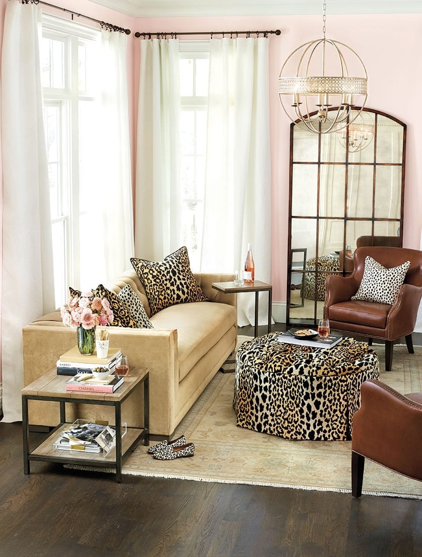
The mix of this room is a bit off the wall, but that is precisely what makes it work. You’ve got these luscious pink walls with super soft velvet and this plush animal fabric, so it’s a very soft room. But then you add a little hard edge to it with the leather and the iron mirror. You have to have those counterpoints to have a balanced room, which is what we really liked about pairing it all together. And then you’ve got that beautiful, super luxurious rug beneath it all.
BD: We love the pink and animal print together. It’s definitely a show-stopping combination.
We are in love with this fabric. This was a very high-end fabric, but the vendor discontinued it years ago. The same vendor brought it back on a more affordable level for us. You can find it on vintage furniture on Pinterest all the time. What we like about this fabric is that it has longevity, as good design always does. This could have been in your grandmother’s living room, but you can put it in your living room and it suddenly looks so fresh. Then we wanted to liven it up a little bit with that gorgeous pink.
BD: Animal print has always been our thing, but Serengeti feels new and different for us. Why is that?
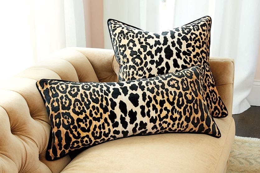
It’s bolder. Our cheetah that we’ve had forever and is considered a basic of ours is an allover print. This really has kind of a striped pattern and it’s large scale with a bit of airiness to it. You’ve also got a couple of different colors in the background, so it’s going from a lighter to a darker shade. I have to admit, when I initially saw the fabric, I thought, “Oh, this is too much.” But then I saw it upholstered on some of our pieces and I was in love. It looks so great on anything. But you don’t need a lot of it, so if you don’t want to walk too much on the wild side, just do a pillow. The ottoman in this room could easily be white and the room would still have that punch with the two throw pillows.
BD: We have to talk about these pink walls, which is really more of a blush. It’s such a fantastic color.
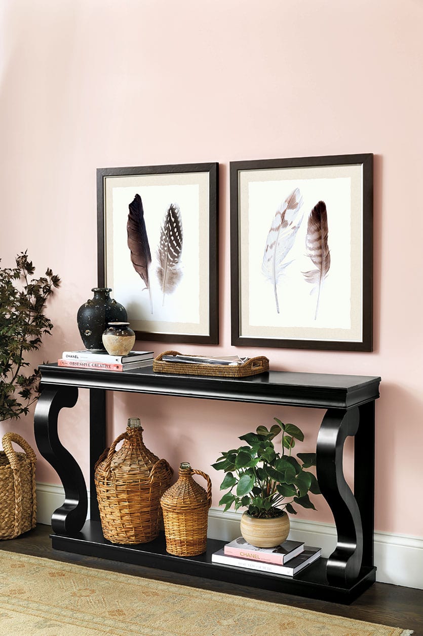
Suzanne Kasler has always been in love with pink. It hasn’t been a big staple for Ballard outside of Suzanne’s linen, but we are fully on board now. It’s such a flattering color — and it’s not just for girls. Even guys love to wear a pink shirt. We love it because that softness is a nice juxtaposition to black furniture and really bold prints. So they balance each other and play off each other in a really nice way. We especially love it on the walls. It’s the least expensive investment you can make for the biggest impact in a room. Don’t be afraid to try a new color, especially this one!
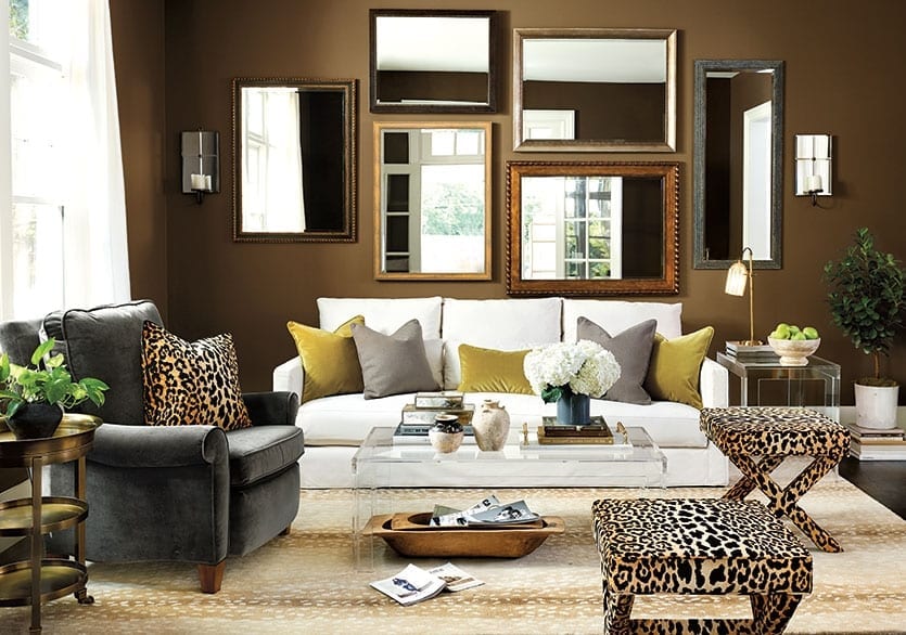
BD: This room is so sophisticated and chic. Tell us about the overall look and feel.
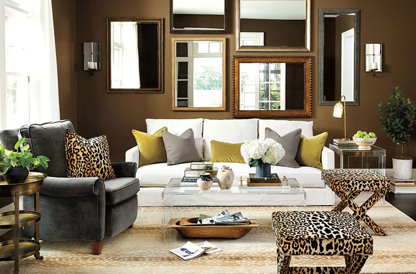
We wanted to strip this room down except for that pop of animal print — we can’t get enough of it — so everything else is a solid color. Those chocolate walls create an instant shell, or cocoon, that gives the room a cozy feel. Then we went with a simple arrangement of mirrors, because we didn’t want to get too complicated or create visual noise with art. There are different frames and sizes, but because they’re all mirrors, it works perfectly.
BD: You broke a cardinal rule of decorating.
Yes, we did. Mixing two different animal prints is just not done! But, hey, when you know the rules, you can break the rules. I think it works, because this rug reads more like a neutral. It’s super sophisticated and a beautiful foundation for the great pieces in this room.
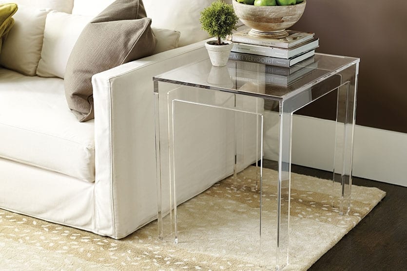
BD: Speaking of, Ballard is introducing a collection of acrylic tables. They’re super modern, yet this room proves they fit in with the Ballard aesthetic. Is this part of that mix you were talking about?
Yes. The core principal of the Ballard aesthetic is mix. You find the things that are beautifully designed that you love and you put it together — and that’s what Ballard is. These are beautifully designed, simple tables. And, really, it’s a very classic look that happens to be very in style right now. In my opinion, it never went out of style. You could say these pieces are on trend, but they’re not trendy. If you love the look, these tables will appeal to you today and always. And if you have a small living room, these pieces are great. Acrylic cuts down the visual clutter. Plus, you get to show off your fabulous rug.
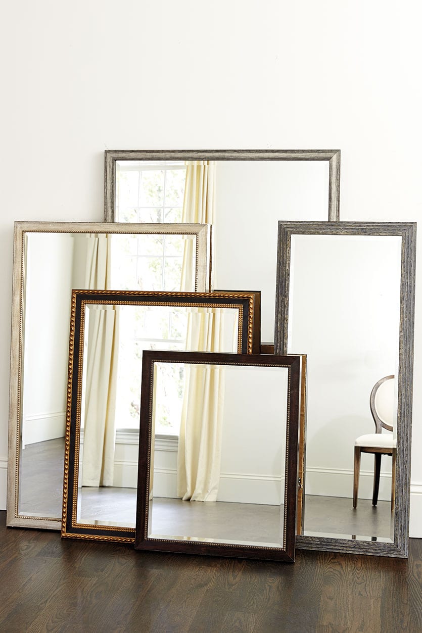
BD: Let’s talk about our exclusive Mirror Gallery Collection. Is anyone else doing this?
Not that I know of. The basic premise of the program is that you can pick exactly what you want — frame style, finish and size. So you can get a frame that’s super simple and skinny that’s just going to go away on your walls, you can pick something that’s much more ornate and will make a statement in your powder room or you can do an entire gallery wall. This wall would have been just as amazing if every one of these matched, but this mix creates a more collected look. I think it would be great to do this up a stairway. That area is particularly hard to decorate, and a gallery of mirrors would open up that space.

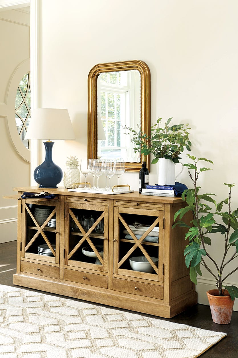
BD: This room is a very pared down look, yet it’s not boring and it doesn’t feel incomplete. Why is that?
It does feel decorated but it doesn’t feel cluttered. Look at the basics of this room. You’ve got this neutral shell with neutral rug and furniture, but then you pick a beautiful piece of art and pull those colors out of that art and pop them around the room and suddenly it’s done. It’s decorated, but not over decorated. When you limit pattern and clutter you get simplicity, which makes the details stand out. Look at the beautiful brass pieces in this room — the window hardware, the lamp and the handles on the marble tray.
If you only have a few things in the room, you’re going to notice the detail and quality of them. I have this tear on my bulletin board in my office that says, “Have fewer things, but better things.” Don’t waste your visual energy on anything in the room that you don’t love. Every single thing needs to give you joy. And what better time than the start of a new year to unclutter your home?
BD: That’s a great New Year’s resolution. Having neutral basics in your decor also makes it easier to update.
You could easily switch out these jewel tones in the summer for chartreuse and spa and take it a totally different way if you wanted.
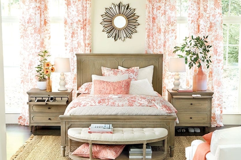
BD: At first glance, you might think this color and pattern is too bold for a bedroom, but it’s really not. It works.
We accented the bed with the same fabric we used on the windows (our Jardin Toile Bedding and Drapery), so it all matches. The repetition of the color and pattern means your eye is not jumping around — and that makes it feel comforting. Designers love to blow out one pattern in a room. We’ve seen this in fashion, too, such as head-to-toe plaid or lace. Pick one thing you love and make a statement with it. And, of course, the perfect anecdote to the winter blahs is color.
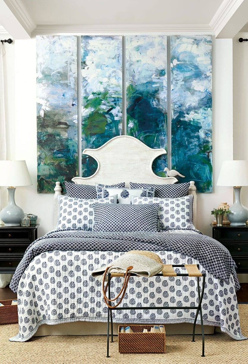
BD: We talked about blush, but another color we’re seeing in this catalog is this very saturated blue. We’ve decorated several rooms with variations of the color.
Blue is getting stronger and darker. Spa blue has been in our wheelhouse for quite some time, but it sort of morphed into mineral and that mineral has deepened into a peacock and the spa has become indigo. The great thing is that all of these blues play well together, and if you mix them up, it feels very current.
We also mix these colors with a lot of white. And as you can see with our Chinoiserie collection, blue and white has been around for a long time. Maybe that’s why a lot of people feel really comfortable decorating with this combination. It’s also very versatile. It can look very beachy and it can feel very sophisticated or really casual and laid back, which is what you see in these rooms.
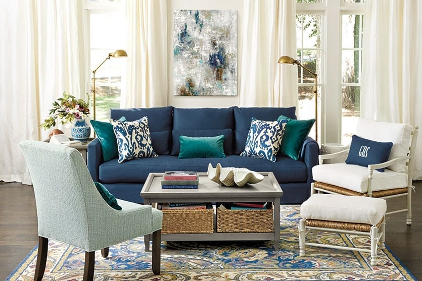
BD: We’re introducing several new upholstered sofas in this catalog, and they are all very transitional in design.
We were looking across the board thinking about where can we make that update — where can we make some subtle changes to some classic pieces to push them forward a little bit. These sofas have a more clean, streamlined look, like our Dakota Slipcovered Sofa. Some have a bench seat, they have squared off arms and low profiles — all details we associate with that more modern look.
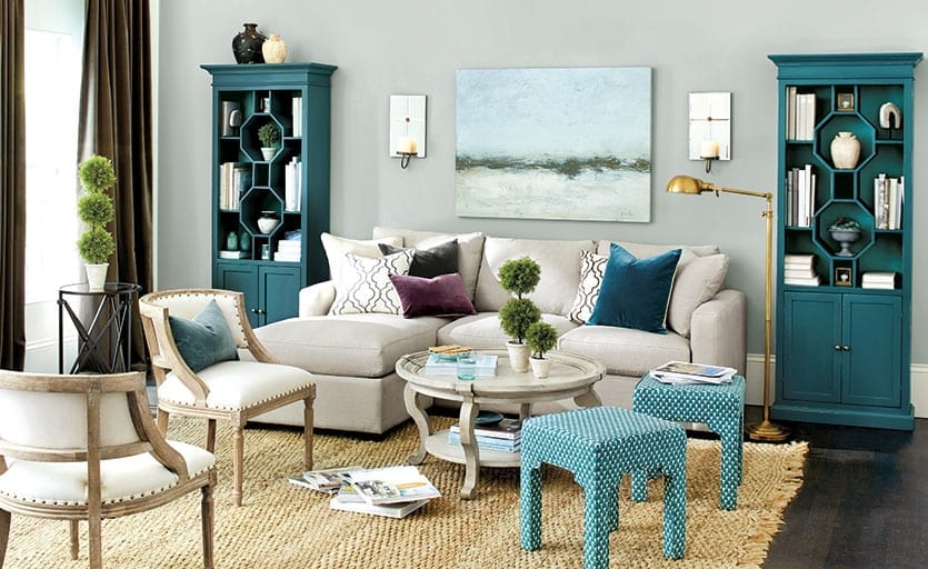
BD: While we’re on the subject of new sofas, the chaise on the Orson Sectional can be moved to either side, and there’s a storage ottoman underneath! It’s such a brilliant solution.
Right? Sectionals are an investment, so it pays to have one as versatile as this. It’s great if you live in an apartment and you don’t know what your next space is going to be like.
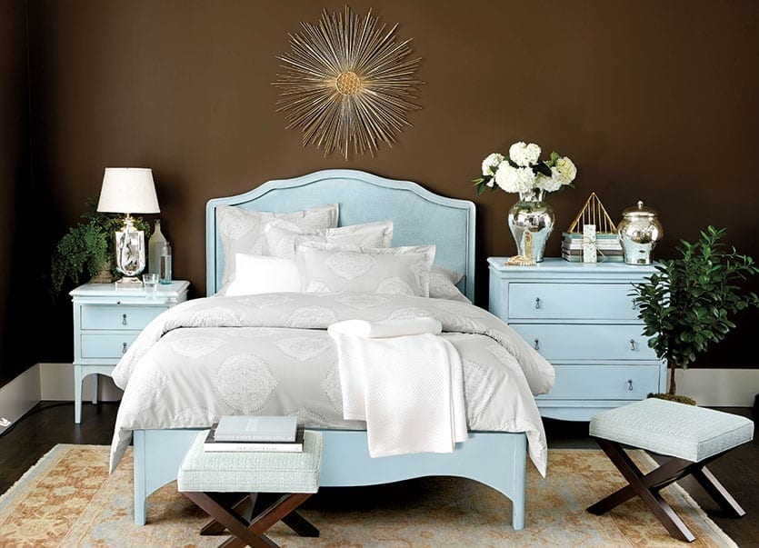
BD: Let’s move back to the bedroom and talk about Helena, our new bedroom suite. Tell us about it.
We wanted to do an update on our traditional Louis cane bed. We took the things about Louis that we love, such as that beautiful gentle curve and the caning, and cleaned it all up a bit. So it’s still feminine and graceful, but it’s not as ornate. There’s not a lot of carving and that fine detail. This headboard is very cool. It’s upholstered with this woven raffia that’s been finished to match the bed. It’s soft and has that comfortable feel of a fabric upholstered headboard, but it has this beautiful caned raffia detail.
The entire collection is made in Italy and hand finished in this beautiful blue or walnut. You know what else I love about this collection? The generously sized nightstands! I can’t stand a nightstand where you put your lamp on it and there’s no room for anything else.
Karen’s Favorites:
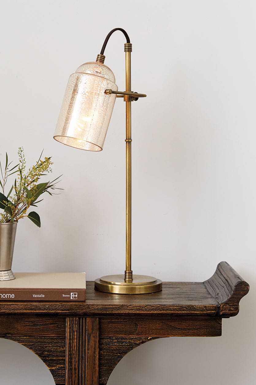
I can’t not like something named after me! Of course, there’s a story: I was looking for a lamp for my office, so I went hunting through the sample aisle and came across this beautiful lamp and immediately fell in love. The merchants said they were thinking about buying it for the book, but couldn’t decide. Well, I think I may have pushed it. It’s mercury glass and very pretty. A little vintage, but very modern, too.

These tables are a reborn classic that honestly could work in any home. The quality is really amazing.
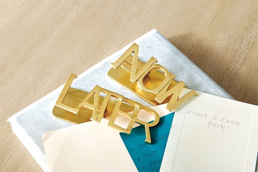
Desktop Accessories
The “Now” and “Later” Clips are my favorite. The chic combination of brass, marble and acrylic is everything classic and everything new. It’s just all so sexy.
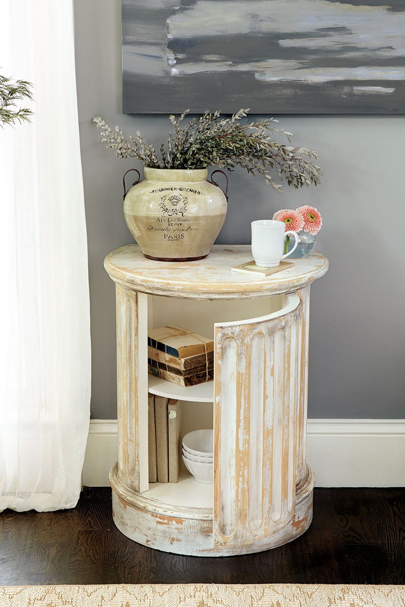
It’s an architectural statement that’s also a side table. Every fluted piece is a separate piece of wood that has been carved by an artisan, then pieced together by hand to create this round column. There’s no other way to construct it. And then you’ve got this invisible door for hidden storage. To me, it feels very modern. Of course it’s super classic, but I could see it in a very minimalistic house.
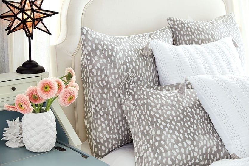
We believe there is a little bohemian in all of us. We are all drawn to tassels and fringe. This bedding has this beautiful pickstitch and a kantha throw kind of feel with these little tassels on the corner. It’s so cute. It also comes in gray, so it can go super neutral, so the only special detail is the stitching.
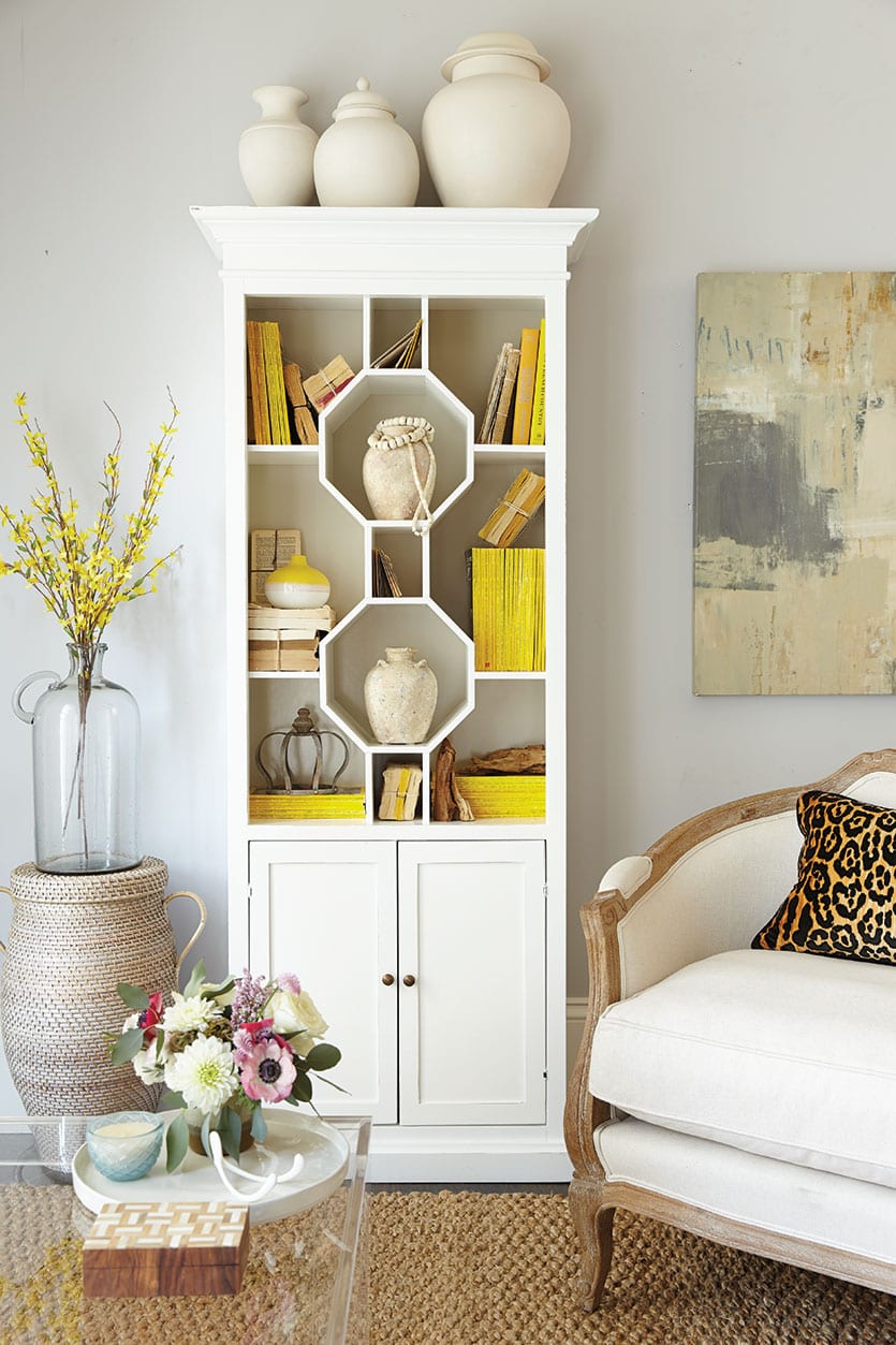
When we were working on the development of this piece, we went to the factory in Italy and kind of fell in love with this idea of having it two- toned, so we made the back panel a slightly lighter color than the front. The back of your bookcase gets so dark, because it doesn’t get any light, and this lightens it all up. The octagons have a plate groove in them, so you can display plates and you’ve got your hidden storage below. It’s a very decorative and functional piece in very current colors.
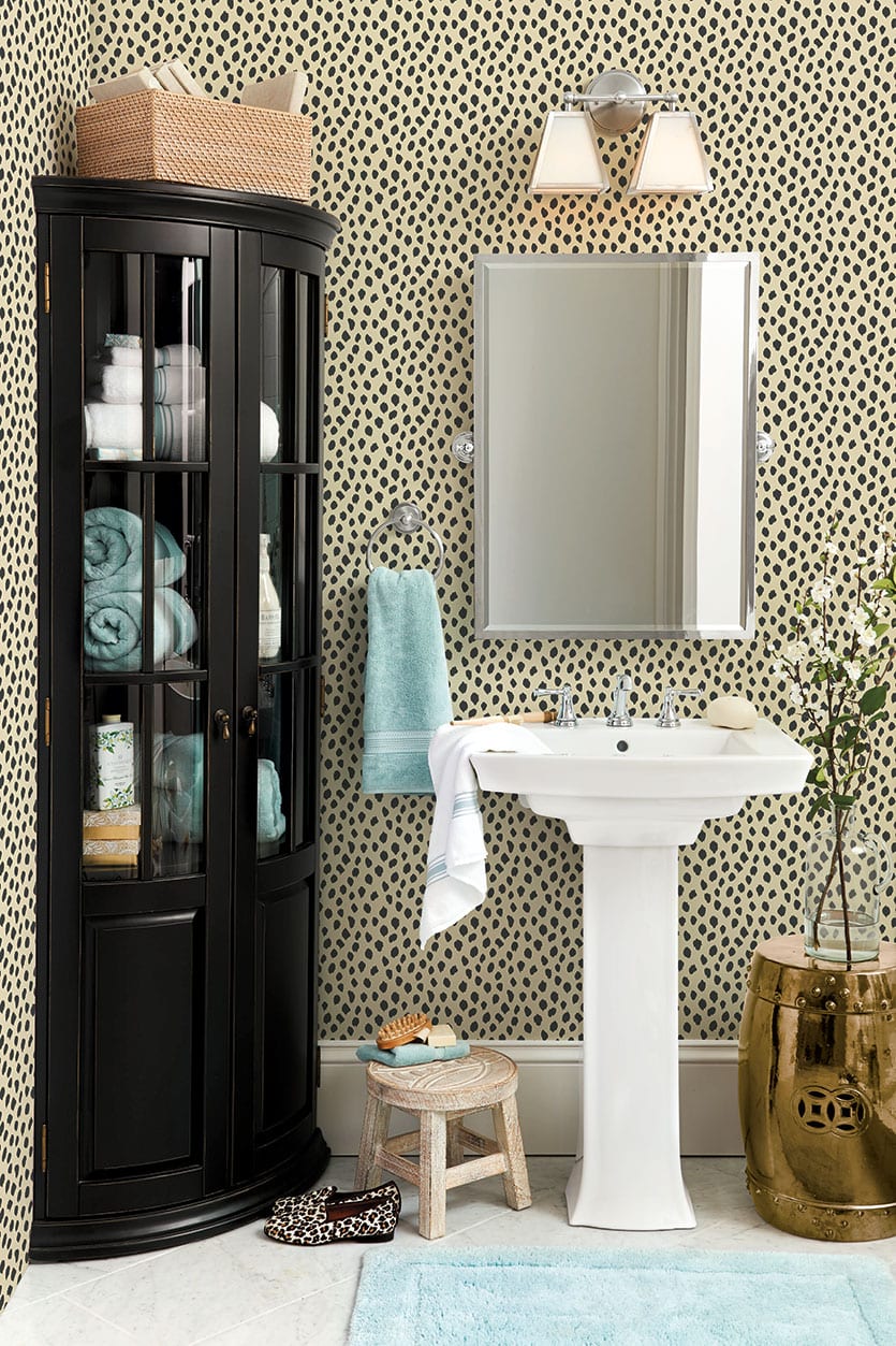
The great thing about a powder room is you can go over the top with a lot of personality in that little bit of a space. That’s exactly what this is for — to be used as an accent. It would also be great in the back of a bookcase or even an open shelf. Just use double stick tape to secure it to the back of the shelf.
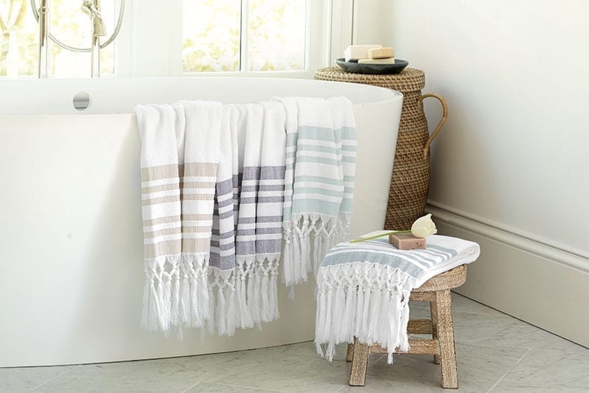
Turkish Towels and Shower Curtains
They’re great, because a lot of the Turkish towels are just this lightweight cotton, but these are backed in terry, so they’re extra absorbent. I think a lot of people, especially here in the United States, are accustomed to a terry towel. These are the best of both worlds. They have that great fringe and stripe at the bottom and they’re backed in terry. I’ve been waiting and waiting to order these for my own bathroom.
Shop our entire Winter 2015 collection here. For more design inspiration, visit our Pinterest Boards, or find more gorgeous rooms in our Photo Gallery.
Did you like this post and find it helpful? Rate it below and share your thoughts in the comments.



julia
Great inspiration! Are the mustard colored, velvet pillows (4th photo down on white couch) on your site? I love them!
Caroline @ How to Decorate
They are! They’re our Ballard Custom 20″ Pillow Cover in Queens Velvet Chartreuse.
Kim
Love, love, love this blog! And Ballard’s products! To have them both together with an explanation as to why the design of a room works and to get info about the products is very helpful. I love some of the rooms’ elements and style and others I don’t. To have them all discussed by a talented designer is so informative and helps me to figure out how I want to do my own rooms. Thank you for the ideas! Keep up the great work Ballard’s!
Caroline @ How to Decorate
Kim,
Thank you so much for this great feedback! We love to hear when our blogposts are helping you in your own home — that’s why we do it.
Keep reading!
Caroline