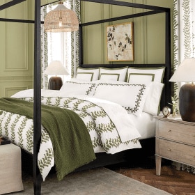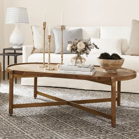
Color forecasting is a tricky business, but a necessary one. Because we work so far in advance of our catalogs, we often have to commit to colors before they’re trending. So we take our cues from the fashion runways of Europe, pull from our core palette and find inspiration in the seasons. This year, we marveled at how closely our color palette aligns with Pantone’s top colors for spring, released earlier this year.
What do these colors have in common? They’re all incredibly fun, stylish and versatile. Ranging from soothing to vibrant, they work in any room and for any gender. Pantone described the palette this way: “Colors this season transports us to a happier, sunnier place where we feel free to express a wittier version of our real selves.” We couldn’t agree more.
Here are our favorite colors this season and how we’re using them to create happy spaces brimming with life and wit.
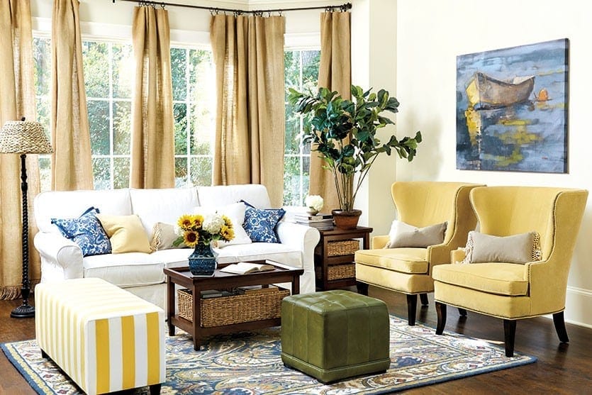
Butter
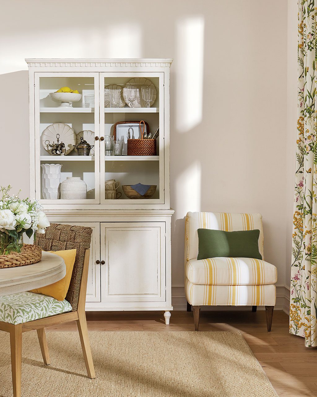
This sunny color instantly brightens a room — and your spirits. Whether you’re decorating an outdoor space with our Sunbrella® Canopy Stripe Butter/White or an indoor room with our savvy striped Escalera Maize, you’ll immediately see and feel the difference. We love to temper butter with a little navy.
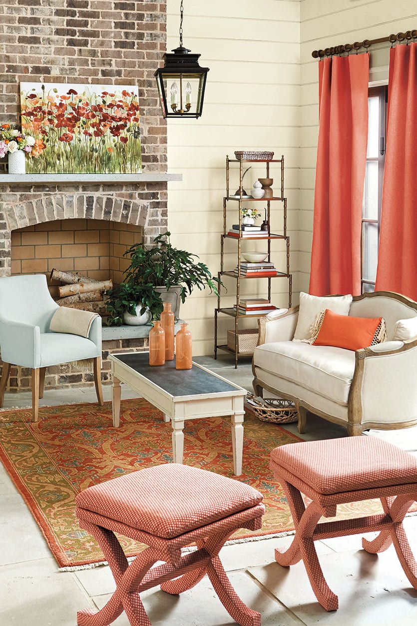
Apricot
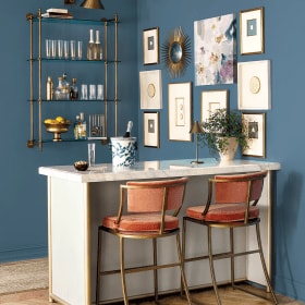
Coral’s cool cousin, apricot, is the perfect compromise between pink and orange. Apricot and white make a powerful duo outdoors in our Sunbrella® Canopy Stripe and Stafford Sunbrella® lattice print. Inside, toss our chic Tahiti or Belize Fringe Pillow in apricot on your seating to instantly perk up your space. The ideal partner for apricot is peacock.
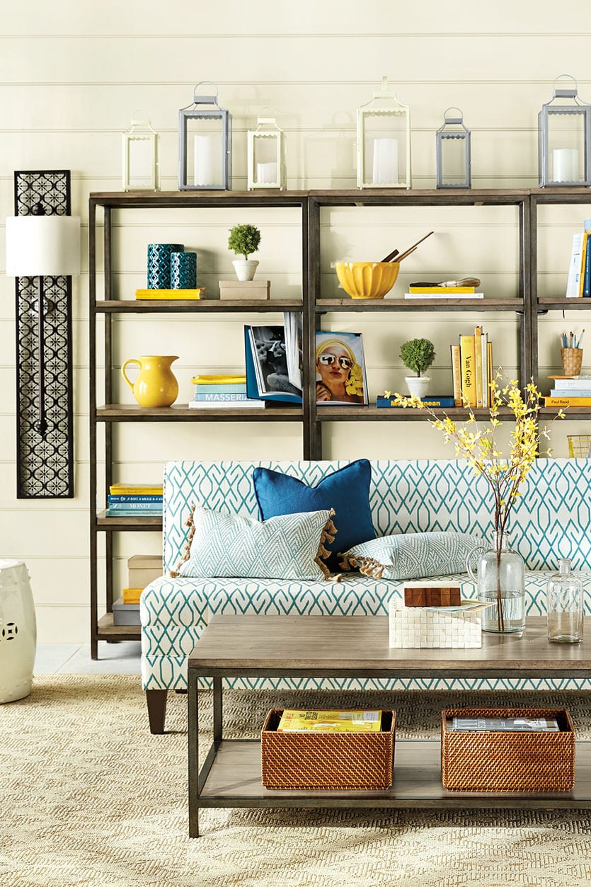
Peacock
This watery blue-green hue is a refreshing choice for ushering in the new season. Our Keira Peacock combines two of our favorite looks this season: peacock and a geometric tribal pattern. And, right now, we’re really into mixing our Tahiti Pillows in Apricot and Peacock together for a jolt of color and pattern. Too much? Opt for our solid Peacock Linen on drapery, an ottoman or pillow. This color really shines with a complementary red-based hue, such as coral, apricot or even blush.

Navy
Okay, so navy isn’t new and it’s hardly revolutionary. In fact, it’s been around for 1,400 years (see our Blue & White Porcelain Vases). But this season, this classic color feels fresh again, whether it’s outdoors on our preppy St. George Sunbrella® fabric or inside on our floral Charlotte Drapery and Pillow. And because it reads as a neutral, it’s perfectly safe to upholster a piece of furniture in a solid navy, as we did here with our Suzanne Kasler Linen in Indigo. Navy always looks great mixed with lots of white and a little black.
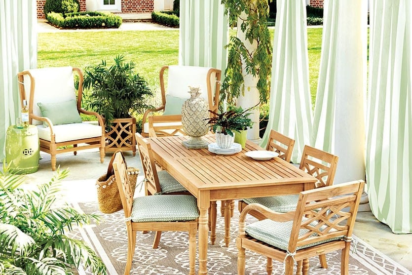
Mint
Say hello to spring! This pretty super-pale green is the ideal Easter egg hue for the season — and it’s surprisingly easy to work in with your existing palette. We introduced the color in three outdoor fabrics: Sunbrella® Bermuda, Sunbrella® Canopy and Sunbrella® Canvas. We think it plays well with any of our new colors.
For more design inspiration, visit our Pinterest Boards, or find more gorgeous rooms in our Photo Gallery.
Did you like this post and find it helpful? Rate it below and share your thoughts in the comments!


