
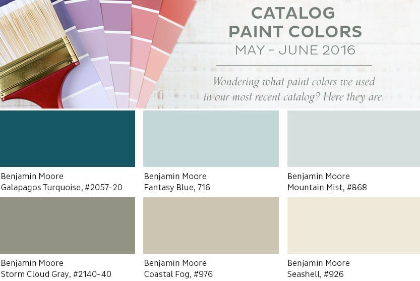
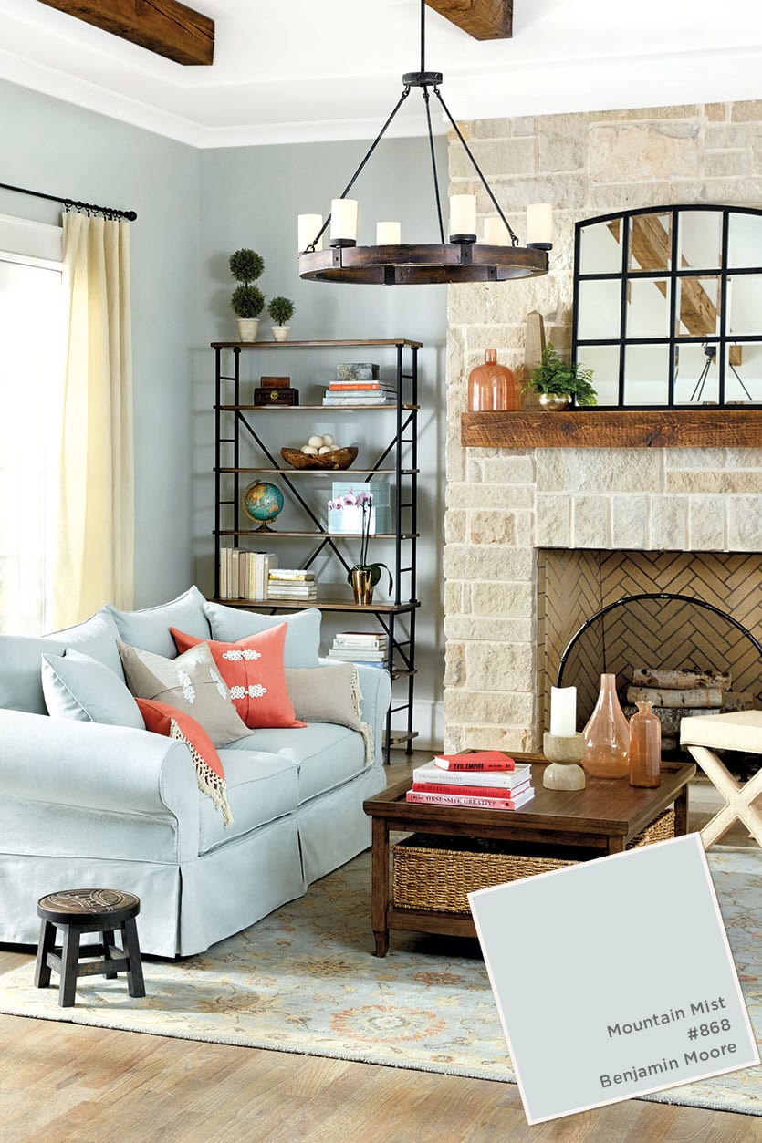
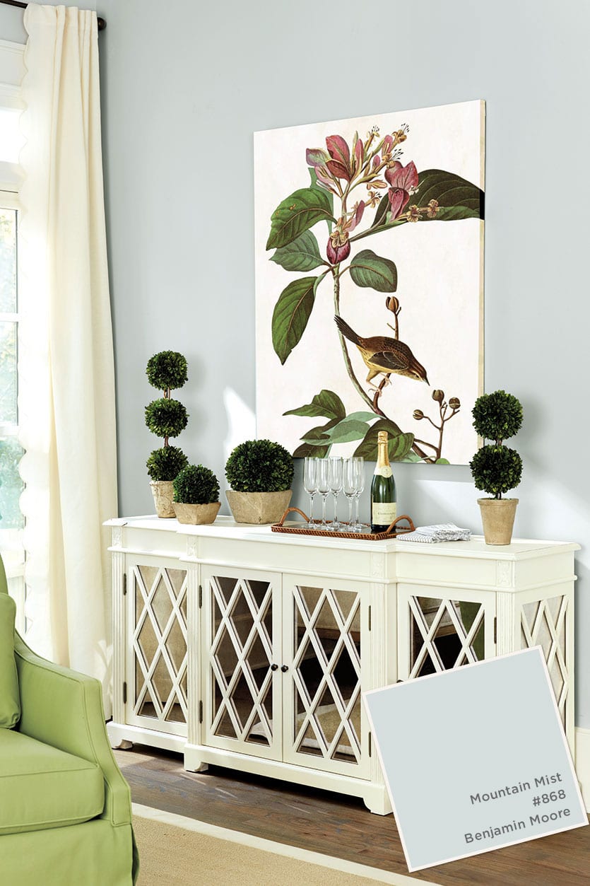
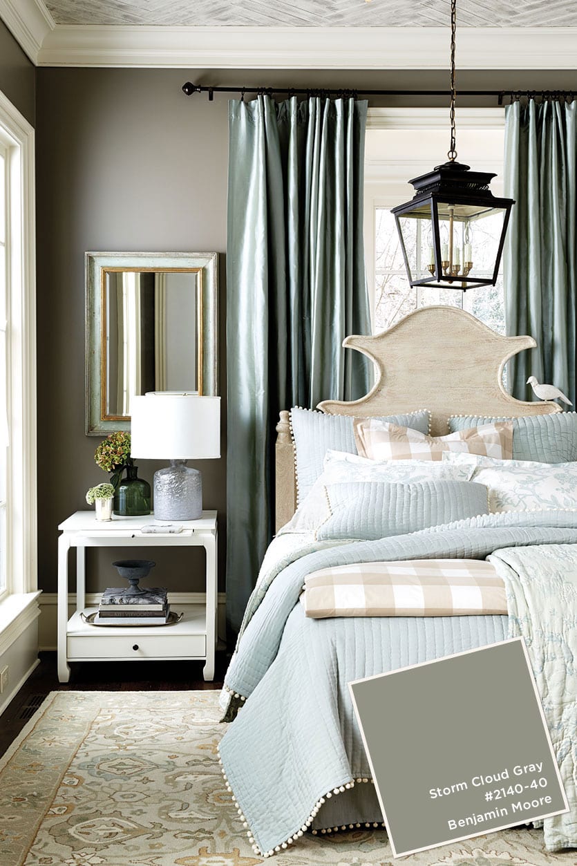
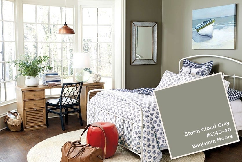
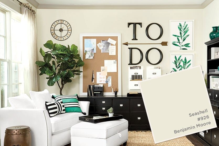
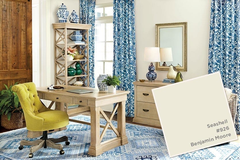
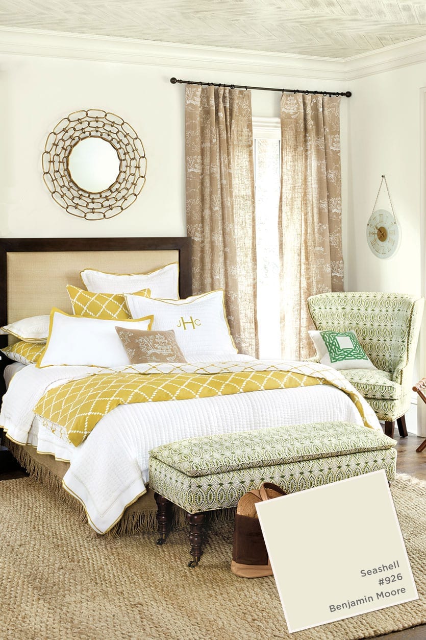
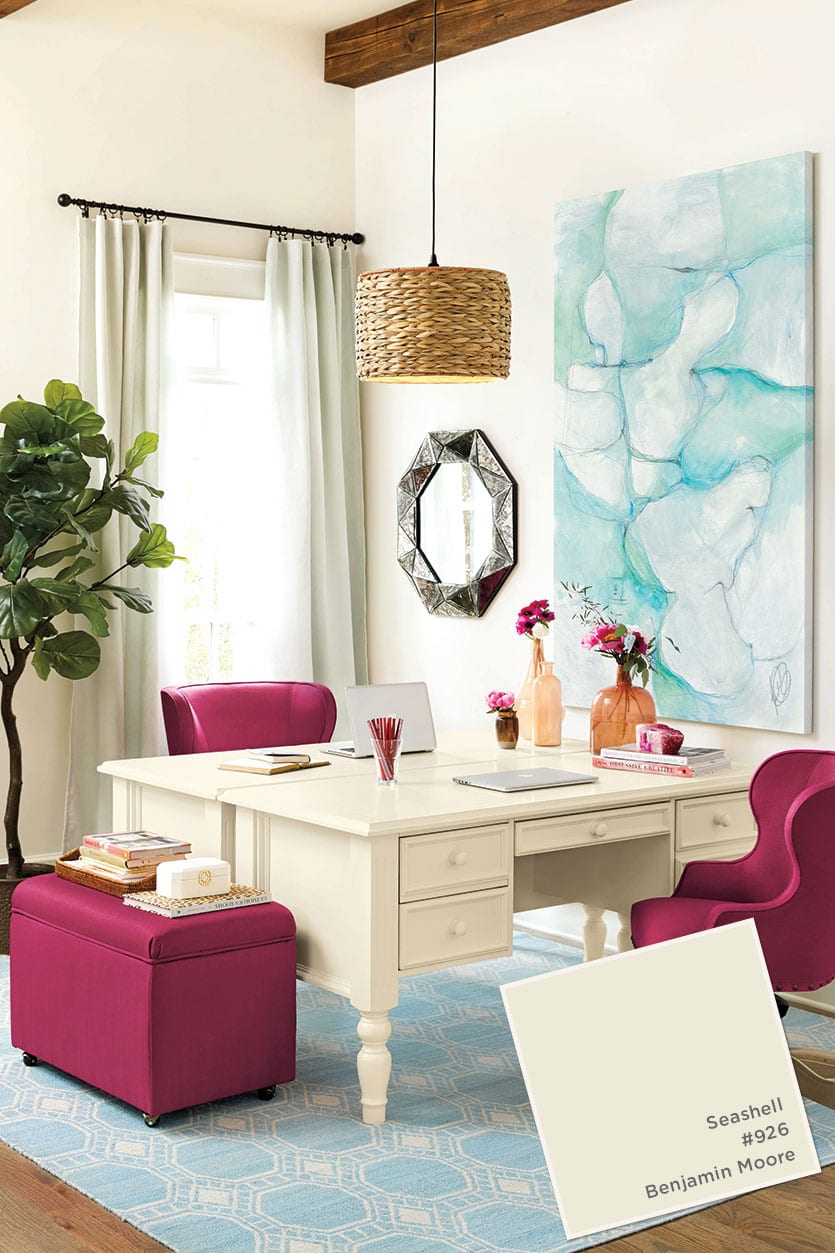
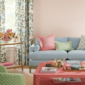
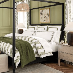
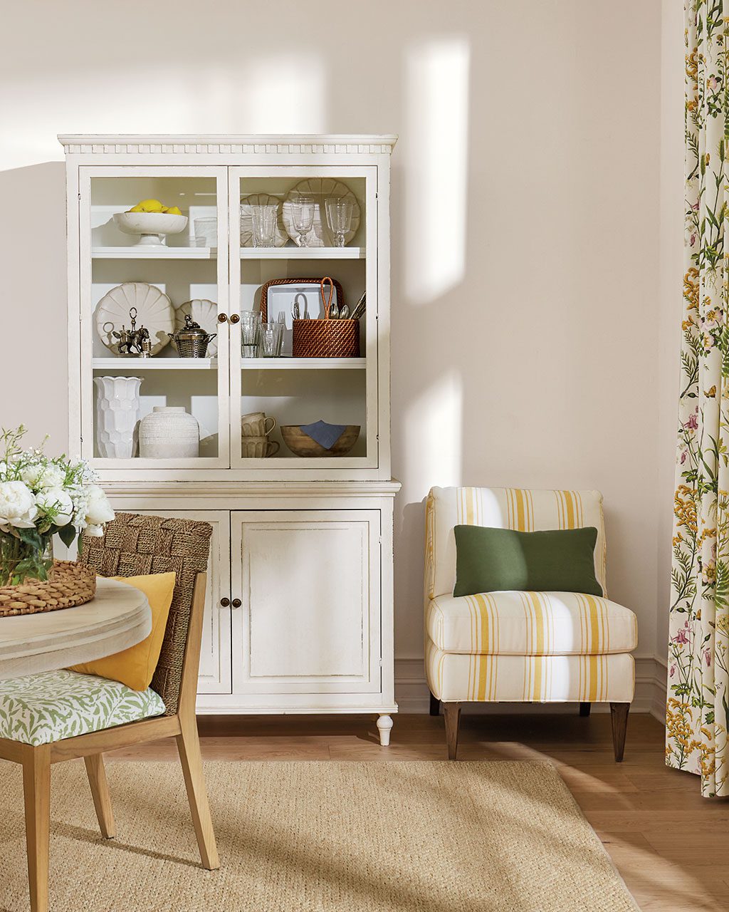
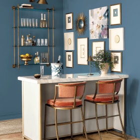
Because we shoot in real homes, we are not always at liberty to paint the walls. In those cases, we have chosen paint colors that best match the wall color in the photo. Please be aware that color may vary due to various light conditions, finish and other factors. Therefore, it’s always a great idea to test a paint sample on your wall first. We use Benjamin Moore paint, but most paint stores can match any color.


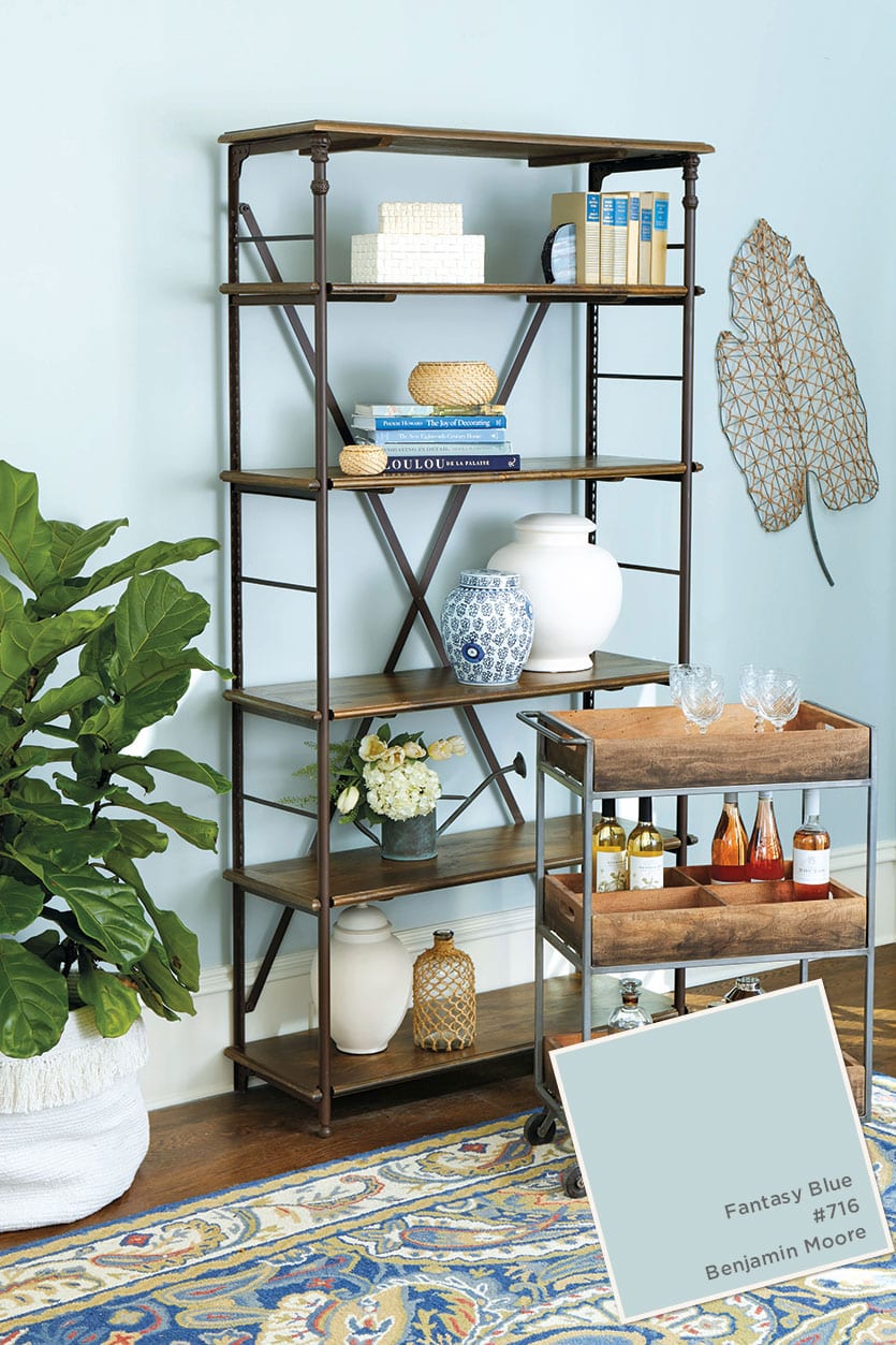
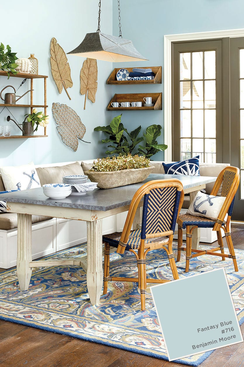

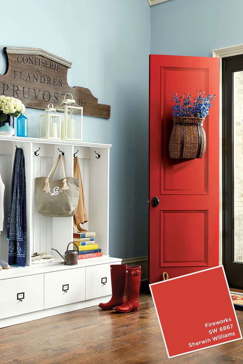


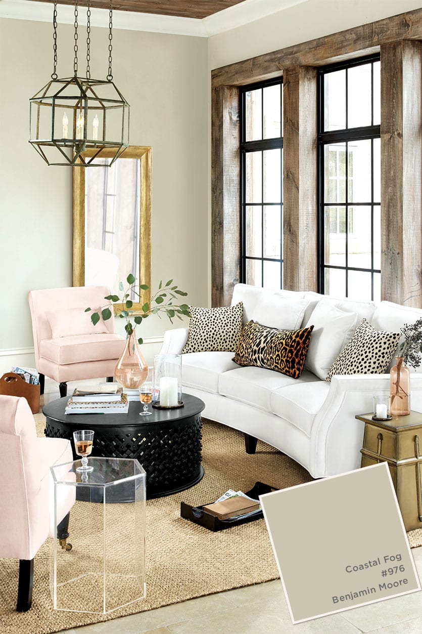
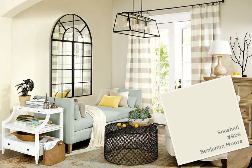
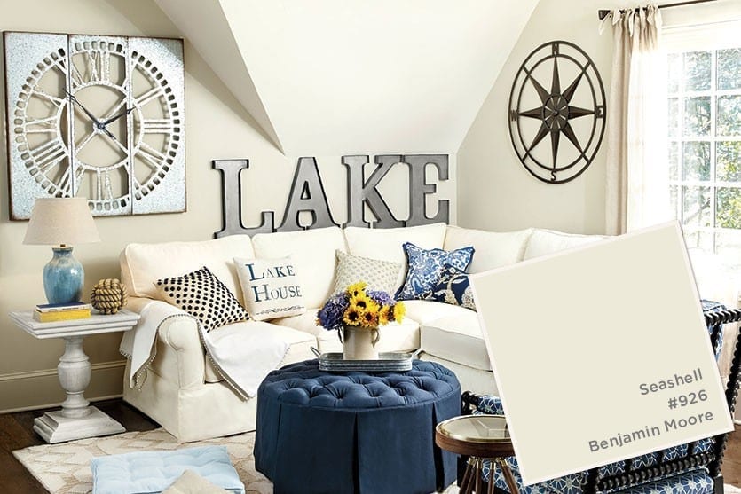
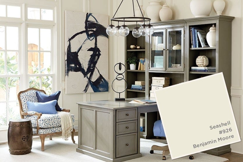
Find our best tips on choosing paint colors, or browse paint colors from past catalogs or decorating inspiration by visiting our Pinterest boards.
Did you like this post and find it helpful? Rate it below and share your thoughts in the comments!



Sarah
I am looking for the name of the paint color on pages 66 and 67 of the July 2017 issue. Thanks!
Annika Dupree
Hi Sarah,
I want to make sure I get you the correct paint color information! In order to do so, could you please give me more information as to what rooms are on those pages so I can locate that information for you?
Thank you!
MJ Theel
Looking for name of wall paint on page 38 July 2016 issue.
Caroline McDonald
MJ,
It’s Galapagos Turquoise by Benjamin Moore.
Kristi Gallagher
I was wondering about Page 52’s paint color. The Calais bath. It does not appear to be one of the blues mentioned. Can you please help identifying this color? Thank you!
Caroline McDonald
Kristi,
It’s Benjamin Moore’s Mountain Mist. Some of the paint colors may look totally different from one another depending on the lighting we used when we photographed them!
Hopefully this helps though.
Anne
Is this paint color Benjamin Moore’s Seashell?
https://www.ballarddesigns.com/howtodecorate/wp-content/gallery/storage-spaces/MJJ16_gallery_6.jpg
Thanks!
Caroline McDonald
It is!
Suzie Que
What type and color paint are the white furniture pieces painted from the original home office collection? Thank you!
Caroline McDonald
Suzie,
Unfortunately we don’t have a paint color matched to these pieces. If you have some of our Original Home Office collection, we’d suggest taking a drawer to your paint store and having them match it!
Kathryn
I am looking for the wall color and trim color used in the laundry scheme on page 51 of the 2016 Best of Summer Catalog that just arrived and I believe it is the same combination on page 60 with the beautiful drape panels and Sofia chair. Windows in a new home I am building are in a taupe color similar to this trim color and I love the creaminess of the walls with this trim color. Thank you for your help!! I loved Ballard Design and I am so grateful that you give guidance with paint colors!! Invaluable help!!!
Caroline @ How to Decorate
Kathryn,
The color is Benjamin Moore’s Seashell. We don’t have any information about the trim color though. Sorry!
Nikola
Looking for paint color to match this pic of the kitchen island!
https://www.ballarddesigns.com/howtodecorate/wp-content/gallery/kitchens/MJJ16_gallery_32.jpg
Nancy
What is the base cabinet paint color (green) on page 104 in the June catalog ?
Thank you ! Beautiful !
Caroline McDonald
Nancy,
I’m so sorry, but I don’t have any information about this color!
Jackie
Oh! Found it – Coastal Fog. Never mind:)
Jackie
Hello! Looking for the paint color on page 70 of the June 2016 issue. Thank you:)
Cindy
What is the paint color used in the Eddie Ross dining room? It’s a great neutral which is what I’m currently searching for. I love how the accent colors pop against it!
Caroline @ How to Decorate
Cindy,
It’s Benjamin Moore’s White Dove!
Nancy L.
Beautiful paint colors! As someone who refuses to “go gray all the way” in my home, the warm taupey-beige tones win my heart. Scrolling through Instagram, all I see is gray paint, gray sofas, gray cabinetry, etc. Gray is nice, but it is very overdone and I (personally) can only take it in small doses anymore. I appreciate BD standing out from the crowd and having your own sense of style!
Gail
Love seeing theses colors in rooms. I am so torn on my ceiling color. I have open concept and I am painting my cabinets, crown and base broads, and doors in White Dove. What color should I paint the ceilings? With the cabinets and the wide crown right at the ceiling is it going to look odd if I paint the ceiling a different shade of white? Apprentice your input!
Caroline @ How to Decorate
Gail,
Is there a reason you don’t want to paint the ceiling White Dove? We’d suggest painting your ceiling the same shade as the rest of your kitchen, but do it in a flat ceiling paint. It will look subtlety different because of the finish, but won’t clash!
Best of luck!
Joanie
I’m looking for a creamy white that will work well with the Sherwin Williams Portabello…what would you suggest? Seashell?? Thank you for your help!
Joanie
I should note the baseboard trim and window casings are painted in Sherwin Williams, Navajo White! Thank you!
Caroline @ How to Decorate
Joanie,
SW Portabello is a great color! Benjamin Moore’s Seashell would look because it does have yellow in it. Look for whites with more yellow and less gray and you should find something that works perfectly. Of course, we cannot stress how important it is to test paint swatches in the room where you’re using them. Colors can look drastically different on the walls versus the paint chip depending on the amount of light your space gets and the direction of that light.
Best of luck!
Eileen
Can’t find the colors I like! There are 2 pages I really like and they aren’t in this section. Please put the color matches back in the catalog. I don’t like having to spend more time on the computer hunting for what is not there.
Thank you!
Caroline @ How to Decorate
Eileen,
We’re so sorry you can’t find what you’re looking for. What are the pages #s, we’ll be happy to help!
Sharon Gray
These are all beautiful colors but I am looking for the color white used on the plank bedroom wall on page 35. Could you provide the brand and color?
Caroline @ How to Decorate
Sharon,
It’s Benjamin Moore’s White Dove!
Anna Bishop
I still don’t see the orange color pictured in the catalog (that specifically states to look on this website to find the color). Please advise what the color is…I have picked up some Benjamin Moore colors that seem to match, but would like to have a specific name/number. Thank you!
Caroline @ How to Decorate
Anna,
Thanks for your comment. The orange/coral you’re referring to is Benjamin Moore’s Rich Coral. This room was in our previous March-April catalog (colors here).
This post features our May-June paint colors which are in our newest Summer catalog! Sorry for the confusion.
The How to Decorate Team
Martie LeRoy
Can the Stormcloud Gray be used to paint a bathroom cabinet?
Shelley @ Calypso in the Country
Love these colors. We only use Benjamin Moore paints and it is so helpful to see the colors in your catalog.