
It’s never too early to start planning for the next season. So while you’re still soaking up the summer sun, take a sneak peek at what we’ve got in store for fall. To walk us through what inspired our Fall 2016 catalog, we talked to Senior Vice President Karen Mooney.
Ballard Designs: What can we look forward to seeing in the fall?
Karen Mooney: Color and velvet. We’re really loving deep, saturated tones and you can see that in our fabrics, rugs and wall colors for fall. And we’re tempted to put velvet on everything, which, by the way, is actually a very durable fabric. Marry saturated color with velvet, and you get a very rich, welcoming feel that looks luxurious, too.
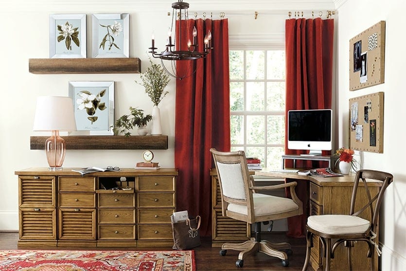
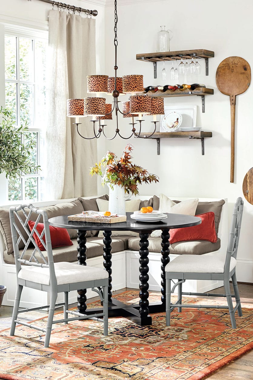
RUSTIC
BD: How do you add some of those rustic touches that feel so right for fall?
KM: Once you’re back to school and getting into the swing of things, you start thinking about all of those fall rituals, from bonfires to football games. So you want to get in the mood, and that’s where our rustic theme comes in. It can be as easy as working in deeper color with a flannel throw or an extra layer of bedding. We also love that distressed wood texture that looks almost like it’s reclaimed. Just remember that when you’ve got a rustic wood finish or exposed metal, you have to mix it with something soft to take that edge off.
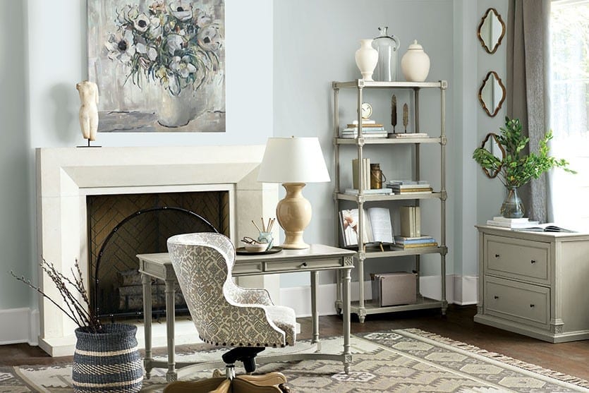
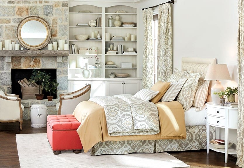
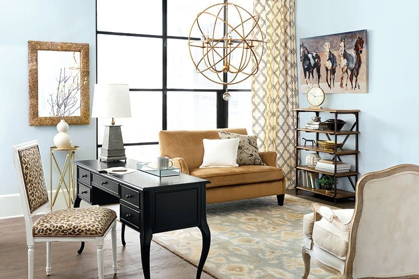
GRAY AND CAMEL
BD: This is such a great color combination that’s easy to pull off. Why is that?
KM: When you think about fashion, wearing these colors together always looks great. That sophisticated, pulled together look easily translates into interiors as well. Gray and camel are such great partners, because they’re both neutrals and share a similar color value, and they play off each other nicely. Camel really warms up gray. And I’m willing to bet a lot of people already have some elements in their home in these colors — maybe camel in one room and gray in the other. Cast a fresh eye and bring them together and create a story out of it. Or just do one thing in our Sloane fabric.
GLOBAL CHIC
Ballard Designs: How do you create that well-traveled look?
KM: You start by drawing on that little bohemian spirit within. You probably already have some things you’ve picked up on your travels, like an amazing piece of pottery that reminds you of the trip. Then let us help you round out your look. As we travel around the world and see things that inspire us, we bring them home and create products around them. Sometimes that translates into details, such as pom poms and tassels that reminds us of India or Morocco. Or maybe it’s an actual found object, like our pizza paddles and dough bowls. Our gold sunbursts are inspired by our travels to France. It’s all about creating that collected, worldly look.
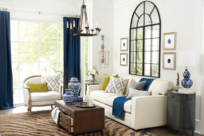
This is actually my favorite room. I love these little touches of Chinoiserie with the zebra rug. If you have these vases, you might think you need a blue or a plain woven rug. You don’t! This fun animal print is a neutral, so it doesn’t scream at you, but it vibes so well with the Chinese-inspired lamps and vases. And then you’ve got these wonderful folk art horses and hand hammered trays. This room has so much personality from all of these little collected treasures.
MIXED MODERN
Ballard Designs: What does the mixed modern mean to the Ballard customer?
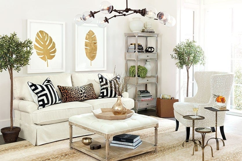
KM: When you have a bunch of classic furnishings in your home — and if you love Ballard, you probably do — mixing in one modern thing, whether it’s a piece of abstract art, a funky mirror or an architectural bench, just puts that little spin in the room that makes it feel current and not so one-note. In this room, we have a very classic, rolled-arm sofa, but then you toss on a few graphic pillows and hang this chandelier, and it just comes alive.

This room is the whole story of the modern mix. You’ve got this very clean, shapely table — our version of the Tulip Table — and it’s paired with Louis Chairs. You can’t get more classic than a Louis chair. The style is more than 200 years old, but it really does work with everything. And then we added this Urchin Pendant. This room is just this great mix of timeless style and modern shapes, so don’t be afraid to mix it up.

SATURATED JEWEL TONES
Ballard Designs: What are your favorite jewel tones and how do you put them in a room?
KM: We are in love with peacock. One way to jump on this color is to paint your walls. I keep saying this — it’s just paint! It gives you a totally new look and makes everything else pop. We especially love to mix saturated jewel tones together. The dark olive green bookcase against this dark wall looks amazing. And we piled on the pillows in those deep tones (in velvet, of course). We added a gold frame to our popular print by Exclusive Artist Rick Reinert, and it looks like a beautiful jewel against this wall.

The finish on this Casa Florentina Piave Breakfront is one our most popular finishes, and it’s just so beautiful and rich, so we built the whole room around it to create this sleek monochromatic look. To make sure it doesn’t fall too flat, we popped in this bright chartreuse to break it up a bit. If that’s too much for you, you could do a more mild hue, but we love that juxtaposition of bold color.
Karen’s Favorites
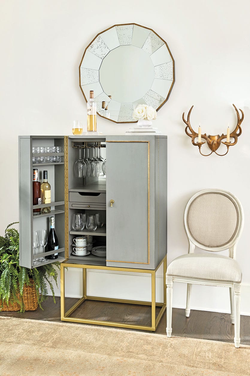
This is my number-one favorite this season. First of all, it is so great looking. It has this chic hardware and it’s got that gray and gold mix that is so sexy. But it’s also incredibly practical. It’s designed to be a bar, but there are tons of ways you can use it. For example, I am buying it to put in my guest room upstairs, and I’m going to deck it out as a little coffee bar.

This table is classic and modern at the same time. It’s shape is so simple and clean, and it’s not particularly overscaled, which makes it perfect for a breakfast nook. But if you had a large living room, it would be a great table next to your sofa with a really oversized lamp and some sit abouts.
I love funky lighting and it’s one of the easiest changes you can make in a room. It doesn’t really have to mix with anything else — it can be it’s own little statement. It would be a knockout in a foyer or powder room.
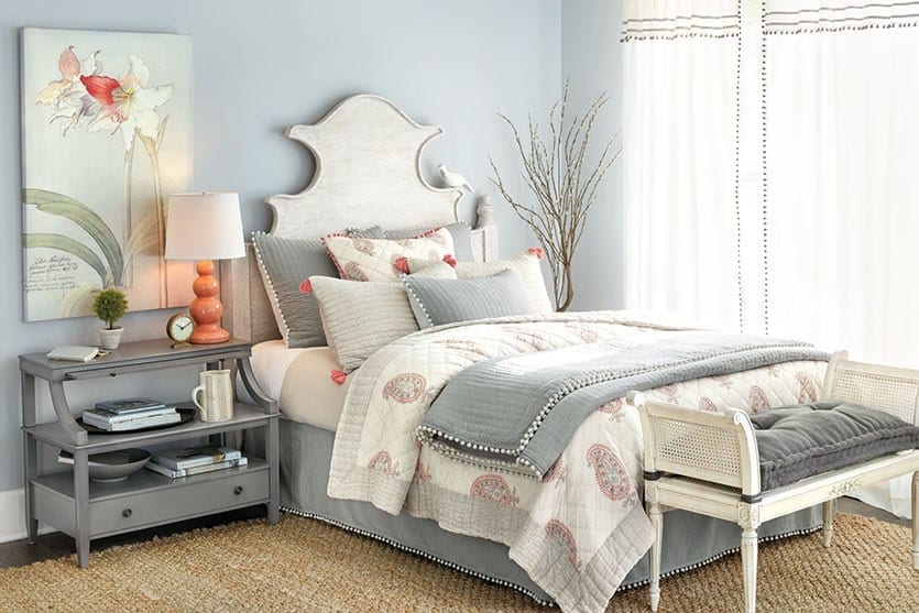
This is a lightweight quilt that’s great for summer, but it’s also easy to layer with when it gets cooler. This paisley is so fresh and it’s got a feminine touch because of that little bit of coral, but that gray balances it out, so it’s perfectly acceptable on a couple’s bed. Those little extra touches of tassels and pom poms is that fun detail that really takes it over the top.
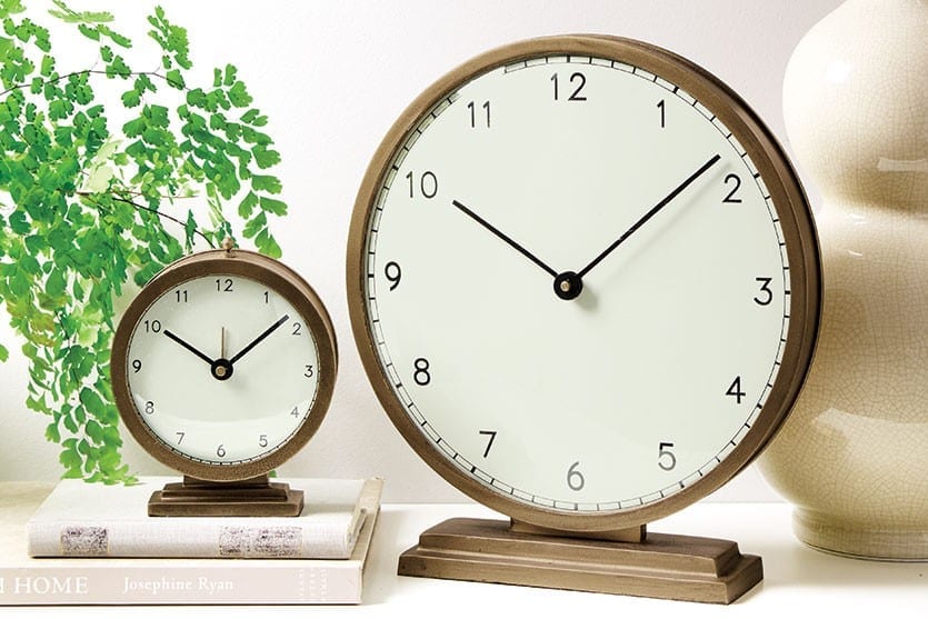
Because I’m a graphic designer, I have a real appreciation for fonts, and the style of the numerals on this clock is so mod feeling. It just has this “Mad Men” vibe to it. It’s a great functional piece, but it makes a beautiful statement, too. It’s the perfect little accent for a table or mantel.
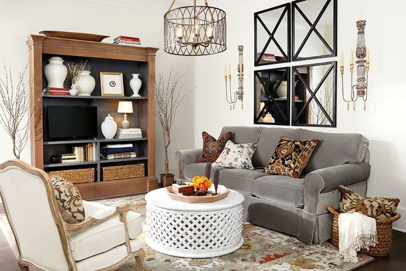
I love this, because it basically hides your television in plain sight. The shelves are completely modular, so you can remove them and put in a giant TV, or if you want to have a smaller TV in your bedroom, you can tuck it in and fill in with books and baskets. It’s just this beautiful bookshelf where you don’t notice the TV, because it has these dark shelves. It also has great cord management that’s hidden in the back, so you can have your cable box and TV without worrying about all those cords. It’s a great solution for media.
Browse all of the new pieces for Fall, or see the paint colors we used in our Fall catalog.
For more design inspiration, visit our Pinterest Boards, or find more gorgeous rooms in our Photo Gallery.
Did you like this post and find it helpful? Rate it below and share your thoughts in the comments.


Gloria Kollmer
I abosoutley love the saturated jewel tone rooms. So warm and cozy.
How to Decorate
Thanks, Gloria!