Each season before we start planning new products, fabrics, and rooms, our whole team sits down to get our creative juices flowing. When sharing what summer meant to each of us, an overwhelming theme emerged — taking the time to enjoy your home and most importantly your family and friends. Enjoy it. Walk around your home barefoot, leave the doors open, and just be within your home. Like we do each season, we sat down to talk with our Senior Vice President Karen Mooney about that very concept and how we’ve translated it into our new collection.
Ballard Designs: There’s definitely a comfortable, laid-back vibe to the catalog this season — light colors, easy pairings, and a casual feel.
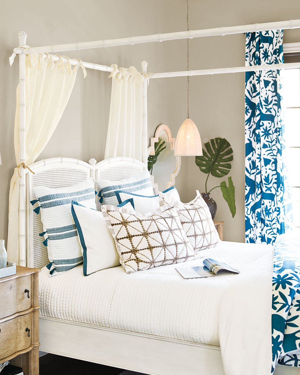
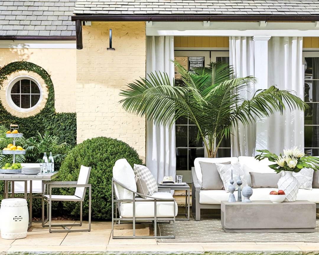
Karen Mooney: This time of year, we’re obsessed with the idea of being outside and feeling like you’re outside even when you’re inside. How do you make your outdoor space feel as comfortable as your indoor space? How do you make your indoor space feel as fresh and summery as your outdoor space? We intentionally designed every room with the outside in mind, so that means lots of live plants, sun-faded colors, and casual fabrics. Then of course, we had to punch up a few spaces with citrus colors like tangerine, lemony yellow, and even watermelon pink. You’re starting to see all of those colors outside in your garden and at the farmers market, so you want to indulge yourself in all of those delicious colors in your home too!
On the flip side of that, a sun-faded palette is really appealing, so we’ve brought that into so many rooms too with watery blues and sandy neutrals. It’s such a comfortable, easy breezy palette and just feels serene and lovely.
BD: There’s a lot of navy this season and in so many applications. Why navy?
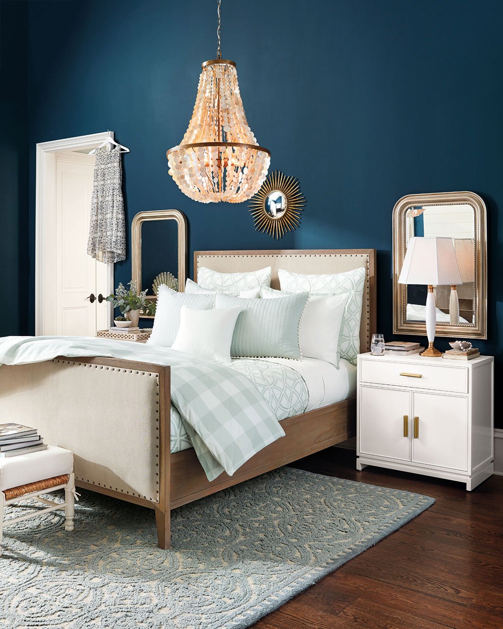
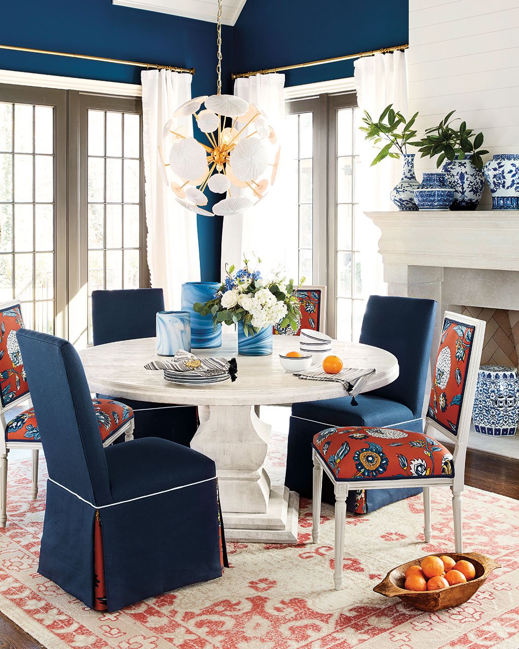
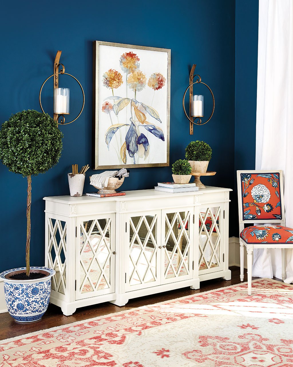
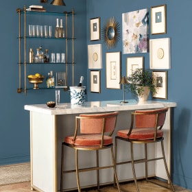
KM: Water is such a soothing presence for humans in general, and spa blue and mineral have been our go-to color palette for so long. We’re starting to see our blues get more intense and move towards navy and cobalt. Navy has almost become a neutral, like black. Even though it’s so strong, it can feel so soothing on a wall, like we’ve used here. It’s a dark color that’s so palatable and complements so many other colors. Of course paired with white, it’s so crisp and classic, and navy also looks great with orange and yellow. It’s like your favorite pair of jeans that just work with everything in your closet. We’ve used it as a wall color, on upholstery, on rugs, and even a new color of our favorite Sidney Nightstands.
BD: We always talk about seasonal refreshing. How much should someone really do to refresh their space for summer?
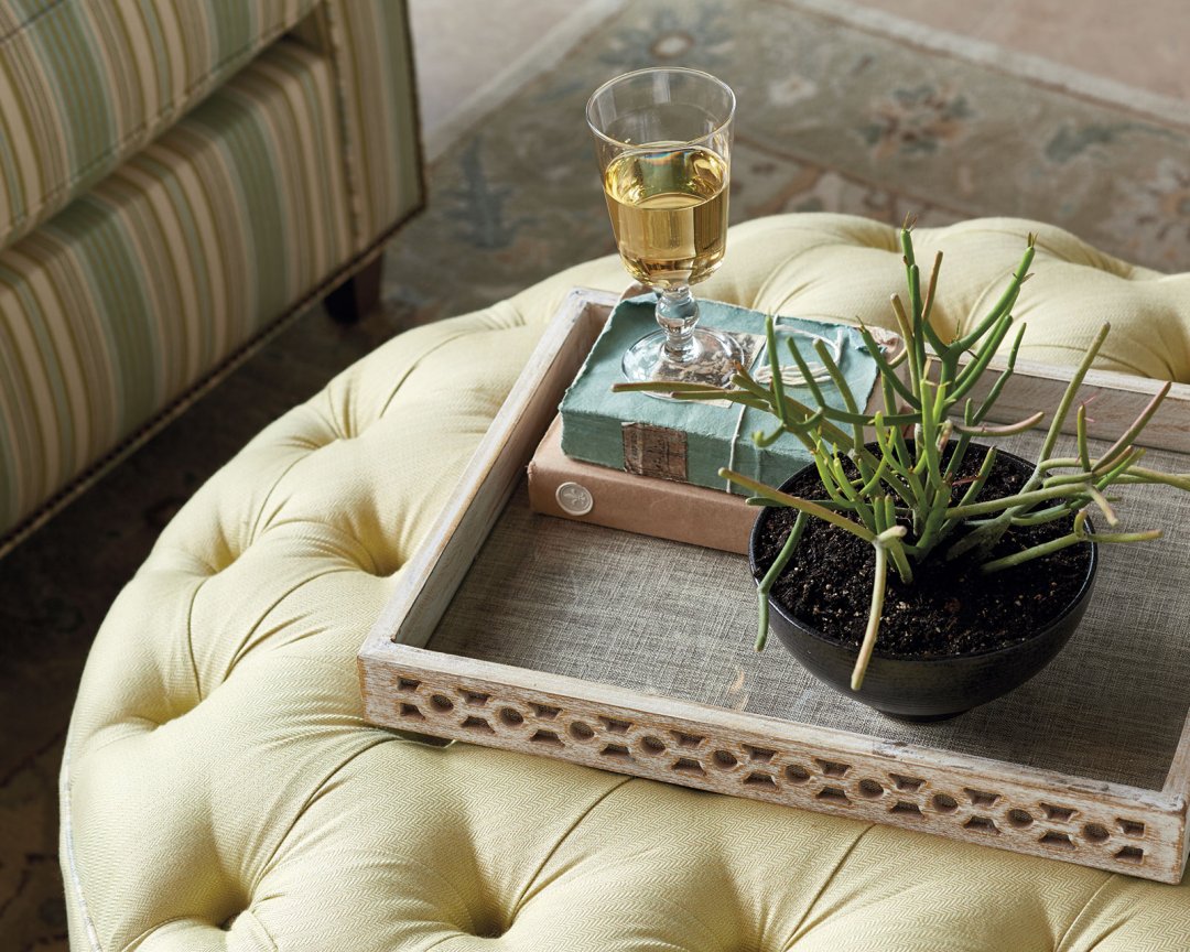
KM: The easiest thing to do is start chopping things out of your yard and bringing them inside. Plants make everything feel so alive, and if you don’t have a garden, you may have a balcony or some potted herbs. In my mind, greenery brings vibrancy to a room that you can’t get any other way. Just put some herbs from the grocery store in your kitchen window or in your breakfast nook.
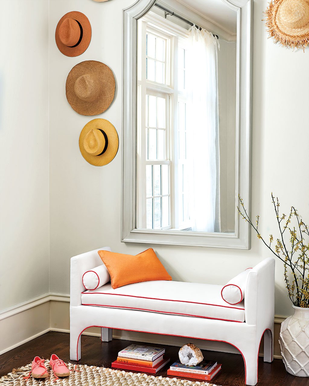
You know a long time ago, people would pull up their rugs to put down seagrass and take down drapery to put up linen panels. I don’t think most of us have the energy to do that anymore, but you could definitely switch out your front doormat for something more light-hearted and fun. I really feel like this time of year, you should be outside. Don’t think about it so much! The ultimate luxury is having time to do nothing. Let it go a little more than you normally would. Cut some flowers from your yard, bring them inside and just enjoy your summer days. Sit on your porch with a glass of iced tea. I’ll even try to take that advice myself!
BD: Let’s talk more about color because there are some really pretty color palettes this season.
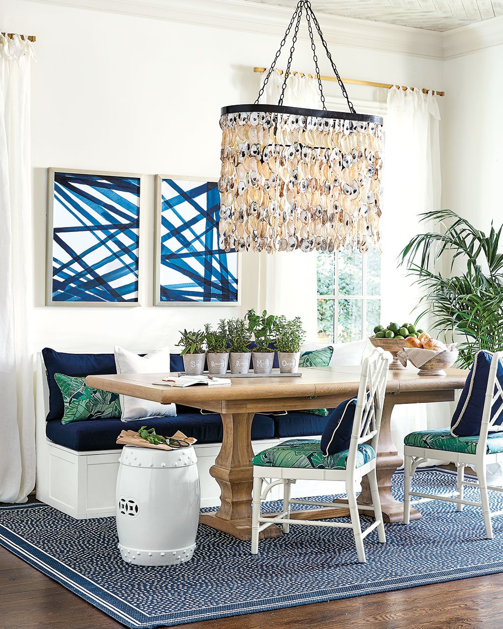
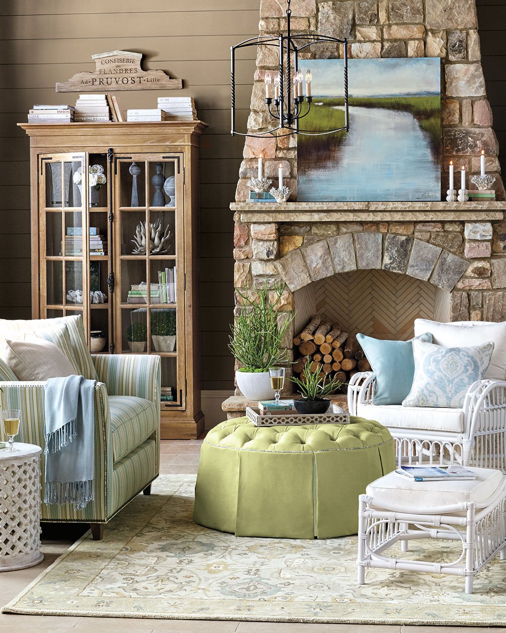
Color is a great way to breath new life into your space. We have a very talented new exclusive artist Laura Lloyd Fontaine. She uses these beautifully soft but vibrant blues paired with a spring green. We used her paintings to inspire our fabric and upholstery choices, and her color palette comes to life beautifully. It’s funny because the colors are soft and almost pastel, but it still feels so alive and exciting. And actually, all of the fabrics in this room are indoor outdoor fabrics, so you really can embrace that laid back summer style!
This is actually a formula we use a lot. We’ll find a painting or rug and pull all of the colors for the rest of the space from there. It’s a strategy that always works, so if you find one piece you really love, use that to guide the rest of your choices. It’s a foolproof way to get started if you’re feeling stuck.
BD: You mentioned indoor outdoor fabrics, and they’ve actually been used liberally in all of the rooms of this catalog. Was that intentional or on accident?
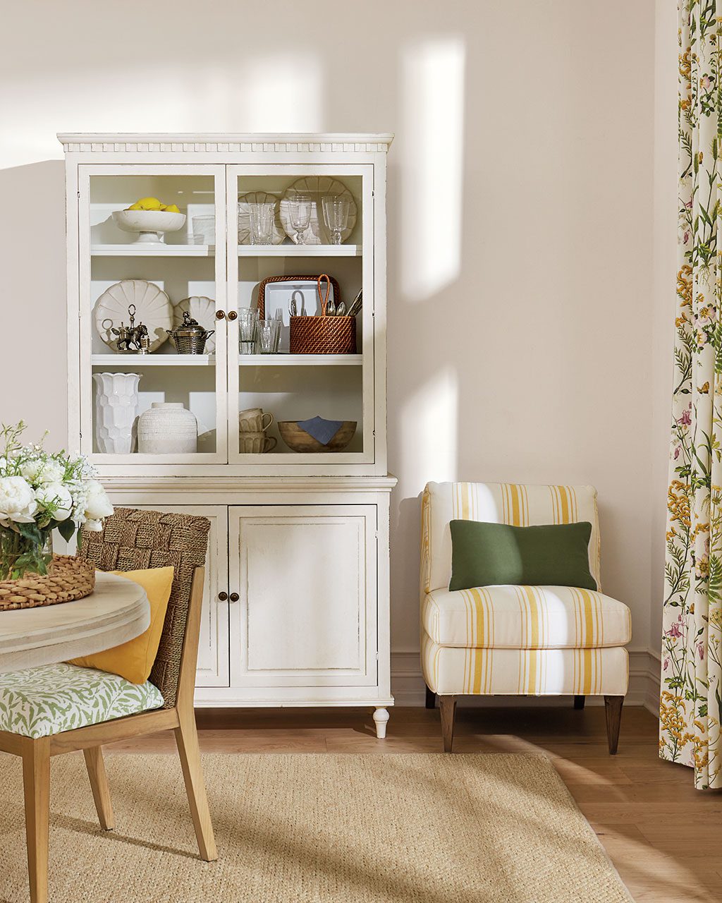
KM: Not only do we have some great new colors and patterns in our selection of indoor/outdoor fabrics, but they really create that laid-back, worry free vibe we want for our homes. This is the time of year when your kids are coming inside with sandy feet, grass stains, and frogs in their pockets. You don’t want to worry about them climbing on your sofa after a day at the pool. When we say performance, we mean it. You can scrub them with clorox, run them through the wash, and they’re still going to look as good as new. Bunny Williams’ has nine new fabrics, and they all have a great herringbone texture that really makes them read like a classic wool or cotton upholstery fabric. The five solids and four coordinating stripes are great basics that can mix and match in nearly any room and give you that durability.
BD: There are so many ways unique furniture pieces this season that you can customize with fabrics, like the Louis and Parsons chairs in this dining room. The fabric combinations are endless, but how do you create something unique but not too wacky?
KM: Customization is in our DNA because we really believe that your home should be unique and reflect you. A home that makes you happy is a home that speaks to your personality and your style, and to make that happen for our customers and ourselves, we try to develop products that are customizable. One of the big things we do is upholstered furniture. Nearly all of our upholstered pieces are available in any of our 200+ fabrics or you can send us your own fabric.
This year, we’ve launched what we’re calling our Custom Plus program where many of our most popular items have an even higher level of customization. For instance, you can pick one base color for the main body of your item, then add a contrasting welt, nail heads, or a kick pleat in a coordinating fabric. The options are endless, and what we’re hoping you’ll do is get in there and be creative. Fiddle with it on the website, try lots of different variations, and see what combination works best. These types of details are normally something you’d only be able to have if you had a designer or an upholstery workroom. So we’re hoping to empower the designer in everyone to create unique items for their home!
In terms of landing on the right combination, you can always talk to someone on our Design Solutions team in the store or online. They’ll help you design your piece and make sure it coordinates with everything else in your room. You can also work from the colors in something you already have. Say you have a favorite fabric that’s already on your drapes. Pull the colors from that to design an occasional chair for your room. Or maybe it’s a piece of art. Maybe the main color in that art piece is green, and there’s a little bit of navy and a tiny bit of hot pink. Follow that ratio when picking fabrics for your chair. Order some swatches, look at your fabrics together with your art, and test it on the website to see what it’ll look like! Print it out, have your girlfriend over for a second opinion, and trust your gut. Don’t be afraid!
BD: We talked about the rise of florals with our Spring preview, and of course, they’re all over our summer collection. How do you mix multiple floral pieces together to create something stylish rather than reminiscent of your grandmother’s living room?
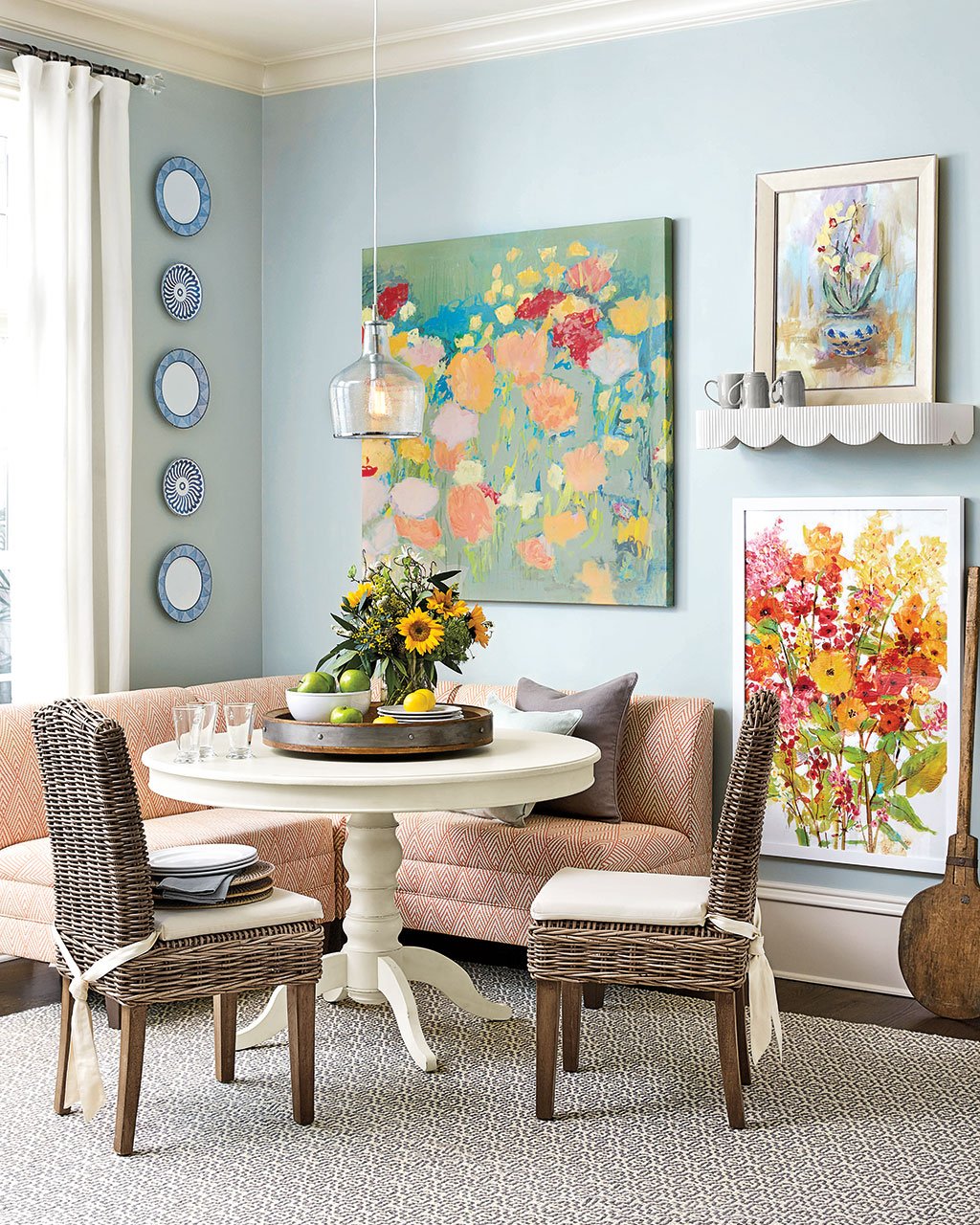
KM: This breakfast room is the perfect example because we’ve mixed three different floral art pieces together. The color palettes all complement each other so well, but you can see how it might be scary to put this space together. I actually helped a girlfriend build a gallery wall just like this recently. She’s been begging me to come over and help her make some updates to her living room. She has lots of really beautiful art scattered all over her house, but you didn’t really notice because there was one small piece on the living room wall and another in the kitchen. I pulled it all down to create a dramatic gallery wall in her living room. We just started grouping things together based on a color palette. She loves feminine pieces, especially floral subjects painted in oils. There were lots of pinks, purples, and blues. I grouped all of those with a few pieces of her children’s art in a similar color palette.
When you’re creating a gallery wall like this, you want lots of different sizes and shapes. You want some horizontal, some vertical, some large, and some small. Start with your largest piece as your anchor, then fill in around it, leaving space for your wall to grow. On Suzanne Kasler’s podcast, she made a similar suggestion. You don’t want your art wall to be static so that you can’t add to it. Keep adding things you love. If you’re really confident and a rule-breaker, you could drop something down to the floor. Or add a ledge to your wall and lean something small against the wall. I love that look, and it lends a lot of character and dimension rather than everything being flat. Or on a bracket, add a vase or a plate.
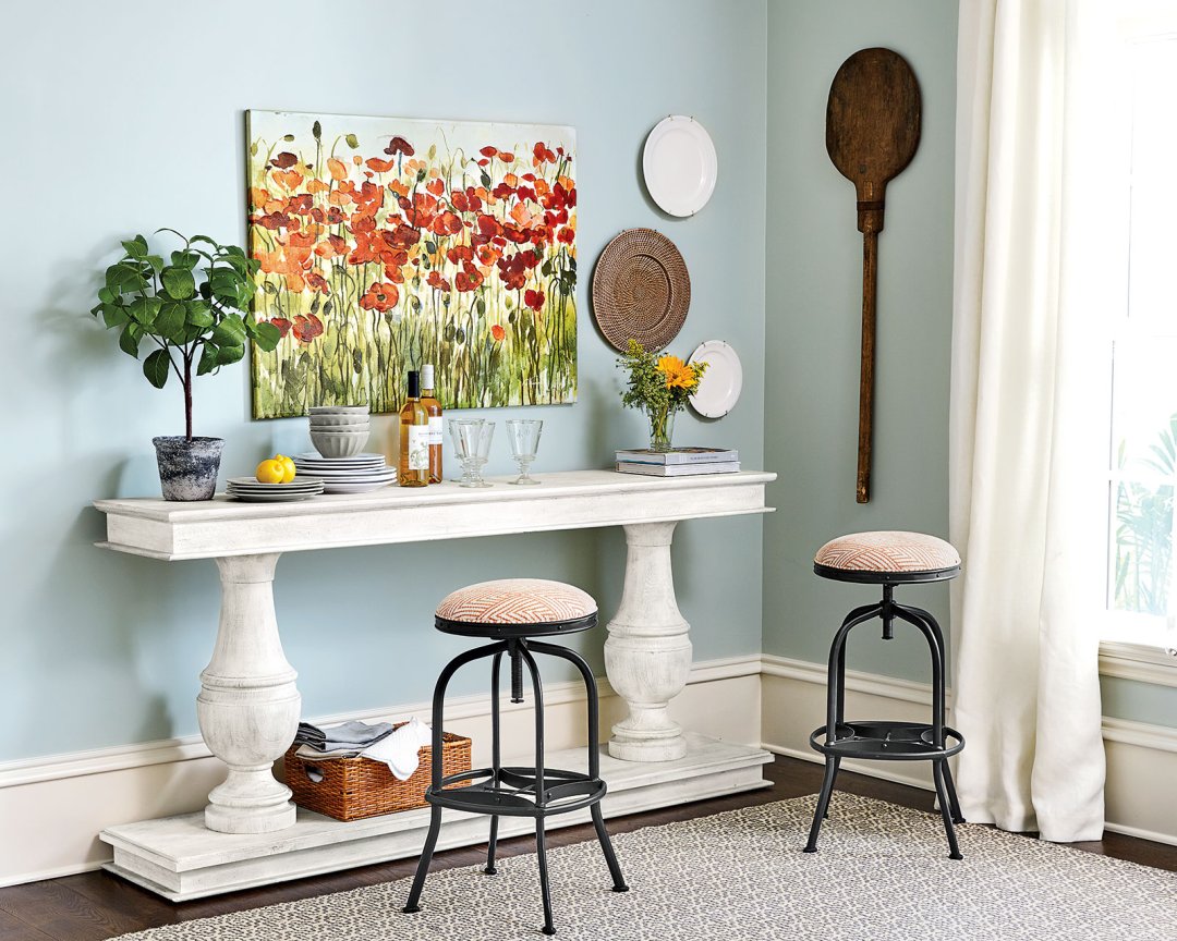
In this room, we’ve mixed in plates from Bunny Williams’ Campbell House Collection. Don’t limit yourself to artwork. A shallow basket is an interesting texture — even a charger! Look around your home and think outside the box.
BD: We can’t forget to talk about pink because it pops up over and over again in this collection.
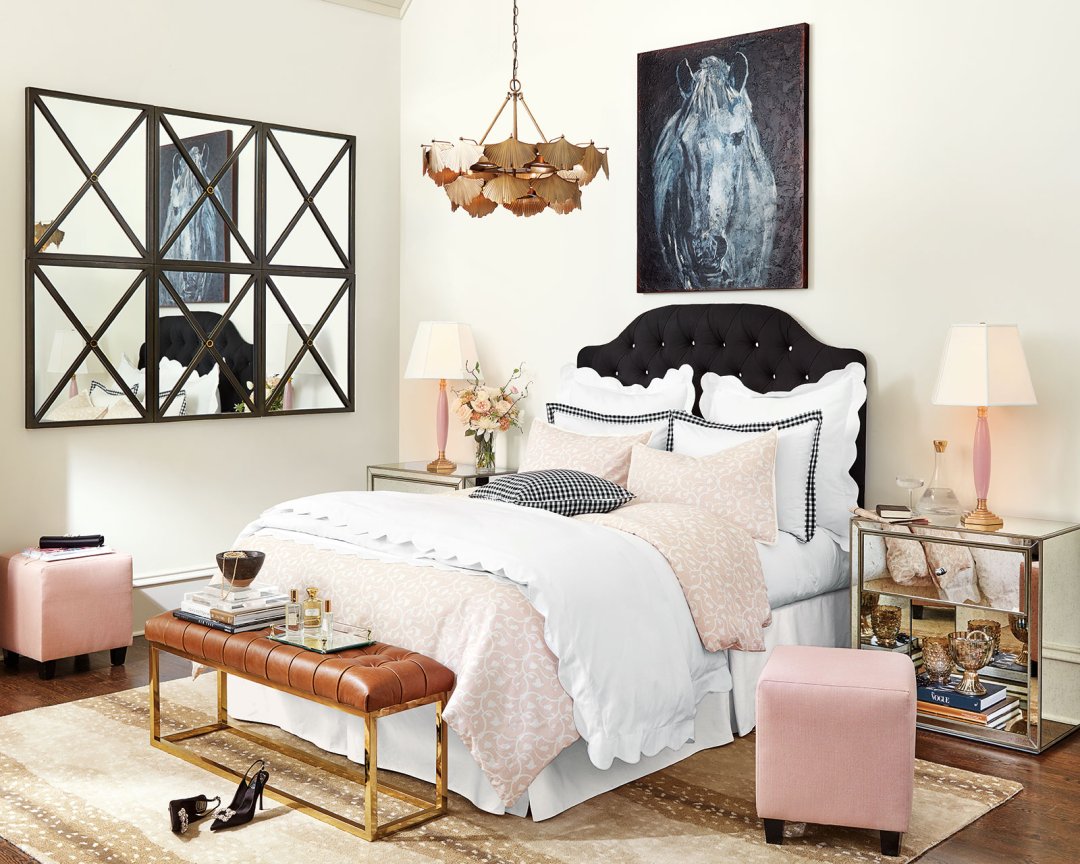
KM: Everyone get used to it because pink isn’t going anywhere anytime soon. Five years ago, we thought Suzanne Kasler was crazy when she wanted to introduce a blush pink linen into her fabric line. We thought, “who has pink in there house?” Now, pink is everywhere and in every shade! Blush eased us into the pink phenomenon, and it’s been a staple in our closet and our homes for a couple of seasons now. It’s almost a neutral because it’s just a few shades off of beige and works well with gray, brown, and black. We’re seeing pink go more intense though, especially in fabric. We’ve got a new lamp in a pretty pink shade, and we even have a floral bedding collection in a graphic blush and white pattern. It looks great mixed with black because they’re opposites, and they balance each other nicely. I love it mixed with animal prints — it feels so fashionable.
Karen’s Favorite Things
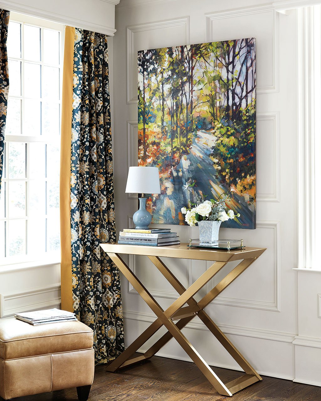
Athens Table
I’m putting this and the side table under my pergola with my Suzanne Kasler Directoire Collection. Outdoors I’m really drawn to simplicity, so I love the clean lines of this piece.
Hensley Console Table
I want to use this in my bedroom to put my television on. If you’ve listened to the podcast, you’ve heard my many trials and tribulations about mounting the TV on the wall. It has to sit on this unremarkable cabinet that I have, and I think it’s time to upgrade that piece to something more glamorous.
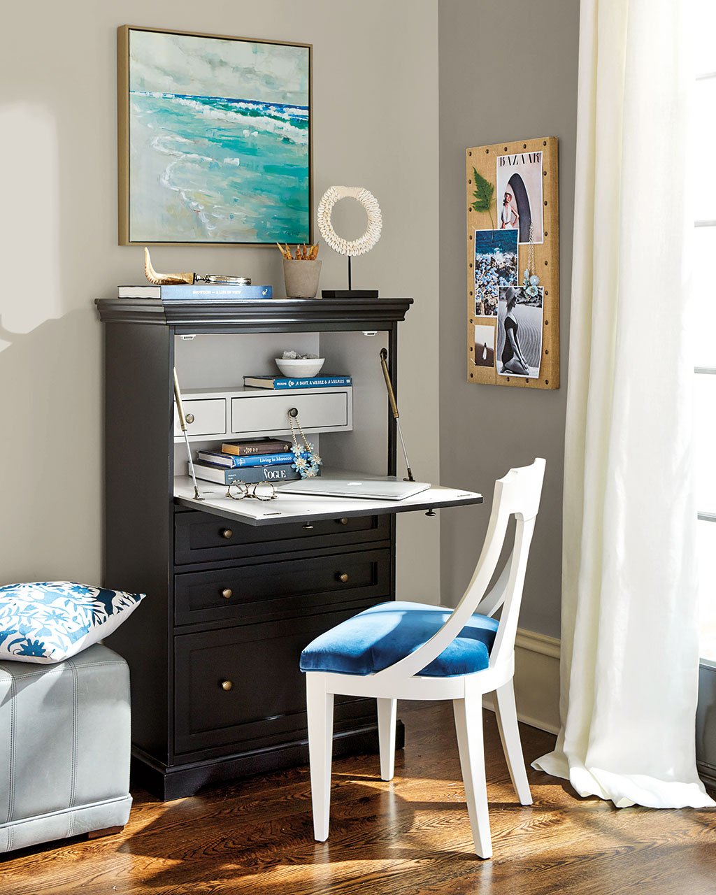
The Edita Chair
I love a chair with a slip seat because it’s easy to change up your look with a yard of a fabric. Just pop out the seat and grab a staple gun. More than the flexibility of a slip seat, the sweeping curve of the chair is what stands out to me. It feels a little modern but also classic.
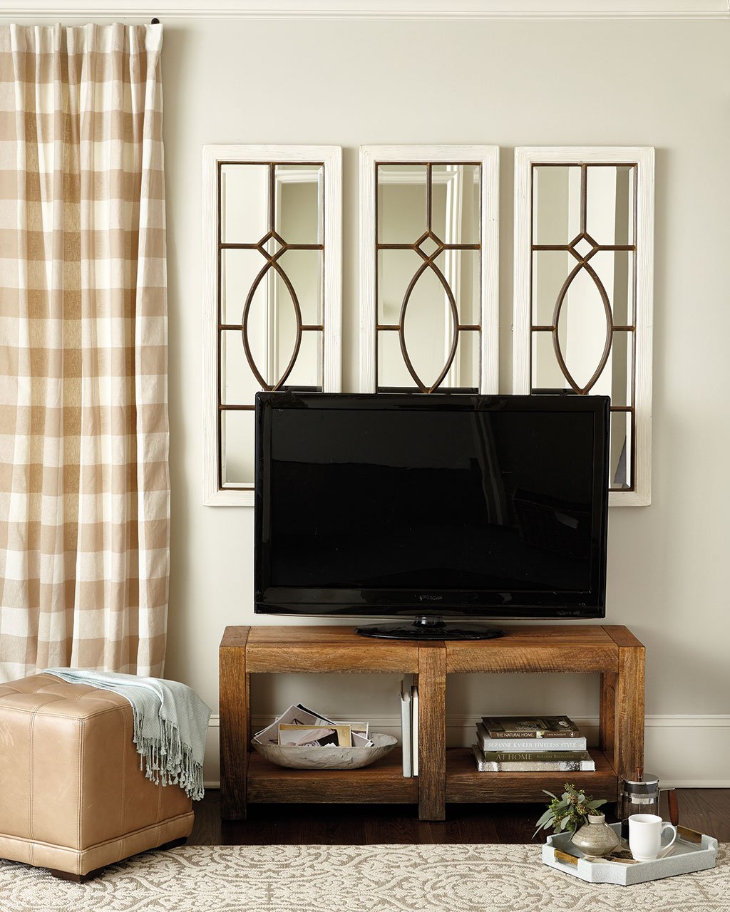
Gavin Media
This is the cleverest media cabinet. It looks just like a little rustic console, but it has these wide, deep channels in the back to store all of your cords so there’s no mess of wires. You’d have no idea looking at it!
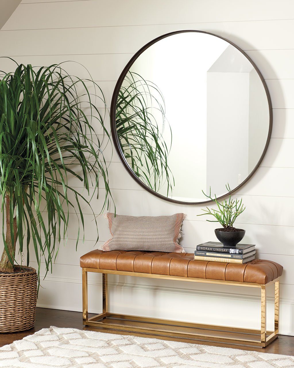
Alexa Metal Bench
I love the proportion of this bench. I’ve been looking for something like this for my guest room. I need something to tuck at the foot of the bed or right across from the bed so guests have a place to put a bag. I don’t have much space, and a narrow bench like this is hard to find. I love the brass base and how sophisticated and simple it is!
Browse all of the new pieces for Summer 2017, or see the paint colors we used in our Summer catalog.
For more design inspiration, visit our Pinterest Boards, or find more gorgeous rooms in our Photo Gallery.
Did you like this post and find it helpful? Rate it below and share your thoughts in the comments.



Monica Chaddock
Lovely
covemaven
I absolutely love the Stephanie cane canopy bed! Any chance it will be carried in a King size in the future? Maybe more color options?