With every new collection, we fall more in love with Suzanne Kasler’s tailored, timeless style, so it’s no surprise that her summer 2017 collection has us ready to throw back the window treatments and take in that gorgeous summer weather. We visited Suzanne’s office to talk with her about her new pieces, her new favorite color, and why nautical accents belong in every room.
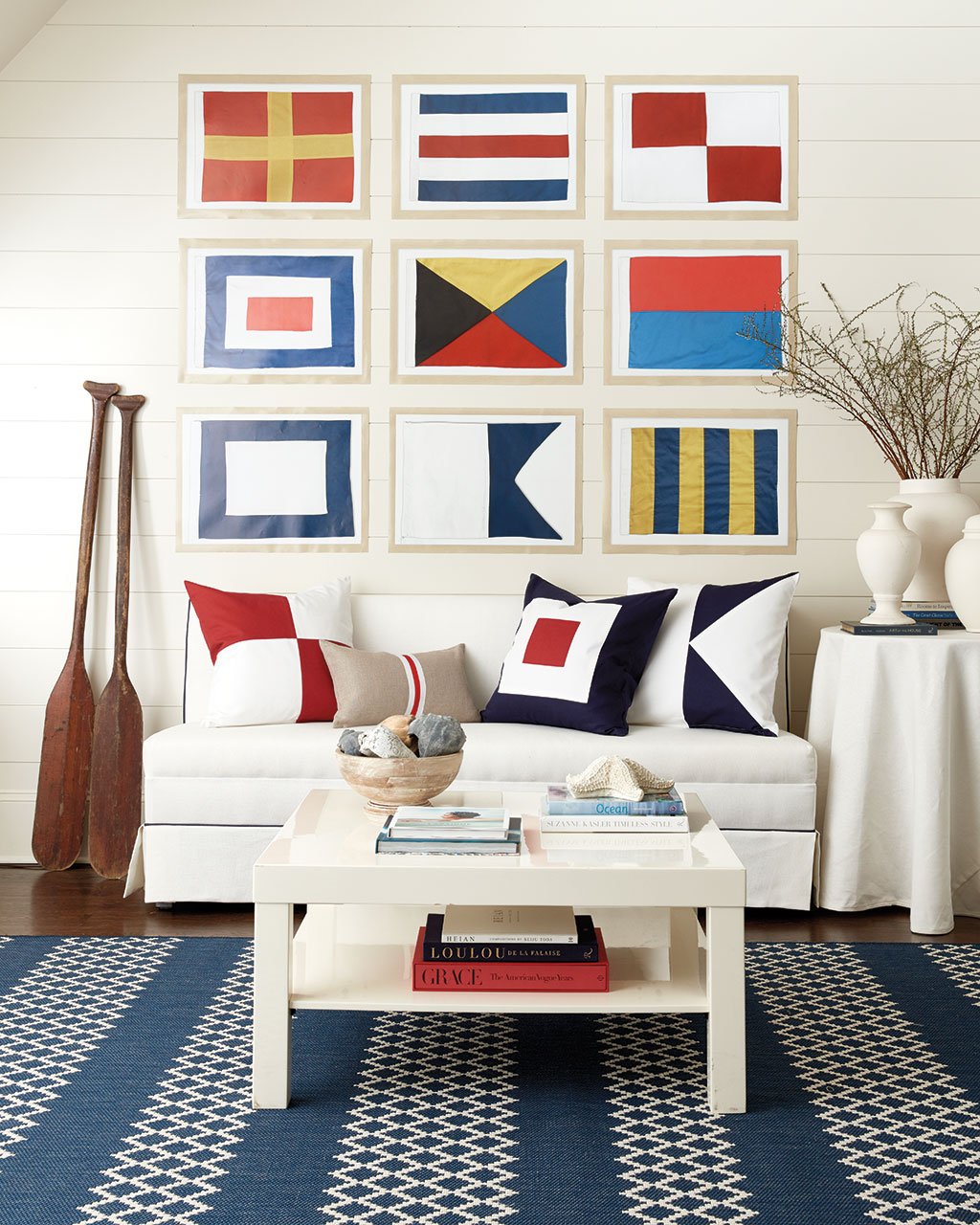
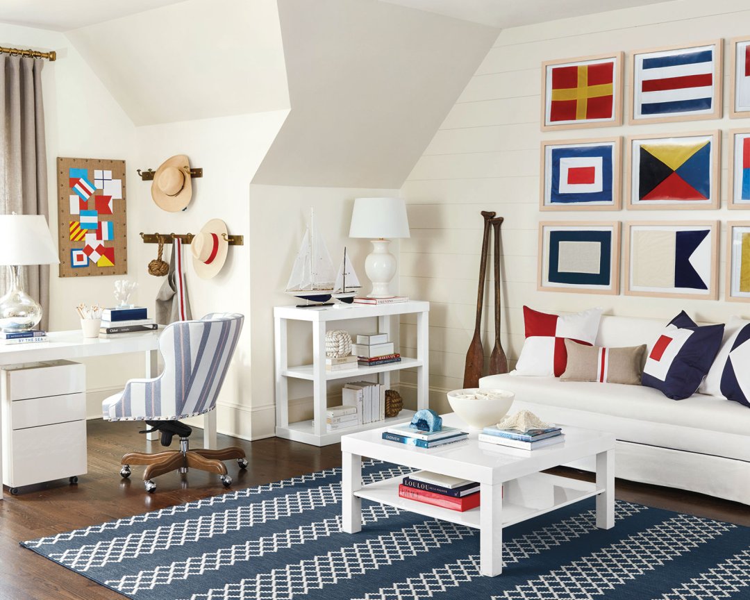
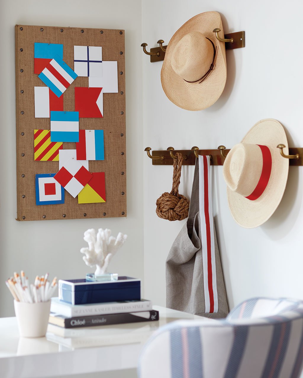
Ballard Designs: Let’s start with probably the most striking look from the summer catalog, your blue and white nautical office. You’ve mixed these nostalgic flags with your super clean and modern Parsons office collection.
Suzanne Kasler: Every year we think of the season, and one of my favorite places is Nantucket. I spent some time there last summer and just fell more in love with that nautical look. It’s so classic and fun, especially the flags! Their colors are bold, but their shapes are simple. I’ve always loved that combination. An entire collection of them does create this seaside feel, but they can be broken up and used regardless of whether you’re near the water.
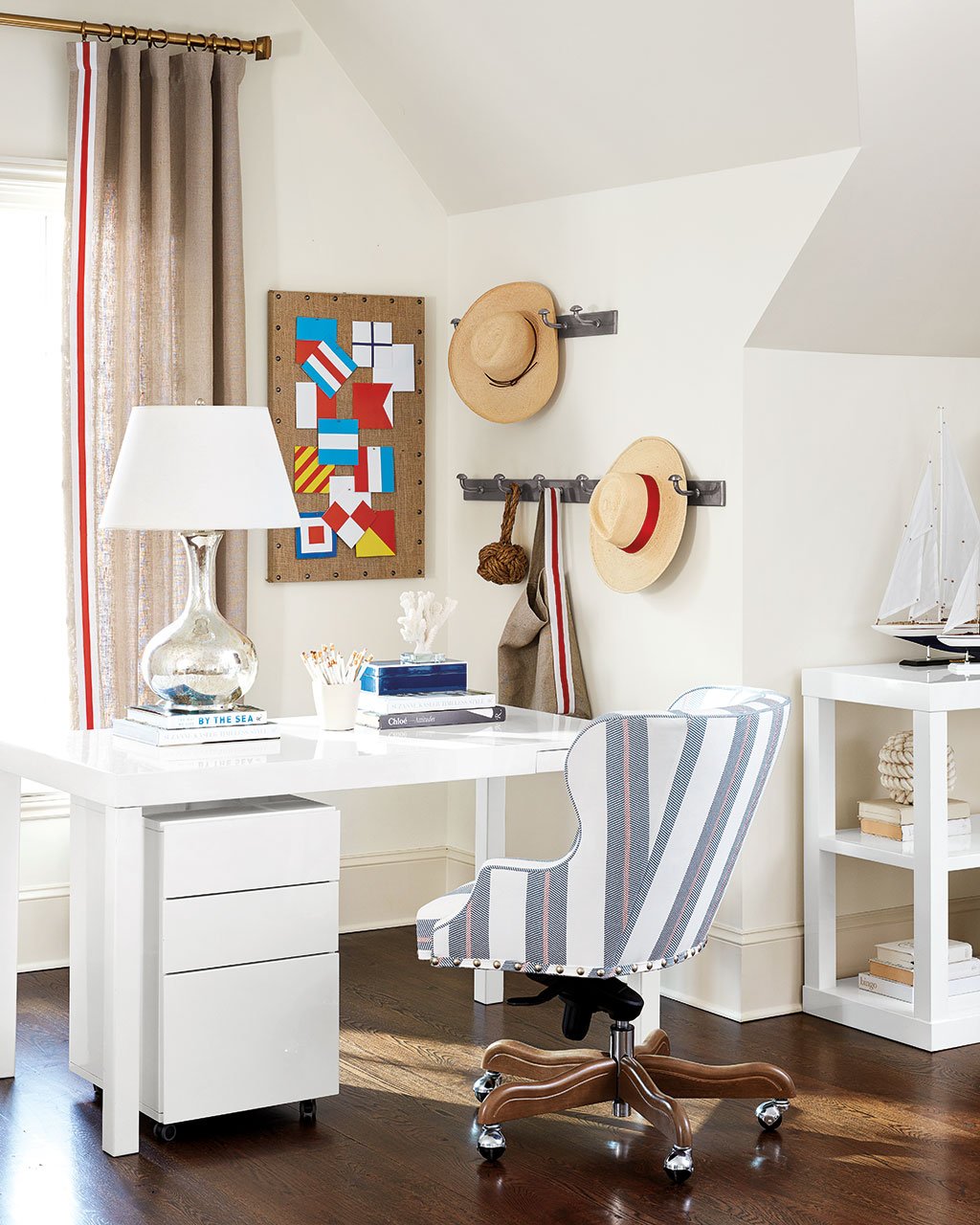
I’d gone to a museum and got a whole packet of flag postcards which you can see on the bulletin board, and those were really our inspiration for the artwork.
We’ve also added some new pieces to my Parsons Collection — the file cabinet, three shelf bookcase, and the coffee table. As the collection keeps expanding, I love how versatile everything is. You can use them in so many ways and in so many rooms. Of course every room needs a little sparkle, so I brought in my Gourd Lamps in the mercury glass. I love how they look more silver here than mercury glass. It dresses up the space.
BD: Very often you combine classic, timeless pieces with clean lined pieces to create this signature combination of modern and traditional. You flags check that traditional box, but then the Parsons Collection has that clean lined feel that defines your spaces.
SK: It’s so interesting because of course the Parsons design is vintage, but the shape and straight lines make it feel modern, even though it’s a vintage design. That’s the sign of a timeless piece, does it look fresh and different even though it’s not? I love the Parsons style because it works seamlessly in nearly any home. Right now out there in the design world, people are drawn to that edited look. Of course, the lacquered finish gives it that extra modern touch.
BD: There are lots of stripes layered together throughout the room. How do you mix multiple stripe patterns in one space without getting dizzy?
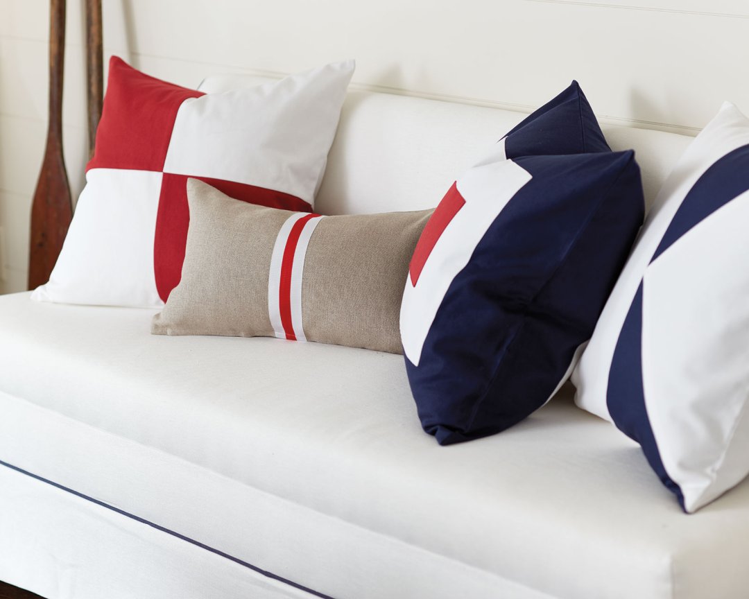
SK: We did this striking red stripe trim on our curtain panels, on a tote bag, and also on a pillow. I do love the stripes! Then we used a different red and blue stripe on the desk chair, and that linear pattern really accentuates the curvy lines of the chair. It’s unexpected.
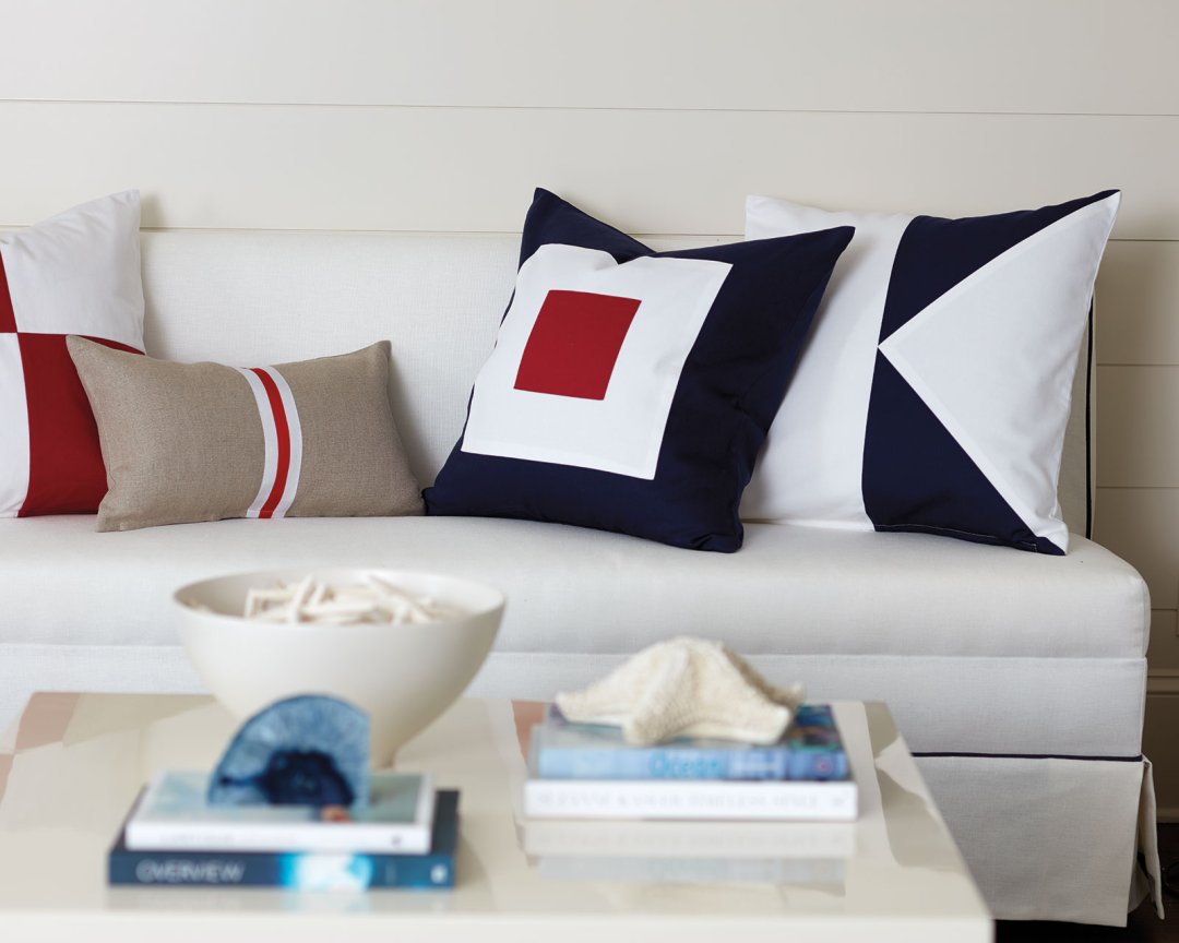
The other thing, we translated the flag artwork into pillows, and those flag patterns work beautifully with a simple linen pillow with a red stripe trim. You can bring them all together and not worry it’ll be too much.
BD: And these nautical flags each represent letters, which is a fun detail. Are these “S” and “K?”
SK: I don’t know! I do love that detail, but I wasn’t playing favorites based on the letter meaning behind the flags. It would be cute though to spell out initials maybe of your children with the flags.
BD: How do you envision these framed flags being used? Multiples together in a grouping, or individually?
SK: They’re so strong that you could use them either way. I’m attracted to certain color combinations and stripes, but I’d encourage everyone to just pick their favorite couple of flags and mix them into a larger gallery wall.
BD: You’ve used lots of different blues in this space, not all one shade. What’s your guideline for mixing different shades of the same color so it feels intentional?
SK: We do run into this question a lot when pieces don’t match exactly, even with our clients. In those situations, we always say that we want to create a more layered, collected room. Stay within the same color family, but there’s no need to match everything exactly. So you’ll see we didn’t use a baby blue, we kept mostly to the navy family, but each one of the navy pieces isn’t exact. Whether it’s blue or white or any color, don’t worry so much about it matching, instead focus on creating a composition that works.
BD: You mentioned liking Nantucket. What is it about the island that you love so much?
SK: Architecturally, it has this amazing style that’s stayed so consistent. The strict design code they have has given the island a unique personality that’s irresistible and also constant. It’s been there all the time and when you visit, you’re transported almost into another world.
Plus, Nantucket red is the perfect shade of red. Red isn’t usually a shade I’m drawn to, but there it works. When you think of Nantucket, you think of woven baskets and that classic red. They’ve kept their culture so intact, and they’ve beautifully preserved what’s special about the place.
BD: You’ve added two new fabrics to your signature line of linens, Olivine and French Blue.
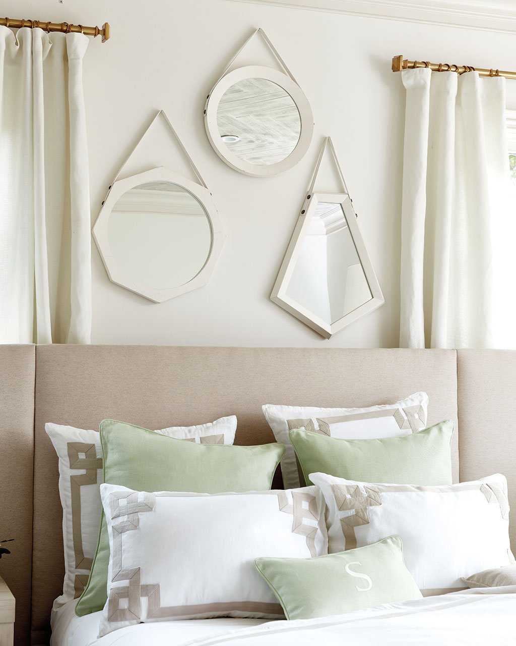
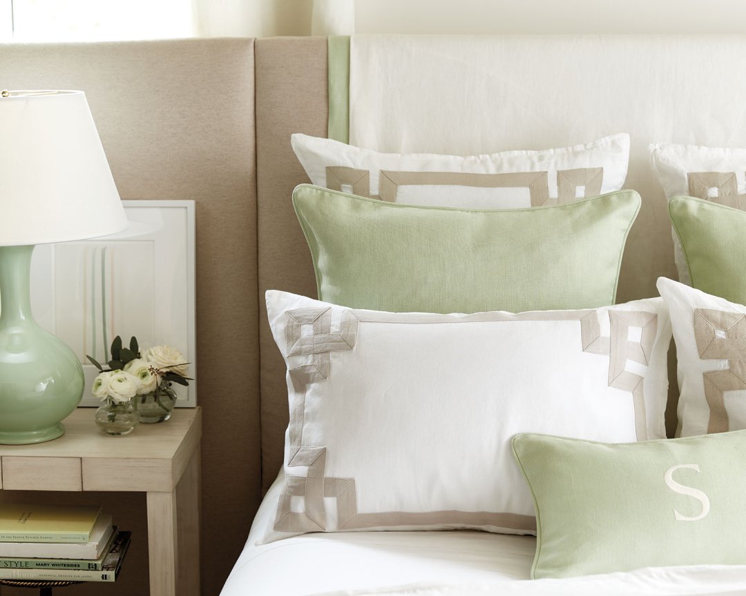
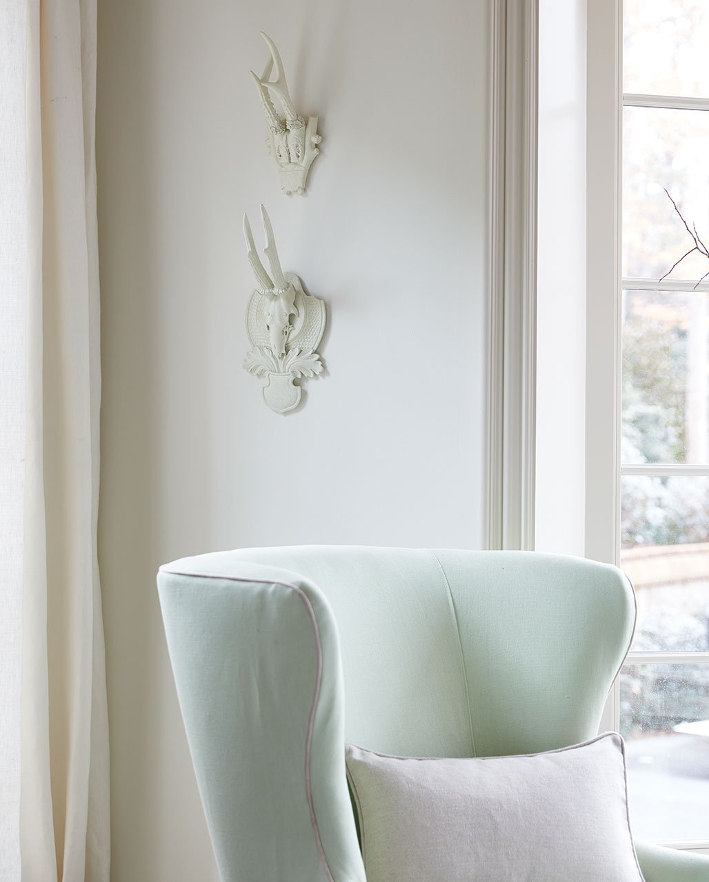
SK: Colors can be tricky business because they’re constantly moving in an out of style, and a lot of that is driven by fashion. I don’t really like to use the color of the moment exactly, because in a few years it’ll feel dated. Instead, I like to zero in on colors that are fresh and feel new but are timeless. Green has been coming back into focus, but the challenge was finding that perfect shade that would layer beautifully with flax, parchment, and the other colors in my fabric line.
BD: Of course, green is the color of the year, but you’ve been working on this color for months and months.
SK: You know, it’s funny. It’s never ends up being a coincidence. I think everyone starts getting ready for the next thing, don’t you?
BD: Well and green has been missing from your linen collection until now.
SK: Green is a difficult color, especially in linens. You can’t imagine how many samples and strike offs we went through! I wanted something that felt washed, rather than the kelly and emeralds that you’re seeing in fashion. It’s just a more livable shade for interiors.
BD: How did you know this was the right one?
SK: Color is just my language. I’ve actually had this range of colors I’ve been working off of, and they come out in the products I design.
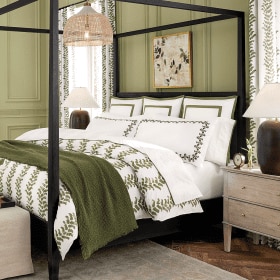
BD: Let’s talk about your new Gigi Headboard.
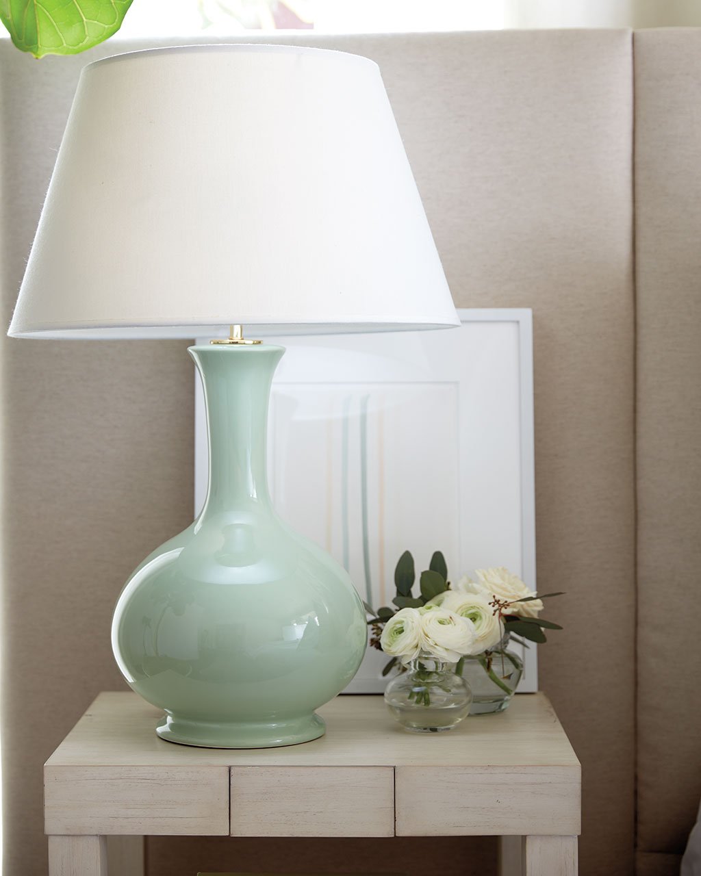
SK: It’s funny. I love collecting fabrics and textiles and draping them over the top of the headboard. It’s an easy way to swap out your look and to bring in new, personal memories and treasures from your travels. At some point, I realized that all of my headboard designs were curved! So I new I wanted a straight angle on the top to allow for layering. The side panels create this luxuriously cozy, warm vibe that you really need in a bedroom. Another great thing about this headboard in particular is that you can actually hang things on the panel like art work. Here, there’s something simple leaning, but you can hang something too.
More and more we’re seeing that very edited look in interior design, but how can you incorporate that modern line into your more traditional pieces? A headboard like this is a great way to subtly bring in more contemporary lines.
BD: Your new Beauvais Nightstand is a petite little thing. Why this size?
SK: You know, we don’t always have tons of space on either side of the bed, so I wanted something in a more modest size. This one is a great scale because it’s big enough for a lamp and a few other small accents.
BD: What does your nightstand look like? Is it clean and edited like your interiors or does it have lots of mementoes and necessities on it?
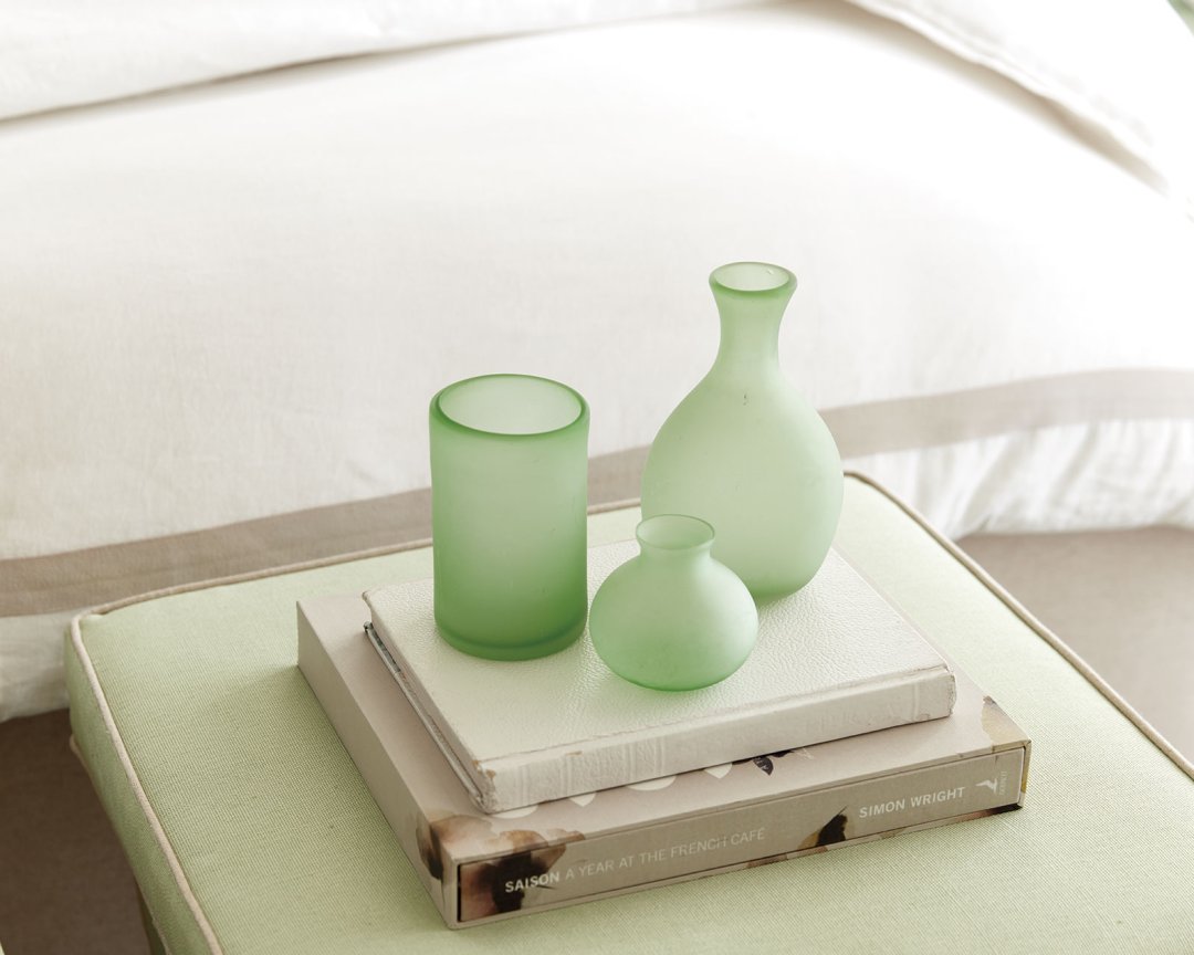
SK: It just has tons and tons of design magazines stacked. So, that’s actually one reason I love layering in smaller tables in front like we’ve done here. A little stool is great for a basket for small tray, just to give you a little extra space.
BD: You have so many layers in this bedroom, like the tables and the fabric over the headboard, but it still feels very clean overall. How do you know when to bring in one more layer and when to hold back?
SK: There’s really no formula, unfortunately. My best advice is to constantly educate your eye. Look at the way that we’ve laid out the room in the catalog or in a magazine, then try it. And also know that when we’re creating these beautiful spaces, whether it’s for the Ballard catalog or one of our clients, we’re trying things constantly before we land on just the right look. We may try a side table layered in front of the nightstand, then take it away. We may try two or three accents pillows, then just leave one. We don’t always know just the right combination ourselves, so we’re constantly adding things and taking them away.
BD: How do you have the discipline to stay so edited?
SK: Well, it’s difficult to collect things in your home because you can’t keep everything! I love collecting, but like I said, I’m always adding and taking away. Both in my own home and my clients’.
BD: Summer is a time when we’re traveling, so it’s a great time to be sure your guest room is in order. This bedroom feels like the most perfectly appointed room. What are you must-haves in a guest bedroom?
SK: I always love to bring in fresh flowers, and of course you need comfortable bedding and sheets. The most important thing to me is keeping it clutter free. Your guests are bringing their own things too! They’ll bring their book and their luggage, so leave plenty of open space for them to unpack and get settled. Don’t over accessorize.
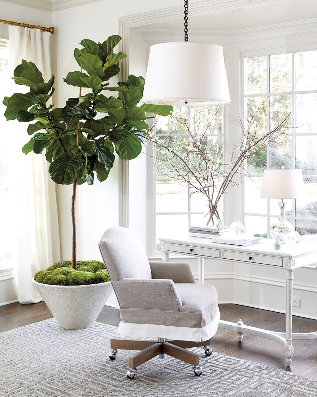
BD: I love the statement this large planter makes. It’s an exaggerated cone shape and so unusual for a planter. Where did the inspiration come from?
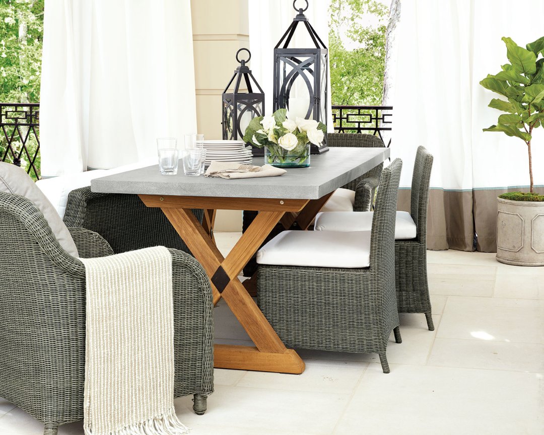
SK: I love playing with scale, and sometimes one piece that’s really over-scaled, even just a planter, can make your whole room feel up-to-date. I found this great antique bowl with an unusual shape, and we used it in a project and kept wanting to use it again! Of course since it was a one of a kind piece we weren’t able to, but that’s why I wanted to bring it into my Ballard collection. A large fiddle leaf fig looks great in it, but you could also use it on a tabletop like my outdoor Orleans table which has a generous scale.
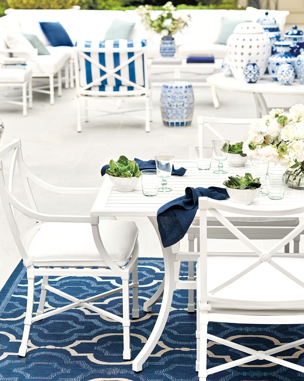
BD: That’s the perfect segue into your new outdoor pieces. Your Directoire Collection is now in white and it’s so striking.
SK: I’ve been wanting to do the collection in white for years and finally convinced the team to make it happen! It turned out beautifully, plus it’s so comfortable.
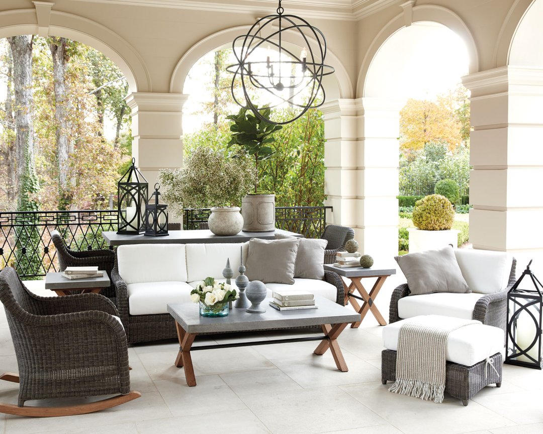
SK: I love the Versailles Collection because it’s so comfortable and handsome. The gentle curve to the arm is really comfortable to sit in, and the color of the wicker is kind of a dark brown taupe. It works in nearly any outdoor environment. I’ve mixed it with my teak Orleans collection. I think it’s important to mix outdoor furniture pieces together so you have a more layered look rather than everything from the same collection. Bring together materials, shapes, and colors to create a space that feels as layered and collected as your indoor rooms.
My favorite thing in this space though is my rocking chair. I love a rocking chair for a classic, Southern porch, but often the traditional wooden chairs aren’t all that comfortable. This one has a generous shape and that great rocking motion.
BD: You’ve mixed two of your outdoor collections together – Versailles and Orleans. Were they designed to coordinate or was that a happy accident?
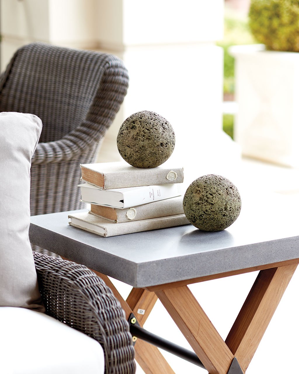
SK: Yeah, I like to mix things when possible. Start with maybe the key pieces matching, like maybe a sofa and chairs. Then, bring in accents that are different. In my own outdoor space, I had some benches and chairs that weren’t actually meant to be outdoors, and I just recently had to swap them out! So I’ve always liked mixing things into my outdoor spaces, and that’s one of the reasons in my outdoor collections for Ballard Designs I’ve chosen several different collections that can all be mixed and matched together — the aluminum Directoire with the wicker Versailles and the teak Orleans.
BD: Your outdoor spaces are treated almost like a grand living room in the way you lay them out. How do you live in your own outdoor space?
SK: I think today, you just have to think of your outdoor space as another room. Think of your patio as having walls just like your living room does. Often in our interior spaces, we want them to have multiple functions for entertaining, intimate conversation, and lounging. We address all of those functions inside, but don’t expect the same multipurpose layout on our patio. So consider console tables, small side tables tucked next to chairs, and multiple seating areas, some larger and some smaller. It’s hard to think of a patio as a room because of course it’s open air, but you’ll create a more comfortable space if you do.
Learn more about Suzanne Kasler, or find Suzanne Kasler’s collection for Ballard Designs here.
Did you like this post and find it helpful? Rate it below and share your thoughts in the comments!



Sanctum
Great design inspiration! I also like how you labeled out those furniture pieces in the photos, it’s a very useful article!
Penelope Bianchi
Suzanne is a genius! Also the nicest, most talented lovely person! I love absolutely everything she has designed for my favorite catalogue company!