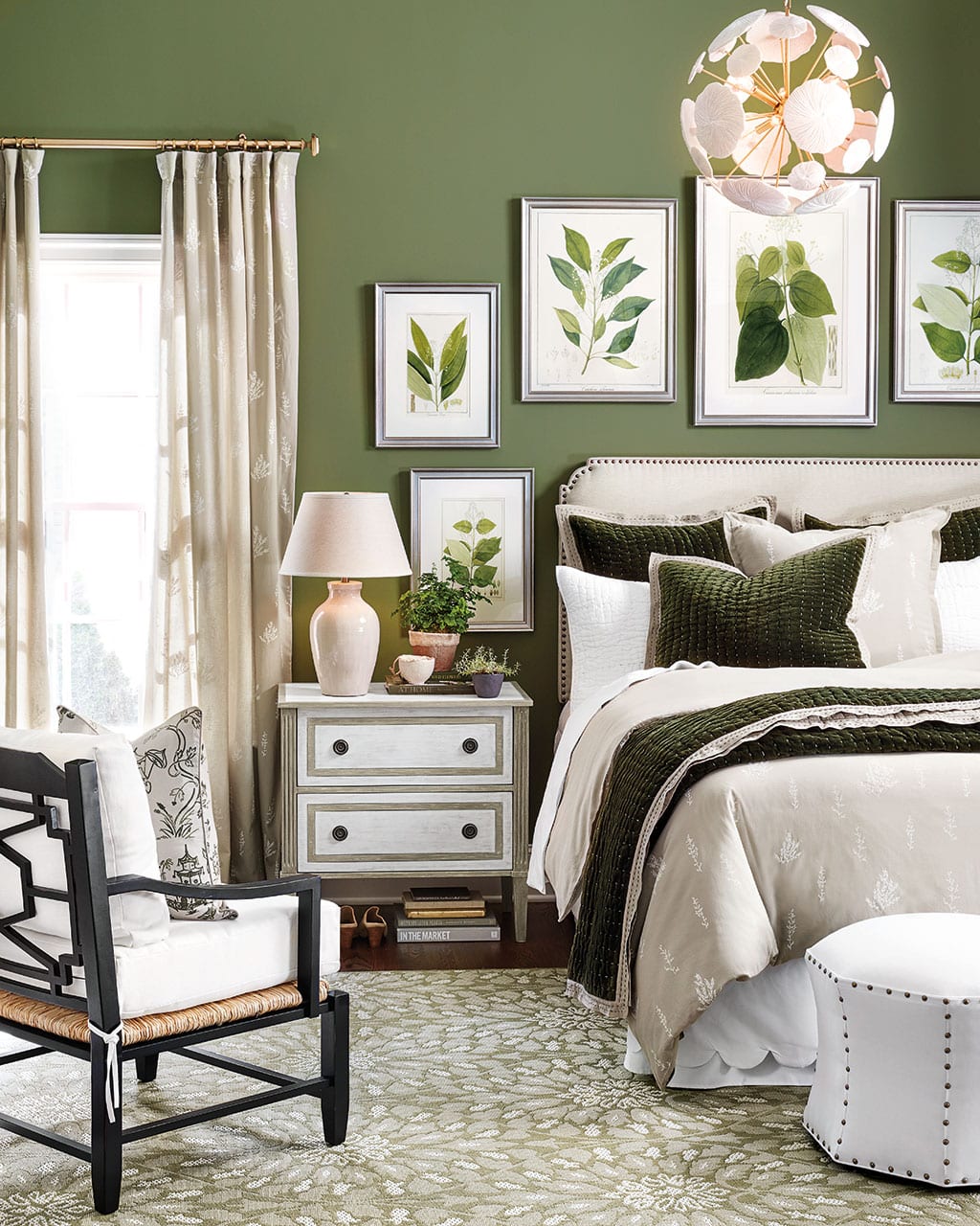
Because we shoot in real homes, we are not always at liberty to paint the walls. In those cases, we have chosen paint colors that best match the wall color in the photo. Please be aware that color may vary due to various light conditions, finish and other factors. Therefore, it’s always a great idea to test a paint sample on your wall first.
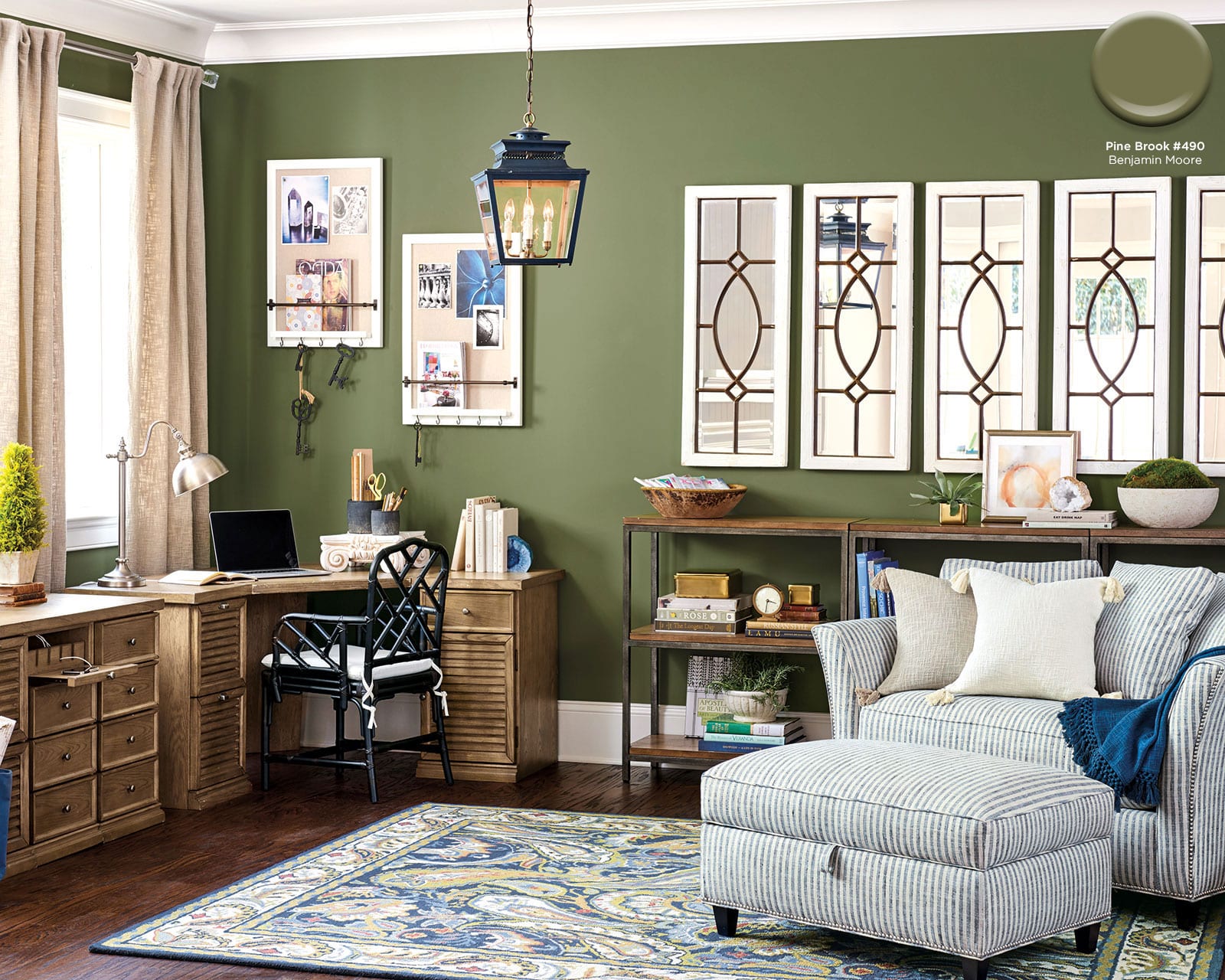
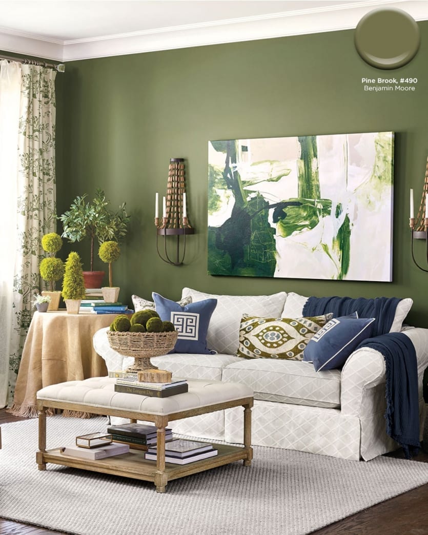
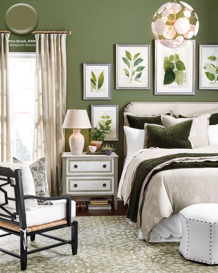
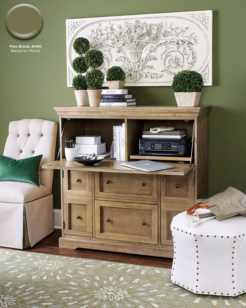
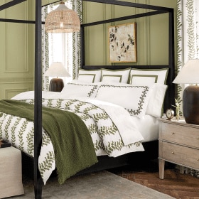
Pine Brook #490, Benjamin Moore
This rich, mossy green looks fantastic with nearly any neutral. We chose it for it’s earthiness and because it works with both chartreuse and emerald.
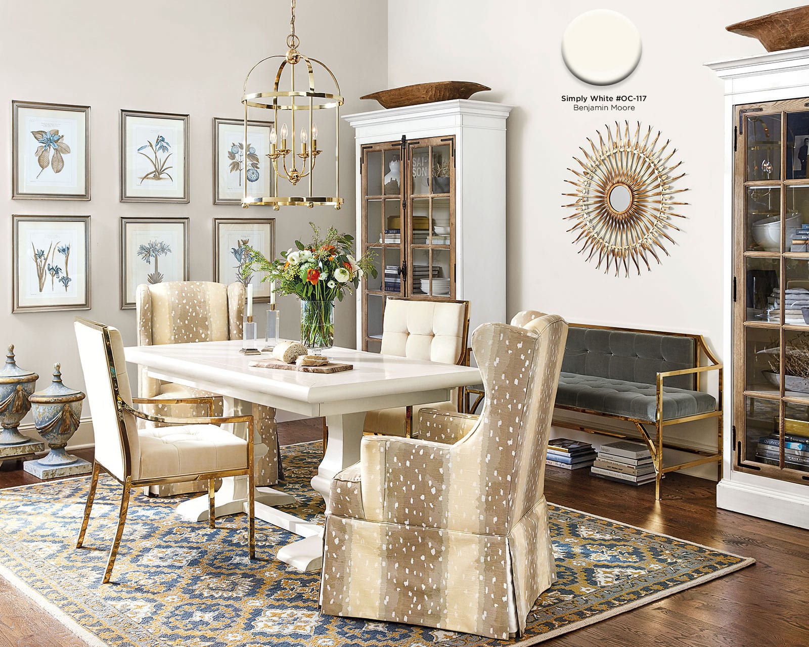
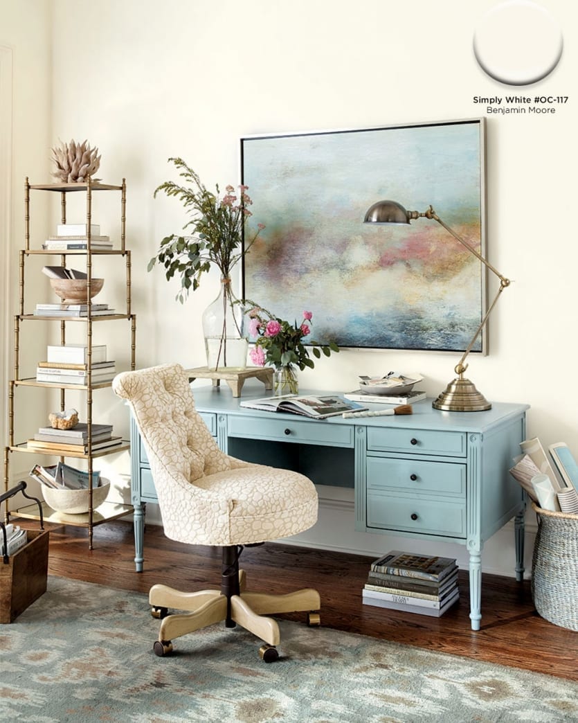
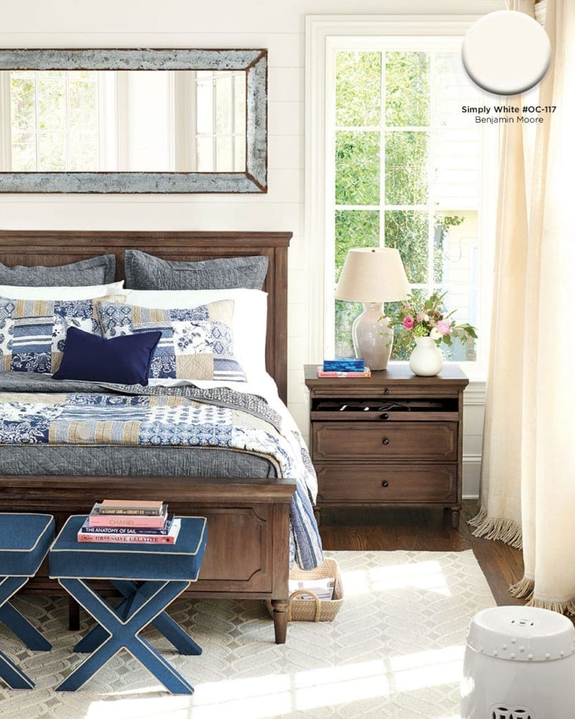
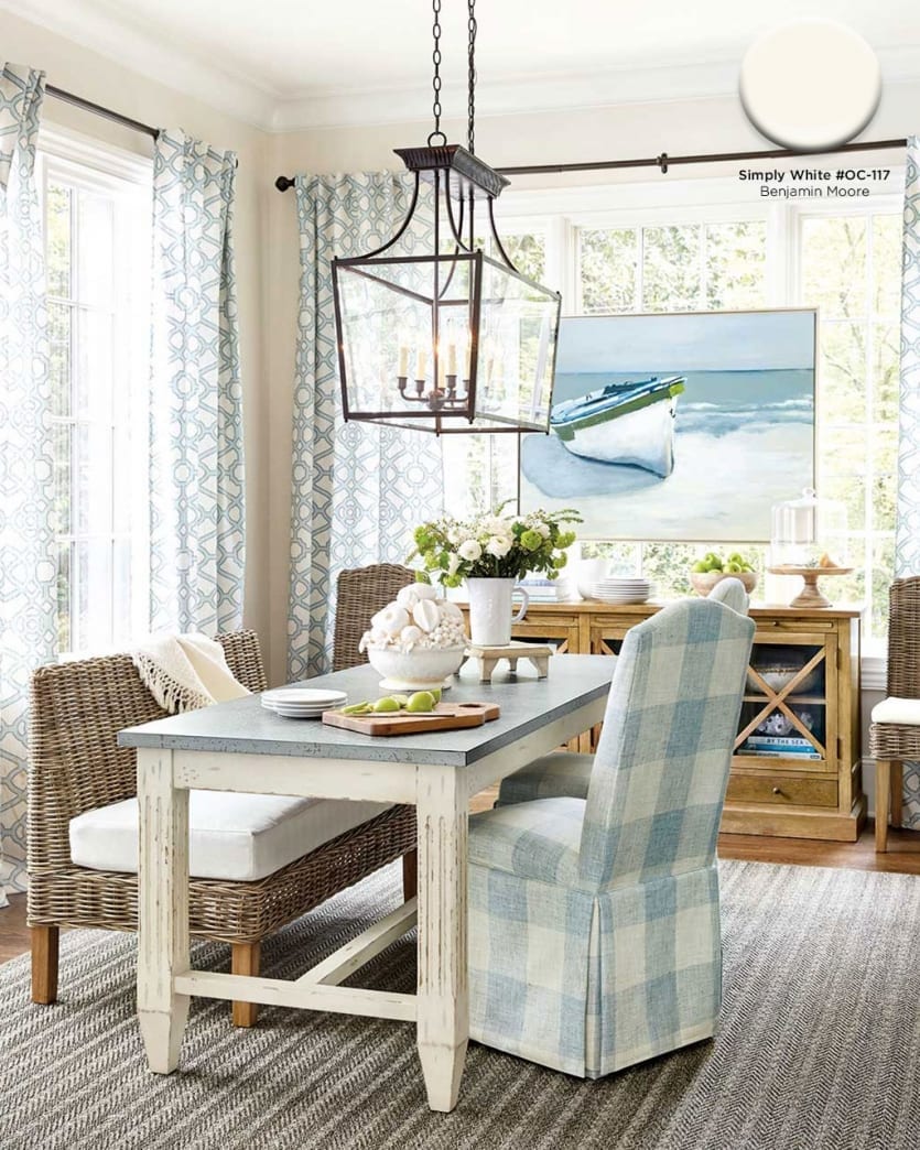
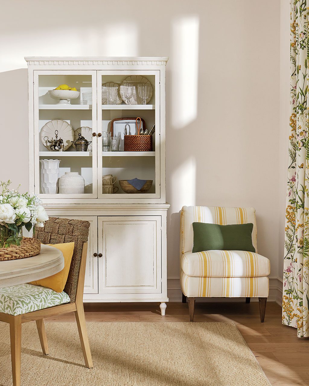
Simply White #OC-117, Benjamin Moore
A true cream adds a little warmth to your room, while still giving you a fresh and airy backdrop for art and accessories.
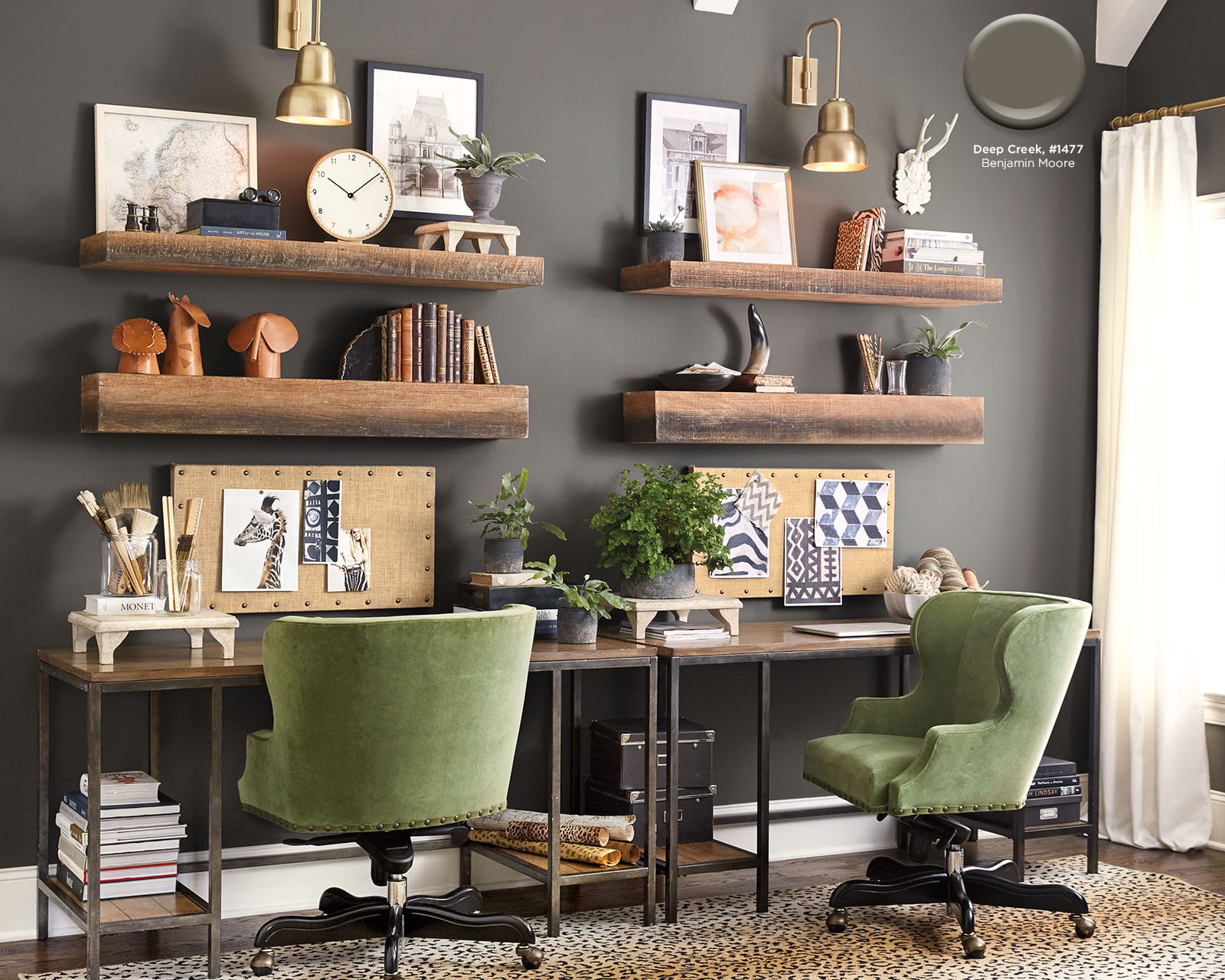
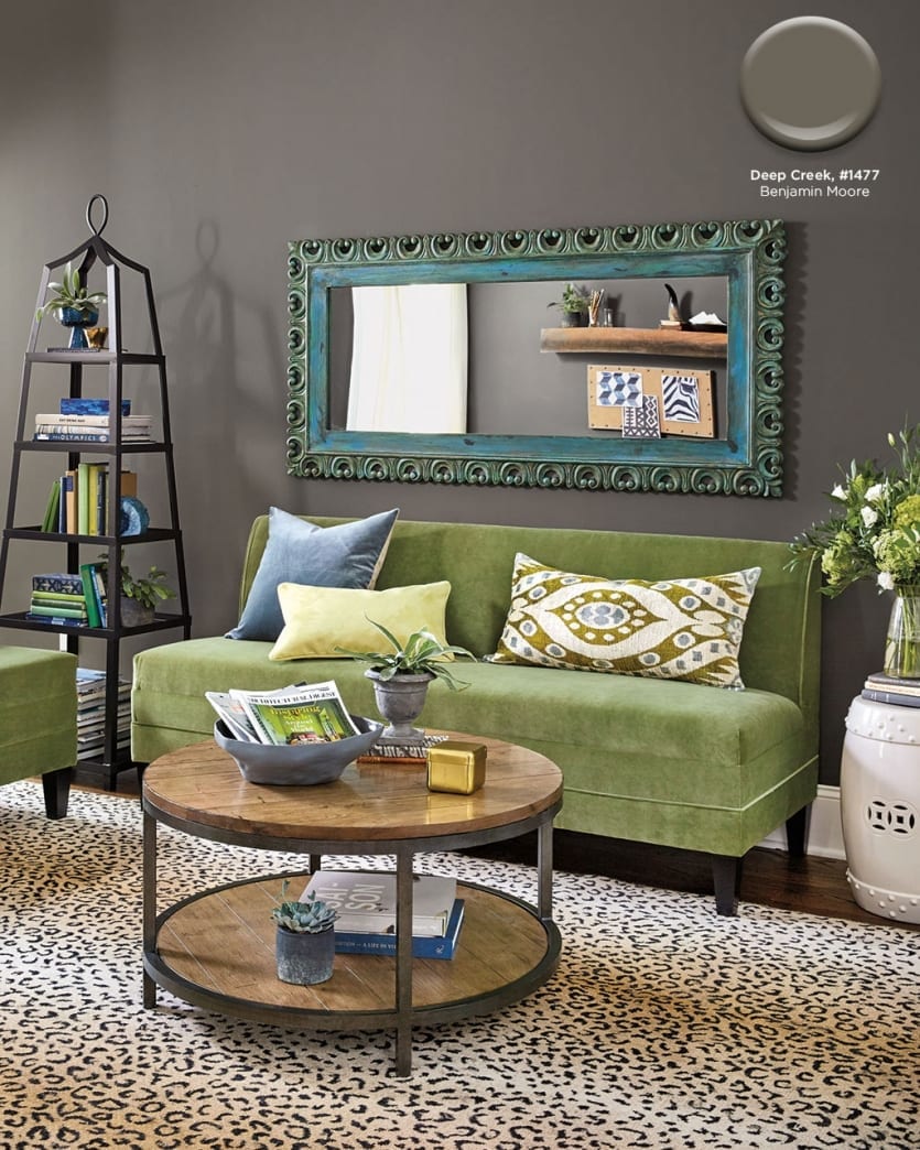
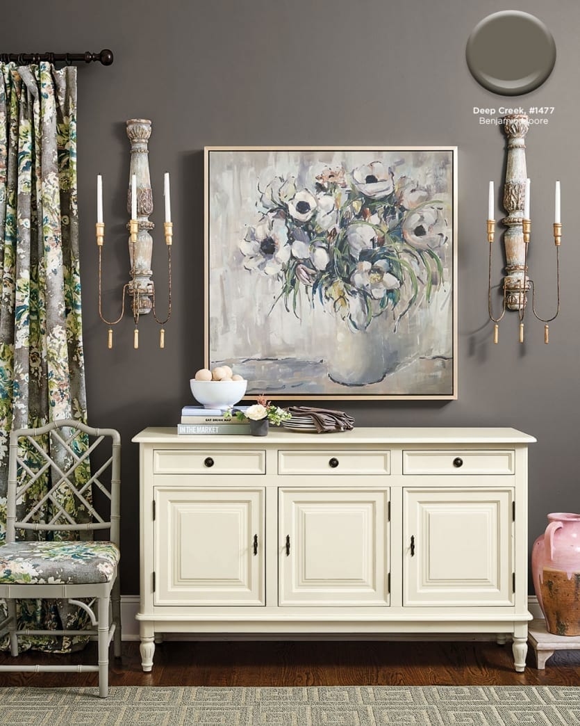
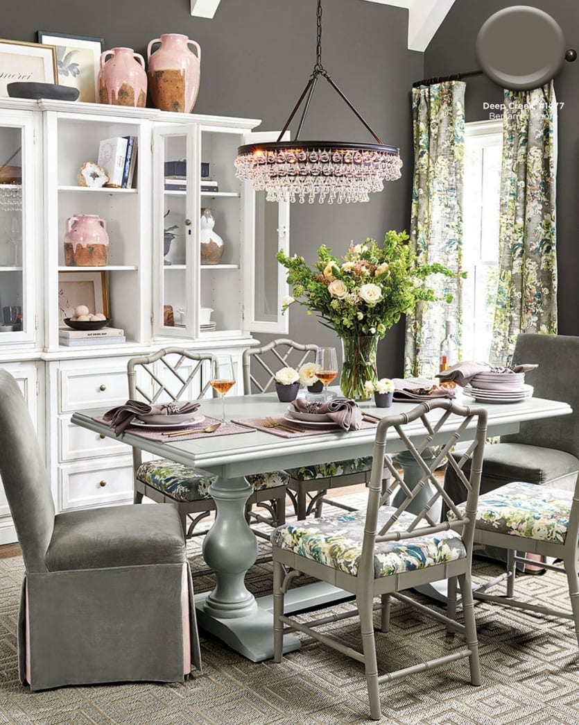
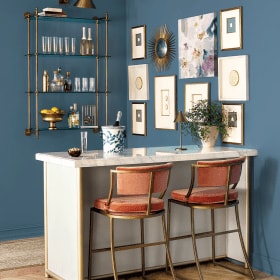
Deep Creek #1477, Benjamin Moore
Dark walls have a certain drama about them. We love using them with ladylike pieces (think florals and blush) for an unexpected twist.
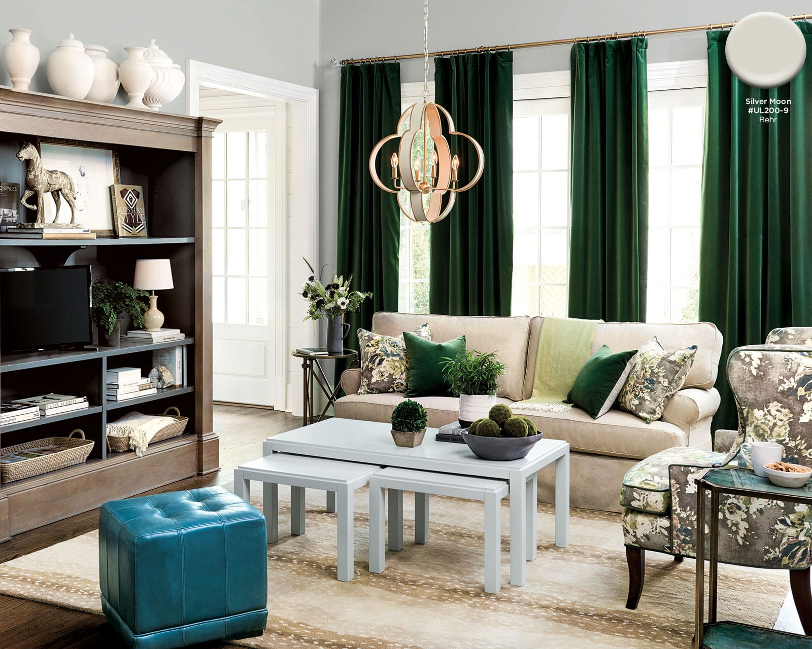
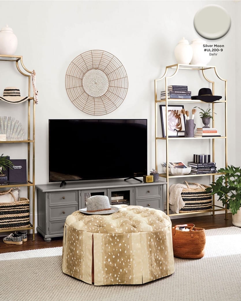
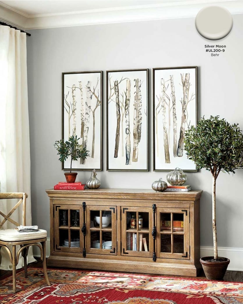
Silver Moon #UL200-9, Behr
A light grey goes with nearly any decor. It balances both warm and cool colors and adds a subtle backdrop to your space.
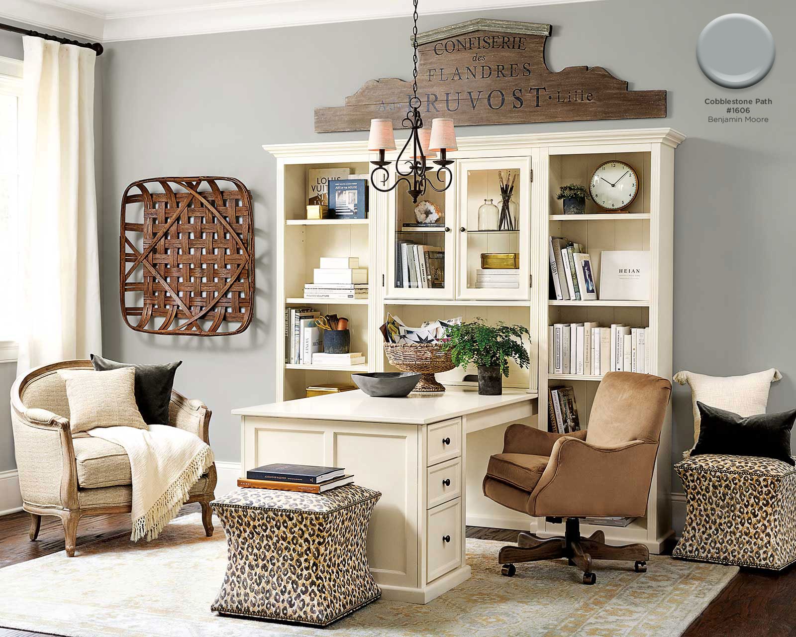
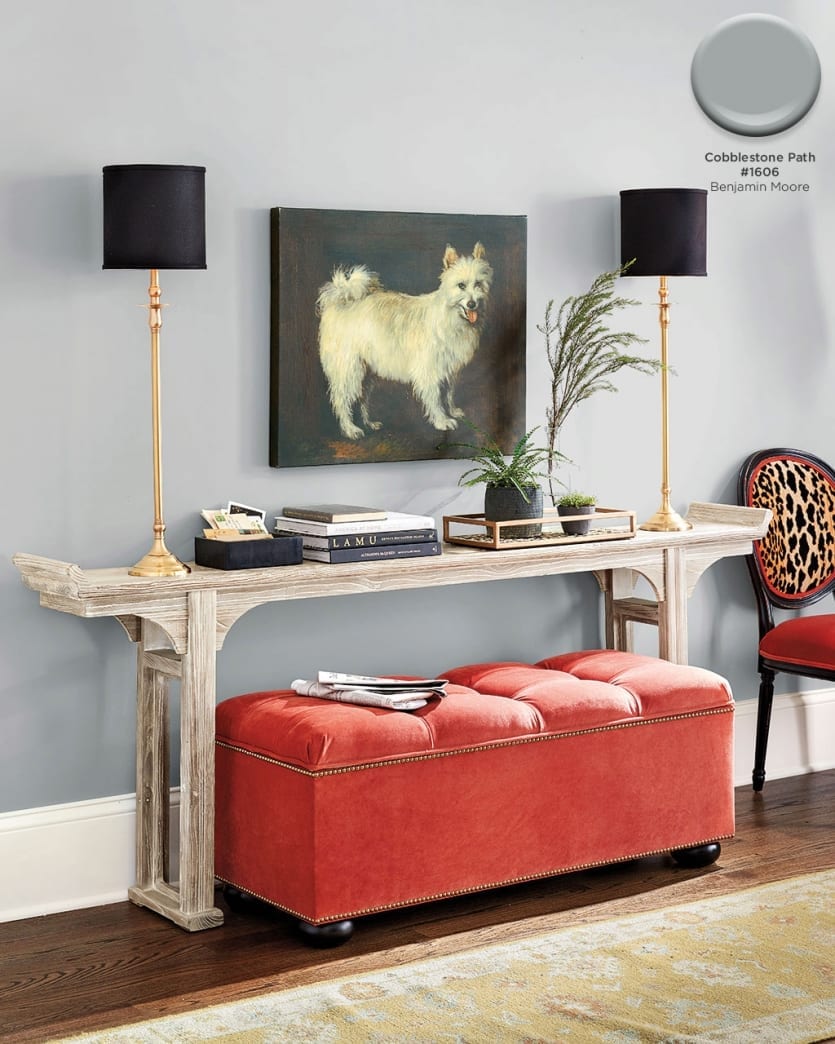
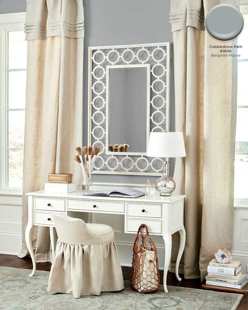
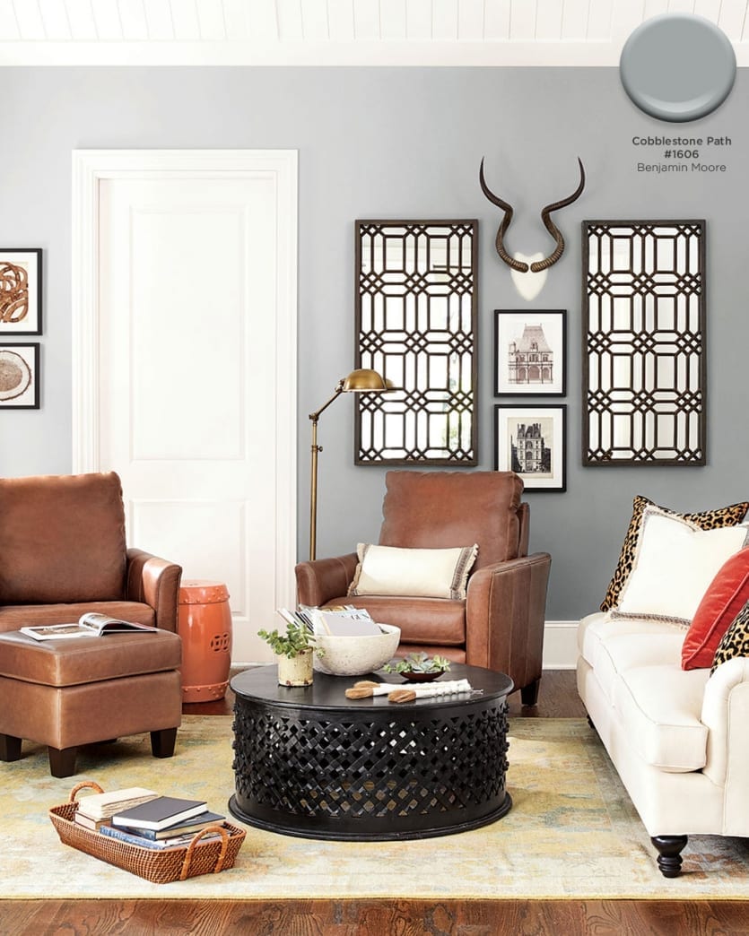
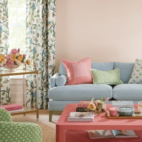
Cobblestone Path #1606, Benjamin Moore
Balance Warm tones with a gray paint color. We chose this one because it’s a true gray, no warm undertones.
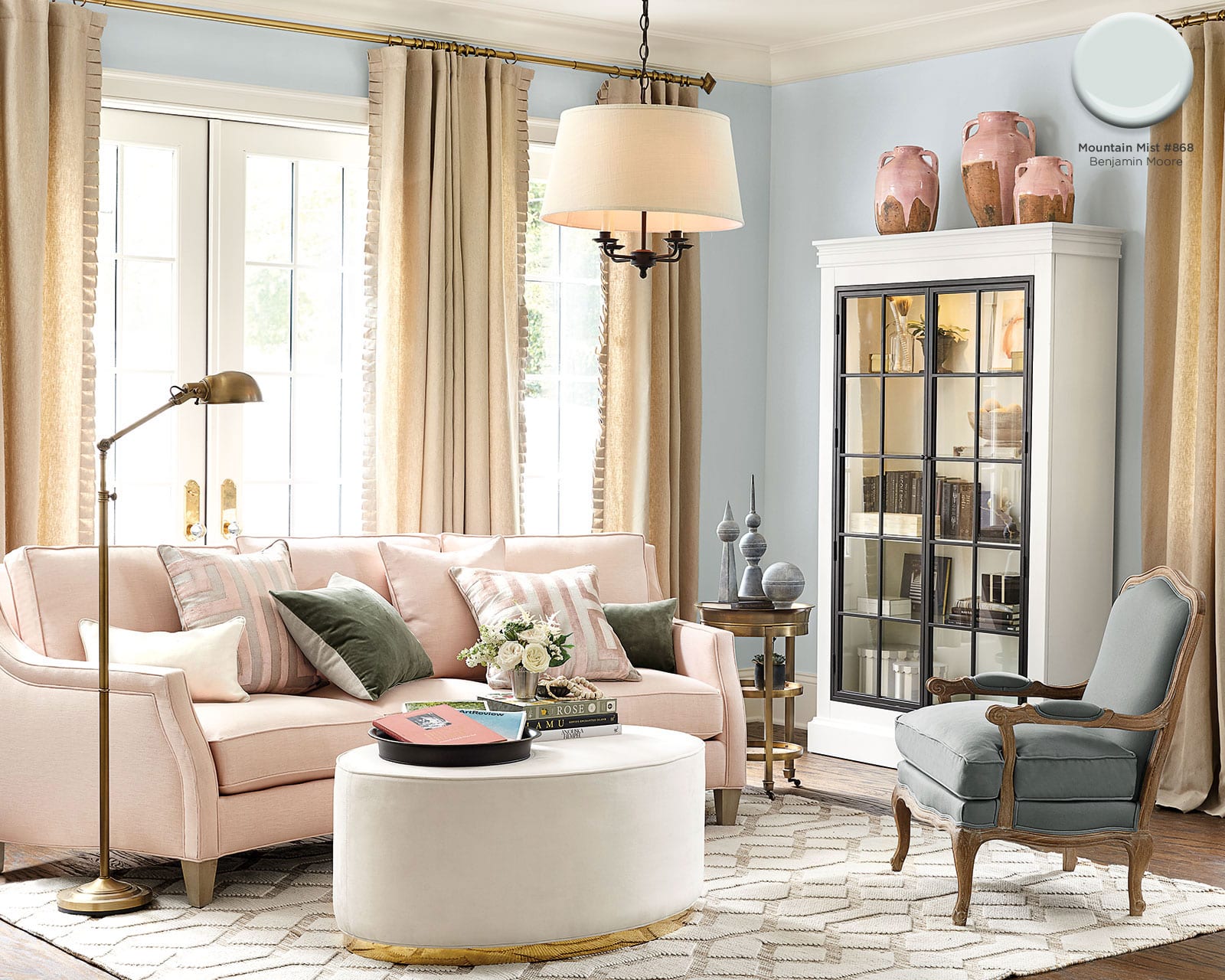
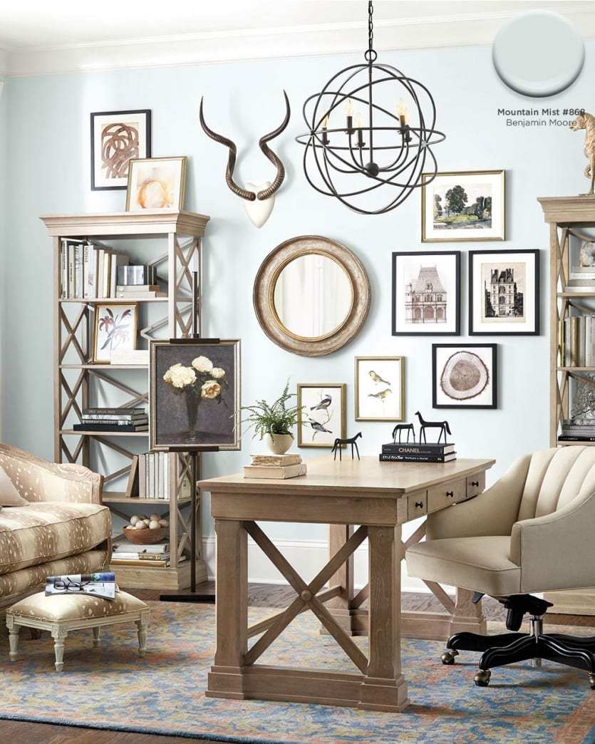
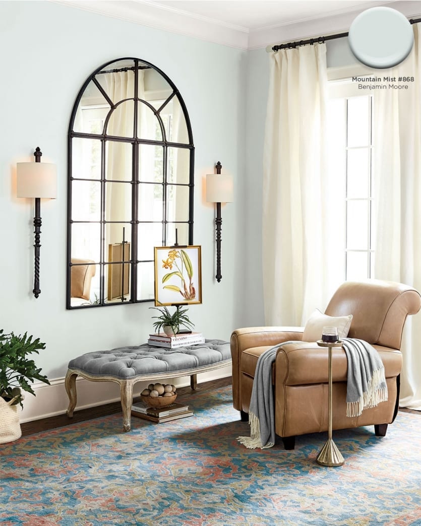
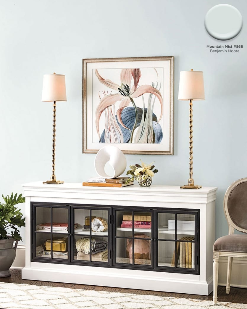
Mountain Mist #868
An icy blue sets a sooting tone for your space, perfect for bedrooms and offices.
Find our best tips on choosing paint colors, or browse paint colors from past catalogs or decorating inspiration by visiting our Pinterest boards.
Did you like this post and find it helpful? Rate it below and share your thoughts in the comments!




Doug Robb
We’ve used Deep Creek a number of times with clients brave enough to go with a dark colour.
It’s dark without being “too dark” for nervous homeowners
Love your site by the way…first time commenting
Fernanda Waxman
Can you please share wall color on of. 69 – I THINK of August catalog?
Caroline McDonald
Fernanda,
Would you mind telling us what pieces are in the room? That way we can find the right space and let you know the color.
Rose Rodriguez
Hi- I love this August catalog! Is it possible to find out the colors for these pages: 6, 26, 69? Especially 69? Thank you!
Annika Dupree
Hi Rose,
So glad you love the catalog!
The wall color on page 6 is wallpaper from Miles Redd’s Schumacher collection. On page 8, we actually used our Mira Blue fabric to upholster the walls. On page 69, the paint color is Cobblestone Path #1606 from Benjamin Moore.
Hope this helps!