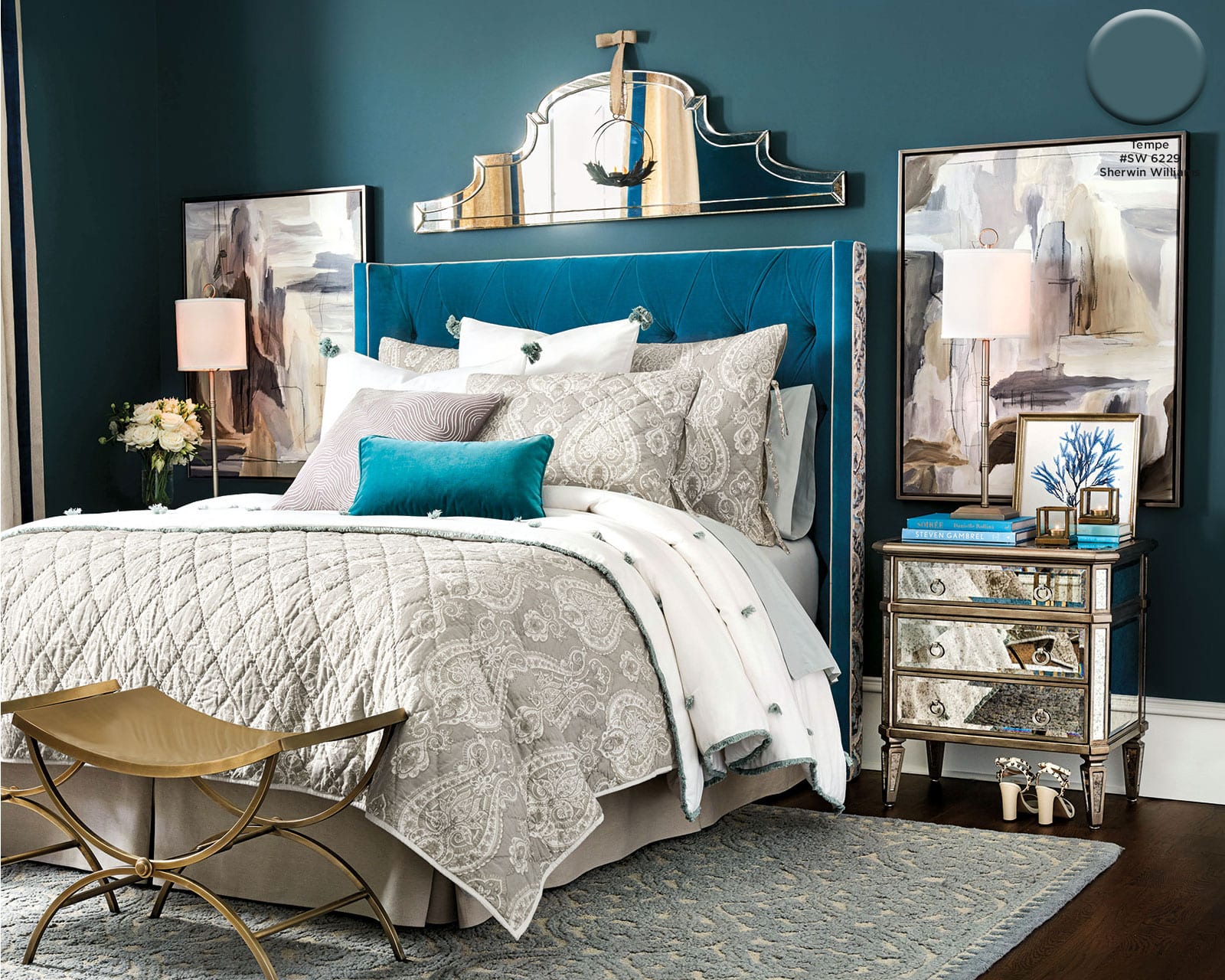
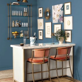
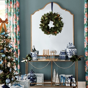
Because we shoot in real homes, we are not always at liberty to paint the walls. In those cases, we have chosen paint colors that best match the wall color in the photo. Please be aware that color may vary due to various light conditions, finish and other factors. It’s always a great idea to test a paint sample on your wall first.
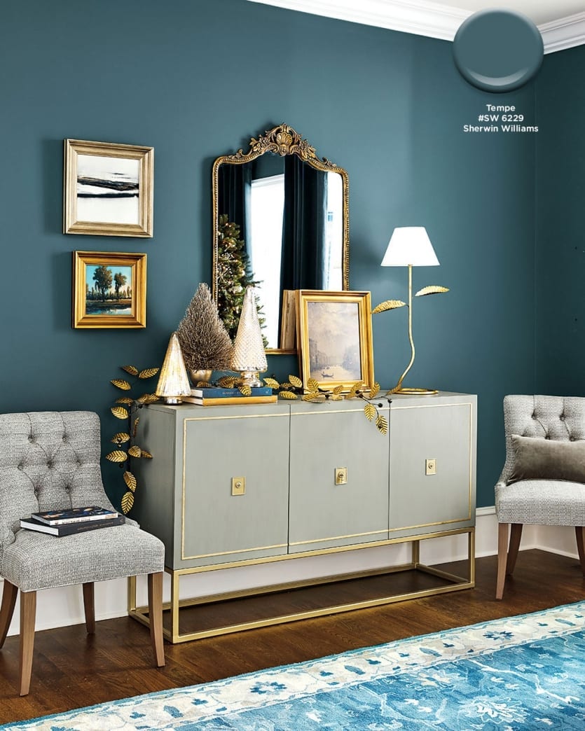
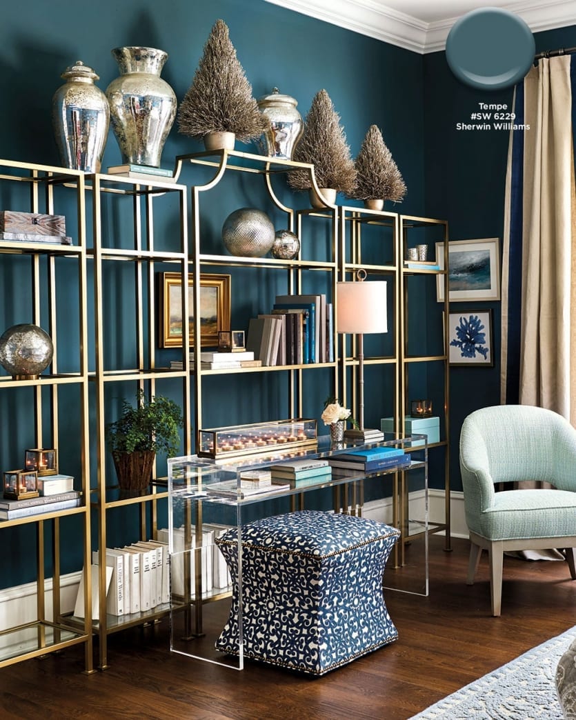
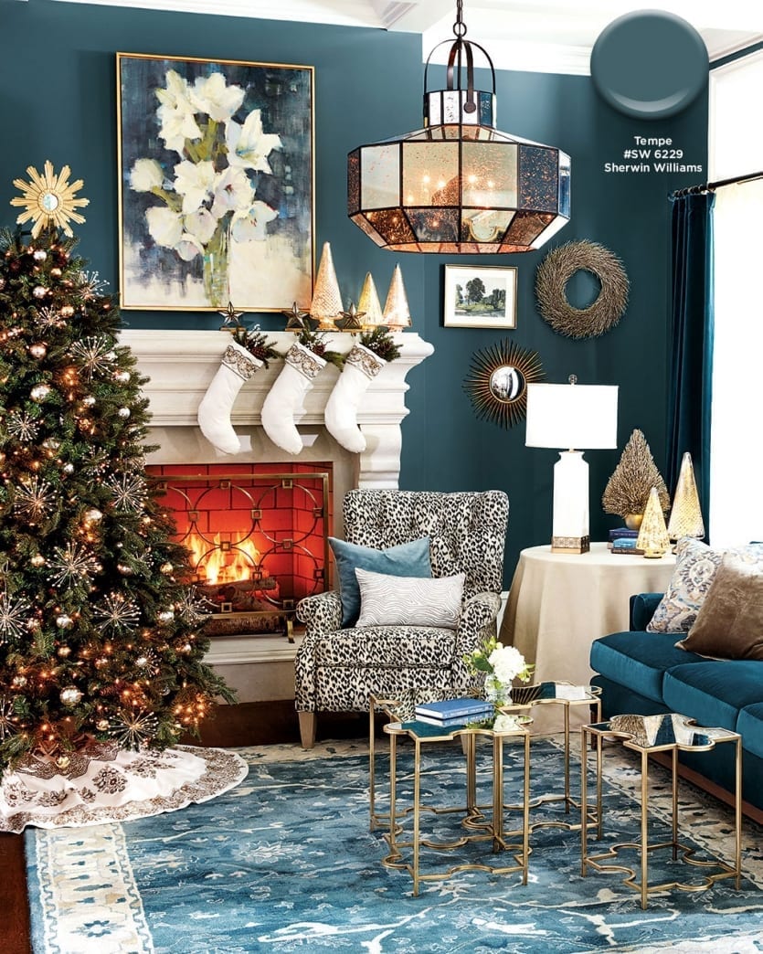
Tempe Star #SW 6229, Sherwin Williams
You don’t have to decorate with a sea of red and green to create a festive, holiday home. We love using blues in every shade — navy, teal, sky — as a backdrop for metallic holiday decorations. To create some drama, we chose a deep teal, Sherwin Williams’ Tempe Star. Metallics, silvers, and grays pop off this bold color and bounce around the room.
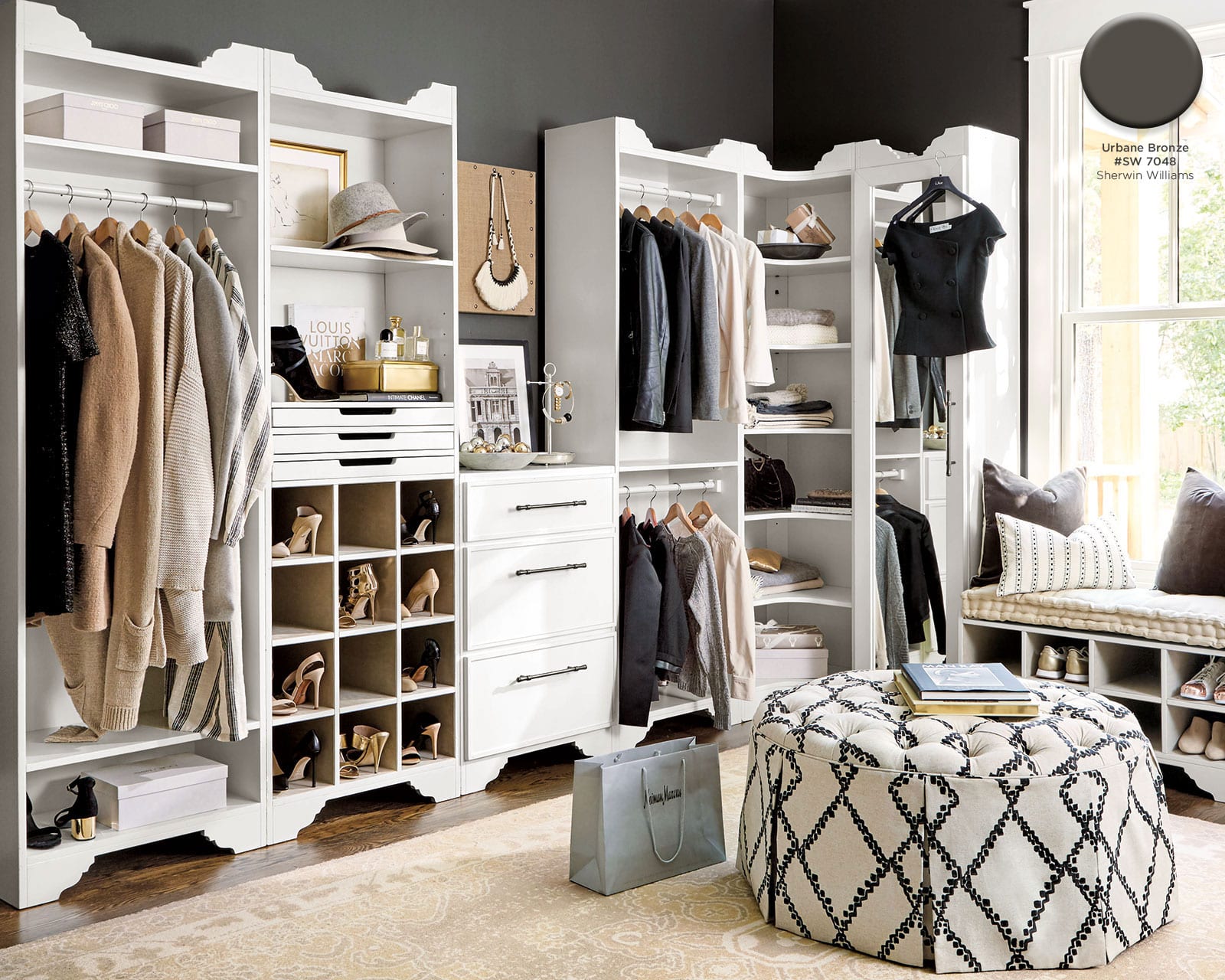
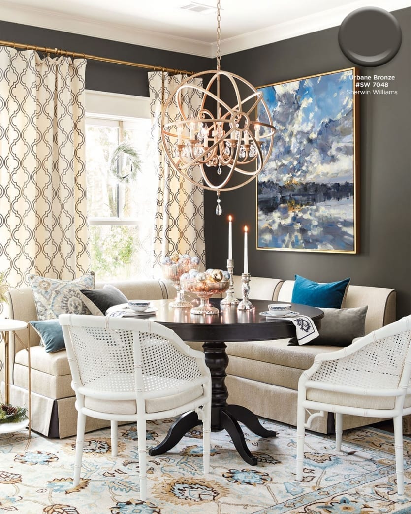
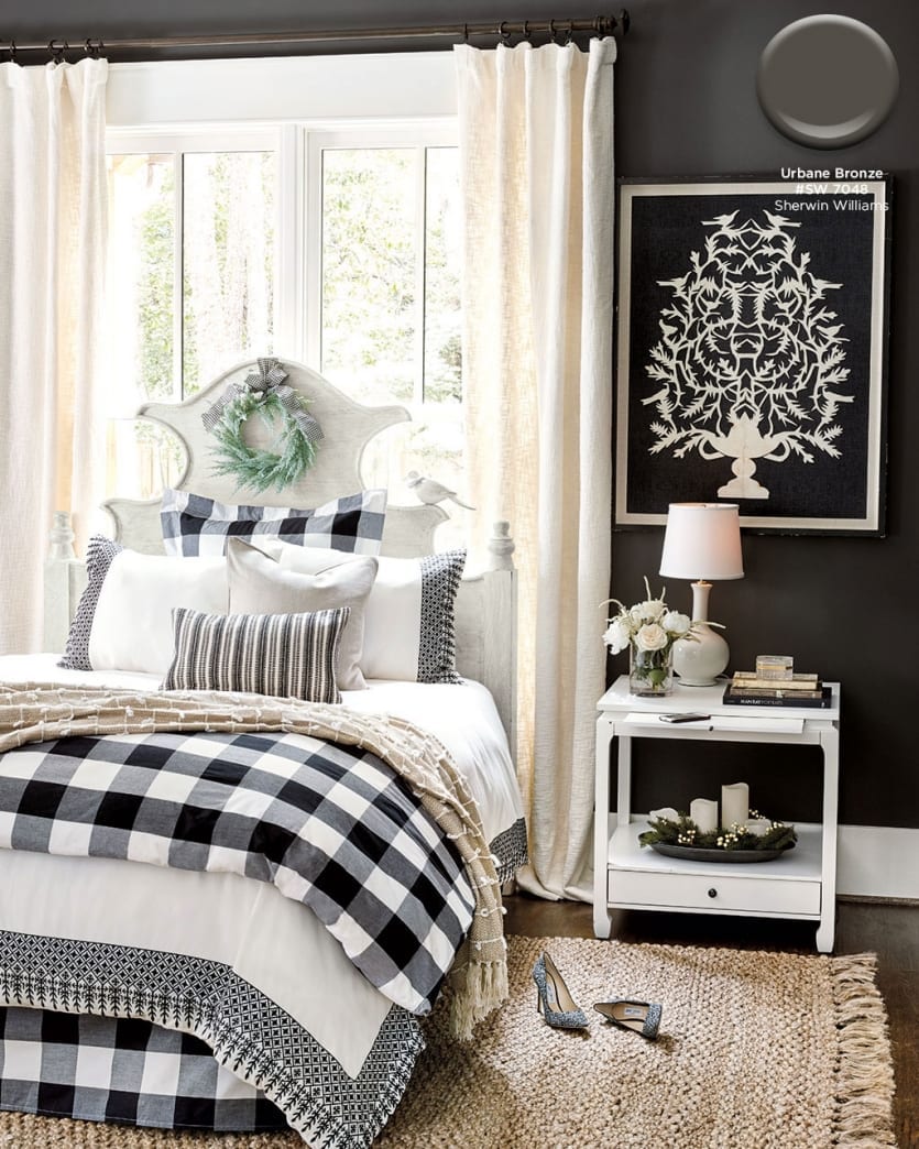
Urbane Bronze #SW 7048, Sherwin Williams
With heaping doses of white and cream, there’s no need to be scared of a deep charcoal wall color. Urban Bronze by Sherwin Williams is one of our favorites because it has a hint of brown in it — just enough to keep it from feeling to cold. It works beautifully with warm golds, creamy whites, and sandy neutrals.
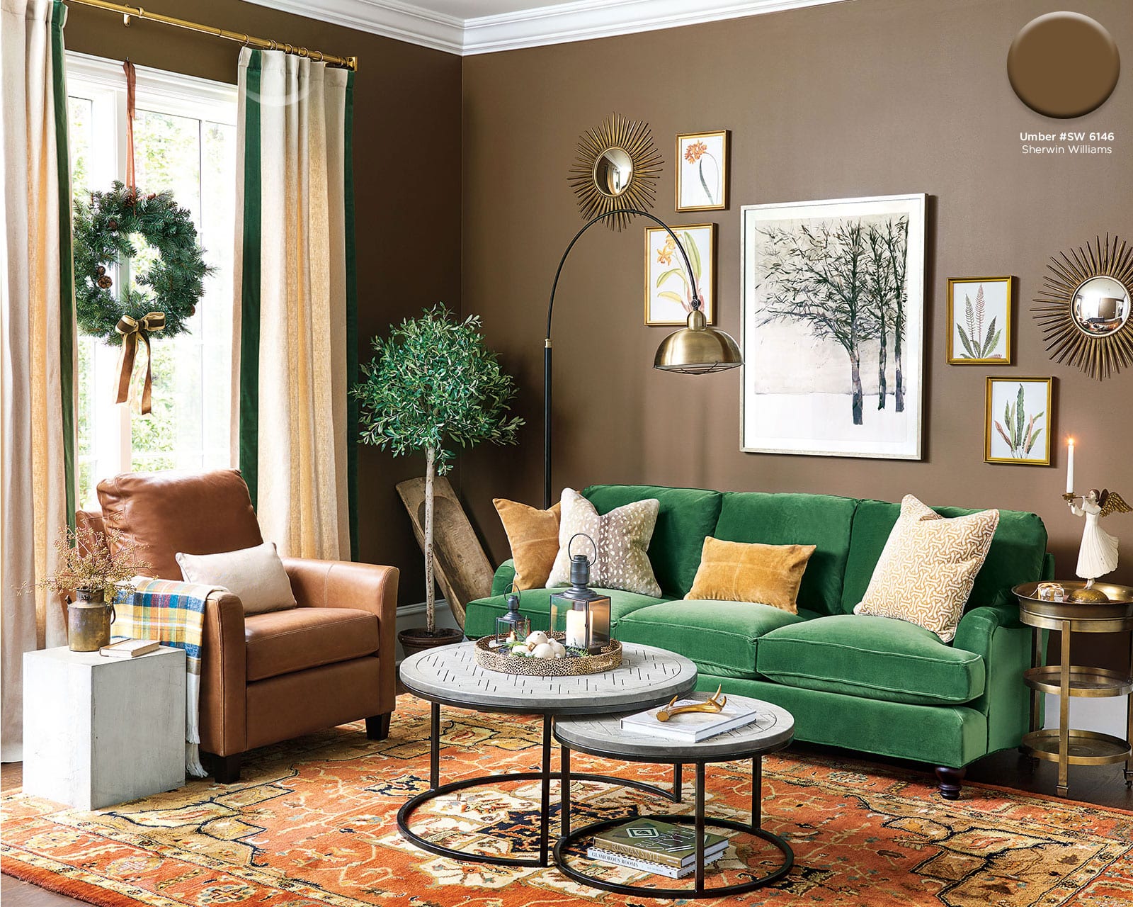
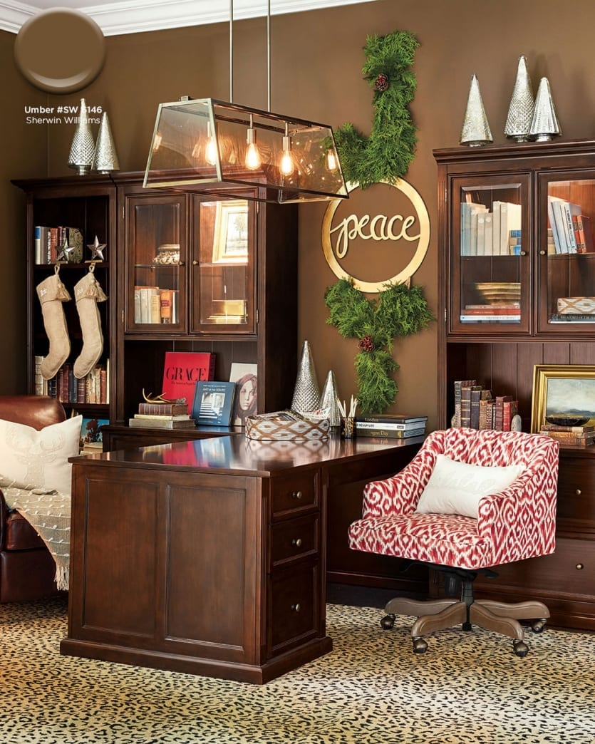
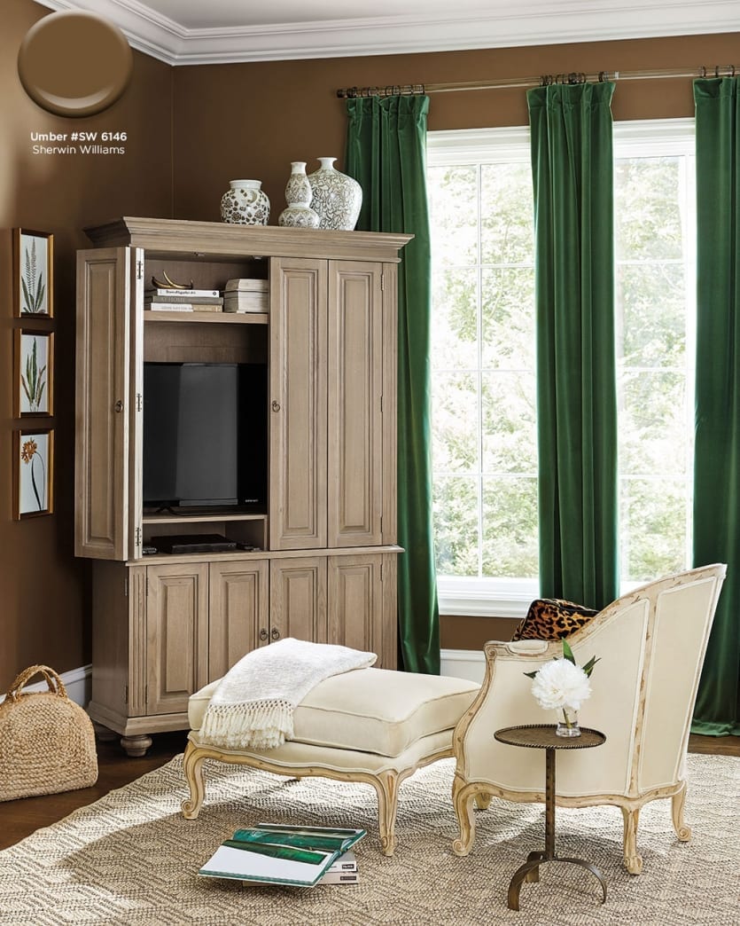
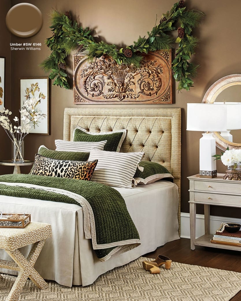
Umber #Sw 6146, Sherwin Williams
To create a seriously cozy space, we chose a deep, rich amber for the walls. Umber by Sherwin Williams complements emerald greens beautifully and picks up the rich caramel colors in our Kashan Rug.
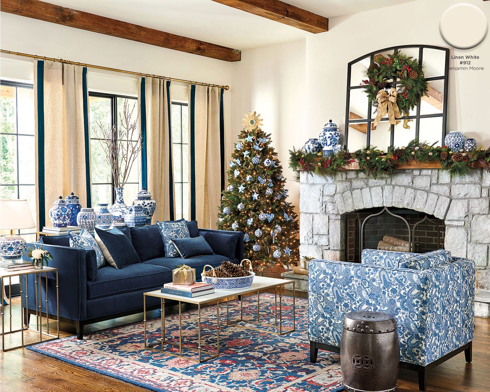
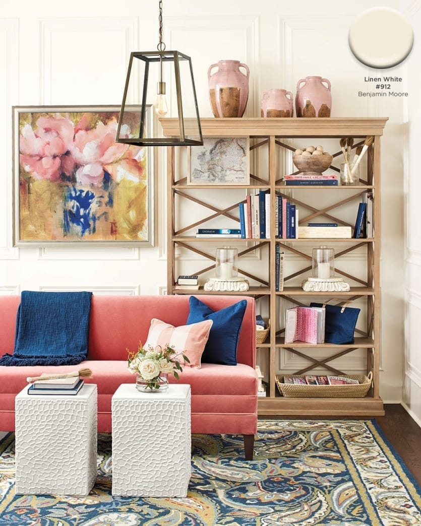
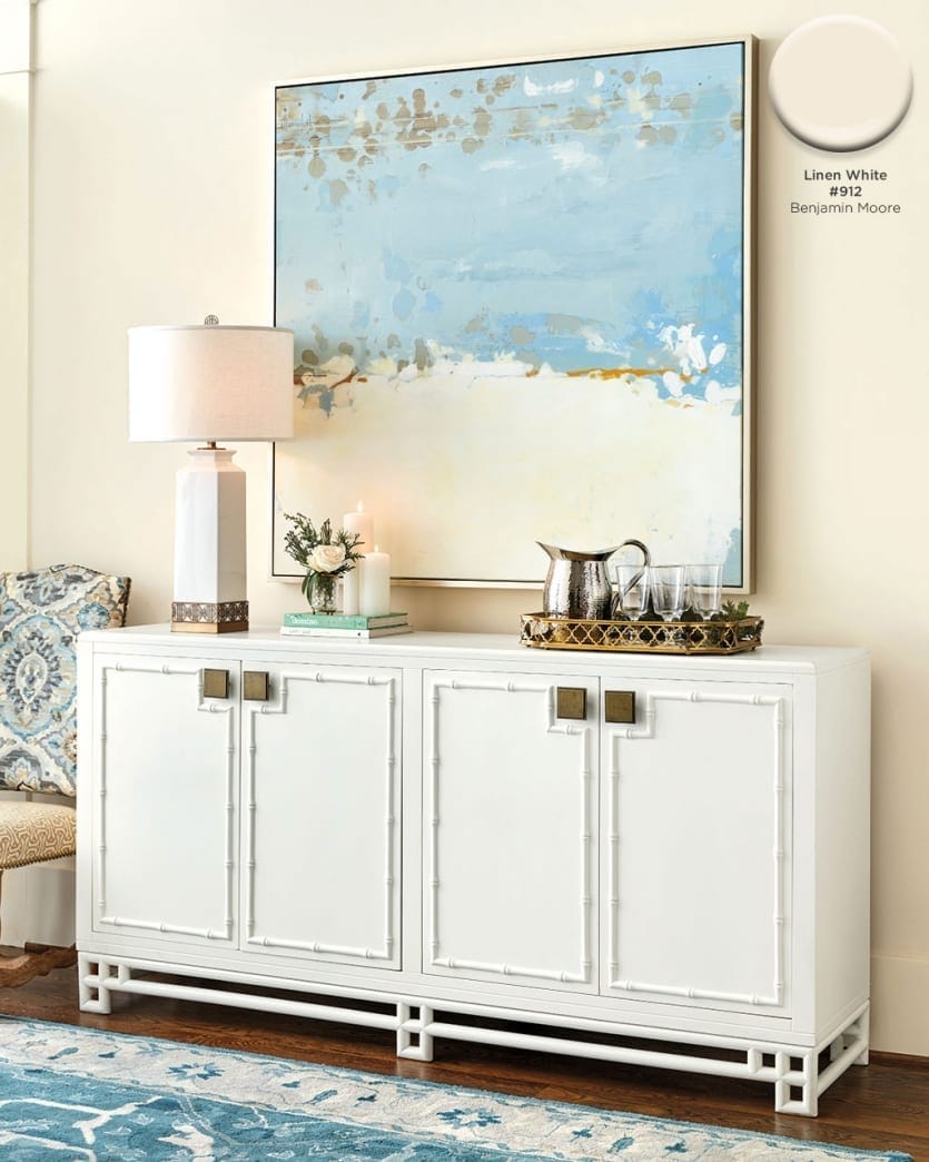
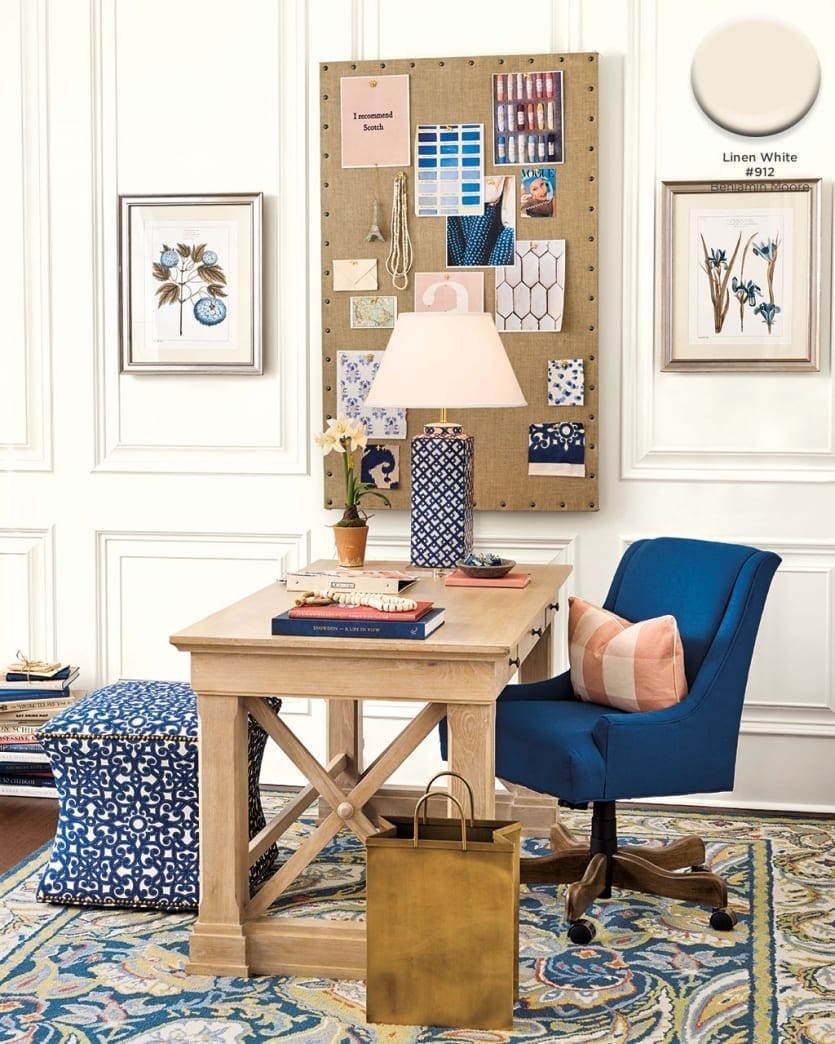
Linen White #912, Benjamin Moore
Of course not every room needs a bold wall color. Sometimes you need something more simple. Benjamin Moore’s Linen White has just the teeniest touch of warmth, giving every room the feel that it’s glowing with sunshine.
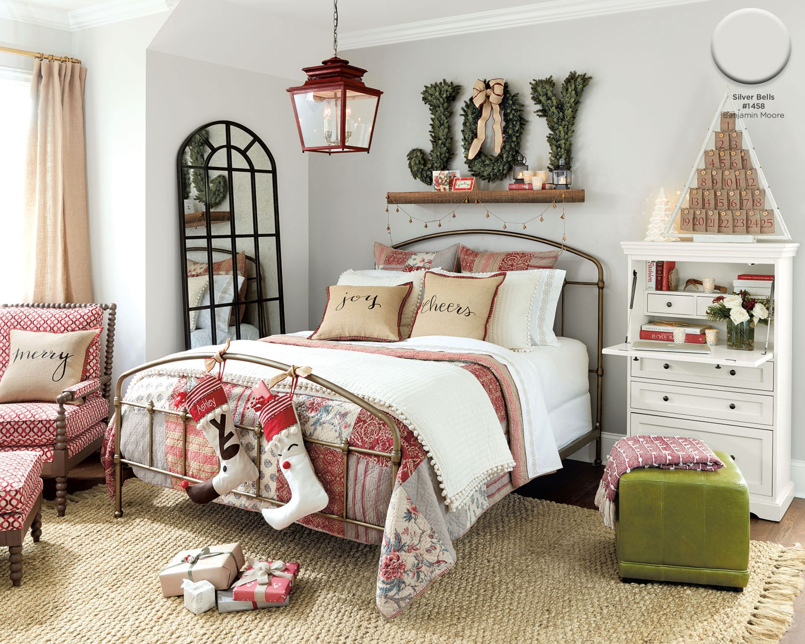
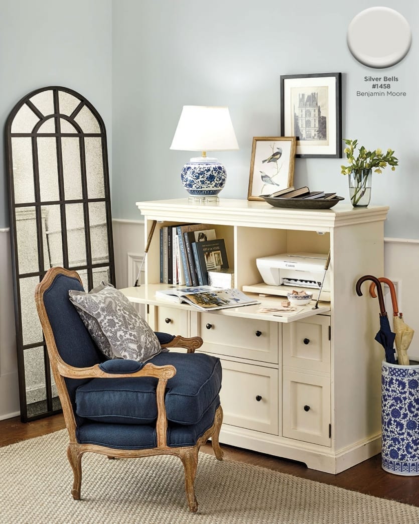
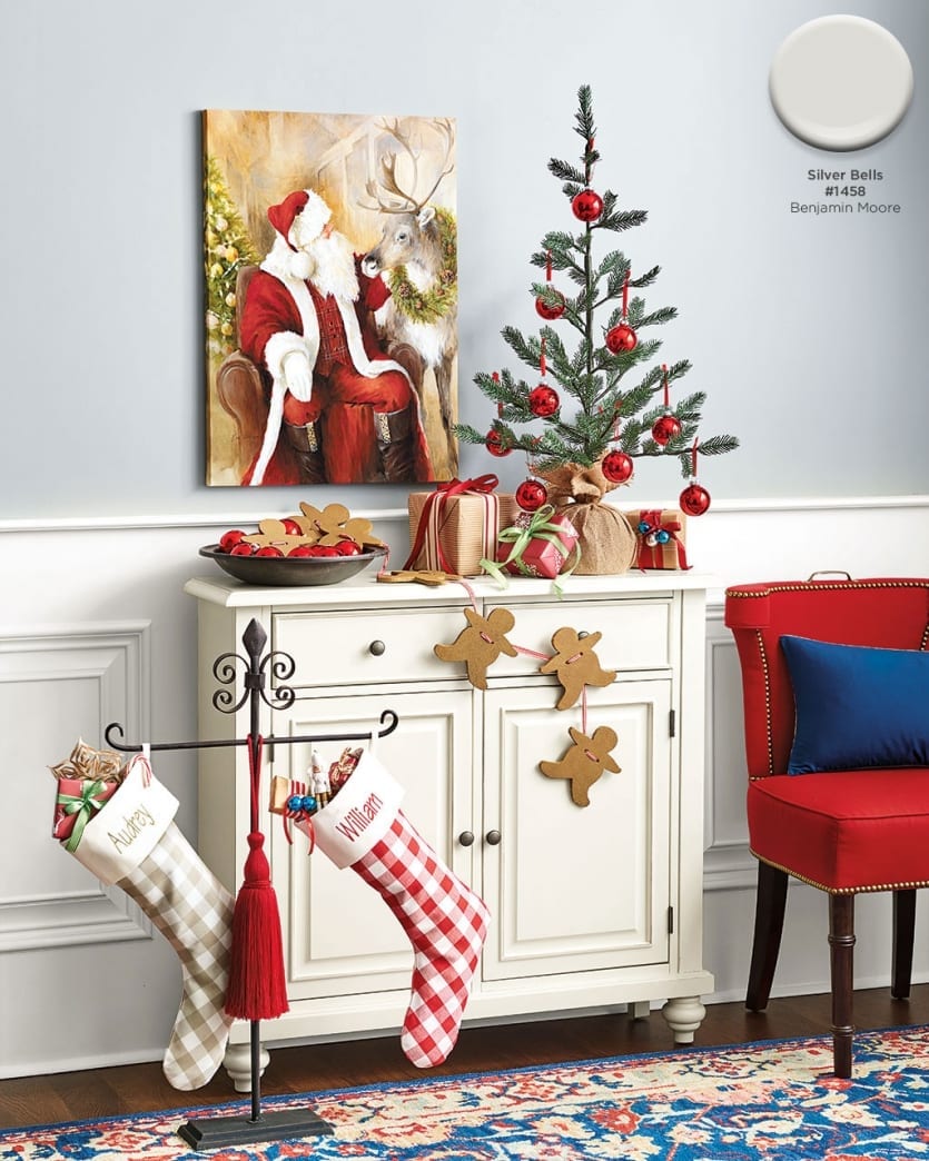
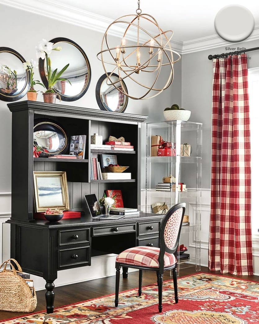
Silver Bells #1458, Benjamin Moore
To balance the strength of Christmas red, we chose Benjamin Moore’s Silver Bells — a gray with just a tiny touch of blue. White would’ve been too strong a contrast to our red accents. Gray balances out the warm tones but still creates a fresh backdrop for a room.
Find our best tips on choosing paint colors, or browse paint colors from past catalogs or decorating inspiration by visiting our Pinterest boards.
Did you like this post and find it helpful? Rate it below and share your thoughts in the comments!





Susan
I am so thankful for this article. I saw the rooms in the catalog and I immediately had to figure out the beautiful blue. Thank you! My master bedroom will be magnificent!
Sarah
I love the Tempe Star color! I’m trying to work up the courage to paint my downstairs a deep, dramatic color like that…
Caroline McDonald
Go for it! It’s just paint. You can always paint over it!