We’re always looking for design inspiration, and we know you are too. That’s why for each new season, we like to share the paint colors we used in our seasonal rooms. In this post, we’re sharing all of the colors from our Fall 2018 catalog.
Because we shoot in real homes, we’re not always at liberty to paint the walls, and in those cases, we’ve chosen paint colors that best match the wall color in the photo. Please be aware that color may vary due to various light conditions, finish and other factors. It’s always a great idea to test a paint sample on your wall first.
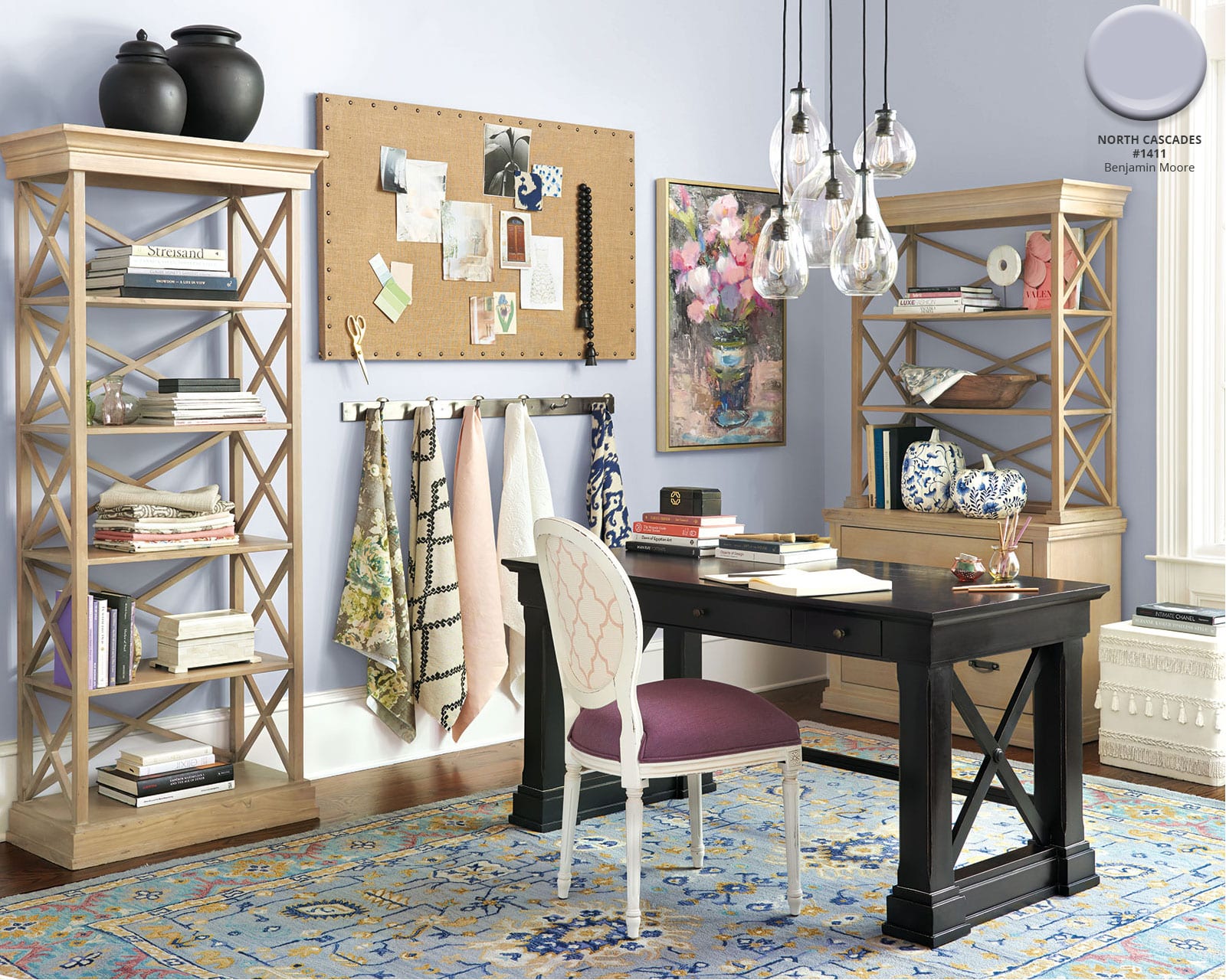
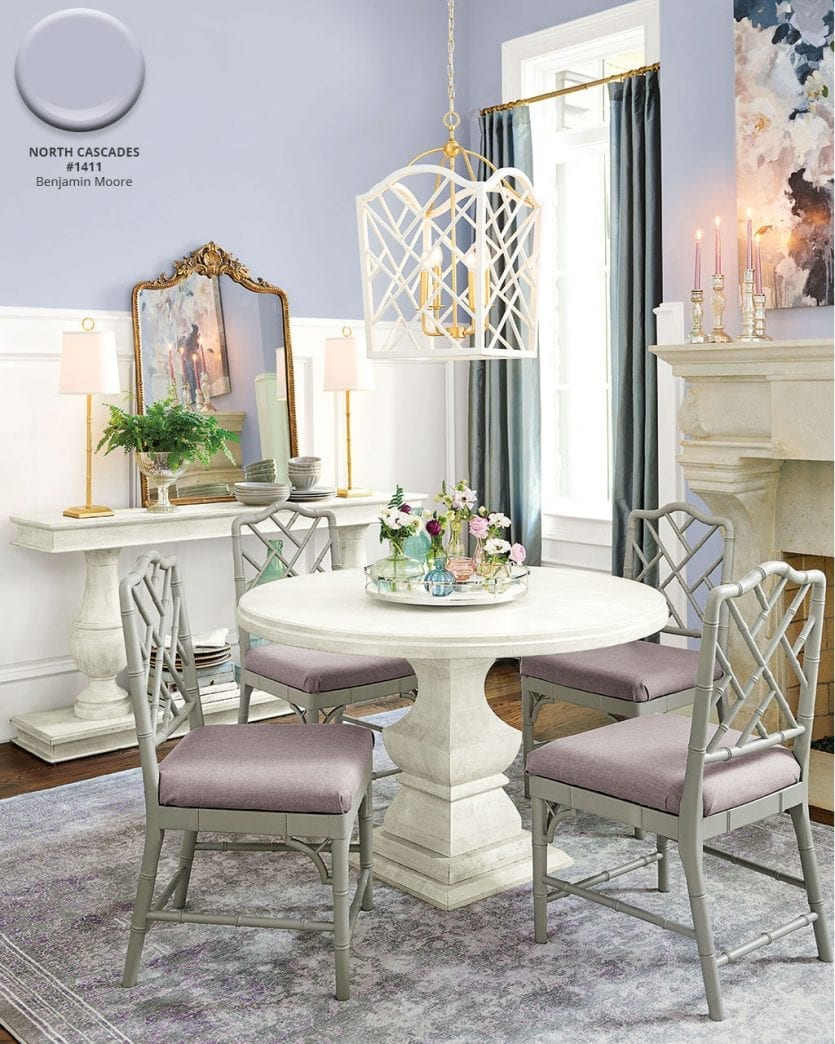
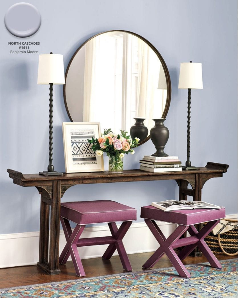
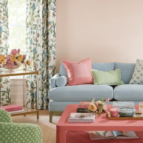
North Cascades #1411, Benjamin Moore
Soft, serene pastels set a relaxing mood and set off warm woods and grays alike. We love how unexpected light purples feel this time of year.
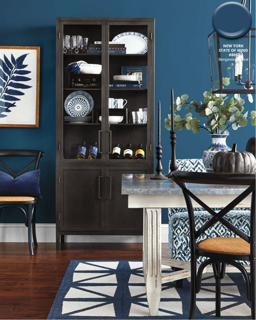
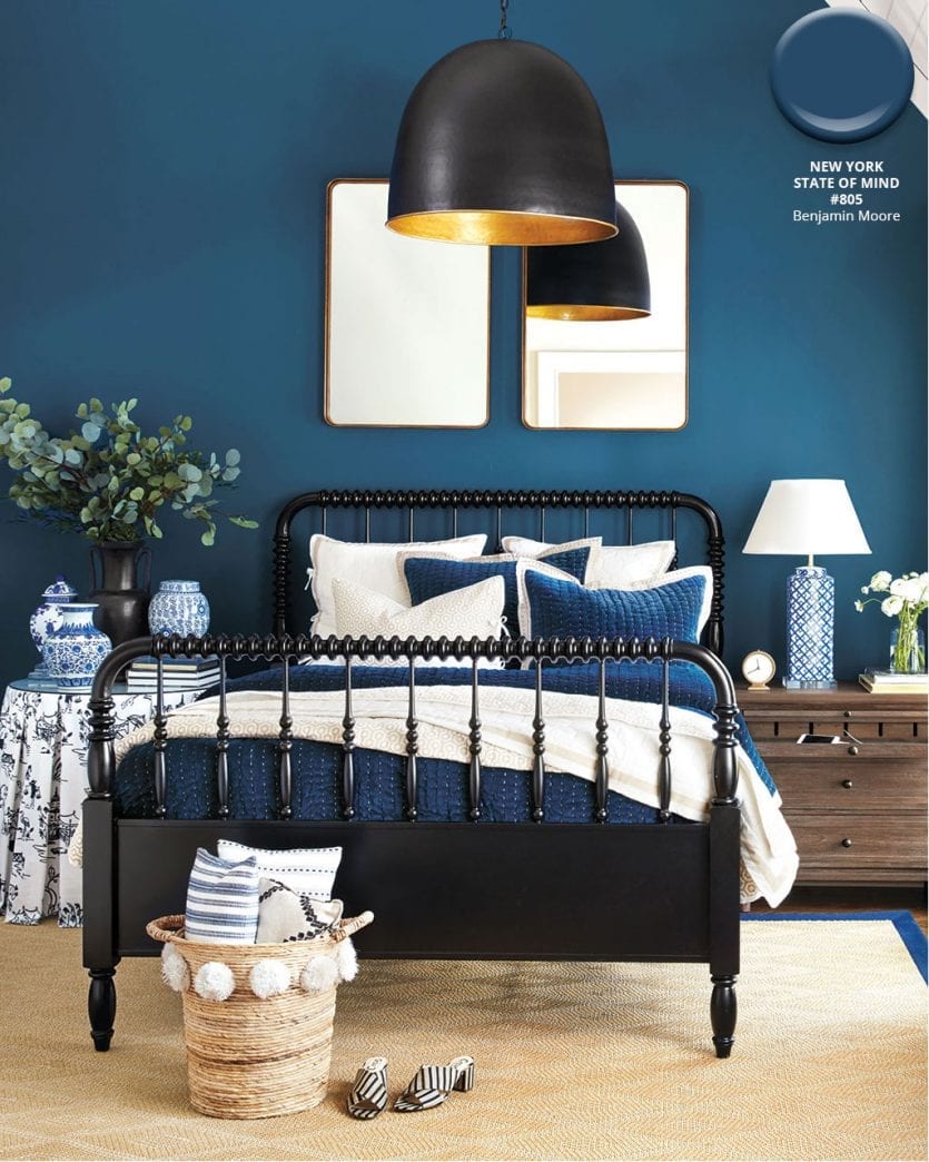
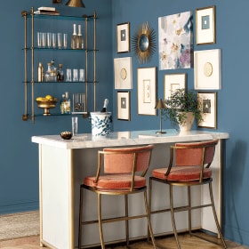
New York State of Mind #805, Benjamin Moore
A little drama never hurt anyone. For these spaces, we chose a dark and moody blue from Benjamin Moore. Bring in whites, woods, and black to complement this perfect navy.
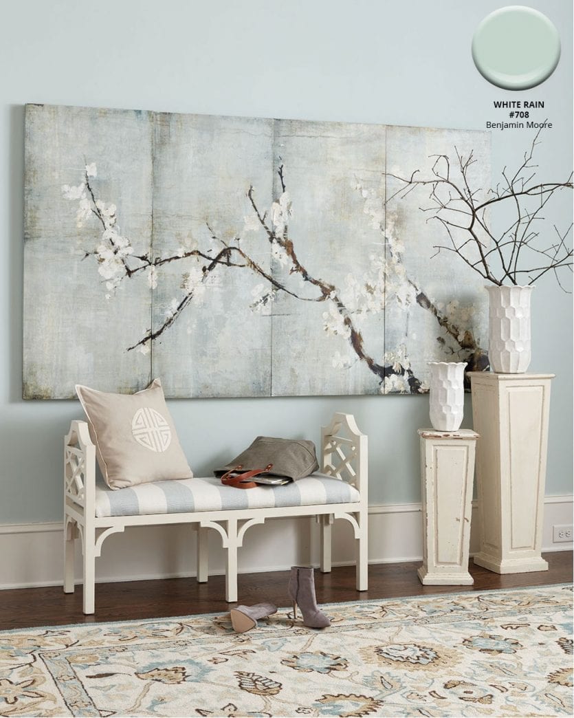
White Rain #708, Benjamin Moore
We consider spa our signature, so it’s a no-brainer to use Benjamin Moore’s White Rain on the wall of this feminine bedroom.
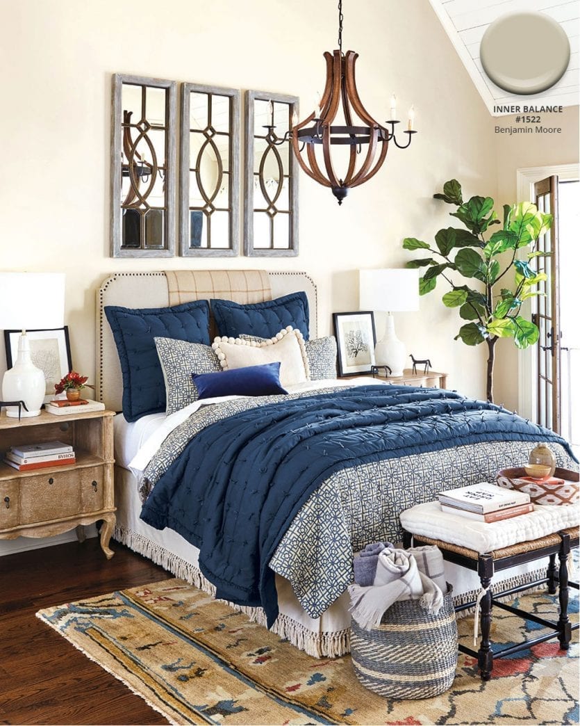
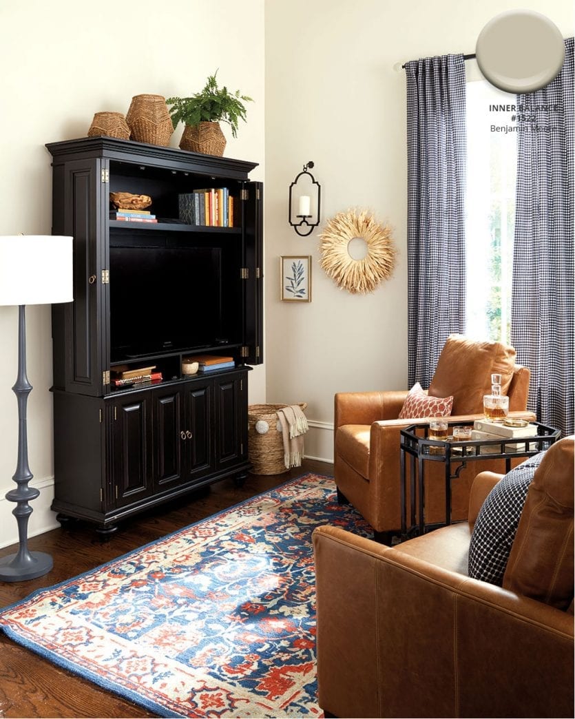
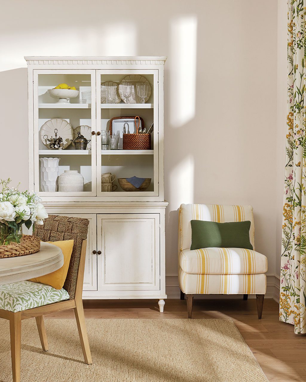
Inner Balance #1522, Benjamin Moore
For a little warmth, we chose this versatile taupe from the Benjamin Moore fan deck. Beige doesn’t have to be boring, especially when you mix in warm caramel, navy blues, and tons of texture.
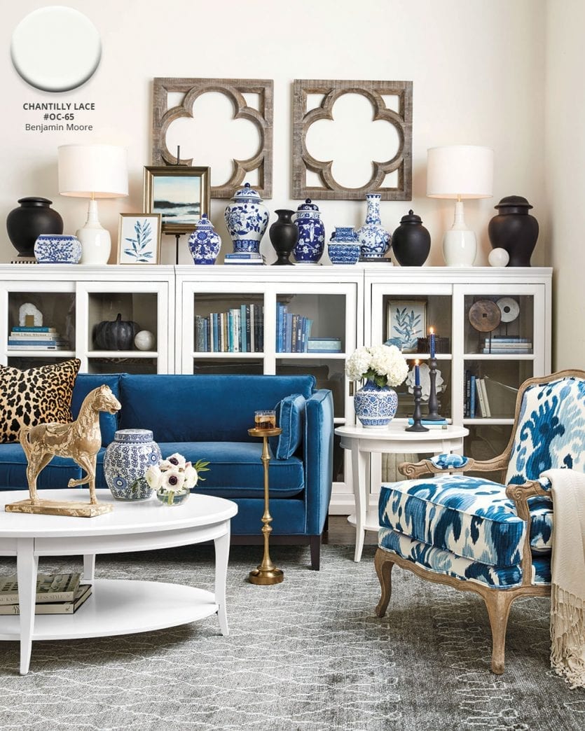
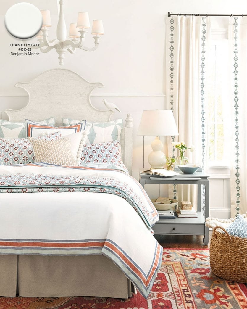
Chantilly Lace #OC-65, Benjamin Moore
For a crisp background, we love using Benjamin Moore’s Chantilly Lace which has the smallest touch of yellow so it never looks cold or gray.
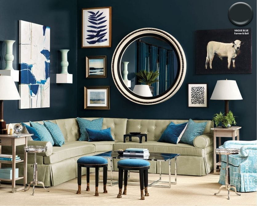
Hague Blue, Farrow & Ball
In this rich living room, designer Miles Redd chose Farrow & Ball’s Hague Blue which has a touch of green. We love the way it blends dark teals and sea greens.
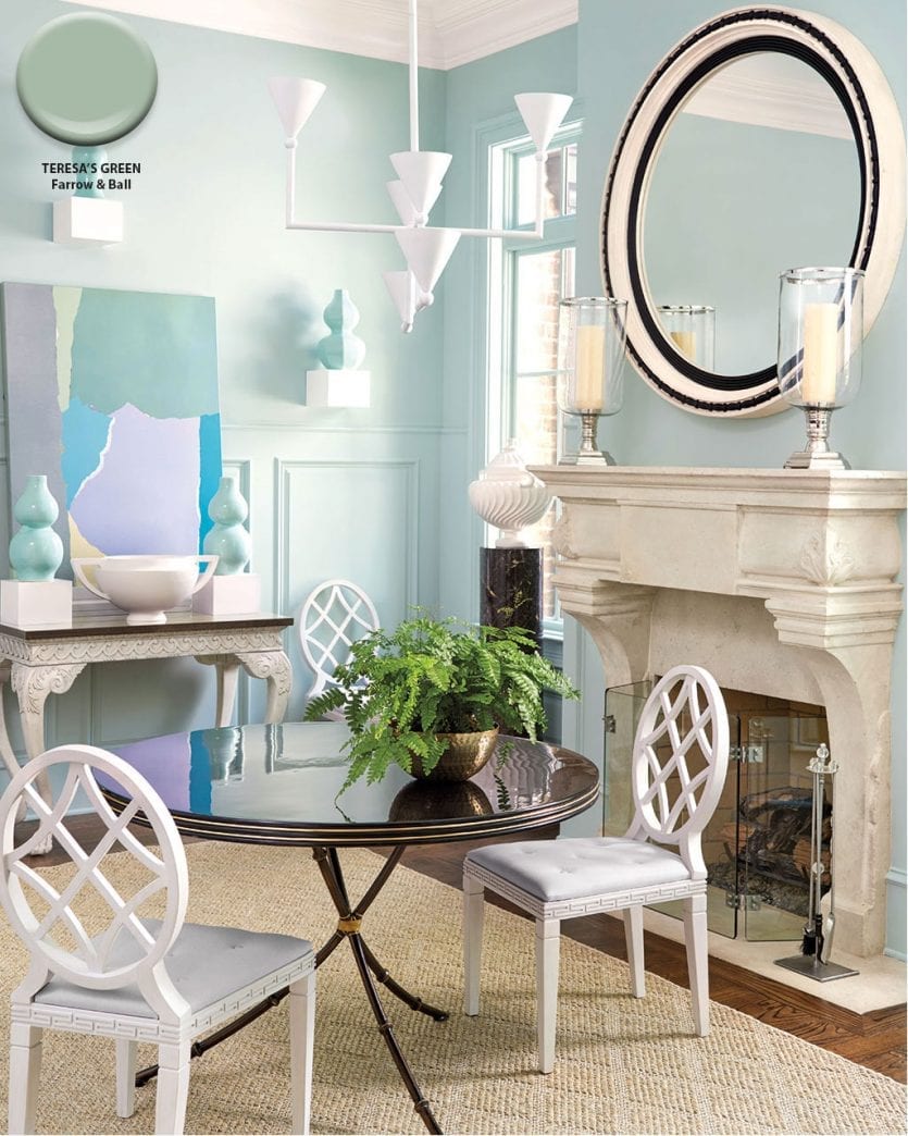
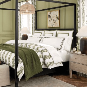
Teresa’s Green, Farrow & Ball
While the walls may feel soft and serene in light aqua, the dramatic elements in this dining room designed by Miles Redd bring the drama.
Find our best tips on choosing paint colors, or browse paint colors from past catalogs or decorating inspiration by visiting our Pinterest boards.
Did you like this post and find it helpful? Share your thoughts in the comments!




Tracye Brandt
Hi Caroline! I am redecorating my home office and love the feel of the the space on page 54 of the September 2018 catalog. Is the paint color used also Benjamin Moore, North Cascades #1411 or a different one? It looks a little more saturated, but it could just be the lighting effect. Thanks!
Caroline McDonald
Hi Tracye,
No, this paint color isn’t North Cascades. This is actually the wall color in a home we shot in. I do not know the color because we didn’t pick it. I’m so sorry! I’d suggest taking our catalog to the paint store and having the guys match it.
Best of luck!
Debbie
Which warm grays do you use from Benjamin Moore.
I saw one online in a bedroom from Ballard but it didn’t say which catalog it was from. It has a couple gold sunbursts above the headboard.
Heather Daly
Hi Debbie,
We love Benjamin Moore Stone Hearth #CC-490, Storm #AF-700, Herbal Escape #1487 for warmer gray options.
Debbie Miller
I would love to get your catalogs for each season if possible. I don’t now and would love to not have to request one for each new catalog. Thank ;you
21178 SE Foster rd
Damascus,Or
97089
Heather Daly
Hi Debbie,
You can sign up to receive catalogs by filling out this form.
https://www.ballarddesigns.com/RequestACatalogView?storeId=10052&catalogId=10551&langId=-1
Cynthia Priola
Please come to Las Vegas we need you and were growing !! Love your eye for color pattern texture it all comes to gather beautiful .
Virginia Tutza
August 2018 catalogue. What color paint is on the walls on page 69 and page 70.
My home has an Open floor plan. Living room has Ballard Marchesa rug 8×10 family room and dining room each have Ballard Tabitha rug 8×10. Wall color on page 70 looks like it will work with all 3 rooms.
Thank you in advance for a response.
Caroline McDonald
Virginia,
The color is Benjamin Moore’s Inner Balance. I definitely think it’ll work with both the Tabitha and Marchesa rugs. Those pair so well together! Glad you liked these spaces.
Happy decorating,
Caroline