
We’re always looking for design inspiration, and we know you are too. That’s why for each new season, we like to share the paint colors we used in our seasonal rooms. In this post, we’re sharing all of the colors from our Holiday 2018 catalog.
Because we shoot in real homes, we’re not always at liberty to paint the walls, and in those cases, we’ve chosen paint colors that best match the wall color in the photo. Please be aware that color may vary due to various light conditions, finish and other factors. It’s always a great idea to test a paint sample on your wall first.
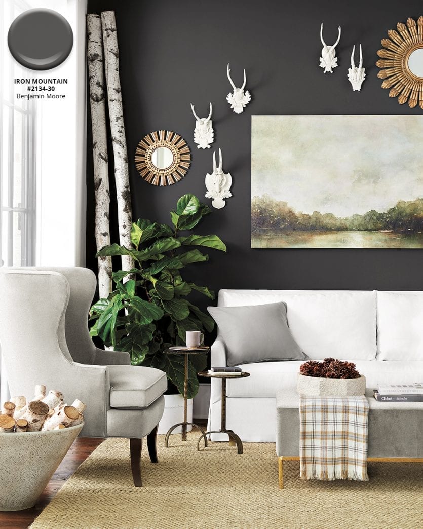
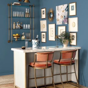
Benjamin Moore’s Iron Mountain #2134-30
Every room needs a little drama, and a high impact paint color is the perfect way to add a power statement to your space. Benjamin Moore’s Iron Mountain is a rich charcoal with just a touch of warmth. It works beautifully with warm woods, sandy natural fiber rugs, crisp whites, and of course the whole gradient of grays. Nearly any neutral you can dream up will work beautifully with this intense shade.
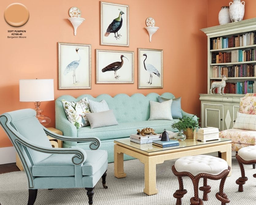
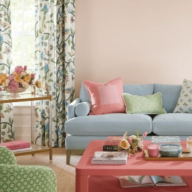
Benjamin Moore’s Soft Pumpkin #2166-40
Bunny Williams is known for her classic rooms, and she’s certainly not afraid of color as evidenced by this living room she designed for our Holiday 2018 catalog. Benjamin Moore’s Soft Pumpkin is the backdrop for soft blue upholstery, and we love the way it complements her raffia coffee and side tables.
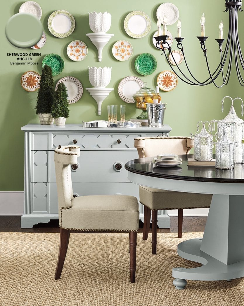
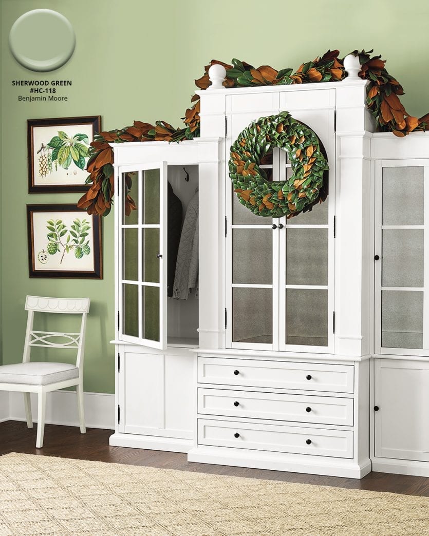
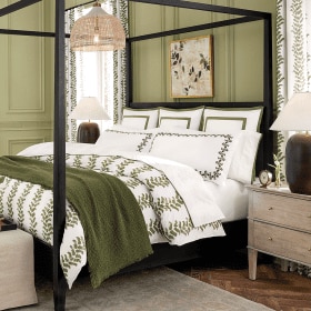
Benjamin Moore’s Sherwood Green HC-118
From the historic collection, Benjamin Moore’s Sherwood Green beautifully complements Bunny Williams’ Manor House dining collection. The soft sage color was inspired by the watercolor design of her Melange Dinnerware. We love how the wall color creates the perfect canvas to hang plates on the wall.
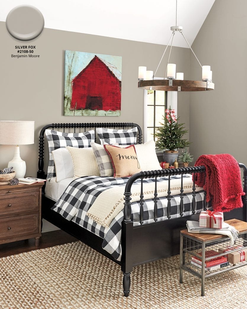
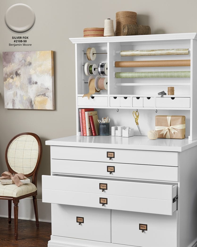
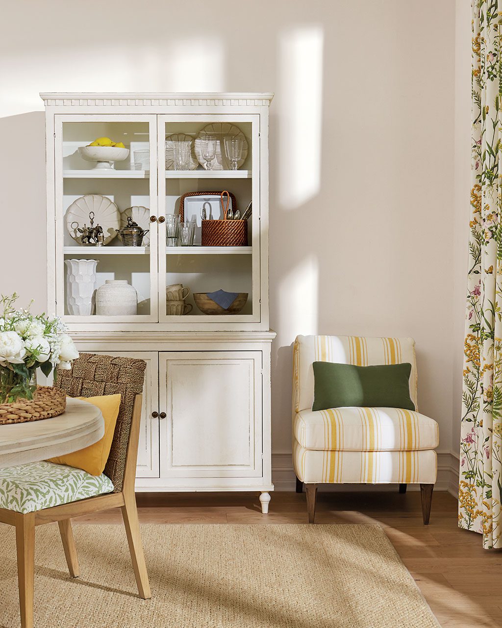
Benjamin Moore’s Silver Fox#2108-50
We love a good neutral, and that’s just what Benjamin Moore’s Silver Fox brings to these two rooms. It’s a little bit gray and a little bit beige — the perfect in between when mixing lots of finishes in one space.
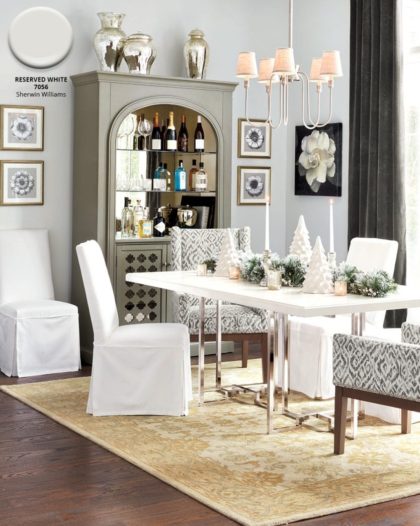
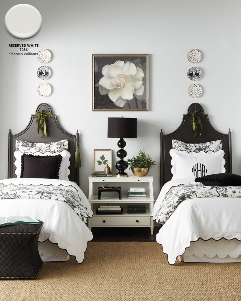
Sherwin Williams’ Reserved White #7056
Sometimes you just want a clean wall color that doesn’t draw attention to itself, especially when decorating with high impact black and white. Here, we chose Sherwin Williams’ Reserved White, a cool white wall color that doesn’t go creamy when paired with ultra white fabrics.
Find our best tips on choosing paint colors, or browse paint colors from past catalogs or decorating inspiration by visiting our Pinterest boards.
Did you like this post and find it helpful? Share your thoughts in the comments!




JEAN VICINO
YOU HAVE THE MOST BEAUTIFUL THINGS I WISH I COULD AFFORD TO BUY EVERYTHING. I AM PAINTING MY LIVING ROOM NOW AND GOT SO MANY GOOD IDEAS. I LOVE WHITE AND LIKE TO KEEP MY WHOLE HOSE THAT COLOR SO I CHANGE CHANGE DECORATION. GOT SOME AWESOM IDEAS THANK YOU