With the start of a new year, it’s fun to experiment with colors and introduce fresh new palettes that reinvigorate our decor. For our Winter 2019 rooms, we choose a few bold wall colors and a few subtle ones, each playing up various elements we can’t wait to share with you this year.
Because we shoot in real homes, we’re not always at liberty to paint the walls, and in those cases, we’ve chosen paint colors that best match the wall color in the photo. Please be aware that color may vary due to various light conditions, finish and other factors. It’s always a great idea to test a paint sample on your wall first.
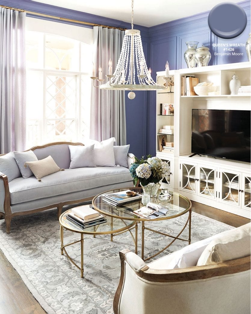
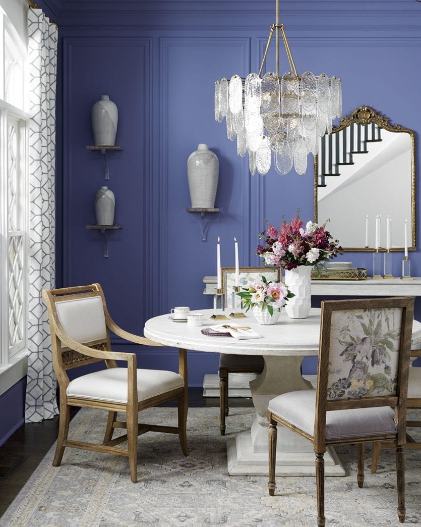
Benjamin Moore’s Queen’s Wreath #1426
We haven’t seen much purple in the design world the last few years, which is exactly why we wanted to experiment with this often overlooked hue. With grays, tans, and metallics, Benjamin Moore’s vibrant Queen’s Wreath turns an otherwise simple space into a triumphant focal point.
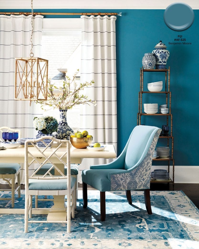
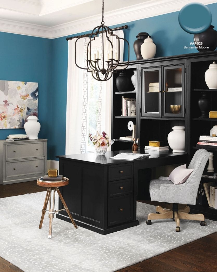
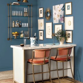
Benjamin Moore’s Fiji #AF-525
Blue is a powerful color, and one we almost never tire of. We love how Benjamin Moore’s Fiji is a cross between teal and sapphire, making it a bold backdrop for all of our favorite blue tones — navy, spa, and cornflower.
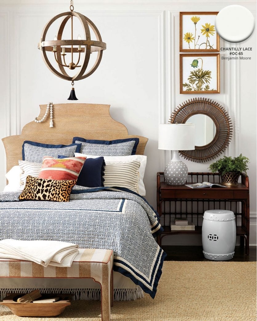
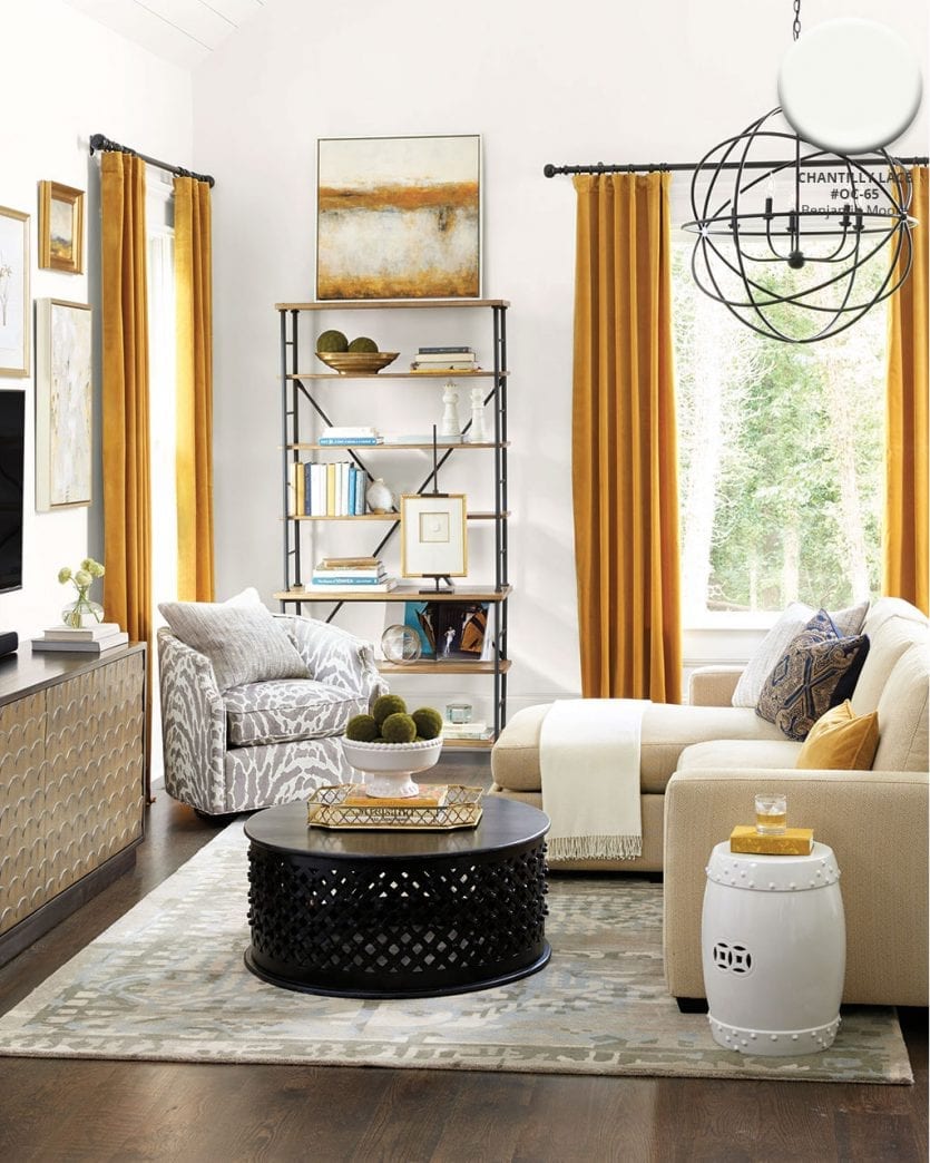
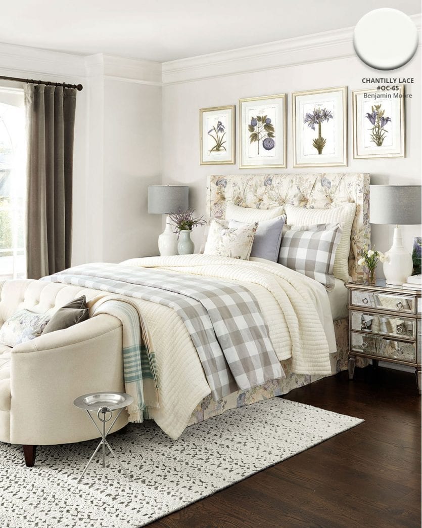
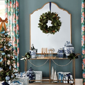
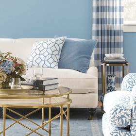
Benjamin Moore’s Chantilly Lace #OC-65
Of course every room in your house can’t be dramatic. Sometimes you want your wall to just be a backdrop for beautiful accents rather than a statement. For the spaces above we chose Benjamin Moore’s Chantilly Lace which is a crisp, clean backdrop for neutrals that could feel dingy against a warmer white.
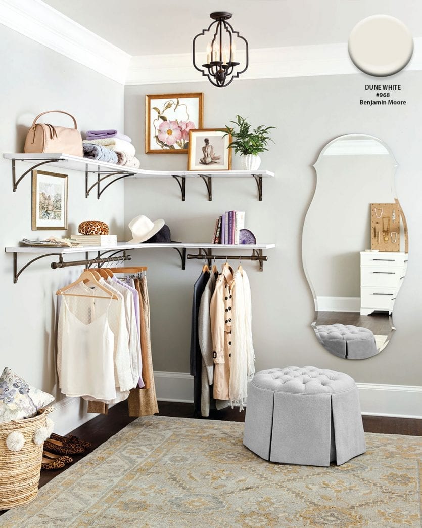
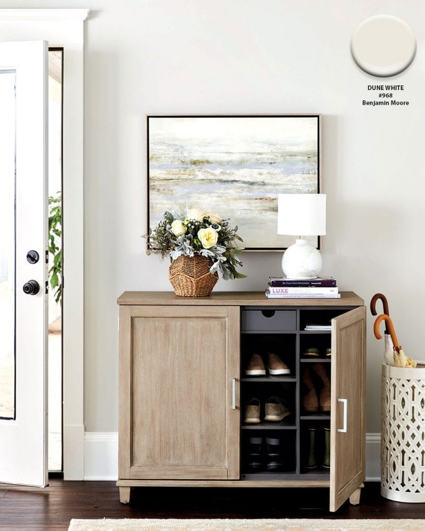
Benjamin Moore’s Dune White #968
Neutrals can be tricky because they either feel too cold or too warm. Dune White is a gorgeous, barely-there greige that blends all of our favorite neutrals together. It’s kind of like the goldilocks of neutral paint colors!
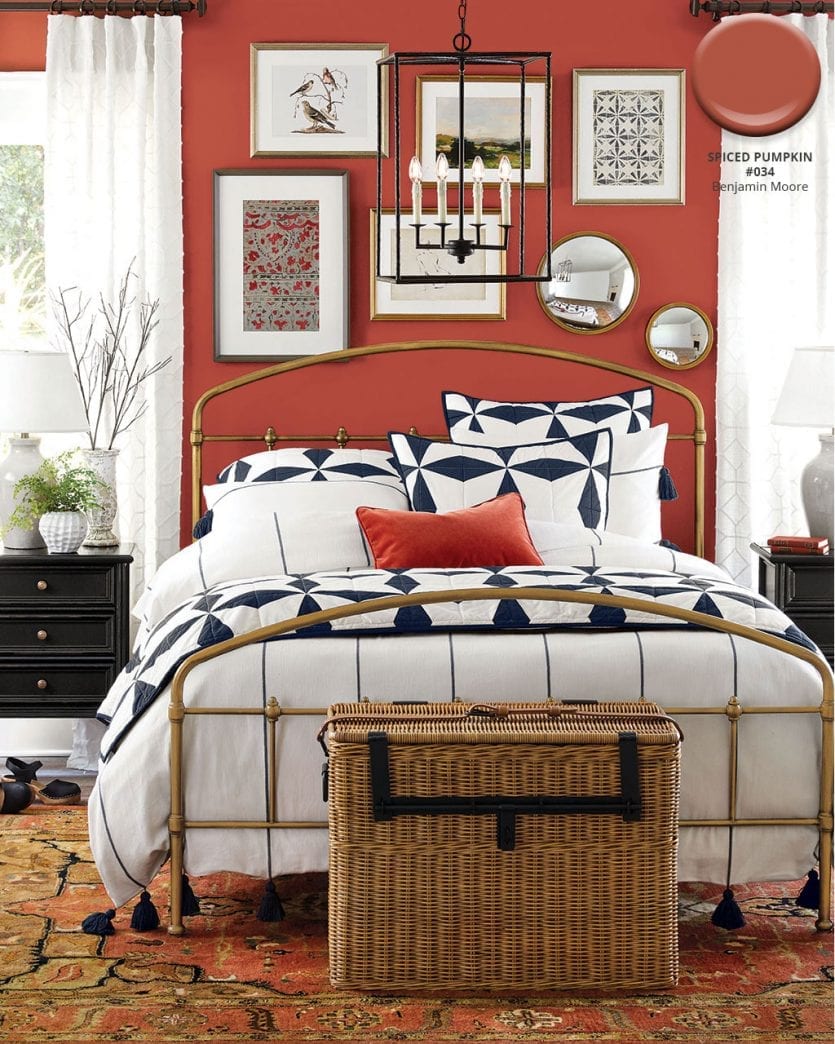
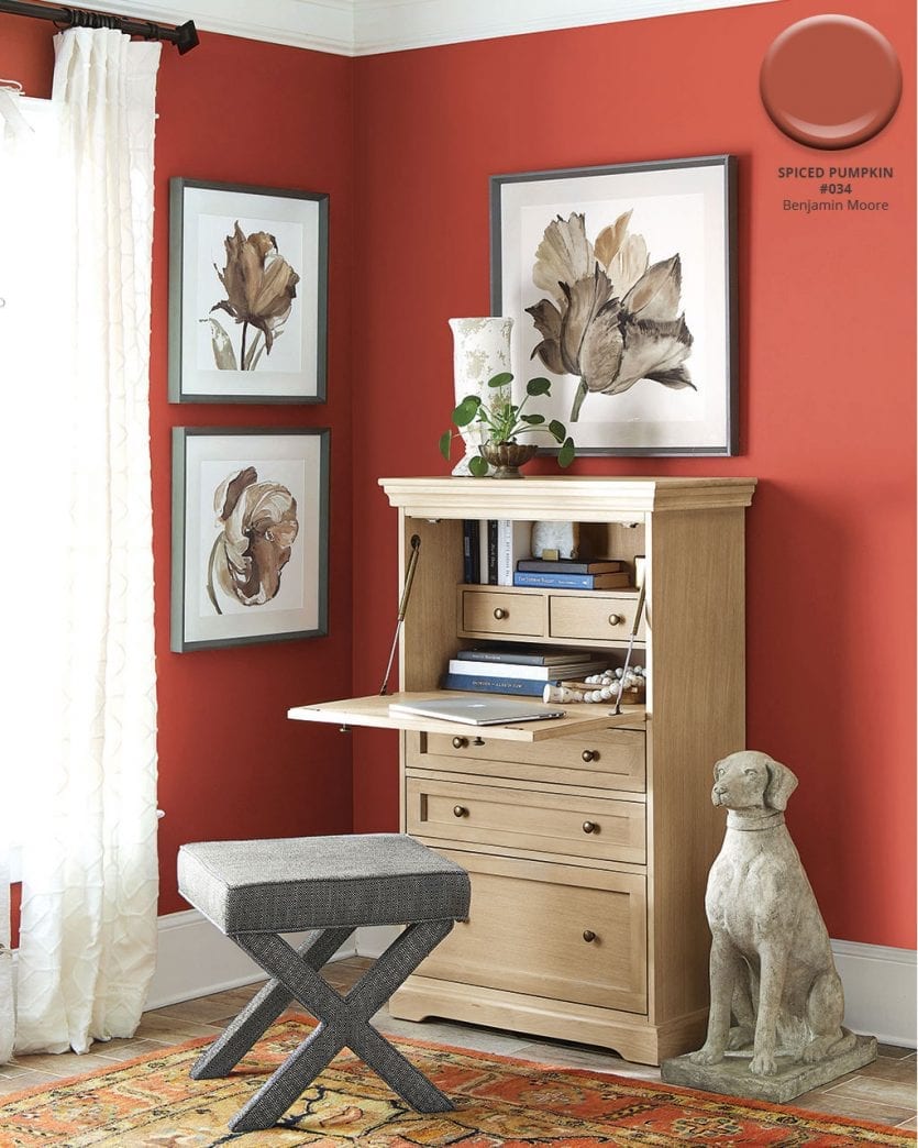
Benjamin Moore’s Spiced Pumpkin #034
Rooms that get a lot of natural light can carry a dark paint color, so we didn’t hesitate to use Benjamin Moore’s Spiced Pumpkin to inject personality into these spaces. Playing off the spice color of our favorite rugs, a warm red-orange sets off navy, gold, and crisp white linens.
Benjamin Moore’s Violet Mist #1437
For a little sweetness, we pulled the lightest shade of lilac from our Oceans Flower Art as a subtle backdrop to feminine details and metallics. Lavender has a lot of gray in it which makes it an easier than you’d expect to work into a room. In some lights, it may look more gray, and in some it may feel more purple. That’s part of the fun!
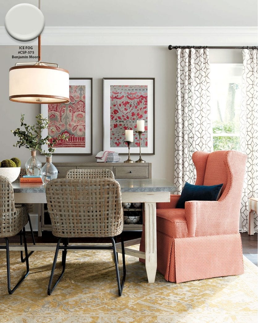
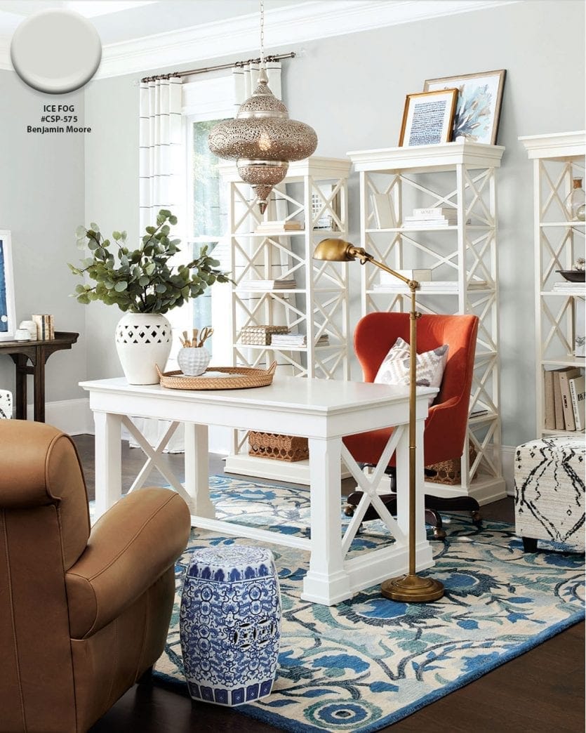
Benjamin Moore’s Ice Fog CSP-575
A soft gray is so versatile, and our most recent favorite is Benjamin Moore’s Ice Fog. We love the way it works with orange and navy, leather accents, and crisp white furniture. We especially love this icy shade in a room that gets lots of natural light, so it won’t feel too cold.
Find our best tips on choosing paint colors, or browse paint colors from past catalogs or decorating inspiration by visiting our Pinterest boards.
Did you like this post and find it helpful? Share your thoughts in the comments!


