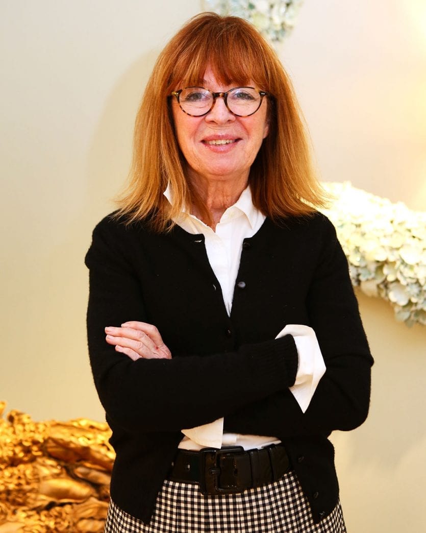
On the first day of the year, we thought it apropos to talk about 2019 color trends, so of course, we went straight to the source – Benjamin Moore’s Ellen O’Neill. As the Director of Strategic Design Intelligence, Ellen and her team pick the color of the year. Naturally we had to get the lowdown on how the color is picked, why they chose this year’s color, how paint is named, and many more of your top paint and color questions.
 What You’ll Hear on This Show:
- Ellen talks through how they pick the color of the year, including what she calls ‘color embeds’ or when her first hints of what trending colors are
- What type of influences there are in picking the color of the year
- Ellen’s ‘personal palette’ and why she is drawn to it
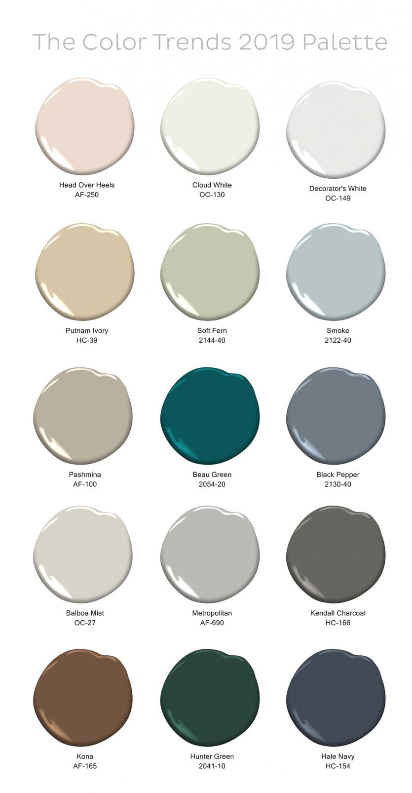
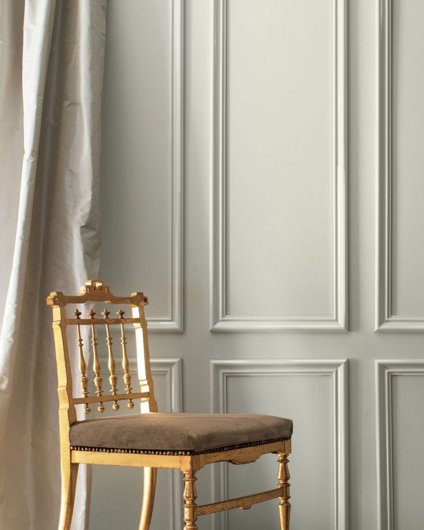
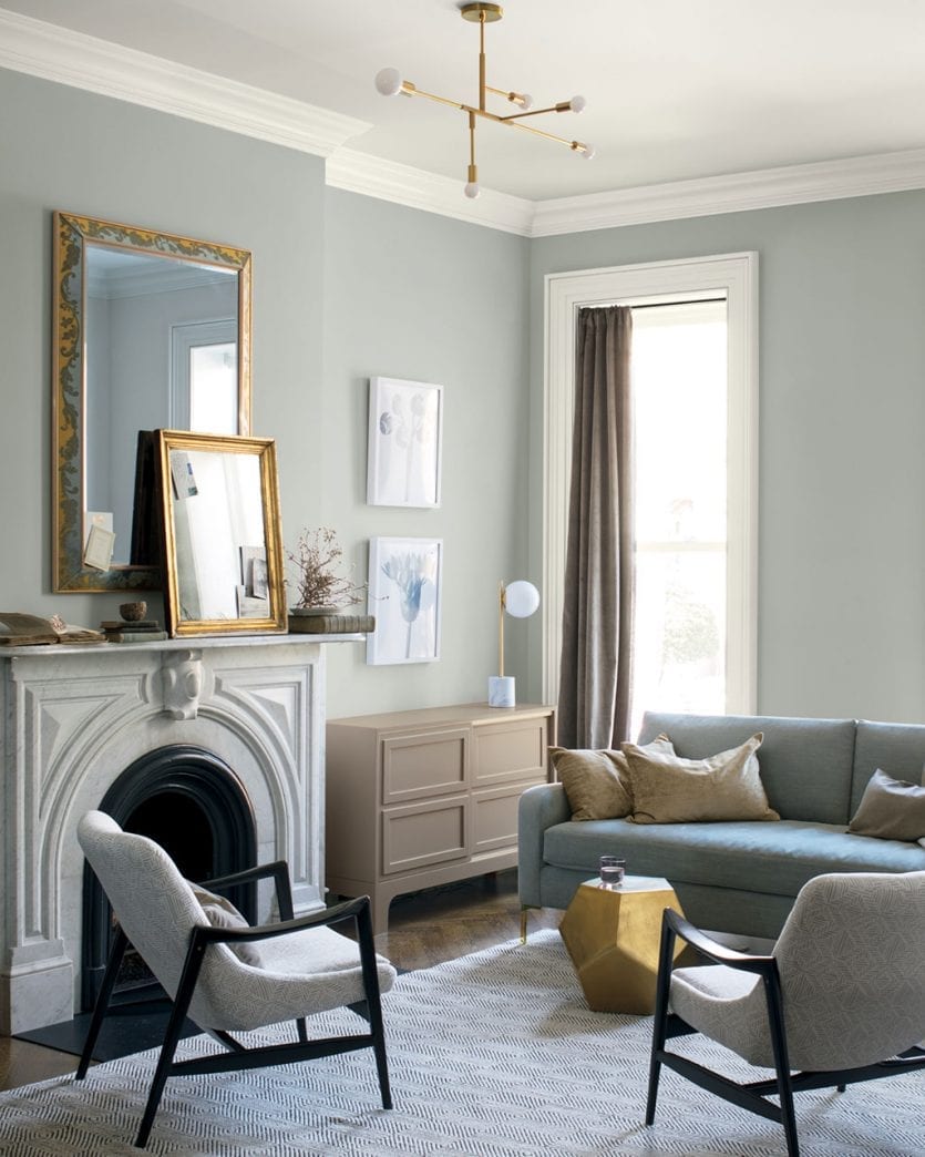
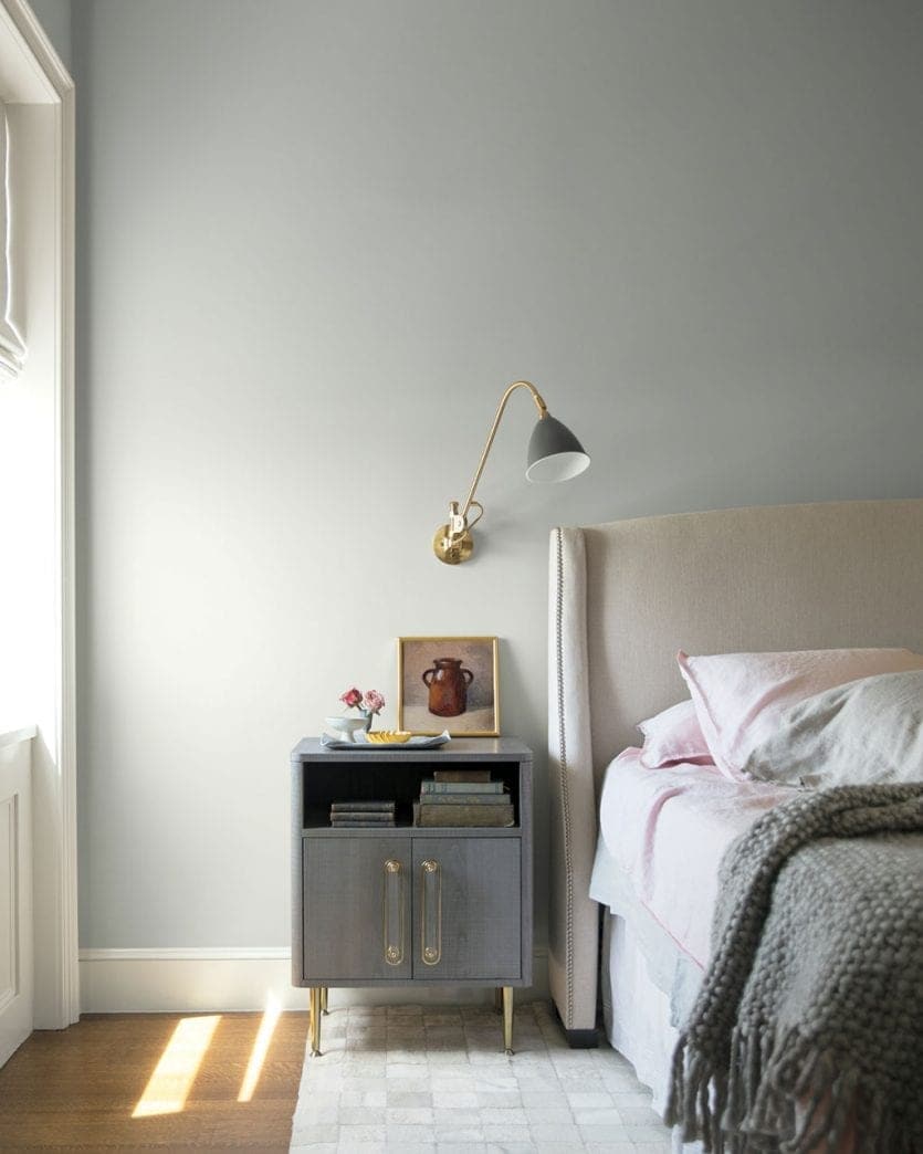
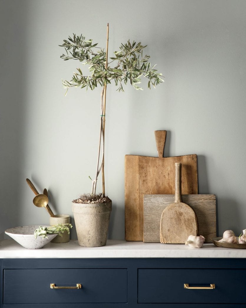
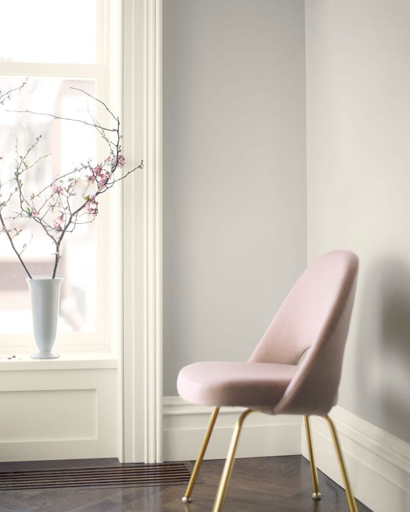
- We talk about this year’s Color of the Year — Metropolitan AF-690
- What makes Metropolitan special, why it’s the color of the year, and why we should love this hue
- Color naming — how the name of a paint color factors into whether it becomes the color of the year, as well as the complications of naming colors in general
- What is a ‘chip pull’ and how it changes once the color of the year is announced
- What the word ‘metamaric’ means and why that makes matching colors tricky
- Why Benjamin Moore hasn’t added any new colors in a number of years
- Whether you’ll get the same quality and color of paint if you have another paint company color match a Benjamin Moore color
- Ellen shares with us the top 10 grays in Benjamin Moore’s catalog
- The secrecy involved in the Color of Year
- We talk about the timeline — when they pick the next year’s Color of the Year
- Ellen’s background and how one starts to work in color
- How to get started picking a paint color for your space
Decorating Dilemmas
Hi Ladies,
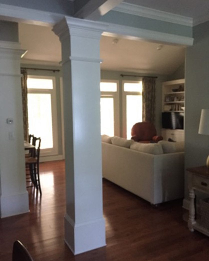
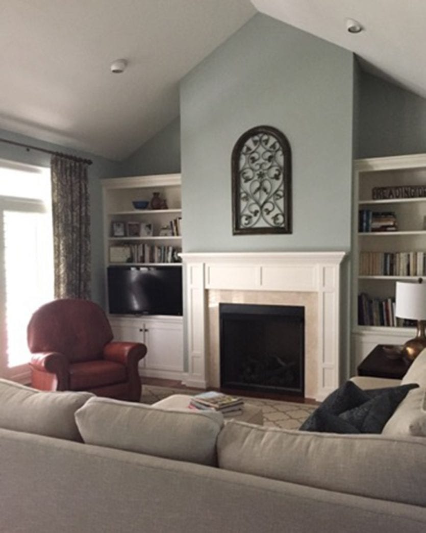
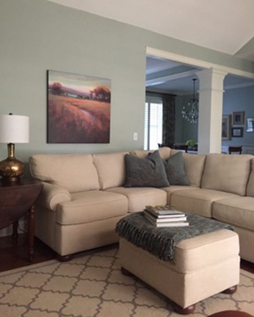
I am so hooked on your podcast! I have a decorating dilemma but it seems so multifaceted, I hardly know where to start. We built our home 13 yrs ago and I have had to decorate in stages. It is now time to repaint, and though I still like the color (SW Comfort gray), I would like to have a fresher look. I would love to be able to start with a clean slate, however; I can’t afford to do that at this point, so I need advice on how to make the most impact for the investment while hopefully not tying myself more tightly to existing pieces that will be replaced at some point.
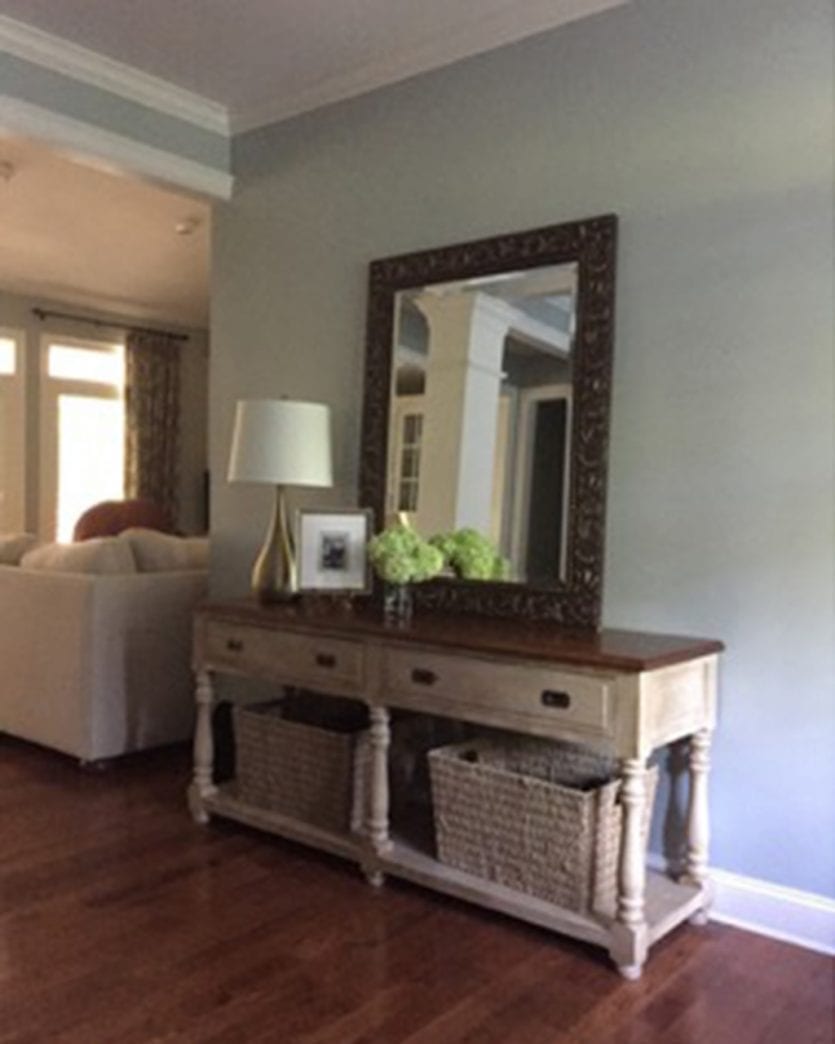
I am having trouble finding a paint color that works well with the drapes. The neutrals that work with my drapes highlight the somewhat dingy upholstery on the sofa. The sofa is still structually great, so its hard to justify the money for a new one at this point, but that would certainly make this project easier. The drapes and plantation shutters are only five years old and I cant afford to replace the drapes right now though I could take them down and live with just the shutters for a while. The rug in the living room is a temporary replacement so I’m not concerned about it. I really want to replace the leather recliner with a swivel chair or pair of chairs with some color (the drapes have a turquoise accent in the design) and I need art and a rug. The dining room is okay but need to look fresher, so I’m open to ideas there too.
I just want to bring the room to life and I can’t decide if I start with replacing the more costly items (drapes and sofa), knowing that if spend there I won’t be able to do art, rugs and chairs till much later, or do I ignore the sofa for a while and go with creating the shell of the room.
Thank you!
Leann
Ellen suggests using a neutral, specifically a lovely gray. Metropolitan would actually be a great choice since you have some blues and greens in your space and it has all of those undertones. Once you’ve painted your walls, then see how you feel about your upholstery pieces. We think your paint color may be making your upholstery feel dingier than it is, so painting may kill two birds with one stone. Once you’ve painted, add some throw pillows and throw blankets, and we think you’ll feel a lot better about the upholstery.
Paint your ceiling and walls the same color, and maybe even your bookcases and mantel too. We don’t like how there’s a big contrast between your ceiling and walls. Or at least choose a ceiling color that’s more similar but just a bit lighter.
You will want to be careful picking which colors go where since the transitions between your living room, entry, and dining room. Any easy fix is to paint it all the same, but if you do use a few different colors in these spaces, plan out carefully which color goes where. Ellen suggests picking a same value of colors so that the transition feels more natural.
……………………
Hello,
I am a regular listener of your podcast and look forward to every new episode. I am a flight attendant and look forward to my overnights in Tampa so that I can visit the Ballard Designs store there. It’s great to see the catalog come to life in the store!
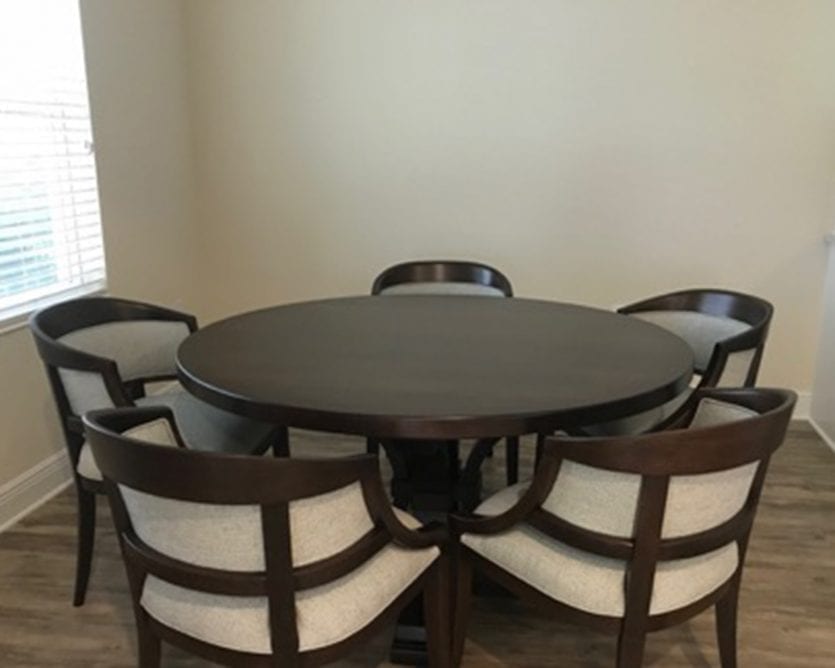
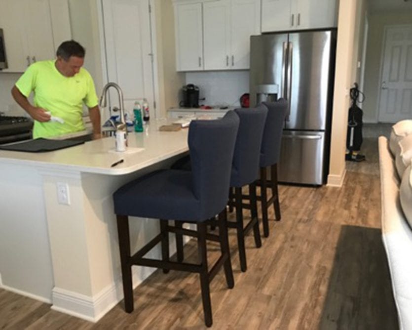
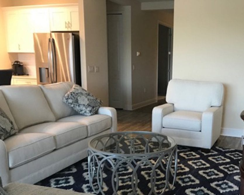
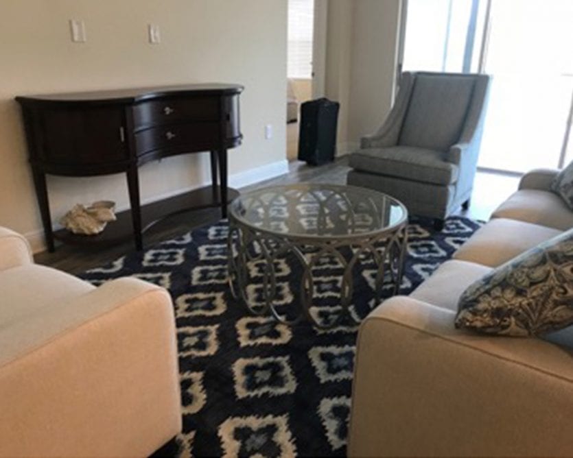
My husband and I just purchased a home on the gulf coast of Florida. We didn’t have any lighting installed by the builder because I wanted to pick my own. I have attached some pictures of the living/dining/kitchen areas. Can you make some recommendations for lighting over the island and the dining table? As you can see from the pictures, I have the Remy coffee table so I was thinking about something over the dining table that would coordinate with the coffee table. For the island, I was thinking about the medium size Eldridge pendants. Any suggestions would be greatly appreciated!
Sincerely,
Lisa
PS- Ignore that there are only the basic furniture pieces. We have a lot of work to do but I am anxious to choose some lighting!
We definitely like the idea of cage lighting — something that feels open over an island. One thing to consider is something with glass or an option without glass. A lot of people prefer light fixtures in the kitchen without glass because the glass gets extra dirty and grimy in a kitchen. Our Hadley Pendants are a good option because they have that open, cage look but without a glass enclosure.
We talk about whether she should do one long or several small pendants (like our Parisian Pendants). That’s totally a personal preference, so whatever you like best!
I emailed Lisa immediately after she sent us this email with the suggestion of using our Alessandra Chandelier which is made of capiz shells over her dining table. Make your dining table a more dramatic moment, but have something more subtle, simple over the island.
We discuss matching fixtures in the same room. We all agree that your lighting over the island and over your dining table should feel related but not be matching exactly!
Good luck, Lisa!
Show Notes:
- Benjamin Moore’s 2019 Color of the Year
- Metropolitan AF-690
- Eldridge Pendant
- Hadley Pendant
- Alessandra Chandelier
- Parisian Pendant
Please send in your questions so we can answer them on our next episode! And of course, subscribe to the podcast in iTunes so you never miss an episode. You can always check back here to see new episodes, but if you subscribe, it’ll automatically download to your phone.
Happy Decorating!
Subscribe in iTunes | Stitcher | Google Play





Carolyu Samuelson
I’m looking forward to the podcast being loaded. It appears it isn’t available to be heard.
Kelly G Race
Hi! First, I would like to say how much I love your podcast! I look forward to every episode and feel like I learn something. I am an engineer by profession, but love all things home and decorating as a hobby. I love Ballard’s intent of bringing good design to the masses. I have never commented on a blog post or podcast before, but I feel like I must here. I could not bring myself to finish Ellen O’Neill’s podcast. She elevated the choice of color of the year to something way more serious than it is. To talk about “truth” when referring to an opinion of color of the year is ridiculous and sounds so self important and out of touch. Also, she related everything to her obviously strong opinions about politics. If I wanted to listen to a podcast about politics, I would not be choosing a How to Decorate podcast. All of her examples seemed very elitist and did not, in my opinion, fit Ballard’s brand. I will not go on and on. Shame on me for not leaving a comment on all of the many podcasts that I have listened to and loved! It is very rare for me to leave any feedback, especially negative, but this one was over the top. Thank you for all the entertaining and educational content you produce. Best wishes in 2019!
Kay
I love How to Decorate, I love Ballard.
But please, discourage your guests from using the podcast as a platform for their political views.
Knowing that the last two Color of the Year color choices were influenced by political climate is disgusting. So much good information tainted by negativity. Come on girls, count your blessings and teach us how to make a happy home.