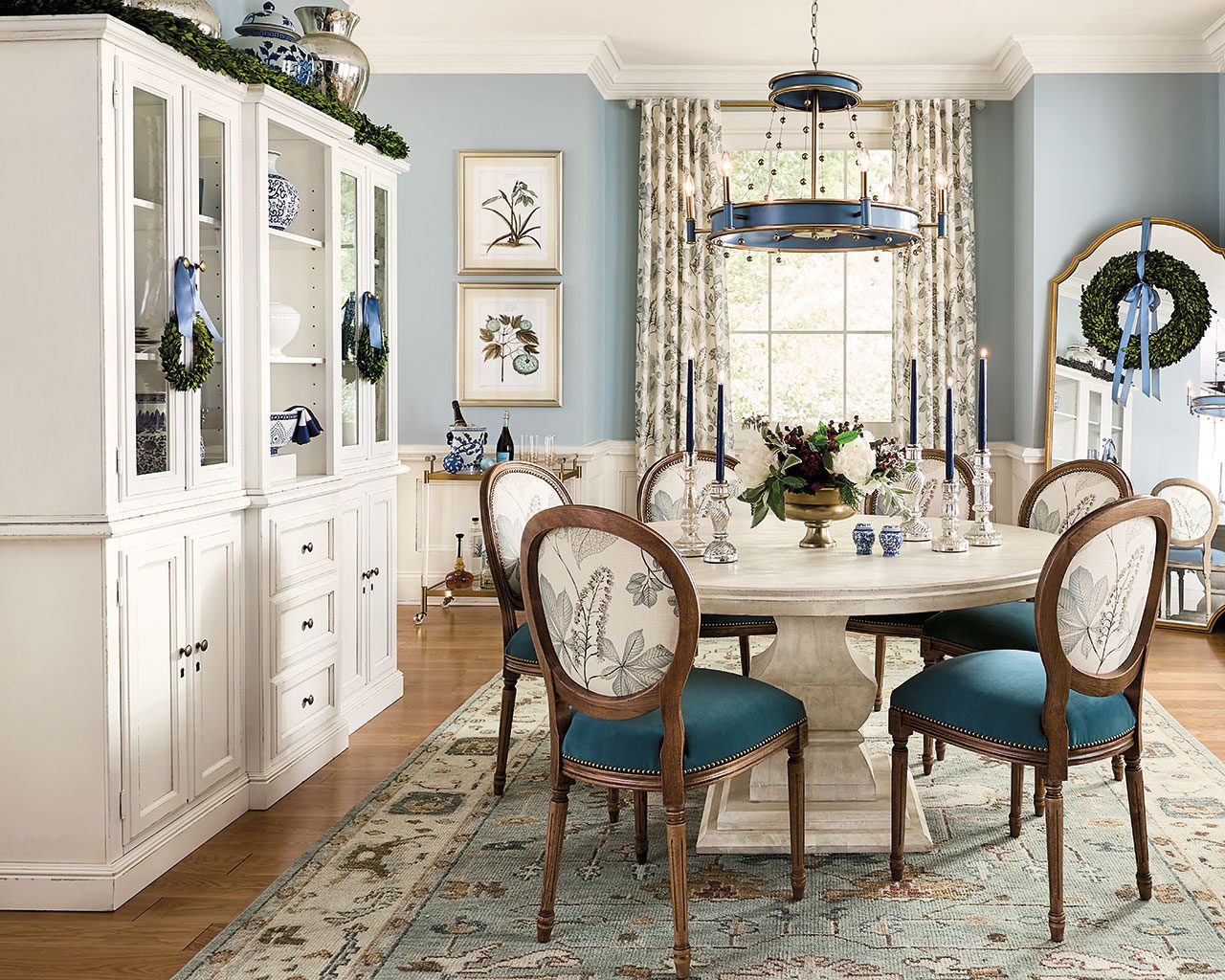
Ask any design professional, and they’ll tell you that paint is the quickest and most affordable way to change a room. The difficult part is picking a paint color, so we’re sharing the colors we used in our most recent catalog and the inspiration behind them. We chose soft colors to highlight beautifully decorated rooms, adding a subtle backdrop to holiday frivolity.
Please be aware that color may vary due to various light conditions, finish, and other factors. It’s always a great idea to test a paint sample on your wall first.
Benjamin Moore Stone Hearth CC-490
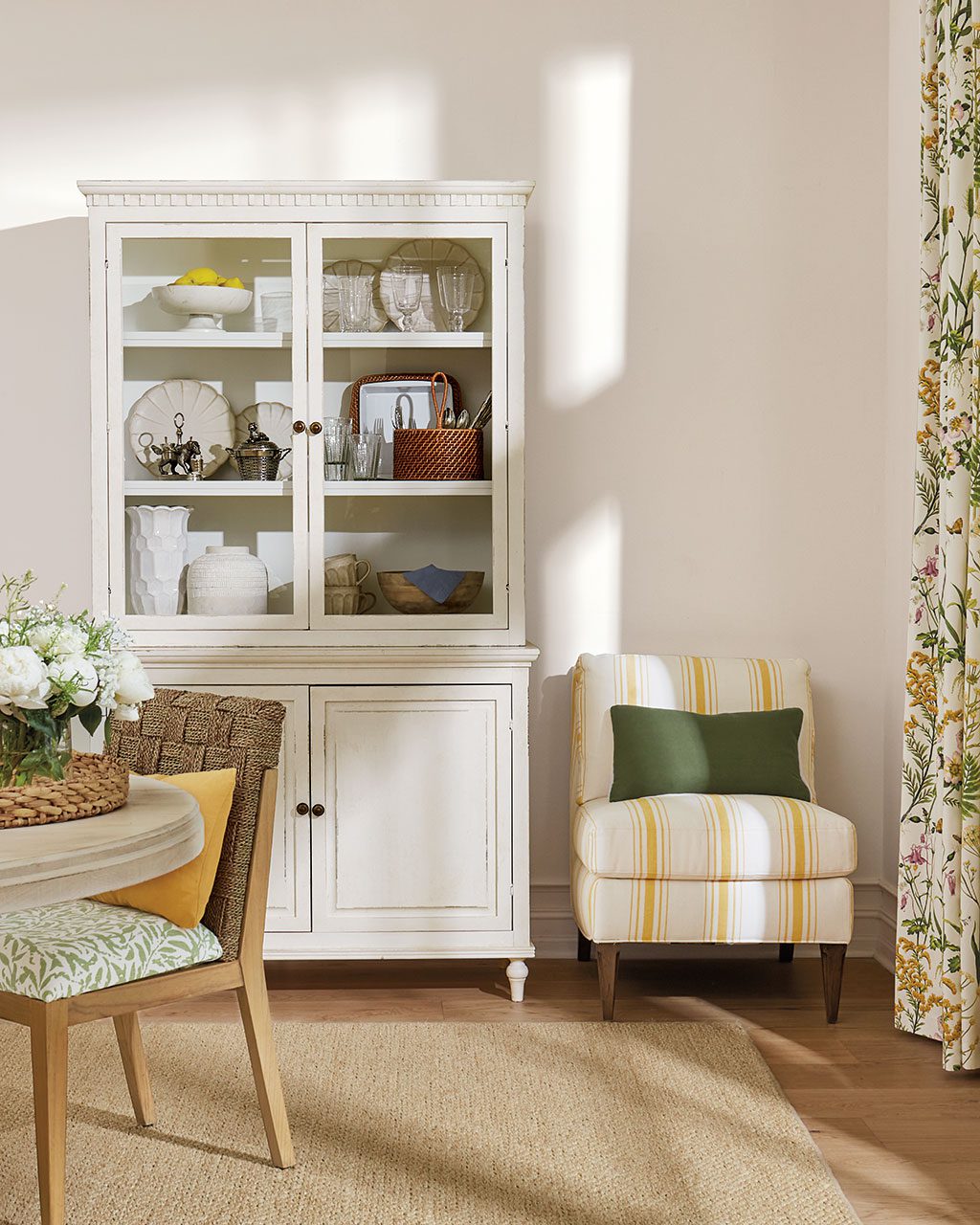
We set off warm neutrals with this nuanced greige. Benjamin Moore’s Stone Hearth is a little bit brown and a little bit gray and the perfect backdrop for neutrals of all shades. A little bit of brown keeps this gray from feeling too cold, plus it feels extra glowy and romantic at night.

Benjamin Moore’s Crownsville Gray
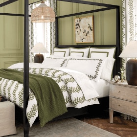
There’s no need to be scared of a dark paint color, especially if you’ll be using lots of white accents. In this bedroom, we used a gentlemanly dark green-brown to balance all of the feminine scallops and florals. The final result is balanced and the dark wall color shows off the difference elements in the space.

Benjamin Moore’s Niveous
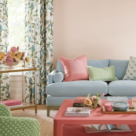
With the menswear-inspired upholstery on the sofa and armchairs in this living room, a white paint color would have felt too stark. We choose a light taupe to echo the texture and warmth of our upholstery fabrics, while the light tone keeps the space feeling airy and expansive.

Benjamin Moore’s Salem Gray
We set off our classic white Claudette Headboard with an olive green to echo the green in our new Bea Block Print Bedding. This moody color almost feels bronze with the right lamplight and balances the sweet bedding we’ve used in here.

Benjamin Moore’s Silver Gray
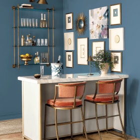
Blue-and-white is a color combination that’s a forever classic, so it’s probably no surprise that we used a light blue wall color in this dressed up dining room. We chose a nuanced blue-gray that doesn’t feel too sweet and changes with the light.
If you’re looking for more paint color ideas, find our best tips on choosing paint colors or browse paint colors from past catalogs. You can also check out our YouTube channel or read these related posts to get inspired:
- Green Decorating Ideas— Why We Love Green
- 25 Blue Rooms & Why You Need This Classic Color
- Summer 2022 Paint Colors & Wallpapers
- Fall 2021 Paint Colors
To stay up to date with all things How to Decorate, sign up for our monthly newsletter.



Caroline McDonald
Thanks, Richard. We’ll do that.
Sarah
Wish l could decorate my apt. Just don’t know where to start. Soo sad
Kelley Bostian
Sarah,
There’s always room to decorate even in small spaces! Check out a blog we wrote about decorating small living rooms to see exactly what we mean.
Happy Decorating,
Kelley