Veronica Solomon, Designer and Founder of Casa Vilora Interiors
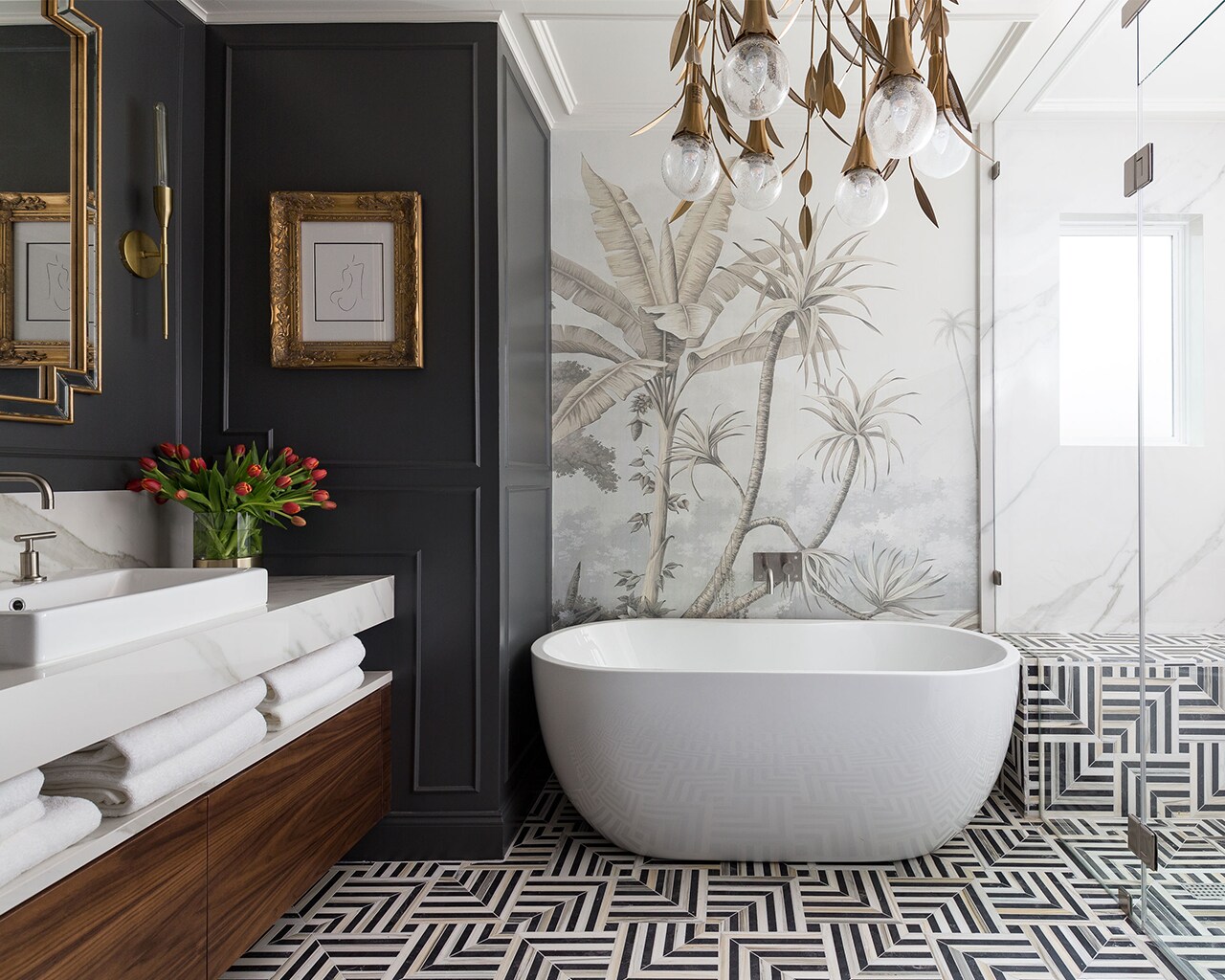
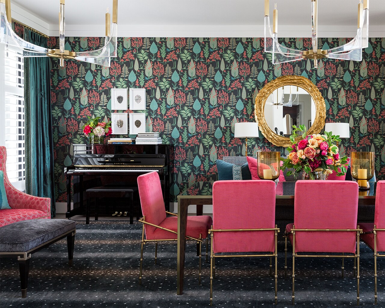
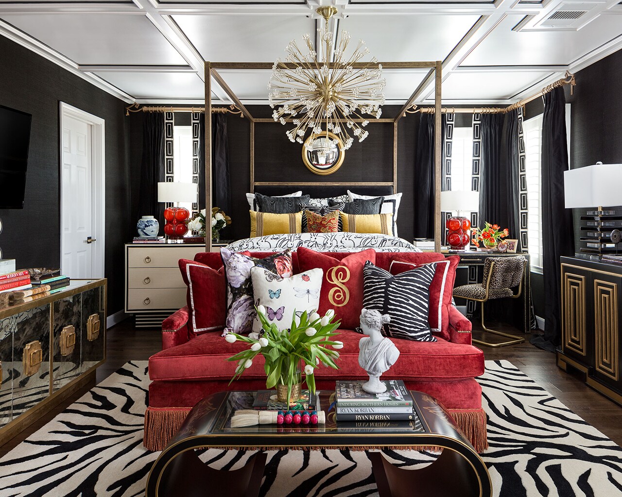
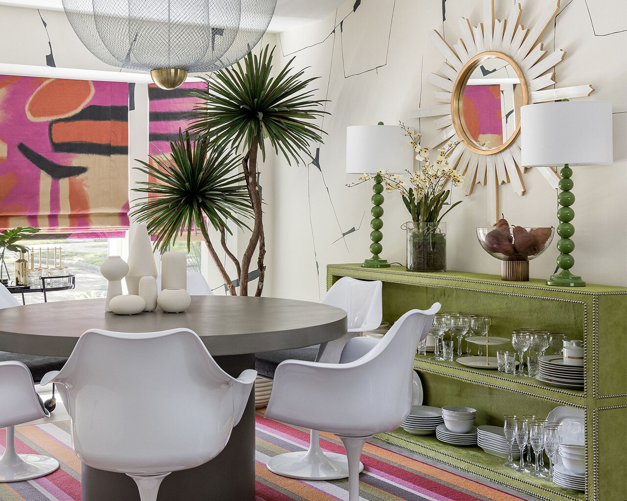
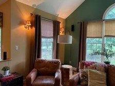
This week features Veronica Solomon, Houston interior designer and CEO and Creative Director of Casa Vilora Interiors. Veronica is also a mentor and a professional coach to other interior designers looking to build their businesses in the design community. She talks about the development of her bold style, her love of the eclectic and layered looks, her inspiration for taking more risks, and how not to be afraid of a dark wall.
- Room Designs from Casa Vilora Interiors
What You’ll Hear on This Episode:
- What does it mean to be eclectic?
- Are there certain rooms where Veronica feels like it makes sense to be a little more bold?
- When is the right time to use draperies?
- Veronica’s advice on taking more risks in a way that is calculated and intentional.
- Low commitment but big splash items that can lend themselves to be a little more bold such as art and light fixtures.
- How to know when it’s time to just call a designer?
- Thinking about putting your favorite color everywhere on the wall? Veronica shares why you may want to think again, and how to weave it in using a more methodical way.
- How to spice up a neutral space.
- Plants are a great way to add texture to a space.
- Veronica’s love of a BIG light fixture.
Decorating Dilemma:
Hi,
My front door needs repairing, and I’m wondering if I should paint the inside as well as the outside.
For the outside I want to go with high gloss from Fine Paints of Europe. I considered 3 colors:
- Stay with a Red as it picks up on some of the interior colors!
- Go with the Teal color that is in the access way between the foyer/kitchen and also on 2 walls in the family room; there is also quite a bit of this color found in the accessories throughout the main floor.
- Black, to match the shutters!
What about the inside–leave it white? Maybe do a high gloss white?
I love color and I have a lot of color in the house.
Thanks,
Carla
Carla,
First off, we love that you are bold and Veronica is certainly the right guest to answer this!
She thinks you should keep it in red, match whatever trim color in the space, and do it in satin instead of high gloss for a nice sheen without too much shine. A grayer red versus an orange-red is what you want.
Let us know how it turns out, we can’t wait to see!
Mentioned in This Episode:
Please send in your questions so we can answer them on our next episode! And of course, subscribe to the podcast in Apple Podcasts so you never miss an episode. You can always check back here to see new episodes, but if you subscribe, it’ll automatically download to your phone.
Happy Decorating!
Subscribe in Apple Podcasts | Spotify | Stitcher | Google Podcasts


