Take a deep, restorative breath this week as we welcome Joshua Smith, an accomplished interior designer who has been transforming spaces and creating homes that evoke comfort and beauty since 2012.
Joshua’s journey began with a rich background in Texas real estate, which eventually led him to pursue his passion for interiors. After graduating from the New York School of Interior Design, he embarked on an inspiring journey under the mentorship of Steven Gambrel, a renowned figure in high-end residential and commercial design.
Joshua’s experiences culminated in the establishment of Joshua Smith, Inc. in 2013, earning him national recognition and features in esteemed publications such as House Beautiful, Veranda, and The New York Times. In this episode, Joshua talks about his creative process, his unique design philosophy, and his insights on creating spaces that resonate on a sensory level, making them truly feel like a home.

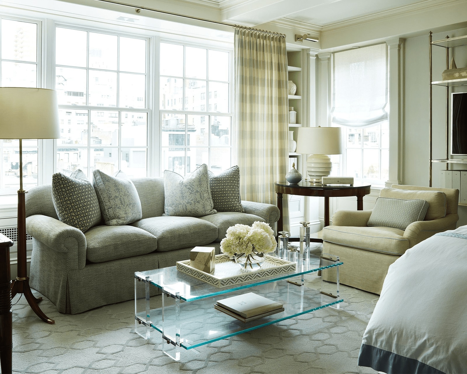
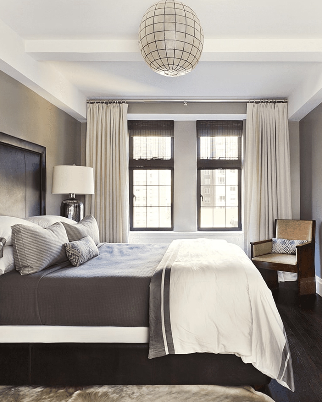
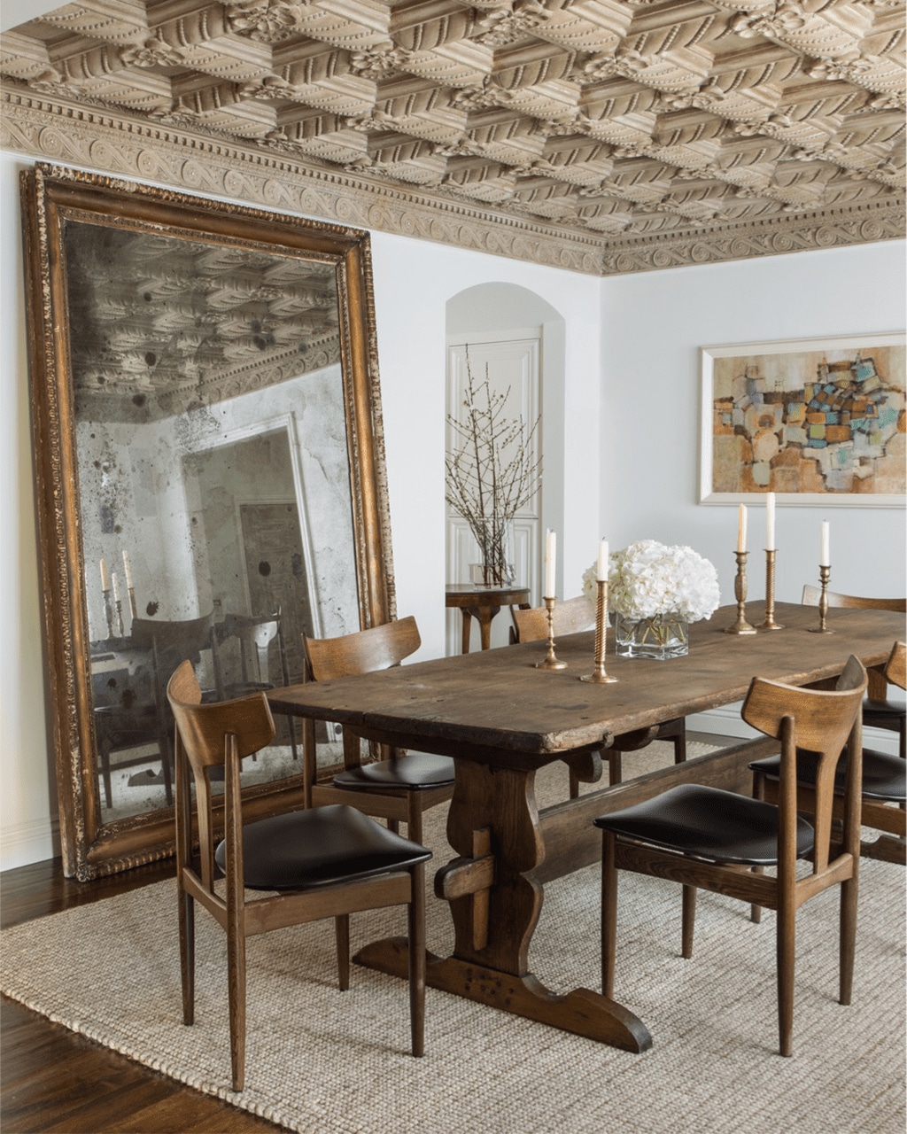
Images from Joshua’s portfolio taken from joshuasmithinc.com
What You’ll Hear This Episode:
- How a Texas boy ended up as a New York designer, under the tutelage of Steven Gambrel.
- Joshua’s “aha moment” that led to him pivoting from real estate to interior design.
- How his background in real estate helped Joshua develop deeper client relationships, and know the importance of communicating and executing your creative vision.
- Joshua’s love of things with age and imperfection.
- How important it is to have negative space in order for the other things to really take center stage.
- Joshua talks about how to create a sense of harmony and peace in your own home.
- How to mix and use colors in a way that draws out the feelings you want to be evoked in your own personal sanctuary.
- How to tap into your gut intuition when it comes to picking art and decor that speaks to you.
- The beauty of leaving a room lighter than you found it.
- A beautiful interior is not just something we see. It should engage the senses.
Decorating Dilemma:
Hey ladies,
I’m sending in decorating dilemma number 2 before the first one I sent has even been answered yet. Clearly I’m running into some dilemmas while trying to decorate my space. First and foremost, forgive my absolutely horrible editing of these photos.
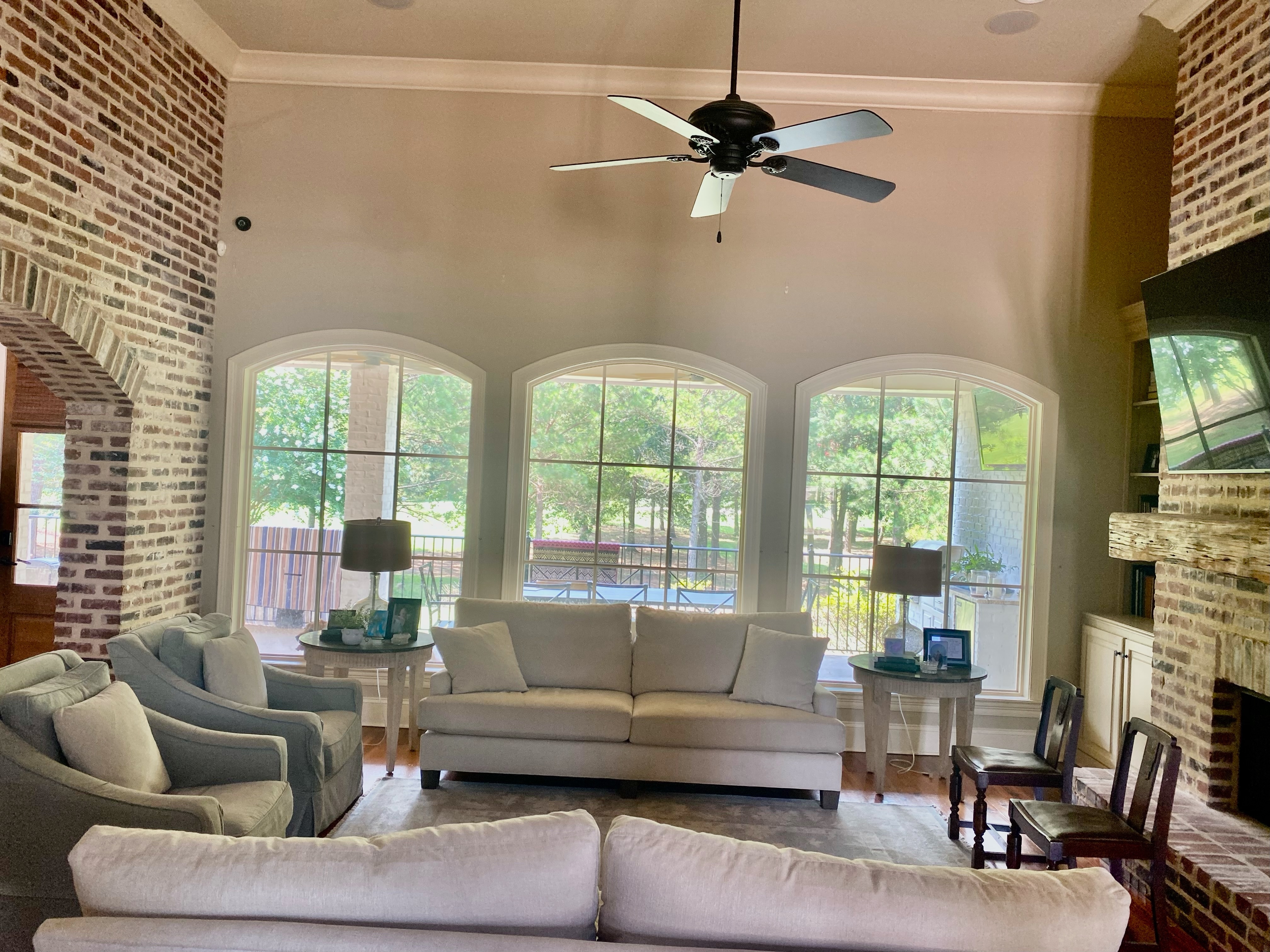
Please help me with window treatments for this awkward 5’2” gap between the top of my window molding and the ceiling. I’ve considered some options and would love your feedback. Note, the drapery would go all the way to the floor, and the ceiling fan is being replaced with a light fixture that is centered on the windows.
To further complicate matters, I only have 4 inches of space between the brick and the window molding, 8 inches of space between the bookshelf and the window molding, and around 7 inches of space between the window moldings. I love the look of full drapery but find it challenging to achieve that look without covering up the view that I love outside of the windows. HELP!
Best,
Kelli R.
 Hi Kelly!
First, we are all really impressed with your creativity and attention to detail. You have so many fantastic options to consider, and the choices you have presented are far from awkward! So first, Joshua points out that working with high ceilings like yours can often be a challenge, but they also open up a world of possibilities. The great thing here is that there’s no wrong choice. A few options stood out to Joshua when we reviewed your ideas and sketches. One particularly intriguing concept involved panels and the potential addition of Roman shades. The notion of using Roman shades is especially clever given the height of the windows. This approach minimizes the apparent distance between the rod and the tops of the windows. The excess fabric from the shades might unintentionally draw attention away from the windows themselves; the goal, of course, is to frame that gorgeous view and let in ample light.
After analyzing various rod placements, including placing it close to the crown or about 12 to 18 inches above the window casings, a new approach began to take shape.
Instead of a highly tailored Roman shade, we recommend a more relaxed style, often referred to as a “scooped” Roman shade. Now, let’s talk about colors and patterns. Given the brick’s strong presence and the desire to frame the view, we suggest solid-colored sheers that blend harmoniously with the room’s palette. For the scooped Roman shades, a subtle pattern can add interest without overwhelming the space. The key is to complement the view rather than compete with it. So, consider a neutral shade for the sheers and a gentle, understated pattern for the scooped Roman shades.
We are confident your space will be transformed into a soft and well-balanced environment that showcases your impressive view. You’re on the right track and we can’t wait to see the final results!
Also Mentioned in This Episode:
- Ballard Designs
- Seeking Sanctuary
- Joshua Smith: Website | IG
- Steven Gambrel
Please send in your questions so we can answer them on our next episode! And of course, subscribe to the podcast in Apple Podcasts so you never miss an episode. You can always check back here to see new episodes, but if you subscribe, it’ll automatically download to your phone.
Happy Decorating!
Subscribe in Apple Podcasts | Spotify | Stitcher | Google Podcasts


