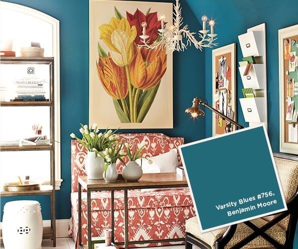
Brighter Days Are Ahead
If you’ve flipped through an issue of InStyle magazine or walked into a J. Crew lately, you already know that color is having a moment. The brighter, the better. After attending the fabric market this summer, we’re excited to report that the same energetic hues are trickling down to home décor and will make a big impact in the coming year.
Look for these vibrant colors to start showing up in retail stores on furniture, drapery and accessories next spring and later. To see what’s in store for you and to get a jump on the color trend in your home, take in our no-nonsense color cues.
Color, color, color!
Forget about the soft pastels of last spring. Color is big, bold and saturated. Here are the top three color trends:
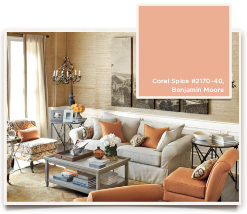
Tangerine
The Pantone Color Institute named “Tangerine Tango” the top color of 2012, and this showstopping color is not going away anytime soon. The radiant red-orange is influencing color in a big way, so look for a variety of shades of energetic orange popping up in home decor.
Goes with: Tangerine invigorates neutrals, like gray, wheat or taupe. For a more daring combo, pair it with either raspberry or lemon, both secondary accent colors that are making a big impact.
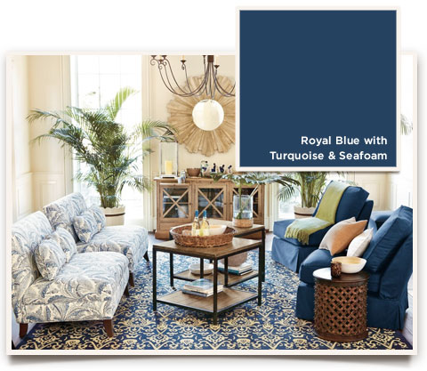 Blue
Blue
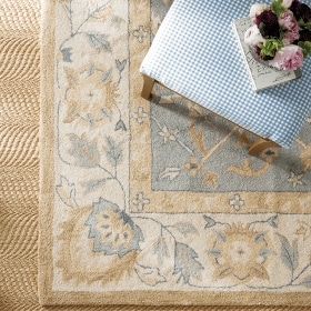
Three equally gorgeous shades of blue are making their way into home fashion. Vibrant turquoise, ethereal seafoam and ever-opulent royal blue pair well with others—and each other.
Goes with: Pair turquoise with earthy eggplant, silver gray or taupe. We love seafoam with purple, and royal blue is especially striking with gold and turquoise.

Green
Green is quickly becoming the “it” color in home design. Earlier this year, House Beautiful declared green “the neutral that goes with everything.” Use it as a vibrant accent color or take it center stage. We saw a lot of emerald green at market, but a refreshing grass-green is on the scene, too.
Goes with: Green plays well with just about anything, from blue to raspberry and, yes, tangerine.

Purple
Varying shades of purple continue to be a big trend, especially rich, tree-ripened plum. It’s easier than you think to work purple in as an accent color, because it’s a color often found in nature.
Goes with: Mix in silver, wheat and a dash of lavender for a beautiful palette.
Q&A with Carmen
As the rug and fabric buyer for Ballard Designs, Carmen is at the forefront of color trends. We caught up with her to get the scoop on how we can incorporate these hot hues in our homes and what we can look forward to from Ballard.
What do you think about all these bold hues crashing the party?
I think it’s exciting that we’re moving toward a lot of color, because we’ve been so neutral in home decor. It’s a sign of the times: people need some refreshment, they need to feel warmth and to feel good—and these energetic colors do just that. Being at market and seeing all the color got me so excited, I started thinking about how I can add that fun pop of color in my home.
And that leads us to our next question: Just how do you work these vivid colors into an existing décor?
It’s really about adding bright color in a usable way that’s easy on the eyes and doesn’t require redoing a whole room just to accommodate the next trend. You have to live with what you have, so it’s being able to mix in those accent colors. Any of these bright hues are ideal for a throw pillow or blanket. I love the idea of a raspberry throw on a khaki sofa. Or paint an accent wall tangerine! Look for the small things that don’t cost an arm and a leg, like wall art, lamps, chandelier shades or even an ottoman. Look for us to start incorporating more of these colors into our line of accessories, too.
What about prints? Are these colors working their way into pattern?
Ikat and Suzani are still hot, hot, hot. Everyone is doing the global influence, and so these vivid colors are very much a part of that. Chevron, geometrics, flame stitch, stripes—they’re all living large in color.
What can Ballard customers look forward to with these colors?
For starters, we have a rich velvet fabric in 11 amazing colors appearing online only in October and debuting in print in the January catalog. These colors are all inspired by what we’re seeing out there, including teal, emerald green, lemon, raspberry, seafoam, royal blue, tangerine, gray and so on. When I came back from market, we had already built the fall/holiday catalog, but we were so excited about these colors we decided to put the fabric online early. We’ve already upholstered several bodies in some of the bold colors, and they all look fabulous. You’ll see!
How can our customers be sure these new hues mix in easily with their existing fabrics?
Any color palette we deem as a trend has to coordinate with our essential core fabrics. For example, crimson twill is an essential. At first glance, it works with the saturated blue. You could have a red-blue story that would be pretty, almost nautical. You can pair any of these hot hues with our popular neutrals, from Parchment Linen to Off-White Twill and even Cheetah, which, yes, we’ve long considered a neutral!
For even more ideas and inspiration, check out our Color Trend boards on Pinterest.


