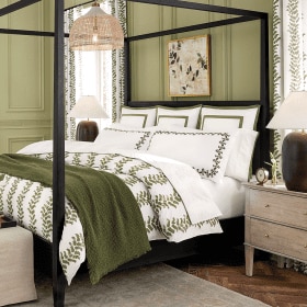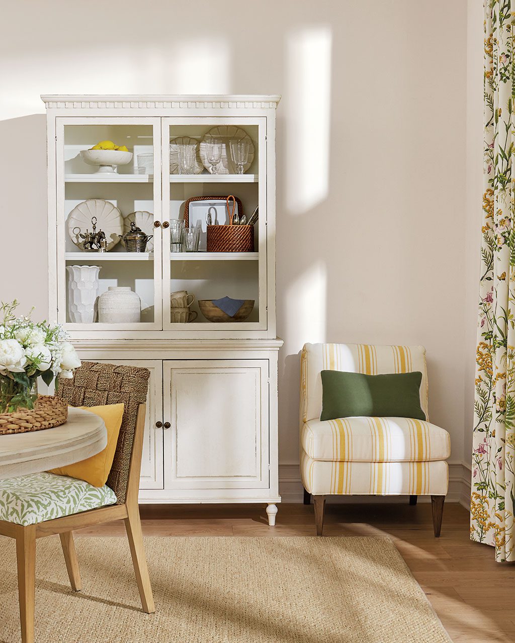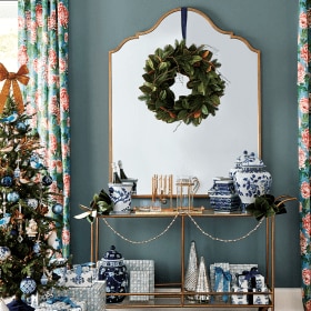
There are so many amazing patterns available in the world of home décor these days, yet some people shy away from them – unable to choose just one and unsure how to effectively combine them. It’s actually not that difficult, though, once you understand a few basic guidelines. Just keep these simple tips in mind, and you’ll be able to blend florals, graphics, stripes and more with style and ease.
Pick Your Palette
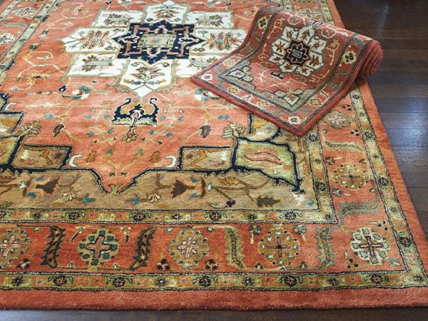
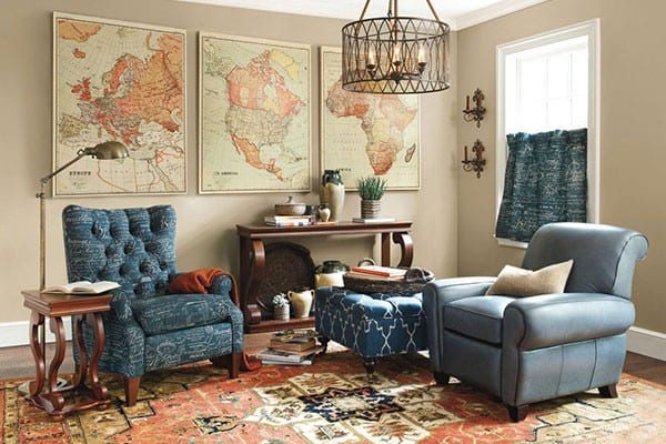
When trying to find the right mix of patterns for your space, a color palette is a great place to start. Begin by determining the three main colors in your room’s design and let them be your guide. Once you have your palette figured out, look for a show-stopping print that incorporates all three of those colors (and even one or two more), then layer in accenting prints that use just one or two of the shades. For instance, using a palette of terracotta, navy, and sand, your starting point might be a gorgeous area rug like our Kashan Hand Tufted Rug. Play off that with a chair or ottoman upholstered in our Document Ink, some throw pillows in our Malabar Coral or Chenille Desert, and our Concorde Medallion curtain panels in Indigo. Despite the variety of patterns, you’ll find the cohesive color palette brings everything together.
Match Your Style
Patterns, just like furnishings and home accents, often have a discernible style. So even if the colors work well together, the “feel” of the fabrics might clash. Your patterns should reflect your interior’s mood – whether with the relaxed ease of ikats and checks or the refined chic of elegant botanicals and paisleys. Some prints, like stripes and animal prints, are decorating neutrals that are equally at home in any setting. If you’re unsure about a particular pattern, just let the fabric itself be your guide. A print takes on an air of formality when rendered in silk or damask, while airy cotton and sturdy twill keep things casual.
Balance the Scale
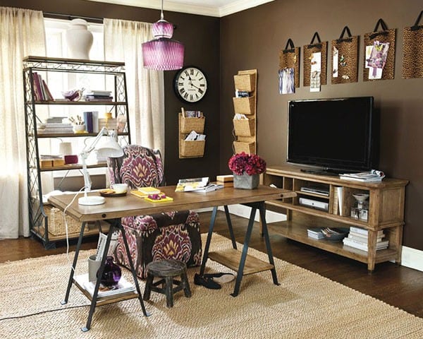
When all the patterns in a room carry the same visual weight, they compete rather than complement. Keep the mix pleasing to the eye by balancing the scale of your patterns: choose one big, busy print then contrast it with smaller, quieter designs. The graphic punch of our Samara Spice suzani fabric, for example, pairs well with our understated Callisto Stripe and the small-scale cheetah print of our Celine Rug. Even softer palettes need balance – though muted in color, our Tamerlane Taupe strikes a bold image that can be nicely tempered by more subtle prints such as our Como Ikat Dijon and Nomad fabrics or the Corinthia Hand Tufted Rug.
Opposites Attract
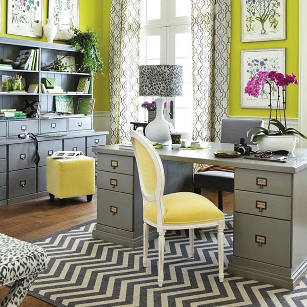
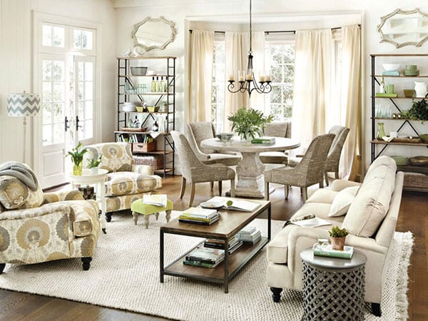
Though you want your patterns to share colors and style, you’ll want to avoid having them be too similar in motif. Whereas plaid with floral is a classic winning combination, plaid with plaid can be a distracting mess. Keeping things different avoids chaos and makes the mix more attractive to your eye. Try pairing a symmetrical geometric pattern with the natural randomness of a leopard print. Accent a circular-based design with something more linear in nature, like stripes or chevron. And play against the swoops and curves of a handwriting print with a more defined diamond or arabesque.
Leave Room to Breathe
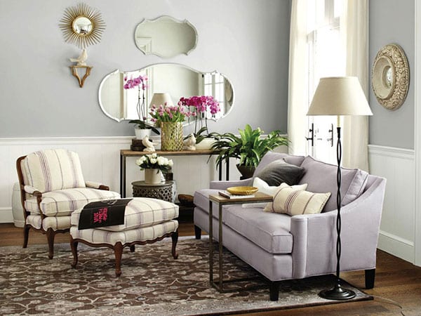
Too many patterns, or all the patterns centered in one spot, don’t give your eye a place to rest or your room’s design space to breathe. Counter the weight of your patterns with solid colors, chosen from the same palette. Place an array of graphic throw pillows on a pure white sofa. Let your bold, beautiful bedding rest against a lushly hued velvet headboard. Arrange floral chairs and a striped ottoman atop a neutral sisal rug. Your patterns will play together all the more beautifully because of it.
Have other thoughts about decorating with patterns? Leave us a note in the comments below.


