
We’ve been huge fans of fellow Atlantan and award-winning interior designer, William Peace, ASID, for years. Through his design firm, Peace Design, Bill specializes in high-end residential projects as well as interiors for destination restaurants, museums and select showrooms. First-hand witnesses of his work, we admire the way his spaces come together in seemingly effortless fashion, at the crossroads of classic design, comfort and luxury. Bill stays away from trends — you won’t find outrageous color and pattern here — and is a firm believer in quality craftsmanship. So when he agreed to design a bedroom and living room for us using Ballard product, we were beyond thrilled, and even a little honored to receive his stamp of approval. Naturally, we loved the end result and got a chance to chat with him about the project afterward.
Why did you decide to do this project with Ballard?
We’ve worked together designing the Connoisseur’s Lounge for the Atlanta Food and Wine Festival for the past two years, and through that process, I gained a real appreciation for Ballard’s products from a quality and design standpoint. So when they asked me if I’d like to design a couple of rooms for the catalog, I thought it would be a lot of fun — and it has been.

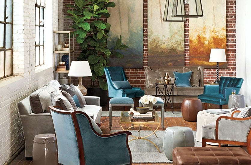
In our Spring Catalog, Bill Peace gave this loft, industrial space the Peace treatment using Ballard Designs products
Can you describe your design philosophy?
I try to create something unique, interesting and comfortable, so when you come into your home every day, you enjoy being there. It’s about getting to know someone and talking to them about what their lifestyle is or what they want it to be. It doesn’t matter if it’s a contemporary project or a traditional project or transitional project — it’s more about lifestyle. And it does depend on whether we’re doing someone’s main residence or vacation home.
Why is that?
We do a lot of work in the west in Montana and Wyoming. Those projects have a very different feeling to them — people want something different from their main home. Something more rustic. So they’re very textural and authentic with natural materials. That also translates into our more modern work that tends to be more on the East Coast.
How did your work translate into this urban space using Ballard products?
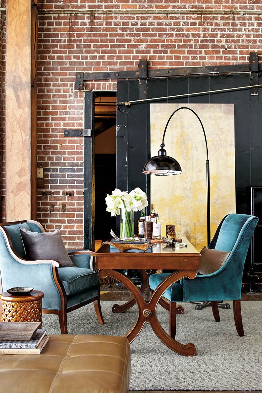
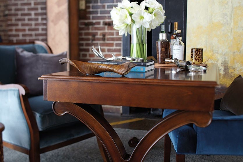
Again, we’re looking at things that are interesting texturally — not necessarily heavily patterned, but not boring, so the texture comes into play and subtle color comes into play. This building is a former textile factory, so it’s architecturally unique and somewhat urban. The interior is a little rustic, not overly refined. So we came in with a contrast of refined material — Ballard’s velvets and the linens that are so beautiful. This design approach is similar to what we do in our western work, but here we flipped it.
So it’s the contrast you were going for with the luxe materials against the industrial-like environment, brick walls and hard flooring.
When most people walk into that space raw, they think this is too industrial or too urban or too like a warehouse. But once you soften it with the right materials, all of the sudden it became, “Wow, we could live here.” It’s very loft-like and very current for people who are in-town dwellers and want to live that lifestyle.
This is definitely a different look, or setting, for Ballard product.
What I was out to prove is that the Ballard product doesn’t have to live out in the suburbs. It can live in an urban area. I wanted it to be a little more masculine, because there are a lot of single men, for example, that might live in an urban area and they want their place to look good. These spaces also might appeal to young couples or single women — especially in a city like Atlanta where they live in these urban environments. I’m really proud of the way these rooms turned out, and I think they did exactly what we wanted them to.
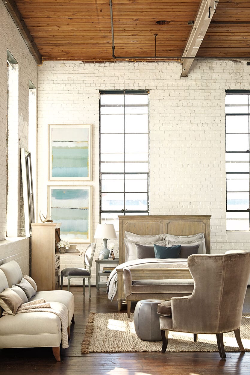
Texture gives this bedroom in an old textile factory a luxe feel
How would you describe these two spaces?
They’re different from one another. The living room takes on a very different character. It’s deeper, richer. It’s a little more masculine, and the bedroom space is lighter, brighter — more of a morning space. When the light flowed into that space, it felt more uplifting and I like bedrooms to have a more light feeling.
Let’s talk about the bedroom. You have this open, modern feeling in this larger space, but at the same time it feels very timeless. Why is that?
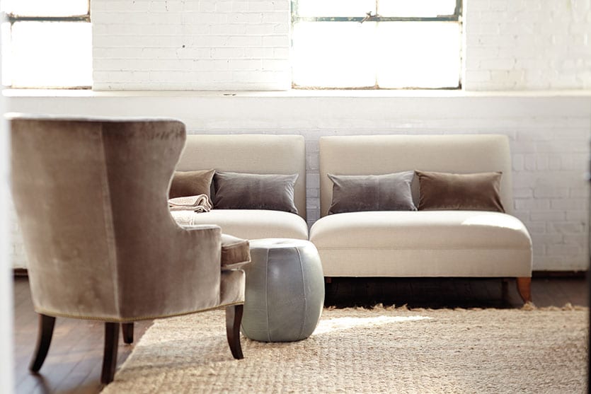
The furniture pieces we chose — the bench, the bed and the desk — have more of a traditional feel design-wise. Then we had a taller wing chair and added a couple of modern elements with the two chairs off to the side. The collected feeling of the furnishings and neutrality of the fabrics against the industrial background gives this space a timeless feel. We also chose a piece of art with very subtle colors to enhance that feeling.
You really could pull off this look in any style home.
Yes, we could recreate that same sort of fresh, light feeling in a traditional setting. I didn’t want it to be so austere that it was unapproachable, and I want people to visualize having those furnishings in any environment.
This bedroom is a very versatile space — you fit a lot of elements into it.
The thought here was how do you combine lifestyles into a single space? How would this space work if it were a small studio? You have the little sitting area and a desk for working at your laptop. It could just as easily be a small apartment for someone just out of college. I wanted to show that a bedroom doesn’t have to be just a bed and a nightstand and a closet. You could have put a TV on one wall and added more storage, and that single space could have been someone’s apartment with a little kitchenette!

Thanks to the design choices you made, the overall look is quite simple and understated.
That’s the takeaway here — you can do this. The bed linens are from Ballard’s Casa Florentina line and they are beautiful. It’s all very luxurious, but it’s not a lot of money and it’s not a lot of stuff. It feels very simple, understated, but it has an elegance about it.

Talk about some of the choices you made for the living room space that make it feel so livable.
I wanted that space to feel like it could be used by one person, two people or 10 or even 12. When designing the layout, I also thought: “Where would I want to sit and read a book and feel comfortable in the space?” So I added these comfortable chairs — high back and low back. With the ceiling height in that space, I wanted to have a variation of heights in the furnishings to add interest and give it a more collected look.
It doesn’t feel like you went out and bought everything the same day.
Even though it’s all Ballard product, I think that it feels like it was collected over time and that it wasn’t all picked from the Ballard catalog. Someone might look at that and think, “Wow, I really love that blue chair. I wouldn’t have thought about putting that there, but I can visualize myself putting that into my home with the other neutral things I already have.” Part of what I was thinking about was putting myself in someone else’s thought process if they were looking through the catalog and saw this setting. I want them to think they could pick out two or three things or even one thing and mix it in with what they already have.
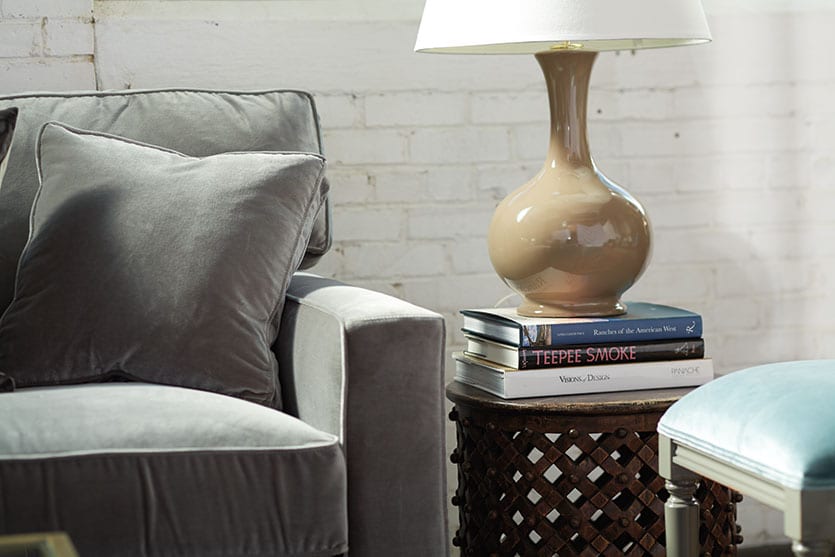
You used a lot of rich materials, but it doesn’t feel like a formal room you can’t use.
I wanted it to feel rich and luxurious but approachable at the same time. I want people to see themselves living in that space and not feel like it’s too formal — but feeling very proud of it.

On that note, do you find that velvet is a good everyday fabric and not something that should be considered as dressy?
The key to velvet is mixing it with other materials like leather and linen, so it doesn’t feel too refined. You also have to remember that velvet and other luxurious materials like good leather are going to age and take on a character of their own. You have to embrace that and not be afraid that it’s going to crush a bit or leave some marks. I think that’s the beauty of it. It shows that you’re living!
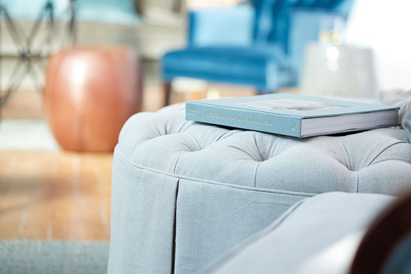
Many of the pieces you chose are versatile. Can you talk about creating a flexible space?
I loved the idea that you can move these pieces around and it’s not stagnant. When you’re a collector of things and you put a bowl on a table, it doesn’t have to live on that table forever – you can move those things around. They are dynamic. It was the same thought process for the furnishings here. We have two different seating areas that can be shifted around to fit different size groups of people, depending on whether you had 10 people coming over for dinner or you wanted something intimate. So by having the ottoman, stools, high back chair, low back chair — all these interesting different pieces — you can shift things around and create a very different feeling in the room and a fresh look in the space overall.
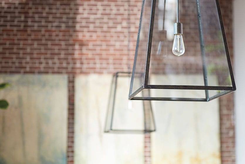
Let’s talk lighting. We love the use of the Eldridge Chandeliers.
I love the Eldridge Chandeliers. There is a sort of transparency about those and they aren’t too imposing even though they are a large scale. We hung a pair in a somewhat arbitrary way, so the seating arrangement didn’t necessarily have to be centered under them at all and it felt more like they were a part of the architecture, as if they could have always been there. There’s a simplicity about them that makes them a little modern, yet there’s a historical reference to the design, so I was really attracted to them.
That’s a great idea about the way you hung them — there’s no need to be overly concerned about the cocktail table being exactly centered under the lighting.
That’s part of the idea of how the whole room could easily shift around. There could be a scenario where the cocktail table is centered under the lighting. Depending on what’s going on in your life, if you get tired of the way the room’s laid out, change it. Nothing’s set in stone. There’s not one good answer; there are a lot of good answers in our world.
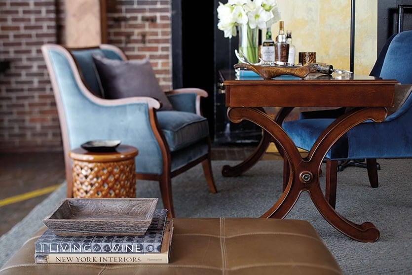
Why did you choose the large artwork on the walls?
There are four canvases that represent the four seasons. The colors are somewhat subtle, but they have a sense of color about them and a monumental scale, so they filled the walls. I liked them against the brick, so we had a textural contrast with these sort of abstract seasonal paintings that had subtle tones and not so literal. They really are a great quality with a great look and feel.
Can you talk about your choice of rugs for both spaces?
They’re both relatively neutral — the rug that we used in the living area had a bluish gray tone to it. But what drew me to them was, again, this idea of mixing textures. They had a casualness about them that mixed with the leather and the velvet that created this interesting relationship. The one in the bedroom had such a heavy texture to it that’s just really interesting. It’s all about the combination of the textures that make it work — smooth against rough. The hard architectural elements with some velvet against it and the nice beige wood floor with a heavily textured rug. All those things coming together is what adds the richness and comfort to the space.
You don’t use a lot of bright colors or patterns in your design. Why is that?
We have an unspoken philosophy in our work that we don’t want to be trendy in any way. We want a certain classic look to what we do, and I think these spaces represent that. Patterns come and go. I always try to go with more of a texture than I do a pattern and add interesting textures in combination with each other. I do use some pattern, but it’s usually pretty subtle and something in a small area, such as a pillow. So if you do decide to change your look, you can get rid of the pillows and it’s not such a huge investment. So you can change it up through color and pattern if that’s something you’re after. But make the bigger pieces you have more of an investment in neutral and classic, so they have a lot more staying power. People aren’t going to buy a new sofa every two years.

What was your big takeaway from this project?
I really want to impress on people the quality level of what Ballard offers and the versatility of these products. They have a classic design to them that’s easily transferred to any urban space or a more typical residential living space. So no matter where you’re living, with creativity you can pull these things in and make a unique space that’s something special.
To shop these rooms, or learn more about the spaces Bill Peace designed for Ballard Designs.



covemaven
This was a fantastic episode! Bill Peace was concrete and concise in his response to your questions, yet loaded his answers with great information. I truly enjoyed listening to this installment of your podcast.
Caroline McDonald
Yay, so glad you enjoyed this episode. He’s super talented but also just super nice! Don’t you love when that happens?
Angela
Hello
Can you tell me about the art pieces you choose for the room. Love, Love, Love them.
Angela
Caroline McDonald
Angela,
So glad you like them. The art pieces are Seasons Art in our largest size and Cote de la Mer print.
Mary
Can you tell me what exact fabrics were used in the living space? I love the colors but it is hard to tell online what color velvets were used.
How to Decorate Team
Hi Mary,
You’re right, there are a lot of velvets used in this space, so we understand that it could be difficult to identify which fabrics are which! We’re sorry about that. Below are a list of the upholstered items (with fabrics) below:
Graham Sofa shown in Signature Velvet in Mineral.
Conley Settee shown in Signature Velvet in Latte.
Gramercy Chair shown in Signature Velvet in Teal.
Lena Tufted Club Chair shown in Signature Velvet in Teal.
Viceroy Chair shown in our Signature Velvet in Spa.
Haynes Round Tufted Ottoman shown in Suzanne Kasler’s Signature 13oz. Linen in Blanc.
Lacquer Louis Stool shown in our Signature Velvet in Spa.
Whew! Hope that helps!
Happy Decorating,
The How to Decorate Team