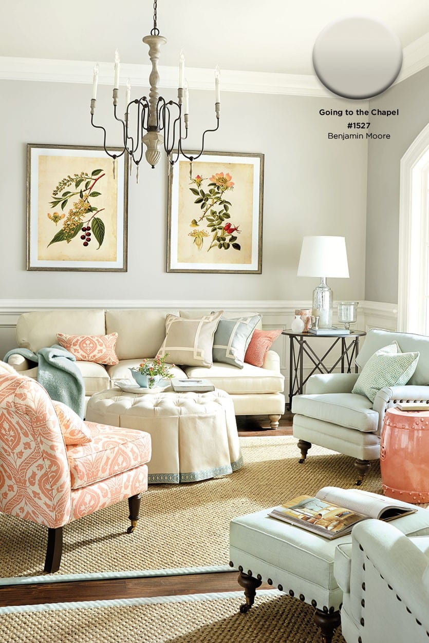
Sometimes it feels as if picking just the right shade of paint can be an elusive task. We know some of you feel the same way, because we get tons of questions about the topic. So we decided to take your most frequently asked questions about paint and picking colors to an expert, color consultant and interior designer, Jennifer Ott of Jennifer Ott Design, LLC.
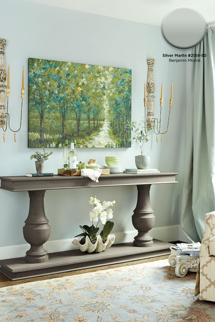
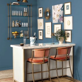
In this room, we let the art piece inspire the color palette. We pulled the lightest blue from the painting for the wall color. It has a gray undertone that feels cool and calming.
Ballard Designs: If you know you want to paint a room, but don’t have a clue about picking paint colors, where do you start?
Jennifer Ott: Some clients have no idea what they want and don’t even know what color they like. In that case, I might have them look at a favorite piece of artwork or their clothing and see if there’s a color theme. We may not even put that exact color on the wall, but we can at least start having the conversation about what colors they’re drawn to. Of course, now we have Pinterest and you can pin your favorite rooms and you’ll usually start to see a trend develop. Flagging images in shelter magazines and design books is another great way to suss out someone’s color preference.
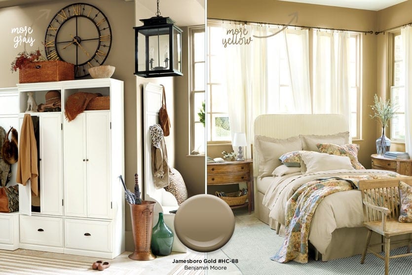
Paint colors can look very different depending on the room they’re in. Here, you can see that Benjamin Moore’s Jamesboro Gold looks much muddier and more gray in the entryway on the left. In the bedroom on the right where there are large windows, it’s much more yellow and light.
BD: When it comes to selecting color, aren’t there other important factors to consider, such as how much light the room gets?
JO: Good question. It really does depend on how much light is in the room. If you’ve got a space with really good natural lighting, you’ve got a lot more options. With rooms that don’t have a lot of lighting or windows, I advise people to avoid muddy colors, like forest green or deep plum. Those colors can look really pretty if you’ve got ample light, and they can look good on the outside of a house, but in a room that doesn’t get a lot of light, they tend to make it feel very dreary and cave-like. So for light challenged rooms, I tend to go lighter and cleaner with more crisp colors that don’t have a lot of browns or grays in them that make them look muddy.
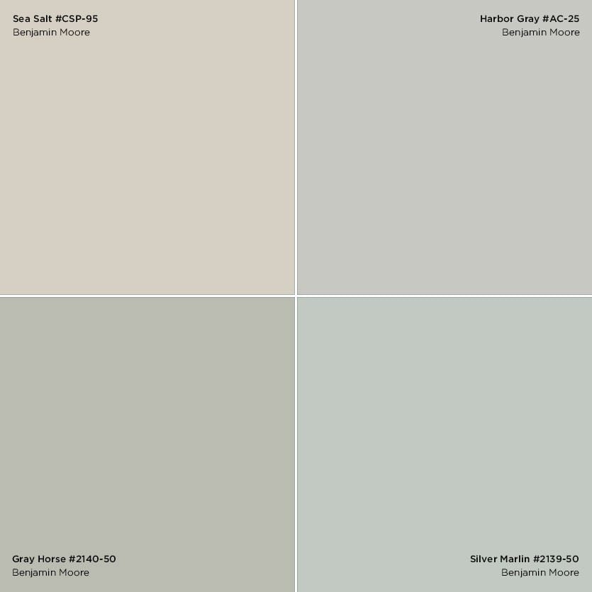
Above, you can see how these four colors all look gray by themselves, but when compared to each other, their undertones are more evident. Sea Salt is much more beige, while Silver Marlin has more blue in it.
BD: And how do you detect those undertones? It seems like such a mystery…
JO: Take gray, for example. Gray is a very popular color right now, but there are so many different shades. There are some that look really blue, there are some that go more green and there are warm grays that start to go into a more taupe color and so on. And if you’re just looking at one color, it’s hard to tell what the undertones are. So gather the different color swatches of grays — or whatever color you’re auditioning — and put them next to each other. That’s when you can really see their undertones. You’ll say, “Oh, this gray looks really green next to that gray.” But that’s not really the best way to pick a final color, because in a space you’re not going to have those other colors adjacent to it, so it’s not going to look green on the wall. It’s only a way of fine tuning the gray you want, to get that cooler gray or warmer gray.
BD: That makes a lot of sense. But then how do you know if you want a cooler or warmer shade of a hue?
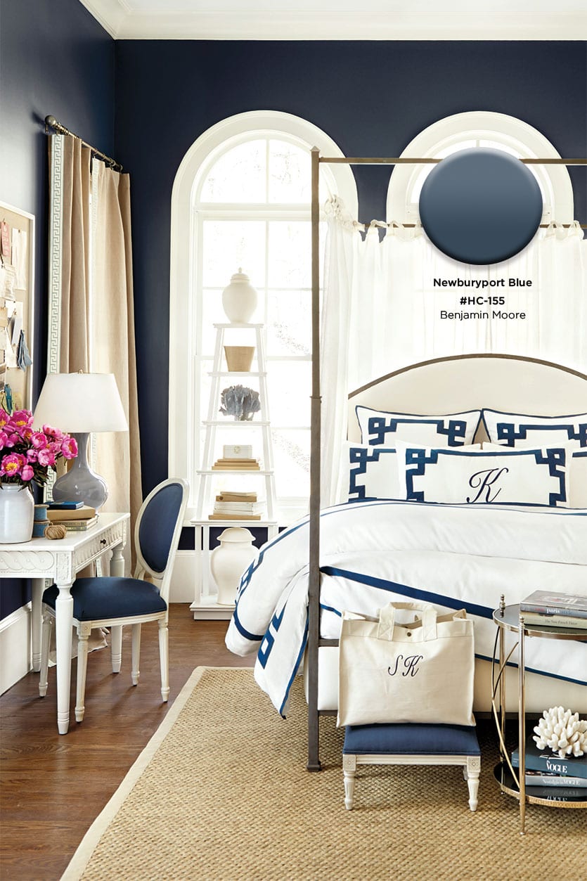
JO: Typically, I think about what the space is going to be used for. Cooler colors are more relaxing and soothing, so if it’s a bedroom or bathroom, and you want a more spa type feel or you’re someone who doesn’t sleep well and you need a really soothing sleep environment, I would look to more cooler colors. And if it’s a room that doesn’t get a lot of light, I would go lighter. I’ve been working with navy blue a lot lately, but in a room that doesn’t get a lot of light, it would be intense, so I would look toward a more denim blue and dial it down with a lighter shade. Warmer colors are obviously more energizing. They get your heart rate up a little faster, so those are good for kitchens, dining rooms and living rooms. But living rooms could go either way, depending on whether you want a relaxing feel or you entertain a lot and want to spur conversation.

BD: What about the size of the room? Do warm or cool colors matter then?
JO: There are qualities to cool colors that tend to recede more visually, so if you want your space to feel more open, use cooler colors, like blues and greens and grays, to help the walls and ceilings feel more expansive. Contrast that with a large dining space that you want to feel more intimate and cozy. You could use more warm colors, like oranges and reds.
BD: How do you ensure the colors you pick are going to work in your decor? In other words, how do you create a cohesive color palette?
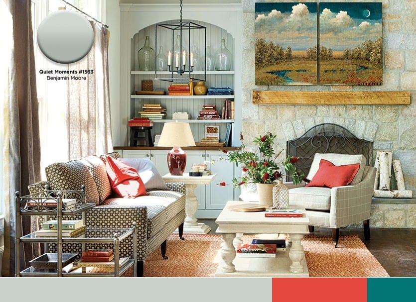
JO: There are a lot of different options. The color wheel is a great guide. I tend to tell people if you want the space to feel harmonious and soothing, then pick analogous colors that are next to each other, such as mixing blues and greens and reds and oranges. If you look in nature, leaves have many shades of green and then they can start to go yellow. With water, there are many shades of blue, and there is something very calming about these colors that bleed together. It’s really like decorating 101 if you’re new with it and not quite sure what you’re doing.
There are also complementary color schemes, where you pick colors opposite on the color wheel so that the combination is very dynamic and high energy. This is a more modern look, although there are some traditional interiors that play with this, too. Those colors offer more contrast to each other, so that gets a little trickier, because it can easily become a little too much. Usually the advice there is if you use complementary colors, make one of the colors a more neutral version. Say you did the blue-orange combo: if you have a bold orange, then keep the blue a very gray, neutral blue. Using bold versions of each color is like decorating with sports team colors — it’s very intense. Of course, that can look good in a kid’s room or a teenager’s room.
BD: How do you create a visual rhythm with a color palette?
JO: I’ve seen other designers write about using a formula like 60-30-10 for using colors in a room, and there is something to that. If you use two colors in a space and it’s 50-50, it can be very boring and a little too matchy-matchy. If you’re going to have multiple colors in a space, make one color the main color that is the 60% and another color 30% and then the 10%. That creates a rhythm in the room where you’ve got primarily one color. It could be a neutral or bolder color. What I tell people is if you go for bolder colors, it should be a more minimally decorated space, because there’s the issue of the focal point in the room. If you have too many focal points, then you no longer have a focal point; it’s just crazy. If you go with a bold color as your 60% color, then that becomes the focal point in the room and everything else needs to just rally behind it and support it. But if your 60% color is a neutral, then you can have a bold piece of artwork on the wall or you can play up your fireplace or you can do other things to create a focal point. So that’s another thing you have to ask yourself: do you want color to be the focal point or is it furniture or a piece of artwork or is it a view out the window, in which case you don’t want to distract from that view.

BD: Do you have a favorite color combination?
JO: I typically look toward more calming colors that tend to be tropical colors. Think about being in the Caribbean or Hawaii and seeing lots of turquoise and watery blues and tropical greens. But it’s personal. Someone’s happy place might be the mountains, and so that would be more earthy colors, like cactus green. I like how blue and green work really well together, and you can mix them and get those bluish-greens that can be really pretty. But if you go with a light blue or a light green, it’s nice to have a little gray in it, because it can start to look like a baby blue, which is a little too saccharine and sweet. For light blue, I like more silvery blues and for light green, I like to go with a sage green, something that has more gray or brown in it. But if I’m going with a medium shade, like a turquoise or a fern green, those can be more pure colors, more saturated.
BD: You obviously lean toward cool colors, but what if you wanted to warm up a space?
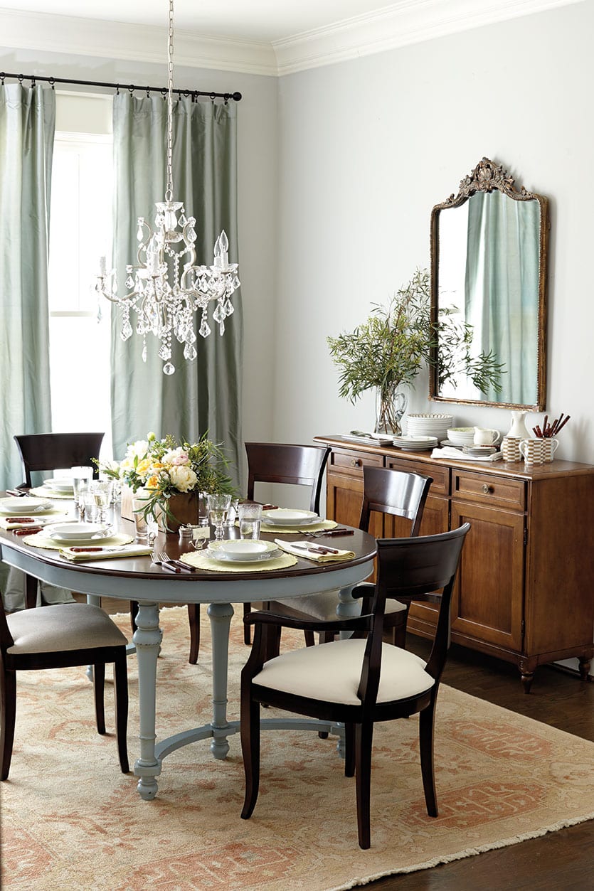
JO: When I want to warm up a space, I actually look to using wood tones. Wood clad and wood materials for interiors has remained really popular and that is where I would inject warmth. Gold tones and metals are another way to bring in warmth. But if I had a client who had a dining room space or a kitchen and they really wanted to make it feel warm and vibrant, I would look to colors of food, like red wine, strawberry or apple. They can be fun colors you can play with. And you can use them in small amounts, so it’s not overwhelming.

BD: One home decor trend that’s still going strong is white rooms. Do you have any favorite whites?
JO: I don’t use a lot of pure white, because I find that it’s a little too stark. I like cooler whites that have a touch of gray in them. And then there are some whites that I don’t really like, the sort of beige colors. When I was in design school I had an instructor who said never use navajo white, because she claims it was a color that was invented for commercial interiors to mask fingerprints. It stuck with me. Those yellow-y beiges just look dirty to me. So if I’m going to use a warm white, I find ones that have the tiniest touch of warmth to them and not too much yellow or peach. Again, the trick is to put a range of white swatches together, and you’ll pick up on the undertones. Once you narrow down your choices, you still have to make sure it works in your room with the colors in it.
BD: One thing we always recommend to our customers is to always test paint color first, even if you think it’s the perfect color on that swatch or you’ve used it before in another home.
JO: Yes! I am guilty sometimes in my own house of getting excited and picking color and just going for it. But I’ve had my own color mishaps, so I have to force myself to follow my own advice and paint samples. One of the best ways to do that is to get poster board or scrap pieces of drywall — a good size piece is at least two feet by two feet — and paint two coats, especially if it’s a vibrant color. Then you can move your board around the space, because if you’re going to paint all four walls in the room, the color is going to look different on each wall depending on the light and time of day. If you’re testing color on only one wall, you’re not going to get a good idea of what the color is going to look like on all four walls. Another reason why it’s great to paint samples onto poster board is that the sheen of the sample paint can stay on the walls if you paint directly onto them. Oftentimes, you can see where you’ve painted that sample, even after three coats. You don’t want to affect that final finish.
BD: What sheen do you recommend?
JO: I like flatter finishes. The advantage is that they hide imperfections. The disadvantage is that they’re harder to clean. So ceilings are great for flat, because they’re not going to get dirty. For walls, if it’s a space where there aren’t young children and pets and the client really wants a matte finish, I’ll use a flat finish. But if you’re a little messy or if you have kids or pets, then I would at least do eggshell finish, the next sheen up. It will still hide imperfections pretty well, but you can wipe it up easier than flat. But in rooms like kitchens or with anything that gets a lot of abuse and use, like doors and trim, you want to use a semi-gloss, because it’s more wipeable and cleanable. In rooms with high humidity, like a bathroom, use a semi-gloss to protect from moisture.

BD: You mentioned ceiling paint. What do you recommend for color there?
JO: There’s a trend now where people will paint their ceiling a bold color. But it only looks good if you keep the walls white or very neutral. I like that trend, but a lot of people want the color on the walls, so I usually say do the ceiling white. If most of the colors in the room are cool colors, I’ll recommend an off-white that has a little gray to it. If the colors are warm then I’ll recommend a warmer white. Here’s a tip a painter gave me once: the ceiling always looks darker than the walls. If you want to use the same light color on the ceiling and walls, I tell people to go one shade lighter on the swatch strip and it will actually look the same color as the walls. Don’t do that if you’re using darker colors, because then it would look like a cave!
BD: You have given us so much great advice. Do you any other insight or advice you’d like to share?
JO: Another tip I’ve gotten from a painter and one that I’ve been using is that paint will be lighter and more vibrant on the wall than what it looks like on the chip. So I tell people if they’re having trouble deciding, go for the color that is less vibrant but darker in hue and that will help you get the look of what you originally wanted on that swatch.
We’re feeling very enlightened — and ready for our next paint project. Thanks, Jennifer!
Browse all of the paint colors from our past catalogs, or find more decorating inspiration by visiting our Pinterest boards.


Alissa
Could you please tell me the paint color on pages 16 and 17 of the March 2020 catalog?
Abbey Nolte
Alissa,
Unfortunately I don’t have information on the paint. I would suggest showing this picture at the paint store and they can match it for you.
Best of luck,
Abbey
Mary Jane
Such a helpful article, thank you. What do you say about the ceilings? I’m thinking of painting my walls and trim a creamy warm white, so do I paint the ceiling the same color too?
Caroline McDonald
Mary Jane,
There are so many schools of thought on how to ceilings. Bunny Williams mentioned in her recent podcast episode that she likes to choose a trim and ceiling color at least a shade or two lighter than the walls to help differentiate them. Suzanne Kasler likes to paint walls and trim the same color. It all depends on the look you prefer!
JT
Not all colors in some rooms are listed. The room with the dark blue ceiling for example. I would like to know the wall color. There are a couple other photos like that example. I love that you show the colors, I just wish it was all of them.
Caroline @ How to Decorate
JT,
I’m so sorry. I don’t have any information on that wall color. I would try a white with a cream undertone, like Benjamin Moore’s White Dove.
Judy Gilbert
What is the color in the dining room, fixture crystal , painted dining room table legs, please?
Caroline @ How to Decorate
Judy,
It’s Benjamin Moore’s Sleigh Bells #1480.
Sue Roberts
Where can I find the Bell Jar Light in one of the above photos?
Caroline @ How to Decorate
Sue,
I’m so sorry but that light fixture has been discontinued!
nicole mixon
What is the paint color and brand name for coral color walls in Ballard Design catalog key code BD126165 on pages 86 and 87. Received this Catalog early April 2016. Thank you.
Caroline @ How to Decorate
Nicole,
The color is Benjamin Moore’s Rich Coral!
Margaret Huguenin
Can you please tell me the name of the wall color in the tropical color question? It is the grey with the tropical blue and green next to it. 6th picture down. Thanks so much.
Caroline @ How to Decorate
Margaret,
It’s Benjamin Moore’s Northern Cliffs, #1536.
Happy Decorating!
Janice Ratcliff
I forgot to tell you the bedding is in natural.
Janice Ratcliff
Could you suggest a paint color for walls in a bedroom? I am using the Audree Pom Pom bedding. I would like to use a white, but don’t know which one to choose. Thank you
Caroline @ How to Decorate
Janice,
White Dove is one of our favorite whites, and we use it often on the walls of rooms in our catalog. It’s a favorite among interior designers, even Suzanne Kasler!
Best of Luck.
reba hutchings
Can you paint the ceiling and walls the same color
Caroline @ How to Decorate
Hi Reba,
Absolutely you can, especially in a small space. A ceiling and wall will help make the room feel larger.
Best of luck.
Helen Dentel
How refreshing and what a relief to have found most of my painting questions finally answered. I am on way out the door to get my color samples and poster board to try them out. Thank You, Helen
Caroline @ How to Decorate
Helen,
We love hearing this! So glad you found this post helpful.
Best of luck with your painting project,
The How to Decorate Team
JW
What were the paint colors (wall and trim) used in the example of a white room – when asked about favorite whites.
Caroline McDonald
JW,
The color is Benjamin Moore’s Acadia White!
Jeannine
Can you tell me the paint color used in the late fall catalog page 55 and page60.
Thank you!
Caroline McDonald
Jeannine,
What items are featured in the rooms you’re interested in?