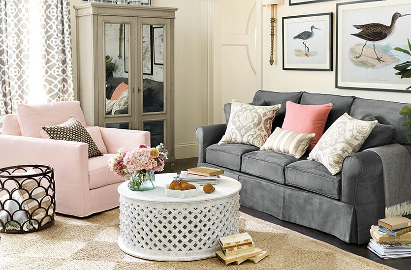

We’re tickled pink over Pantone’s 2016 Color of the Year. This year, the color experts selected a duo of shades to share the honor: Rose Quartz and Serenity. Noting the natural balance between the warm rose and cool, tranquil blue, Pantone said the two shades inspired peace and order — something we all crave in our daily lives. And if you’ve seen our most recent catalog, you already know that we are unabashedly in love with pink right now.
A color that is too often relegated to the nursery or little girls rooms, pink doesn’t get the attention, or respect, it deserves. So without further ado, here are our favorite rooms from our winter catalog that are certainly prettier in pink.
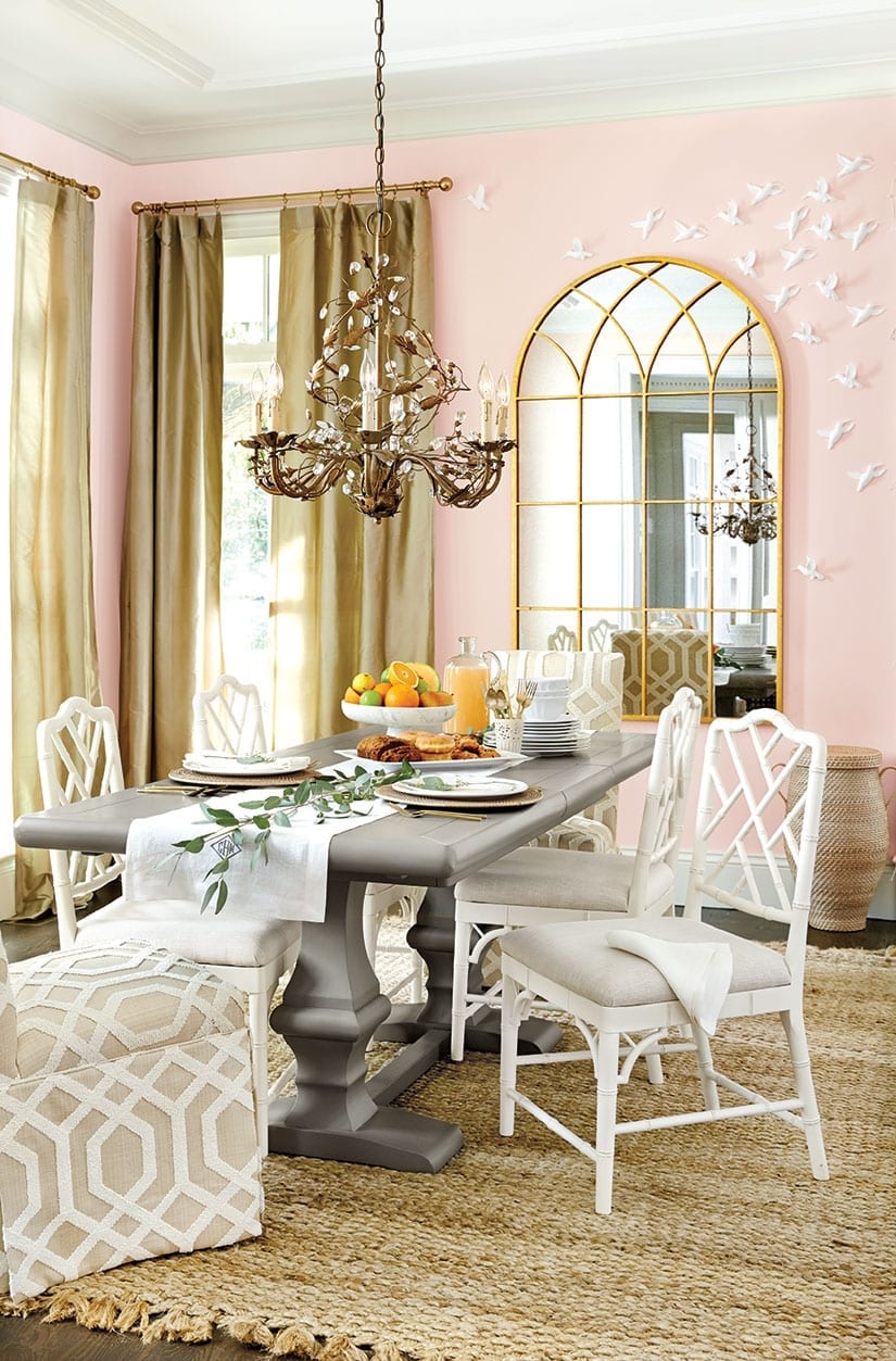
We admit that pink walls may not be your first choice for a dining room, but it ought to be. It’s all in the shade, of course. This soft blush warms the room and casts a flattering glow, making everything and, most importantly, everyone in the room, look and feel just a little bit better. It’s the perfect shade for rooms where you entertain often.
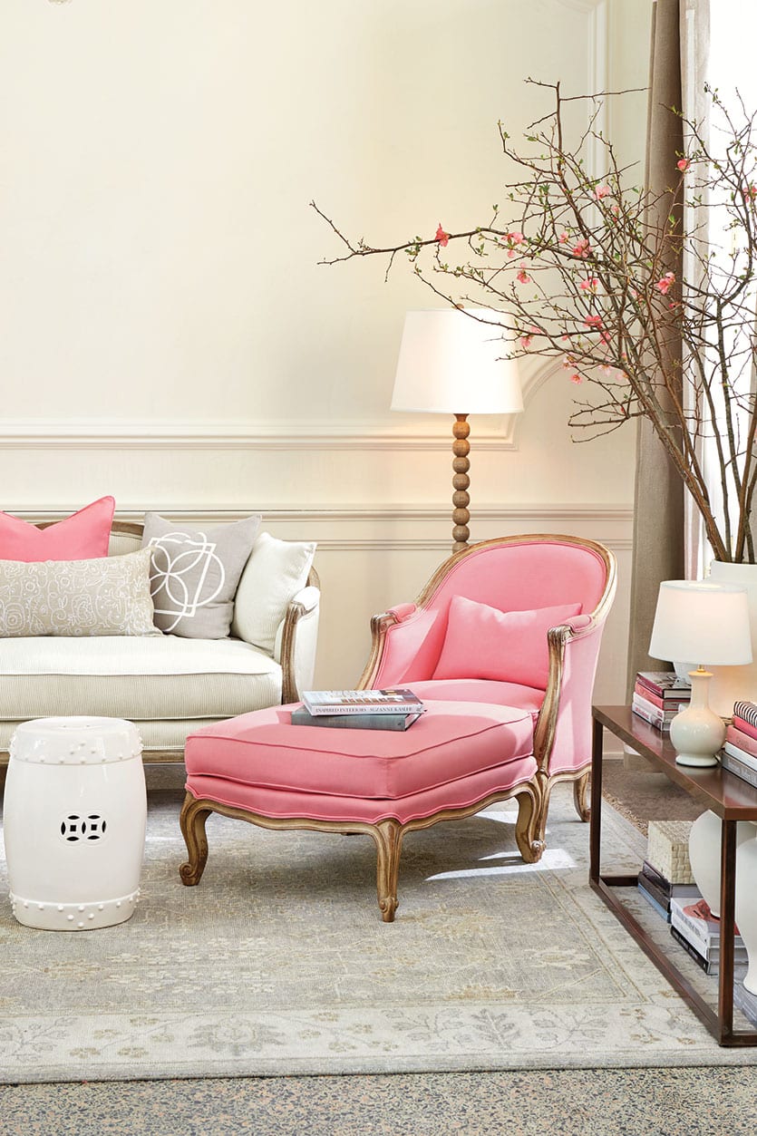
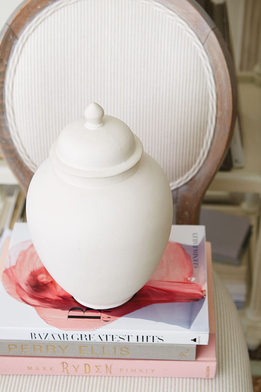
Our design partner, Suzanne Kasler, considers pink a “forever classic.” Long before Pantone named Rose Quartz color of the year, Suzanne was adding pink to her line of Signature 13oz. Linens and dreaming up projects for her soft, feminine Blush and playful, vibrant Peony. “Pink is the perfect color for accessorizing,” says the designer. “The trick is using it judiciously — on a pillow, a chair or ottoman. Use just a touch and you’ll never tire of it.”
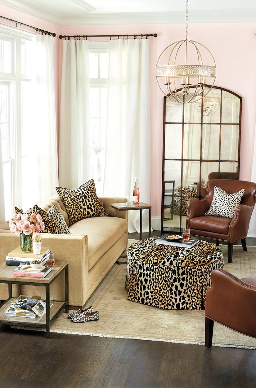
An unexpected neutral, pink is the perfect backdrop to match just about any color or pattern. Here, we paired it with our new animal print, Serengeti, for a fun, flirty mix that can be pulled off in any room. The leather chairs and dark finishes also serve to balance the femininity of the pink walls, making it a universally appealing color for a living room.
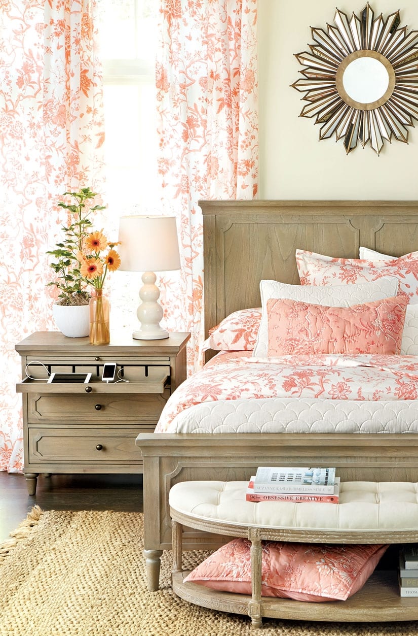
We found the antidote to the winter blahs. Our Jardin Toile Bedding in coral — with a touch of blush — brings fresh, cheerful color to a bedroom. Repeating the pattern on the bed and windows creates a soothing flow that doesn’t overwhelm the senses. We love this bedroom, because it’s pretty and modern at the same time without being overly feminine, so even the Mister can get on board with this look.
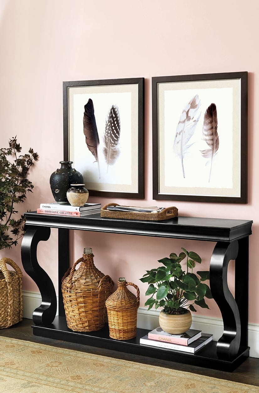
If first impressions are everything, then try this uplifting color in the entry. Immediately envelope your guests in the rosy glow of pink for a warm welcome. Here, we grounded the feathery soft color with a black console and frames, loads of texture and a neutral rug with warm tones.
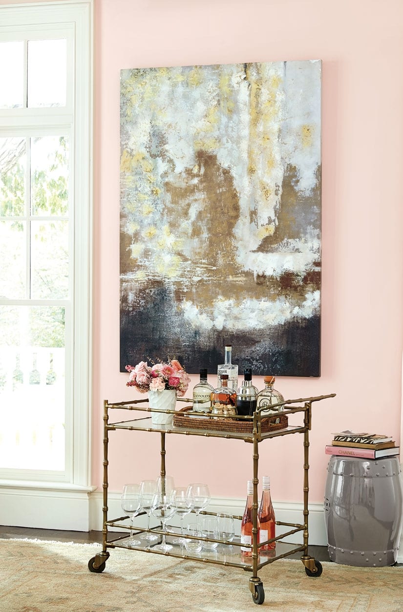
Can’t commit to pink upholstery? Paint your walls! Because pink is such a flattering color and goes with almost anything, you won’t have to make any other big changes to your decor. Paint really is the easiest, most affordable change you can make for the biggest impact.
Shop our entire Winter 2015 collection here. For more design inspiration, visit our Pinterest Boards, or find more gorgeous rooms in our Photo Gallery.
Did you like this post and find it helpful? Rate it below and share your thoughts in the comments.



Irina
Lovely. It made me want to have some pink in my house too.
Mrs. Shockley
Great rooms!