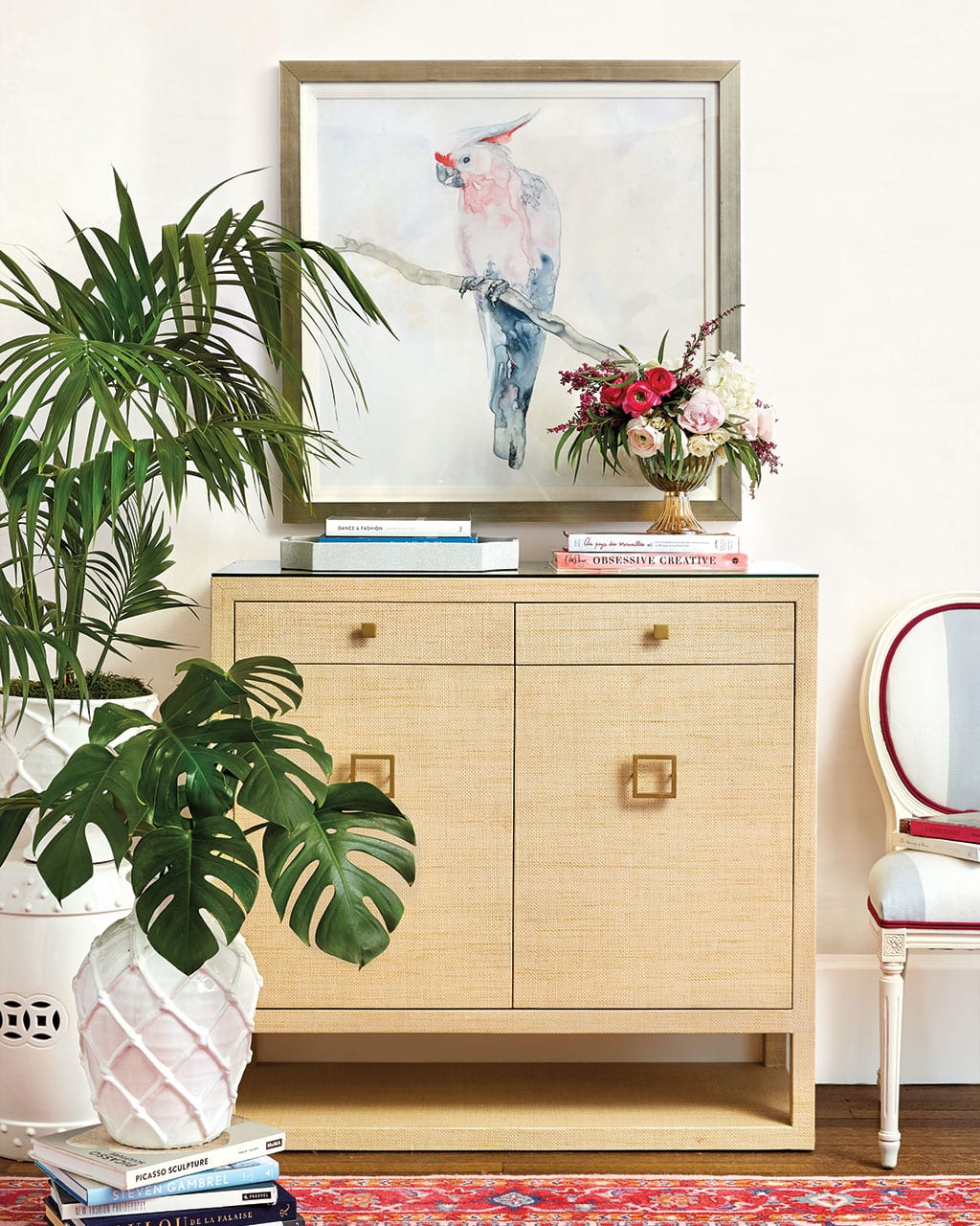
We’re readying for Spring and digging bold color palettes, playful prints, and a sleeker silhouette. We sat down with our Senior Vice President Karen Mooney to talk about all the trends we’re fawning over for Spring, how we designed spaces around them, and which ones she can’t wait to bring into her own home.
BD: The cover is decidedly tropical between the raffia side board, Daiquiri the Parrot print, and the tropical leaves. Pastels are usually reserved for Spring, so why such a bold, saturated color palette in this season?
KM: Well, we’re in love with pink. Suzanne Kasler first introduced her blush linen years ago, and it’s been one of our favorites. But now it’s getting more intense, and you’re seeing it everywhere, especially in fabrics, rugs, and art. We’re got a hot pink Sunbrella fabric, Suzanne’s peony pink, and this new Elle Rug on the cover. It feels current and fun, and it quickly updates any room. So, hot pink has been leading the charge for us, but overall, you’ll see lots of color in this collection. We’re ready for winter to be over, and fun intense color is how we’re beating that cold weather slump.
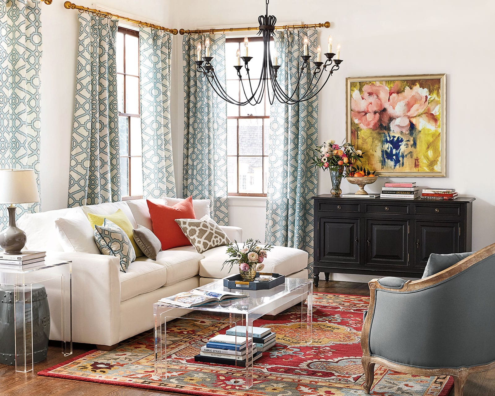
BD: There are so many rich colors this season – oranges, greens, pinks – how do you know when you can and can’t mix them together?
KM: A lot of it is inspired by fashion, so for a long time, we’ve seen strong florals on the runway. We’ve reimagined those florals in art pieces. In terms of knowing which colors work together and which ones are right for you, look to your closet! For example, if I personally feel comfortable with a largely neutral outfit but I like wearing one colorful handbag or shoe, then that’s how I should approach my home. Start with a neutral foundation, then add in some orange throw pillows or lampshades. If you’re the girl who loves lots of tribal prints and you mix and match, then you’re going to be more comfortable doing that in your room. So I think that’s one easy way that people can understand how to pull colors and accents together. It’s no different than your closet. Whatever level of extreme you feel in your closet, you’ll likely feel the same way in your house.
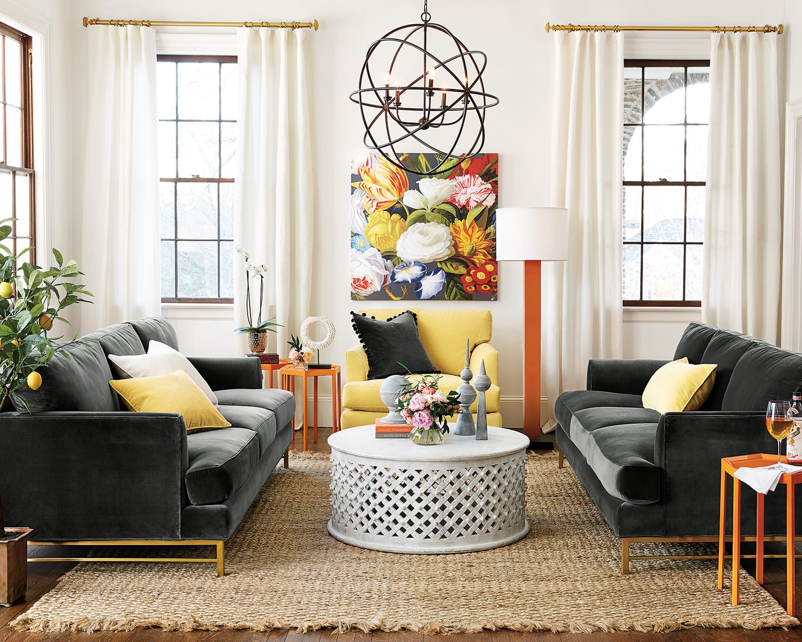
BD: One of the rooms that struck me most was this orange, yellow, and slate gray living room. There’s a lot of color, but it’s all tempered with that rich gray. How did this space come together?
The piece of art was definitely the inspiration, and we do this a lot. We’ll take the palette from a rug or painting, and we’ll pull that thread through the rest of the room’s decor. You can see that here. In this Opulence Art, the background that grounds the whole piece is dark, and that’s what we wanted to do in the room. Then, of course we’ll build on that baseline of dark with accents of color. But there’s actually not that much color in here! The rug, drapery, sofas, and coffee table are all neutral, then we brought in vibrant lamps and side tables. Suddenly, it feels so energized!
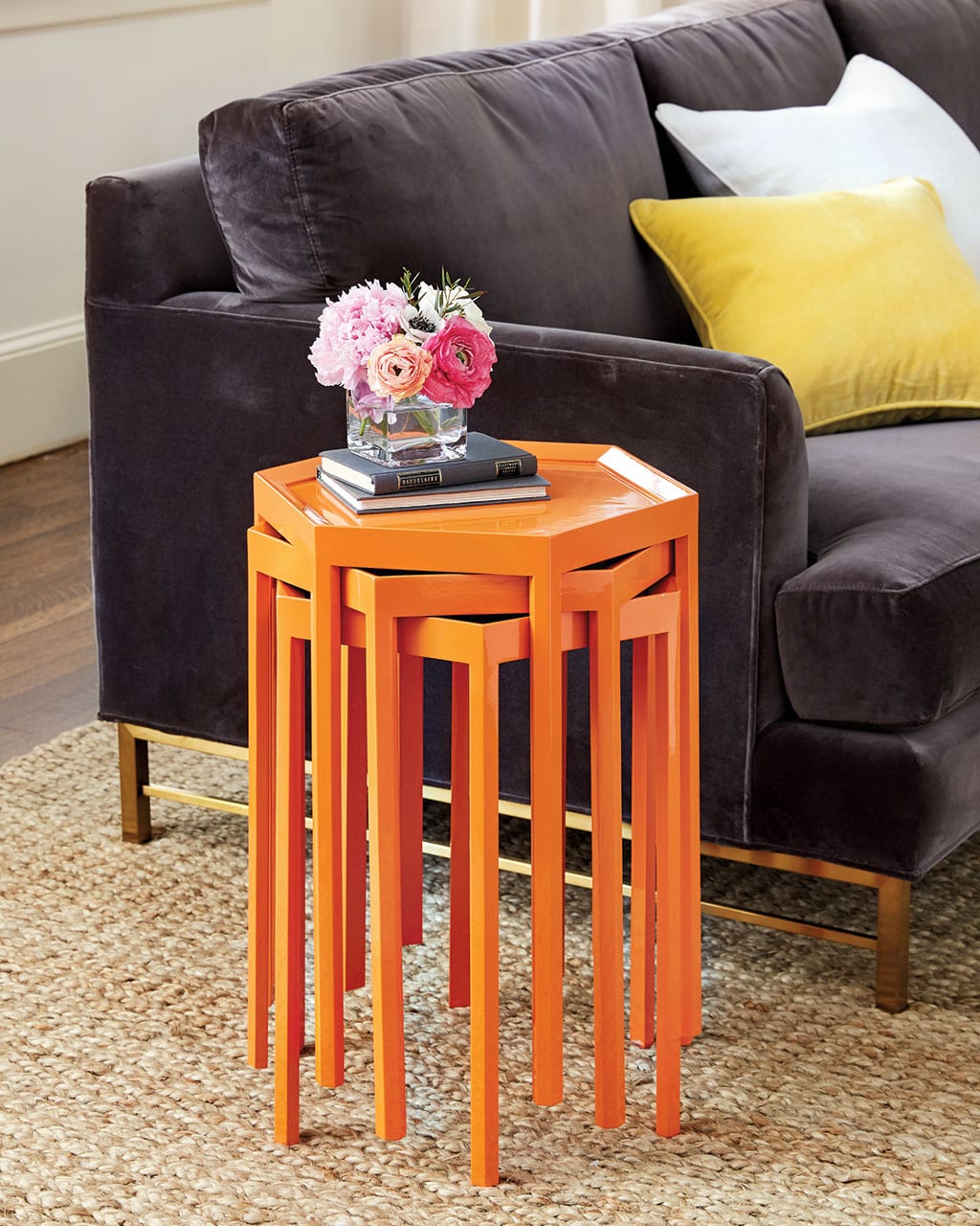
BD: Orange is a fairly new color for us. We’ve always had Suzanne Kasler’s Mandarin linen and some more rust colors, but this is really tangerine.
KM: It’s definitely vibrant, and I think it feels really fresh. I’ve always had a little bit of orange in my house, and to me, it’s such a safe color and looks good with so many neutrals like gray and tan. I’ve never gotten tired of it, and it can go a lot of different ways. It can go really deep and dark and seasonal or more vibrant and punchy. It’s a fun, easy hue to mix in and looks great with navy and green. Just don’t let it get too Halloween-y. That’s the one thing to avoid!
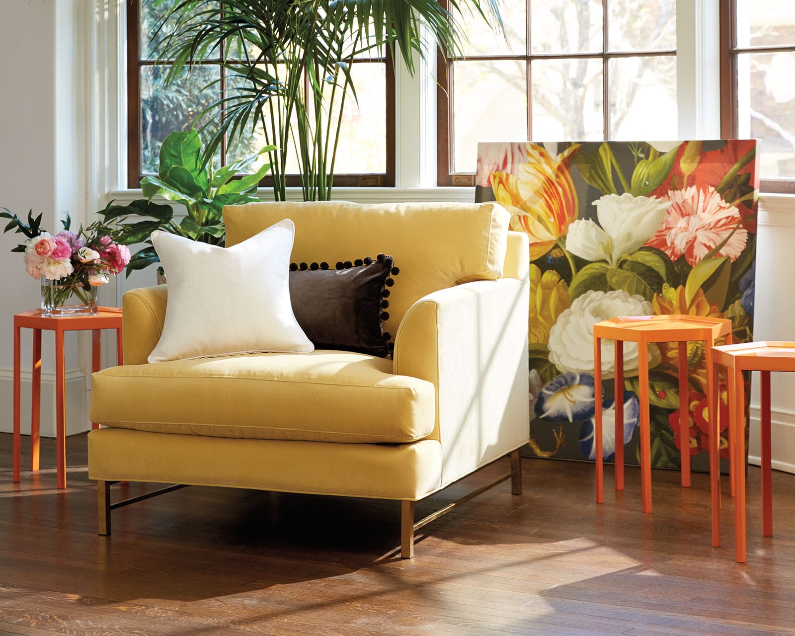
BD: The new Kathryn collection has a super sleek line, metal base, and it’s upholstered in a rich velvet. Tell us about this new silhouette.
KM: I think if you look through the new pieces this season, you’ll notice a more clean-lined, dare I say modern, thread. That’s what we’re all about. Our DNA has always been to layer and mix genres, time frames, and styles because we really feel like a layered room has more character. So that’s why we’re starting to bring in more clean-lined pieces in upholstery. The arms are actually relatively traditional, but the metal base takes it to the next bracket of playful and fun. It’s not nearly as old school.
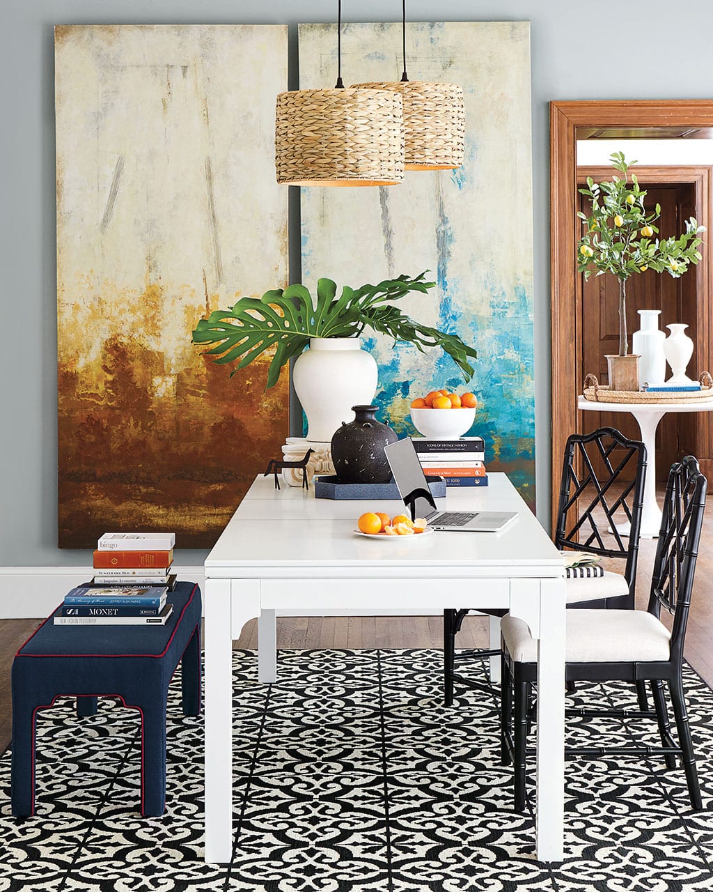
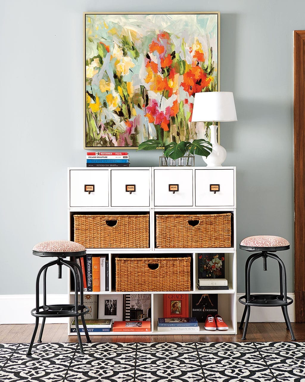
BD: There’s definitely an emphasis on family friendly pieces in this collection, especially in the storage pieces and the use of performance fabrics.
KM: So many of our rooms have to be dual purpose, so this dining room is where we do our homework, pay bills, and do crafts. On one side of the room, there’s our Abbeville Storage piece with cubbies for their art supplies and toys, and the dining space functions in lots of different ways. Plus, it’s grounded in an indoor outdoor rug so spills or messes are no problem. We’re always focused on addressing real life activities, but giving you a stylish way to approach them.
We’re a family company, so our product design team and merchants have families and children. We talk a lot about what issues we all have in our own homes, and then we’re letting those challenges inspire solutions and new products.
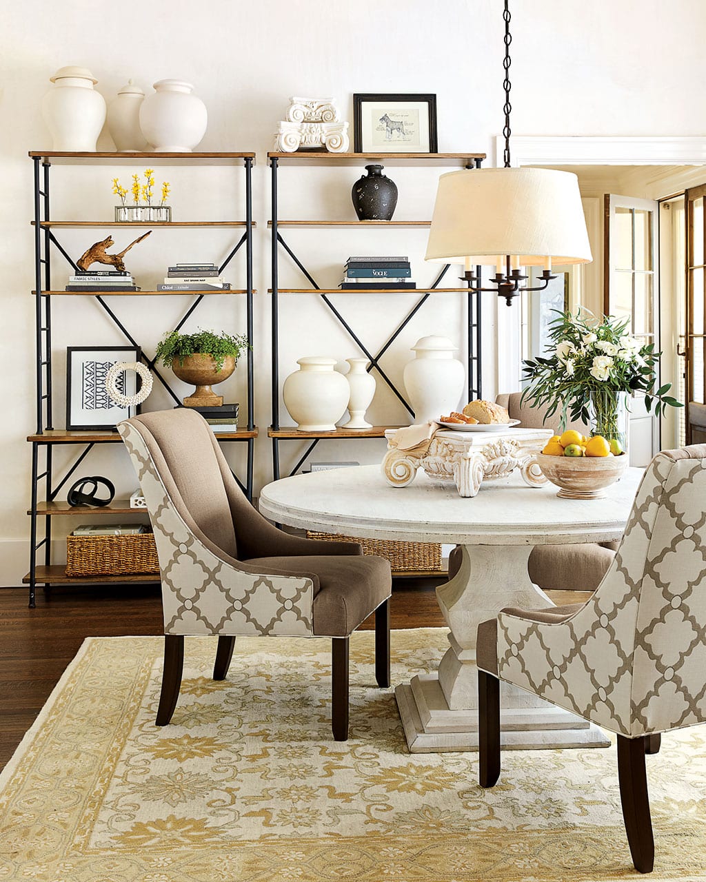
BD: Let’s talk about performance fabrics. What do people need to know about them, and what does it mean?
KM: Performance fabrics are all about durability. Obviously spills and stains are big concerns not just for families but everyone, and performance fabrics are treated in advance to resist stains or are especially durable. Of course outdoor and Sunbrella fabrics fall under the ‘performance’ fabrics umbrella, but also things like our washable velvets and microfibers are super hardwearing too.
BD: Both Suzanne Kasler and Bunny Williams have new outdoor fabrics as a part of their collections?
KM: That’s right. Suzanne has had exclusive outdoor fabrics with us for years, and she’s added a new ditsy print in two colors, called Cannes. It coordinates nicely with her Santa Monica Stripe.
We’re also offering some outdoor fabrics that Bunny Williams developed a few years ago in some pretty solids and coordinating stripes. These translate really nicely to indoor spaces and we’ve used them in a few rooms throughout the season.
BD: Speaking of fabrics, let’s talk about our new Palmae Green print.
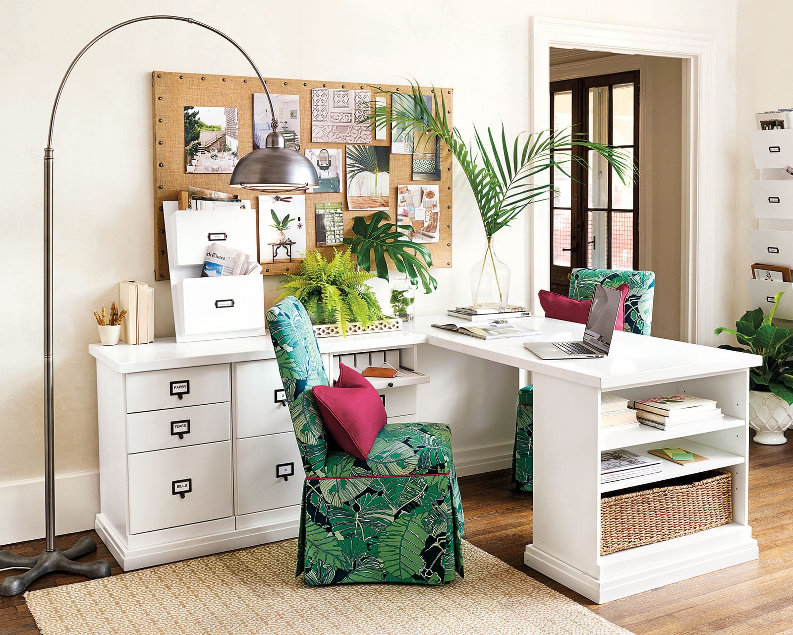
KM: Palm leaf prints are super retro, and they’ve been showing up a lot in fashion and home decor for a while now. They feel so energized which is what we really loved about them. We actually found an old vintage fabric that we used as the inspiration for Palmae. You may have seen the gray version in our Winter 2017 collection, but for Spring, we’re going full tilt with this green one. Little touches of this pattern can really bring a lightheartedness, a playfulness to your space.
BD: We’ve talked all about the color, but there are some rooms this season that are more neutral and tailored.
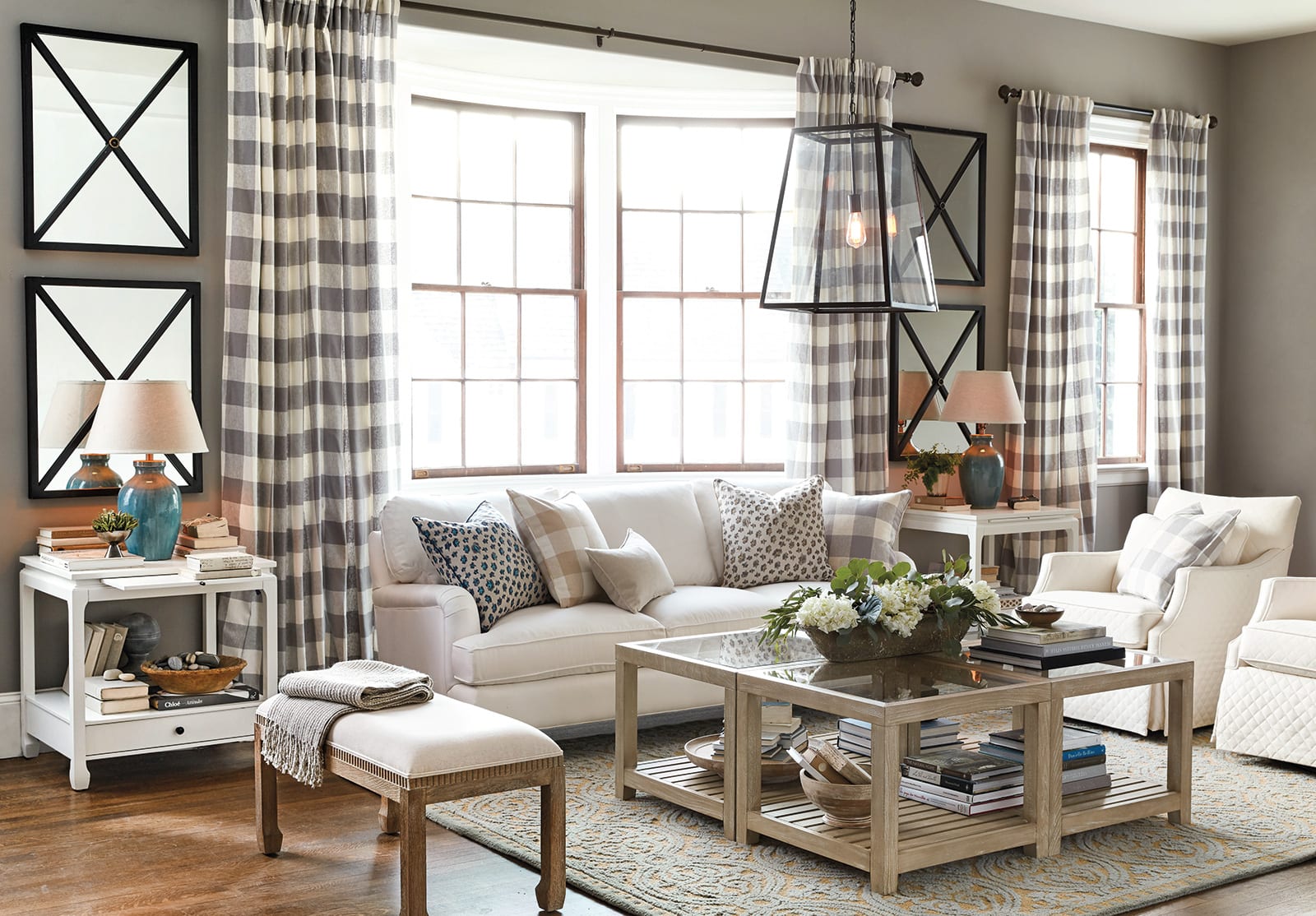
KM: Of course! Not everyone loves tons of color, but some do. When we’re actually planning which rooms to create for the season, we group them together based on personalities and even vacation locales. We had a Palm Beach girl and a lake house girl and a Malibu girl — about five in total. Then we channeled those personalities, so our lake house was more rustic, while our Palm Beach house used lots of palms and hot pink. That gives us the opportunity to take a few different directions in the spaces we’re creating to showcase our vision. The great thing about our pieces is that they can go in so many different directions. Depending on the fabric or what’s around it, so many of our products can easily sit with a variety of styles.
BD: Pink is all throughout the book and in varying shades. In some spaces, it’s very subtle, and in others it’s the focal point. There’s blush, magenta, and even hot pink. How can you bring a little pink into your space?
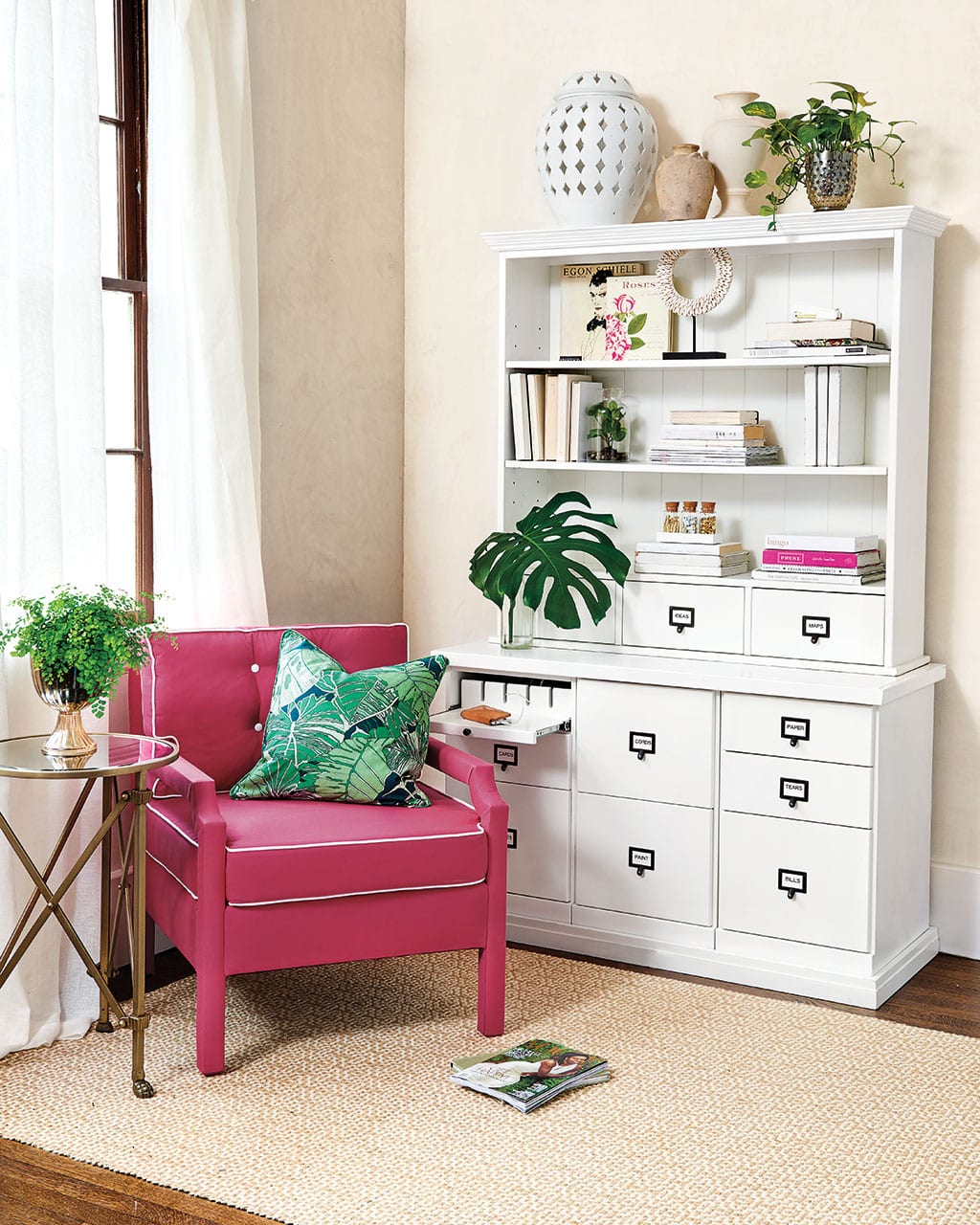
KM: It’s the same as any accent color. If you want to bring in an accent color, you can do it in all sorts of ways depending on how strong you want the color statement to be. With minimal commitment, you can take some colored paper and wrap your books in it. Add in two coordinating throw pillows, and you’ll be shocked at what a change it could make!
I actually remember years ago telling someone here at the office that I wanted to have all lavender accents in my living room. She looked at me like I was insane, but the next week, she brought me two throw pillows. She told me to take them home and try the color out before changing my whole space to make sure I’d love living with it. I think that’s a great approach! Before you branch out into a totally new color scheme, test it out just like you would a paint swatch. If you love it, you can start bringing it in in more ways, like art or an occasional chair.
In my living room, I actually have two x-benches in orange, and for a while that was my only color. I recently layered in some artwork that had orange in it. Then, when I have guests over, I might buy some tulips in the same orange to reinforce the color palette. Those three pieces create a story, and it feels deliberate.
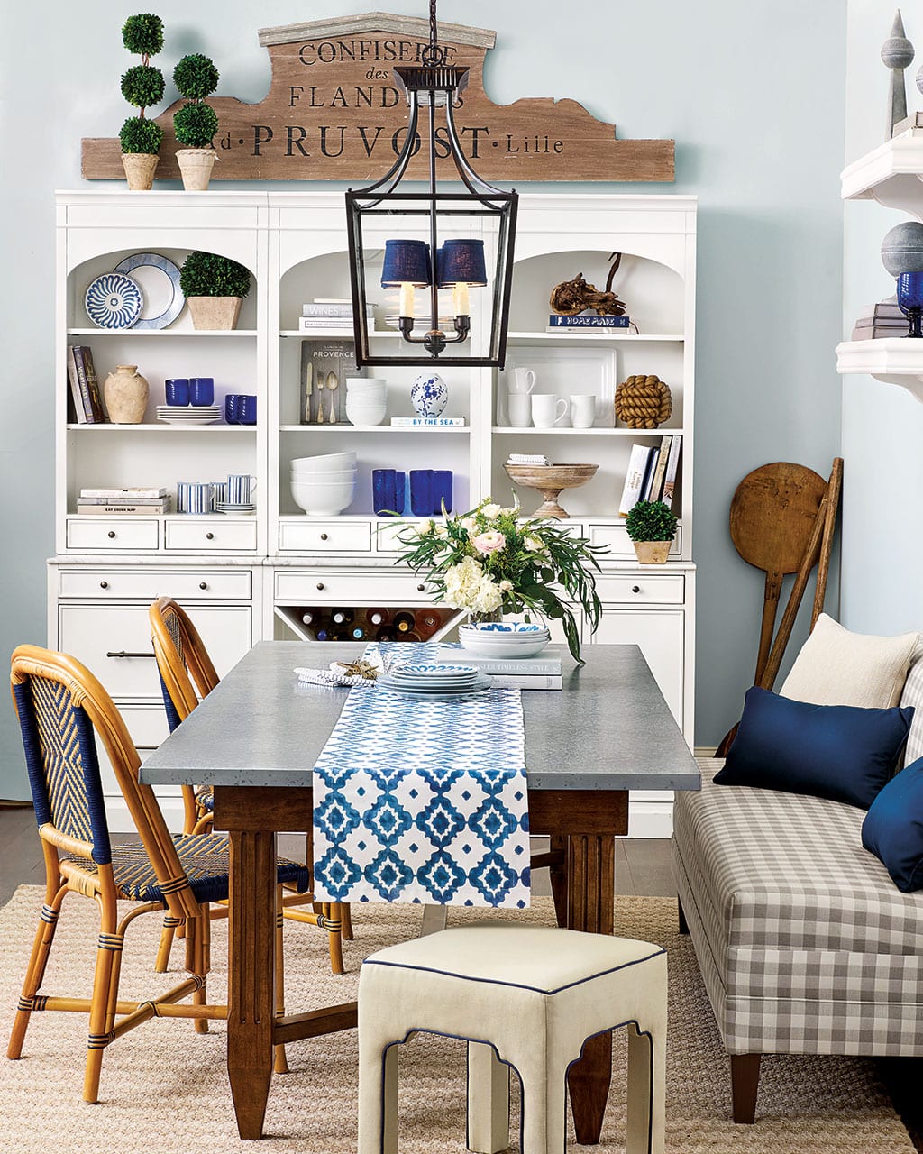
BD: Of course blue and white isn’t going anywhere, particularly navy. It’s almost like a neutral in many of the rooms in the catalog, replacing blacks, grays, and tans?
KM: Navy and white is such a beloved color combination. Look at our Chinoiserie vases which date back hundreds of years, and that color palette is especially present in kitchens and table ware. It’s a familiar pairing that translates beautifully into so many rooms. This is the time of year that navy and white really speaks to us. You’re ready to get outside in the fresh air and blue skies, and it’s just such an easy and casual color to live with.
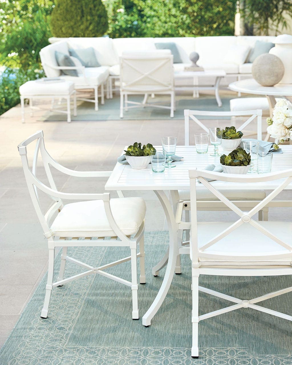
BD: For us, planning our outdoor space starts early because we want everything to be ready on that first warm Spring day. How do you see outdoor living differing this year than last year?
KM: We’re really excited about Suzanne Kasler’s classic summer white collection. Her Directoire collection is one of our favorites because of it’s classic look and comfortable seat. I actually own this seating collection. Now I’m bummed I don’t have white! The white iron pieces pair beautifully with her signature colors that you’ll find throughout the rest of her collection like spa and taupe.
We’re also introducing an outdoor collection from Bunny Williams! Bunny wanted something very practically minded but that looked pretty. All of the cushions are integrated into the seats, so there’s no need to run around the patio pulling up cushions when it starts raining. Bunny really likes a mixed look, so you’ll notice her dining chairs don’t exactly match her seating pieces. But of course they coordinate. She actually has two dining chairs that echo each other but are different. One of our favorite parts of the collection is the generously sized coffee table with a big basket underneath. In her vacation home in Punta Cana, she uses the basket to display seashells they’ve found on the beach.
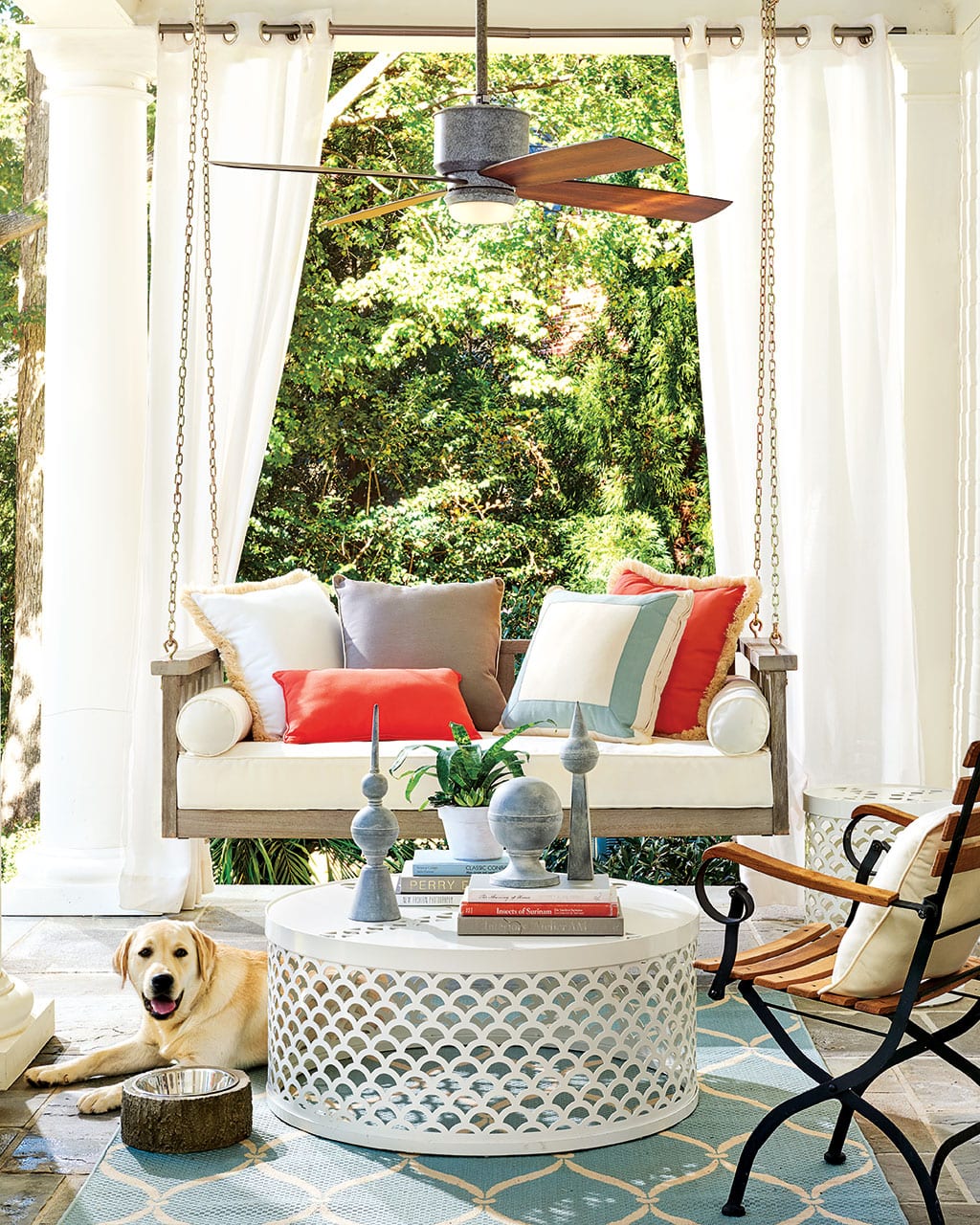
BD: How can everyone take their outdoor game to the next level?
KM: I encourage people to mix up their outdoor pieces! You don’t have to buy a whole set, you can piece together different materials for a more collected look. Maybe you have teak chairs with an iron table. Or wicker with metal. Don’t be afraid to mix things up!

BD: How about outfitting your space like you would an indoor space?
KM: There are a lot of accent pieces in this new collection that work outside. Think about your outdoor spaces like a room, don’t just plop one collection outside and be done. Just like you would in a living room, you want different sizes, shapes, and materials. Tuck in a few garden seats that can be drink tables or extra seating. Get creative with planters. Maybe you use a planter to hold towels by the pool. Look at it with a fresh eye, and use things in unexpected ways.
Karen’s Favorite Things
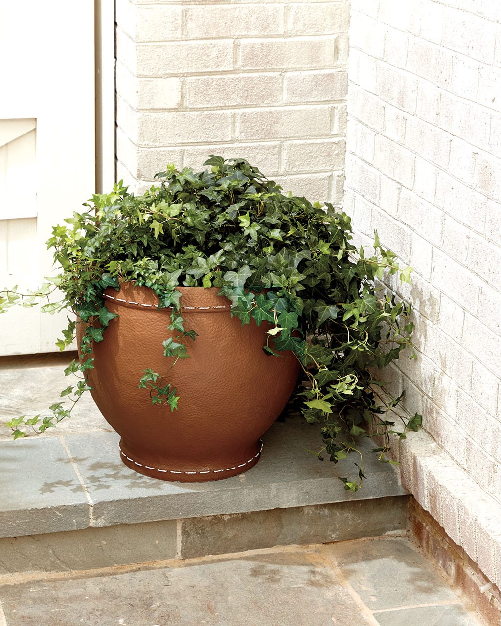
The Burke Planter
It’s the coolest thing ever. It looks just like leather but it’s outdoor safe! I’m dying to put a big tree in this for my living room.
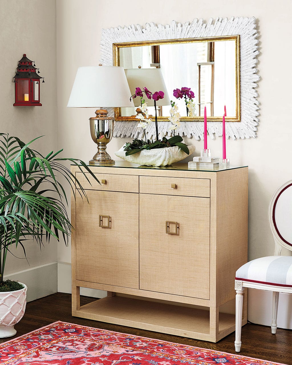
The Adele Sideboard
Anything covered in raffia is totally up my alley. The height is great, the drawers are awesome, and I love the brass hardware!
Elle Rug
I love how bold it is, but it’s not overwhelming. It’s just a beautifully balanced piece. It’s feminine but not too girly because it’s grounded in navy. It could work in so many places. It’s fun and fresh, and I can imagine building a whole room around it!
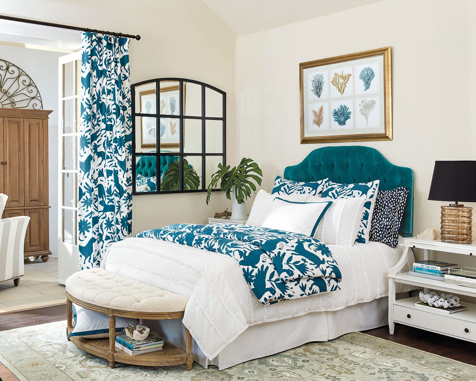
Otomi Prints
I’ve always loved otomi pieces, but it’s so expensive because it’s hand embroidered! I couldn’t afford anything more than a table runner when I was in Mexico. The pillows are embroidered, but the panels and bedding are printed. Often we’ll take a print we love and interpret it onto multiple pieces. This is the perfect example of this. One thing we see a lot with high end designers is they’ll use one fabulous fabric on the drapery, pillows, and on the bed. That head-to-toe look when done deliberately can look so chic, and we make it so easy for you!
We do it also with our Kenzie hand-painted herringbone pieces and our Thandie Watercolor pattern.
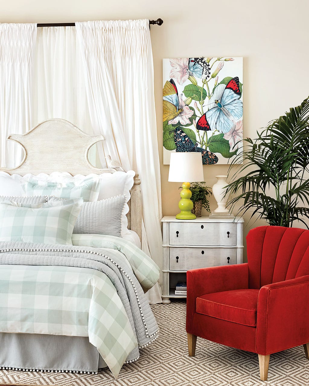
Cici Channel Back Chair
It feels a little throwback, a little mid century modern, and that channel back detail is a trend that’s coming on strong. It’s a great scale for a bedroom, but a pair would look fantastic in a living room too. It’s a chair that’s welcoming and just begs for you to sit in it!
Browse all of the new pieces for Spring 2017, or see the paint colors we used in our Spring catalog.
For more design inspiration, visit our Pinterest Boards, or find more gorgeous rooms in our Photo Gallery.
Did you like this post and find it helpful? Rate it below and share your thoughts in the comments.


Susan Bishop
Gorgeous, Gorgeous and Gorgeous!