**Disclaimer: We had some technical difficulty with one of our mics. It refused to cooperate! We hope you’ll enjoy the show anyways.**
Being the design-aholics we are, we couldn’t turn down an opportunity to interview the Editor-in-Chief of Atlanta Magazine’s HOME, Betsy Riley. We have Betsy to thank for reviving the title in 2015. Each issue brings some of the most gorgeous and inspiring spaces in Atlanta, so we were thrilled to pick her brain about what makes a house magazine-worthy and how she decorates in her own home.
What You’ll Hear on This Episode:
- Karen’s bathroom-related entertaining disaster
- Karen tested our Brian Patrick Flynn’s drapery training trick
- Taryn talks about her entertaining pet peeve — everyone gravitating to the kitchen
- Taryn’s shade swap with a big lighting lesson — take your lamp base to the store!
- Why some beautiful homes just aren’t right for a magazine
- How she picks which homes to feature and what types of spaces don’t make it to the magazine
- What her biggest decorating challenge is
- Why you have to be able to let things go
- Betsy’s tips for making your spaces look good in photographs
- We talk about Betsy’s black and white issue
Decorating Dilemmas:
Hello,
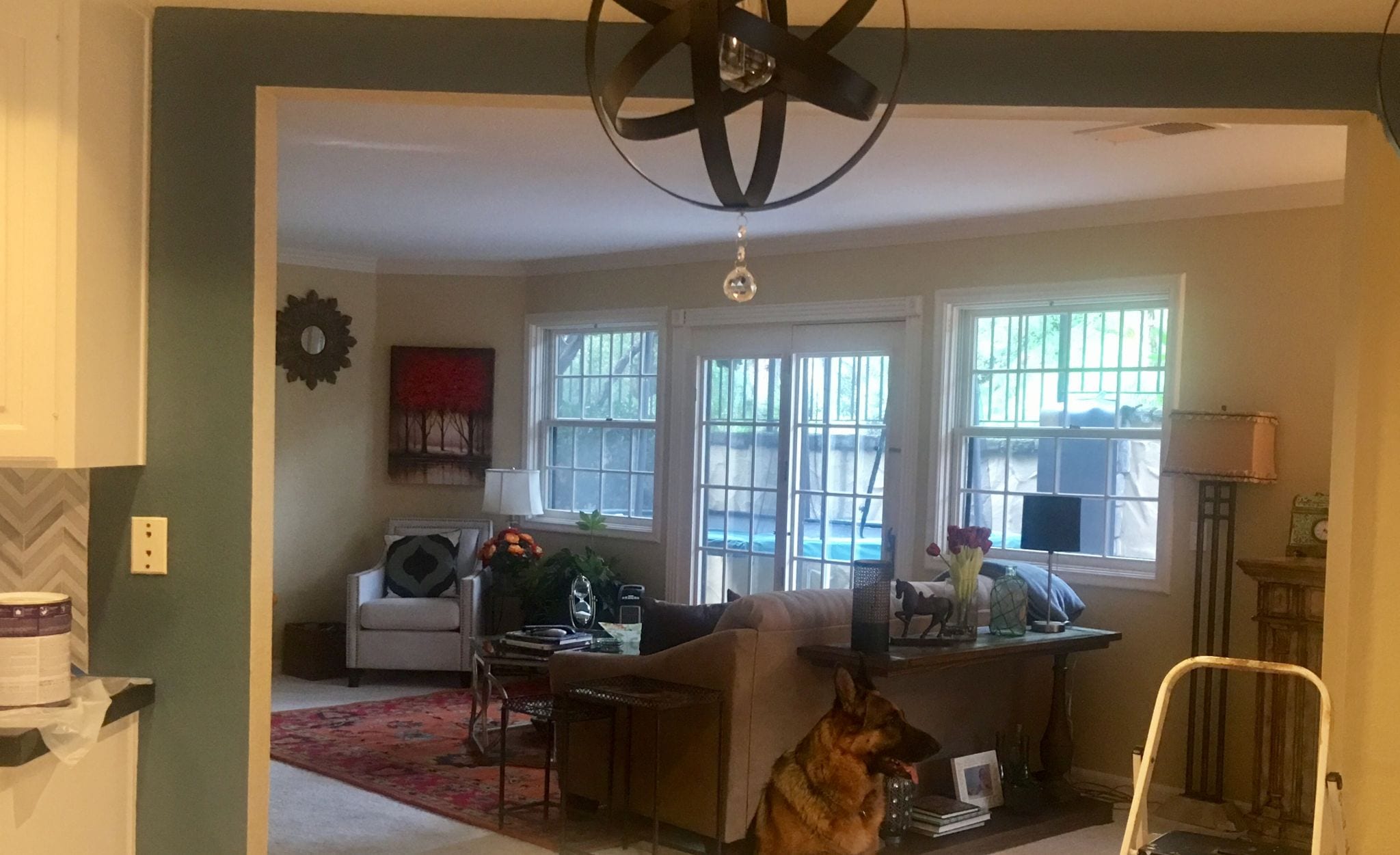
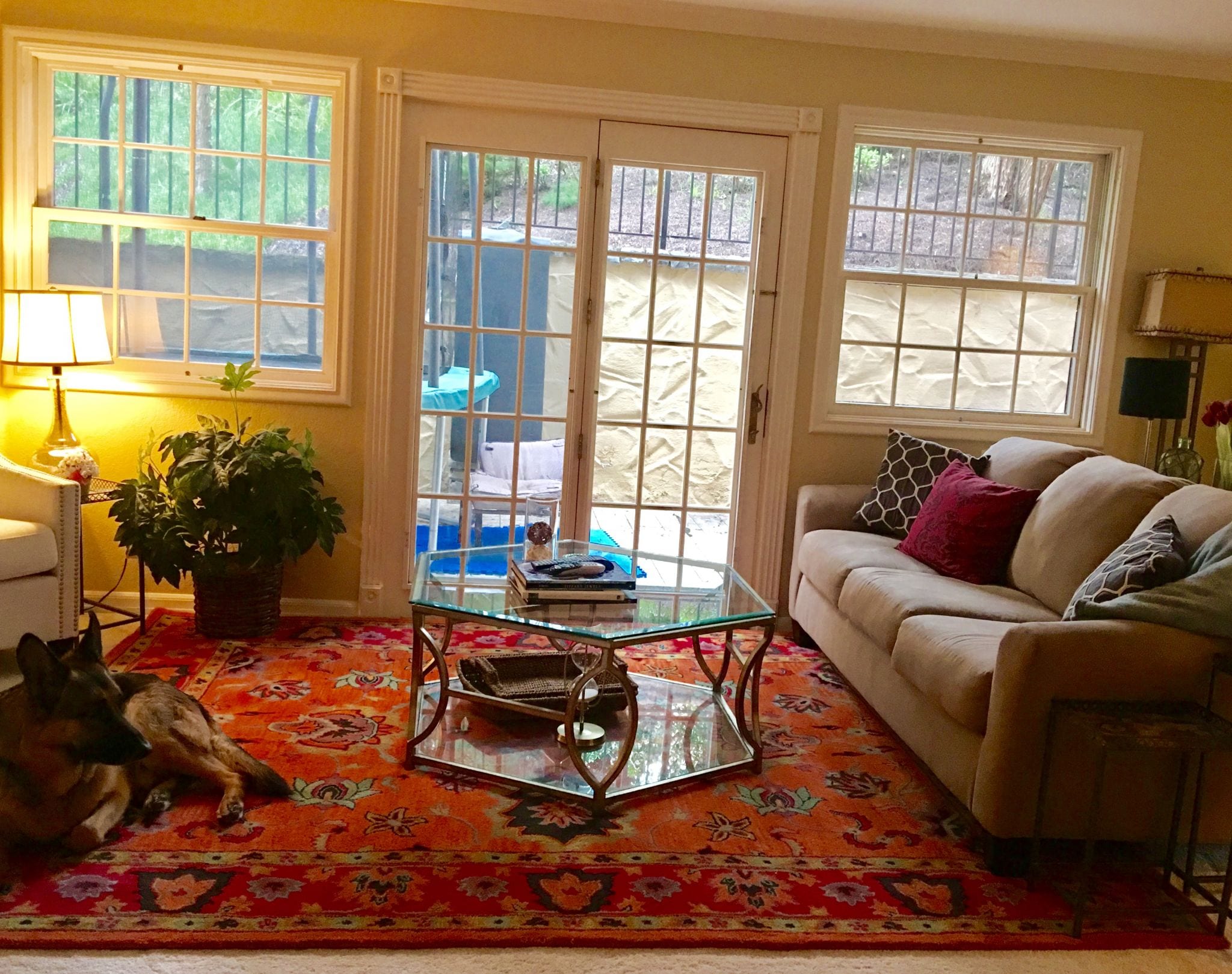
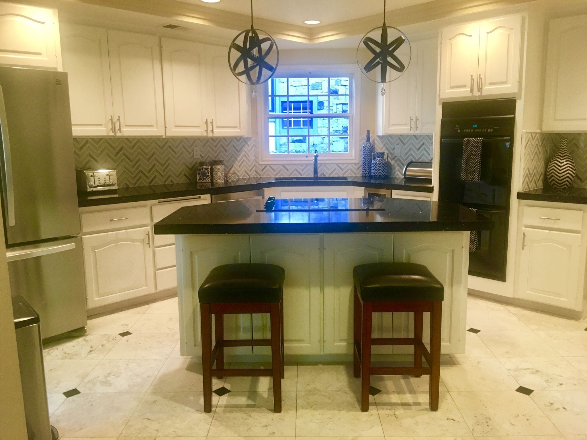
I have a question for you. I’m trying to find a gray paint color that will not look terrible next to a tan/beige color. My kitchen was recently remodeled. It’s now white cabinets with black counters with multi-gray chevron tile backsplash. I’d like to play up the gray, but the kitchen has an open wall into the family room….which has lots of sandy beige paint, reds, oranges, etc. When I look past the kitchen into the living room, it looks terrible. I’ve already tried to paint the kitchen a blueish gray, but it turned out to be quite dark, and more blue than gray.
Advice appreciated. I think it’s hard, in general, to mix tans and grays.
Crystal
Crystal,
We all agree that a white wall color is the best choice for this space. You have a gorgeous tile backsplash and pretty, black countertops, so let those be your focal point. A white wall color that matches your cabinet will be a seamless transition.
Then, to blend these two rooms together, bring more gray into your family room. Maybe some drapery panels with a gray or gray and tan pattern on them, maybe some pillows with a fabric that incorporates both neutrals, and maybe a few more black accents. Then, bring some warm tones into your kitchen, maybe a natural fiber runner or some wooden bowls or cutting boards. Just think of bringing equal amounts of both beige and gray into your kitchen and family room and your space won’t feel so disconnected.
But overall, we love both of your rooms and think you’re in much better shape than you think!
Thanks for sending in your question!
Mentioned in This Episode:
- We talk about Sherry Hart’s black and white house in Atlanta Magazine’s HOME
- Sherwin Williams’ color of the year, Poised Taupe
- The latest issue of Atlanta Magazine’s HOME
Please send in your questions so we can answer them on our next episode! And of course, subscribe to the podcast in Apple Podcasts so you never miss an episode. You can always check back here to see new episodes, but if you subscribe, it’ll automatically download to your phone.
Subscribe in Apple Podcasts | Spotify | Stitcher | Google Podcasts


