Interior designer Miles Redd is no stranger to pattern and color, so when we saw his designs for the rooms in our Winter 2018 collection, we couldn’t wait to sit down and talk to him about his inspiration. Being the design buff he is, it figures that so many of the spaces were inspired by design legends of the past. Learn all about the latest products in his collection, his favorite color pairings, and even his favorite finishing touches for a room.
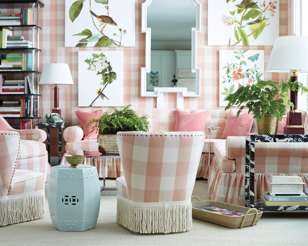
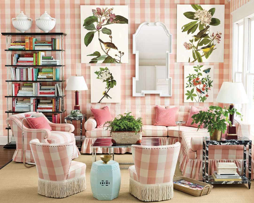
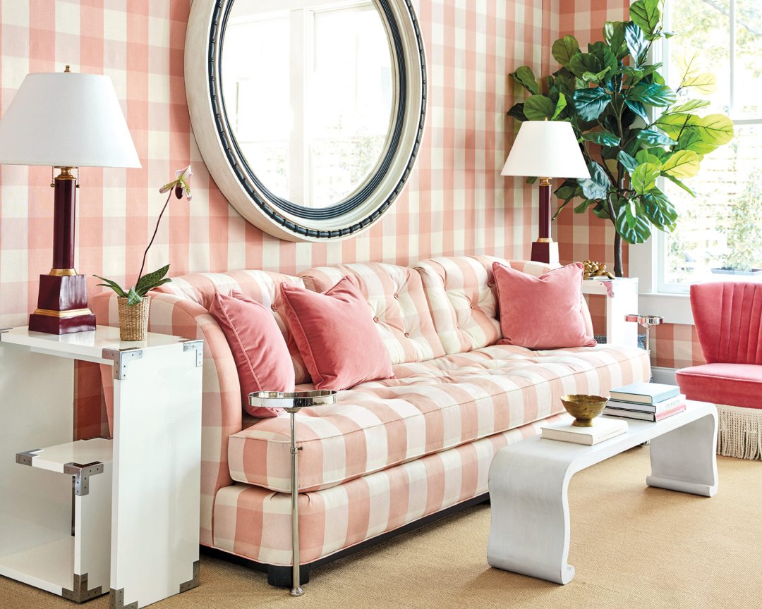
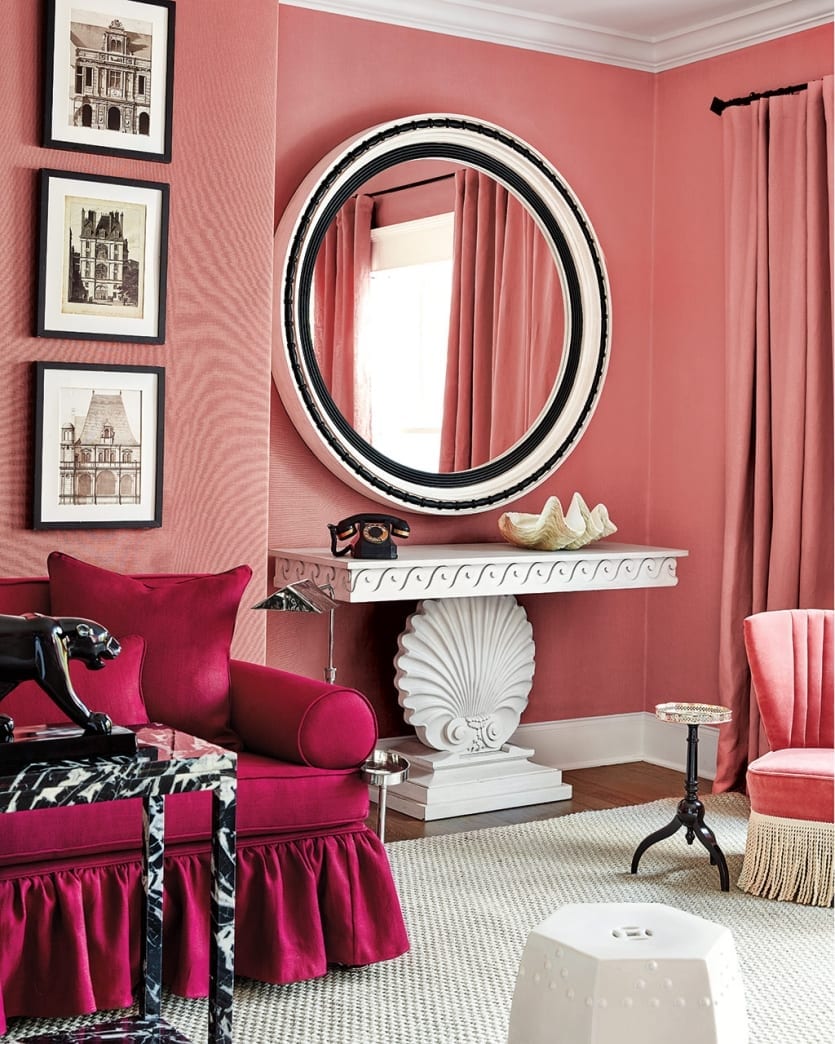
Ballard Designs: Let’s start with your pink buffalo check living room. Why’d you choose this pattern for the walls and upholstery?
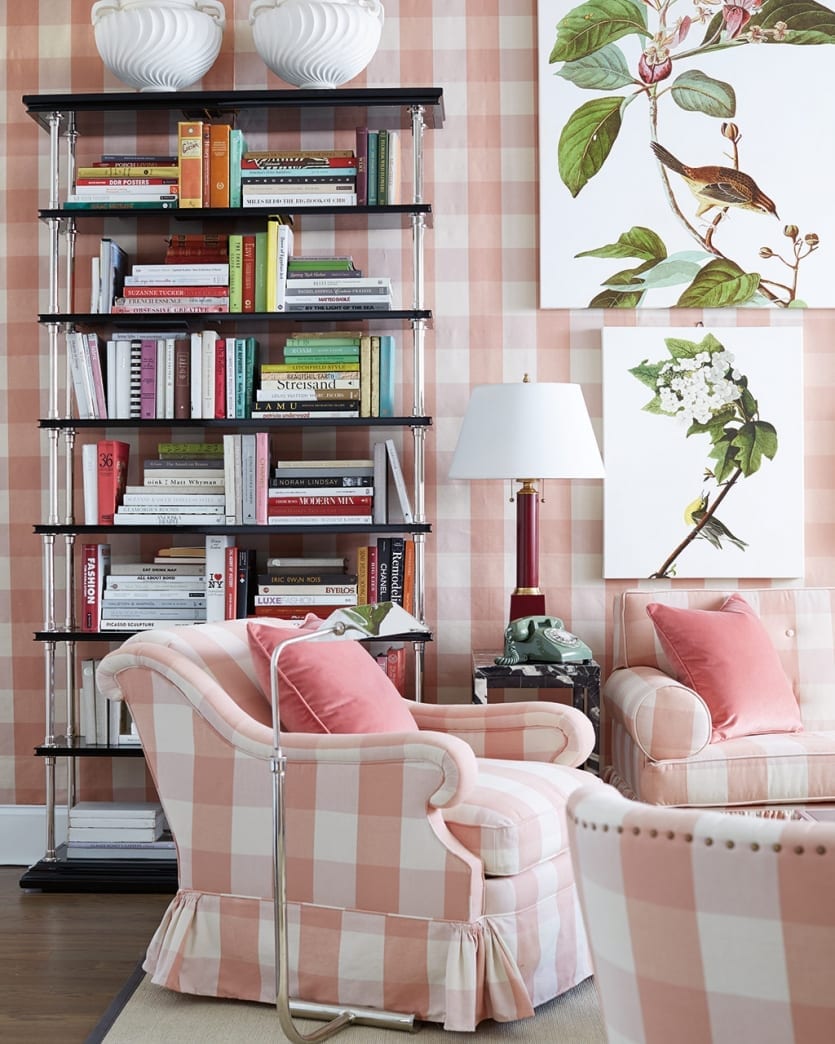
Miles Redd: It was inspired by Gloria Vanderbilt who loved buffalo check, especially pink and white buffalo check. I loved that idea for this room because I imagined a very happy, preppy garden room.
Pink is such a great color. I find it oddly neutral because so many colors go with it – navy, green, white, brown, gray, black, and even red. My own living room is pink and red. Plus, it’s a very flattering color to live in which is certainly nice.
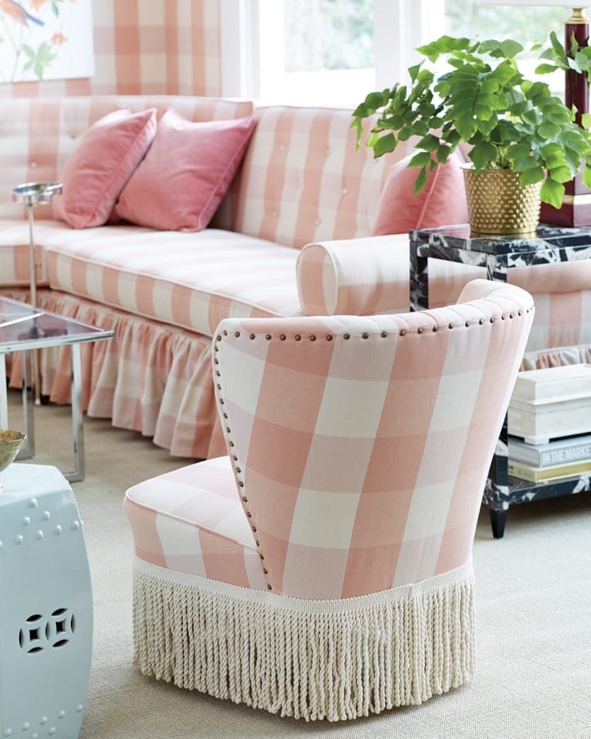
BD: Talk to us about your Lily Bolster sofa. We understand this was inspired by a custom piece you had built for a client?
MR: Yes, absolutely it was, particularly the bolster arm and the rouged skirt. I wanted something comfortable but that wouldn’t feel too voluminous and wouldn’t eat up the whole room. Because of the corner and the scale, the sofa works almost like a banquette and can tuck into so many different scenarios.
You can either do an extra long sofa with two pieces, or you can do the corner to create a sectional. Of course, the sectional doesn’t have to be tucked into a corner, it could also float.
BD: Why is it a useful shape that people should consider for their homes?
MR: I have always loved pushing things to the corners of the room because in a weird way, it opens up the room and makes it feel larger. It gives you a perspective when you’re tucked in a corner. This is an especially great strategy for small spaces. I’ve done it in my own living room which helped open up the space. I have lots of pieces floating in the center of the room, but just like in this buffalo check living room, I used a large corner sectional with floating chairs along the out corner.
BD: You’ve used art pieces on a grand scale in this room. When should we use an overscaled piece of wall décor in our space?
MR: It’s seems contradictory, but putting fewer, larger pieces on the wall will make the room seem bigger. So one tall mirror and big art that goes all the way up the wall to the crown will make your ceiling seem taller. Just make one big statement instead of lots of smaller ones.
What I loved about the botanicals here was that they were this organic foil to all of the geometry on the wall. I love that push and pull of something really angular with something loose and organic. That tension makes decorating exciting!
BD: When should you do one pattern all over? Is there a reason you chose to do that in this space?
MR: I love the graphicness of a check and using one fabric on everything. It makes an amazing statement because it gives your room a strength. I think most people find a fabric they like and because of fear, that just use a little dose of it, but the funny thing is that the more you use it in the space, the more neutral it becomes.
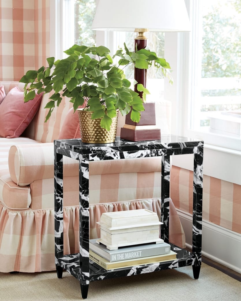
BD: One of our favorite new pieces is your Faux Marble Side Table. It’s a great scale and could be squeezed into so many different spaces. Where’d your inspiration come from and how do you see people working it into their rooms?
MR: I love a small table like this mainly because I prefer a small table and big sofa. Don’t waste your room’s square footage on a huge coffee table and side tables. Your sofa is way more functional, so take advantage of your space that way. For a side table, all you need is a lamp, a place for your phone, and maybe a few books. Anything more than that just becomes clutter
As for the faux marble finish, I love the kicky black and white pattern. Because the scale is on the small side, you can get away with a funky pattern and it won’t feel overpowering.
BD: You used your Waterfall Bench as a coffee table in this space. We love how versatile a great piece of furniture can be. Did you imagine this bench as a coffee table when you initially designed it?
MR: I imagined this space almost like a New York apartment. The scale of this bench is just right which is what makes it versatile. If you don’t have a ton of room for a coffee table, that’s ok. Make your space work for you and reimagine things you already have.
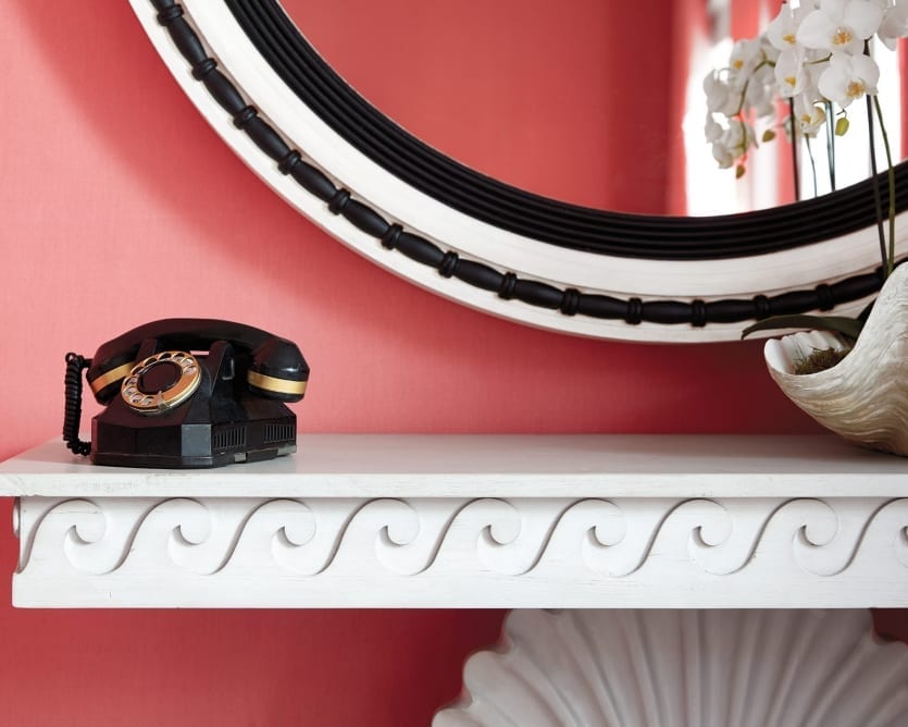
BD: One of our favorite pieces is your Golightly Mirror. It’s such a statement in a grand scale.
MR: It finds it’s origins in 18th century bullseye English mirrors that were usually gold with a convex mirror in them. But I thought painting it black and white would take an old world piece and give it a fresh feeling. My favorite thing about this mirror is that the boldness means it can carry a whole wall. It’s all you need.
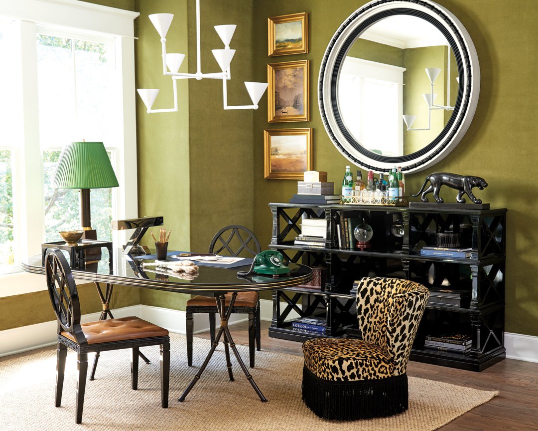
BD: Let’s talk about this green office space. You used your dining table as a desk and upholstered the walls in a green velvet.
MR: I love to use a dining table as a desk, especially in a home office, because it feels less utilitarian.
The green velvet wall covering was inspired by a guy named Charles de Beistegui and his famous home outside of Paris which is called the Chateau de Groussay. He loved this rich green color, and I thought it’d be fun to do an homage to that.
BD: Let’s talk about your new Geometric Chandelier. It’s a graphic shape and has a unique matte white finish. Why this shape?
MR: I’ve always loved Giacometti’s plaster chandeliers from the 30’s. I love this one in particular because it bounces light up onto the ceiling and creates a really bright room but you never have to look directly at the light bulb. It’s light and airy but because of it’s geometric lines, it makes a strong statement.
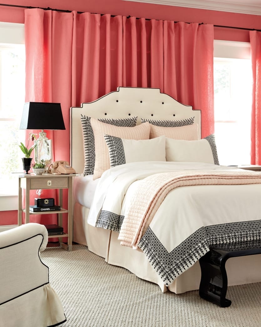
BD: Of course we can’t forget your peony pink bedroom with black and white furniture pieces. Black and white are both neutrals you use liberally in your rooms (both in our catalog and in your client work). What is it about black and white that has you using it over and over again?
MR: Black, white, and pink has always been a favorite color combination of mine, so we really embraced that in this space. Pink is obviously so girly in this room, and the black and white touches balance that femininity.
What’s funny is that before 1904, pink was actually a color for boys and blue was meant for girls. I’ve always found that pink can be surprisingly masculine when used in the right way. Of course here, it’s decidedly feminine, but I never shy away from using it in a home. In fact, my living room walls are pink!
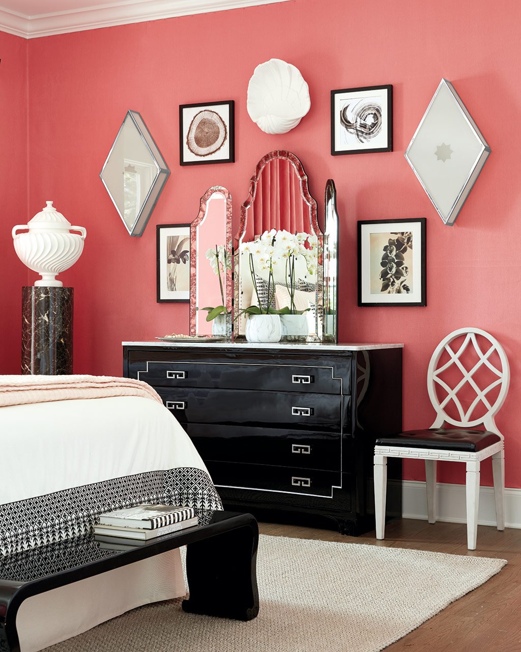
BD: You have a couple new pieces in this room – your Diamond Ceiling Mount, your Shell Sconce, and your Trifold Mirror. Why did you want to add each of these pieces to your collection?
MR: Well, a trifold mirror is not only utterly glamorous, it’s so practical. Especially in a bedroom where you’d use it as a dressing mirror. I wanted something that echoed a Venetian dressing mirror which is why we incorporated the antiqued edges.
As for the Shell Sconce, I’ve been collecting shells since I was a little boy, so I’m always drawn to antiques and furniture pieces that incorporate that motif. It’s almost a signature for me. This sconce is special because it has the prettiest glow when it’s lit, casting shadows all around the intricate shape. I definitely recommend putting this one on a dimmer because you’ll turn it on just for softness and ambiance.
I obviously designed the Diamond Ceiling Mount to go on a ceiling, but I do love to take things and use them in unexpected ways. You can always reimagine something, and I loved the deco-y feel this light fixture gave the wall when used as a sconce. Don’t be afraid to try something risky!
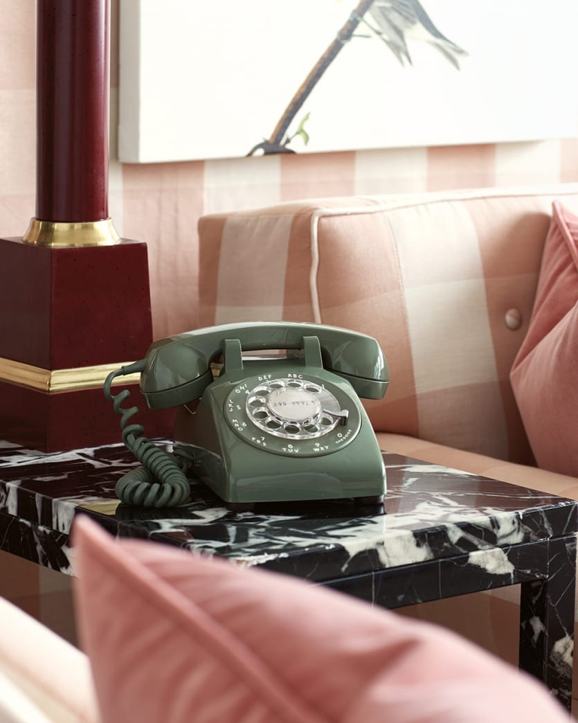
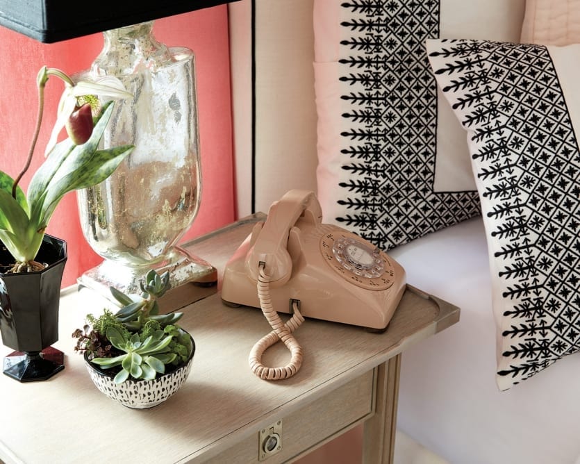
BD: Ok, one of our favorite things about your spreads in this catalog is the way you used vintage phones. Where did that come from?
MR: Ha! Well, we kind of incorporated them as a joke, but I do love nostalgic pieces and have definitely been known to call from my landline now and then. Sometimes you just need to make a call on a real phone rather than a cell, you know what I mean?
BD:What other accessories are your favorite finishing touches on a room?
MR: Greenery is a given because it brings freshness and life to any room, but a wall-to-wall sisal carpet puts the perfect finishing touch on a room, even though it’s that first layer. There’s something about straw underfoot that I just really love, and a wall-to-wall sisal rug beautifully cuts the glamour and shine I tend to bring into a space. It all comes back to that tension we talked about. A natural fiber is the perfect foil to lacquer and metallics and embellishments because it’s casual and beautiful. Plus I really like to add that light, airy background to a room which sisal does beautifully.
Browse all of the pieces in Miles Redd’s collection for Ballard Designs, listen to his episode of the podcast, or find more inspiration from Miles.
Did you like this post and find it helpful? Rate it below and share your thoughts in the comments.




Amanda
Please manufacture and sell the green vintage phone! I was disappointed when it was not the item for sale, but rather the lamp.