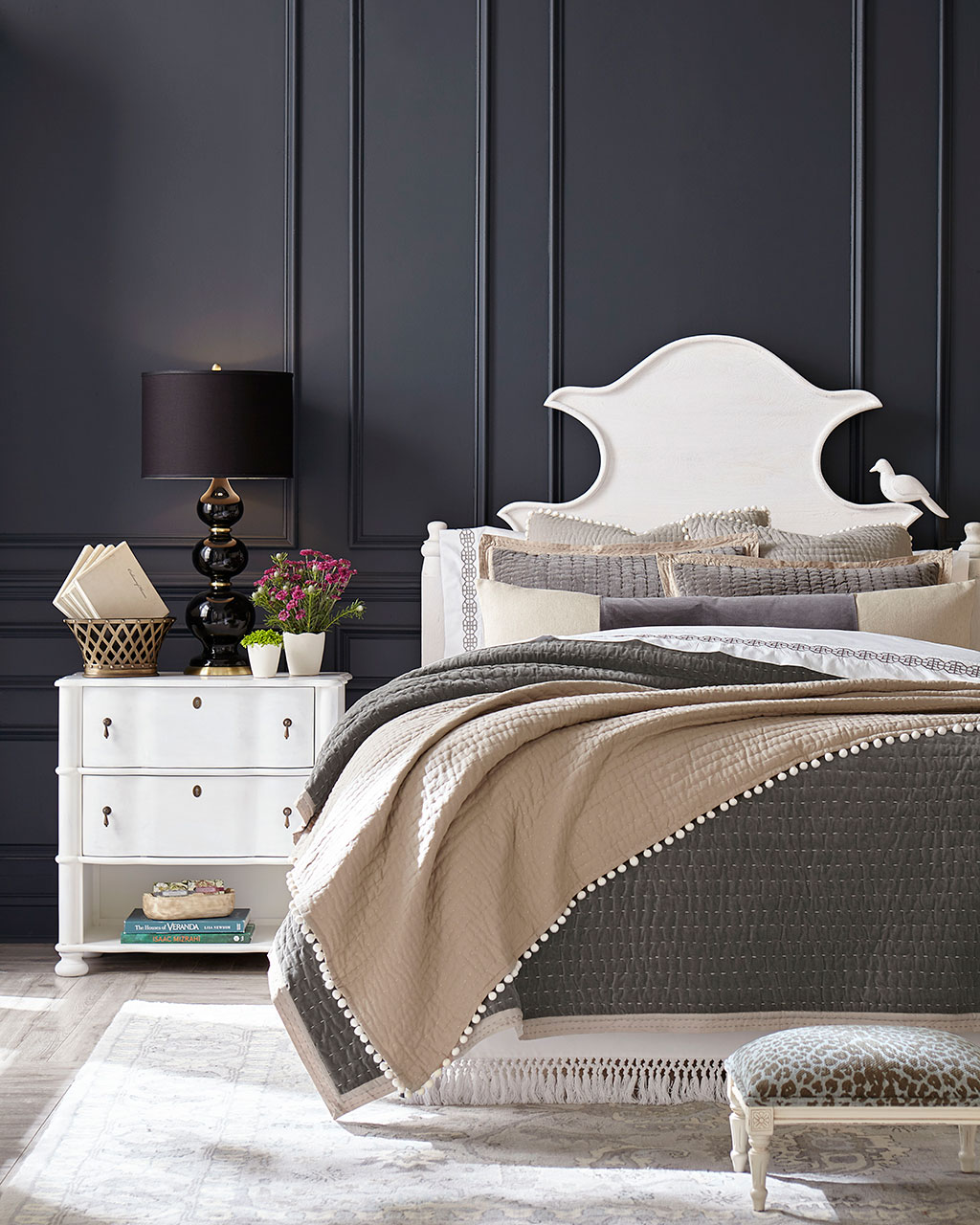
We leaned on moody blues, dark charcoal, and soothing spa blue in this Fall’s catalog. A bold color can make a dramatic backdrop for interesting shapes and patterns, but never underestimate the power of a neutral. Light blues, grays, and whites never fail to let furniture and fabrics shine and leave us with spaces that feel open and serene.
Because we shoot in real homes, we’re not always at liberty to paint the walls, and in those cases, we’ve chosen paint colors that best match the wall color in the photo. Please be aware that color may vary due to various light conditions, finish and other factors. It’s always a great idea to test a paint sample on your wall first.
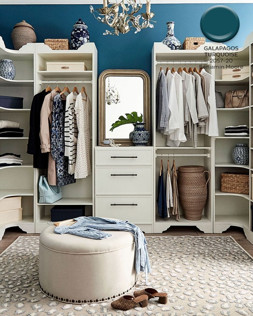
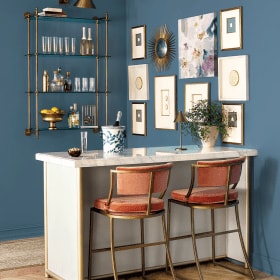
Benjamin Moore’s Galapagos Turquoise #2057-20
A rich peacock blue can set off classic neutrals and breathe life into your favorite tans and white. We loved Galapagos Turquoise because it has a little bit of green, which gives it a youthful, energetic feel.
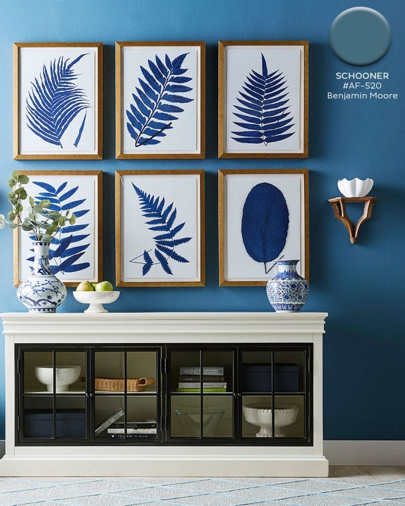
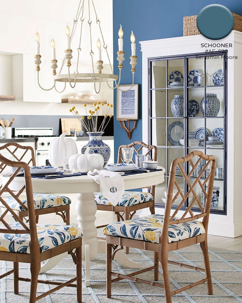
Benjamin Moore’s Schooner #AF-520
Benjamin Moore’s Schooner is a classic blue. It’s dark but still works well with light woods to keep your room feeling open. Mix it with black, wood finishes, white, and even metallics.
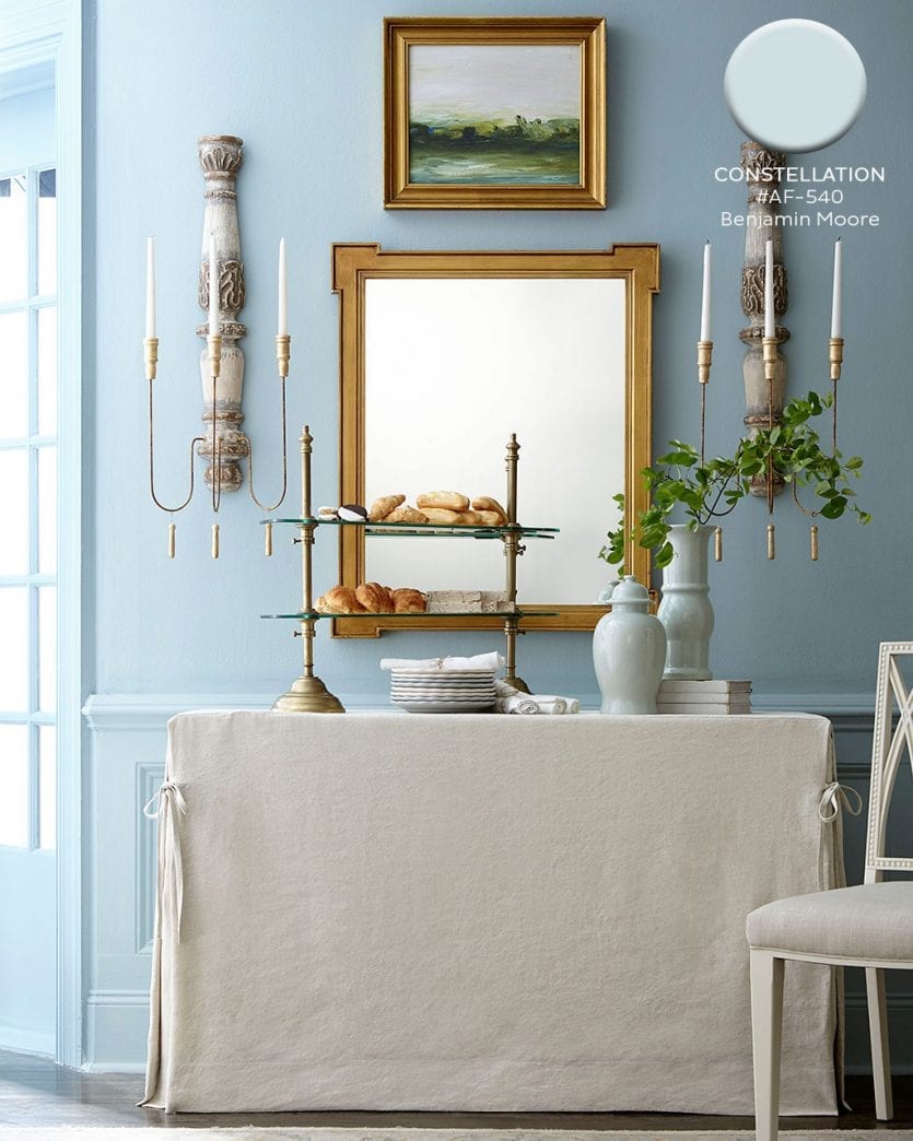
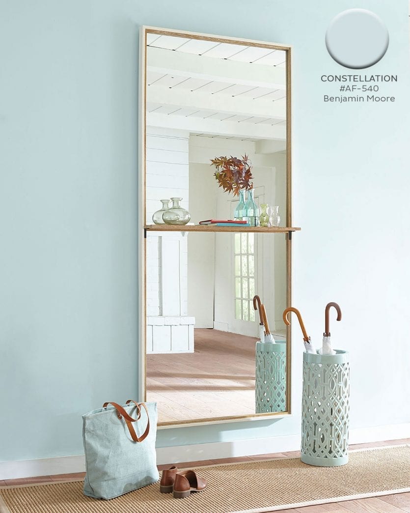
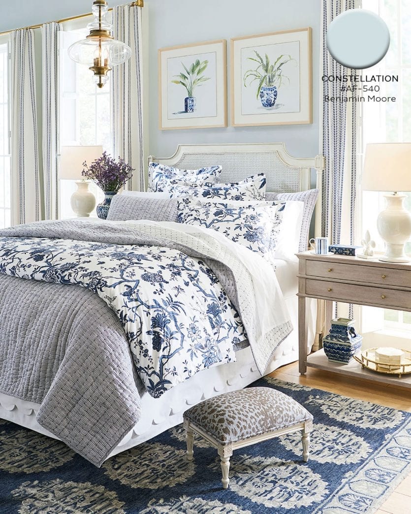
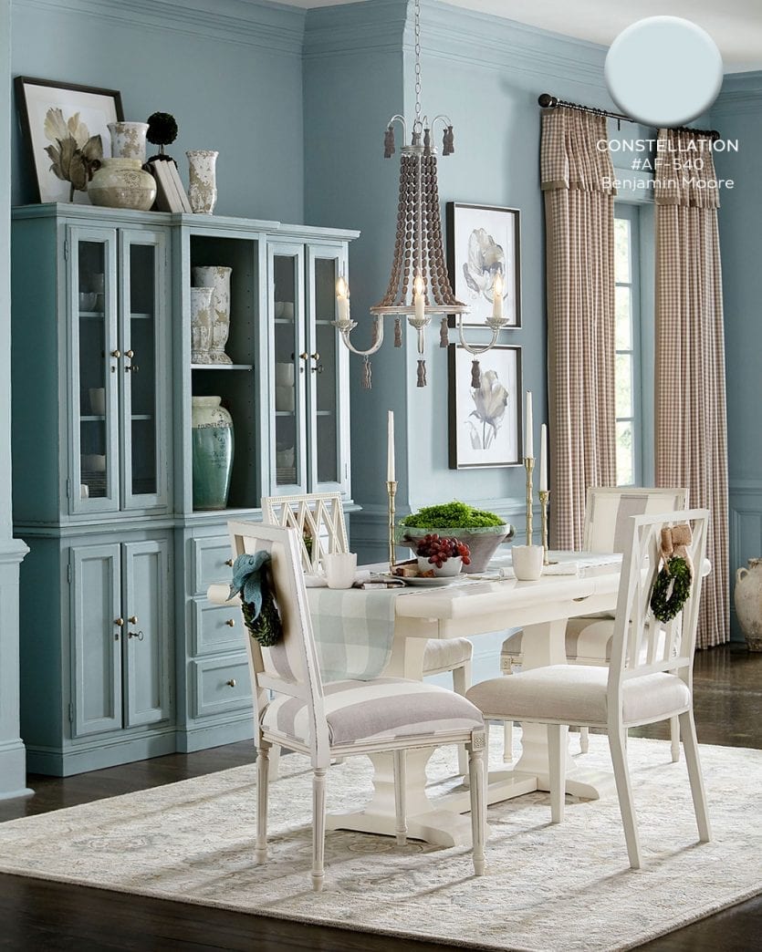
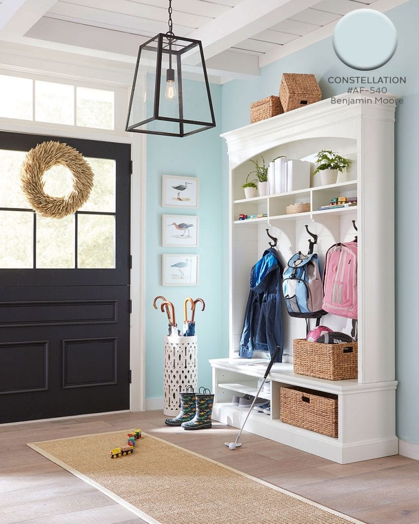
Benjamin Moore’s Constellation AF-540
A soft serene blue works in almost any space. It pairs with darker blues, wood tones, black, white, and so many other colors. A light blue can really work with anything, so it’s no wonder we used this shade liberally in our Fall catalog.
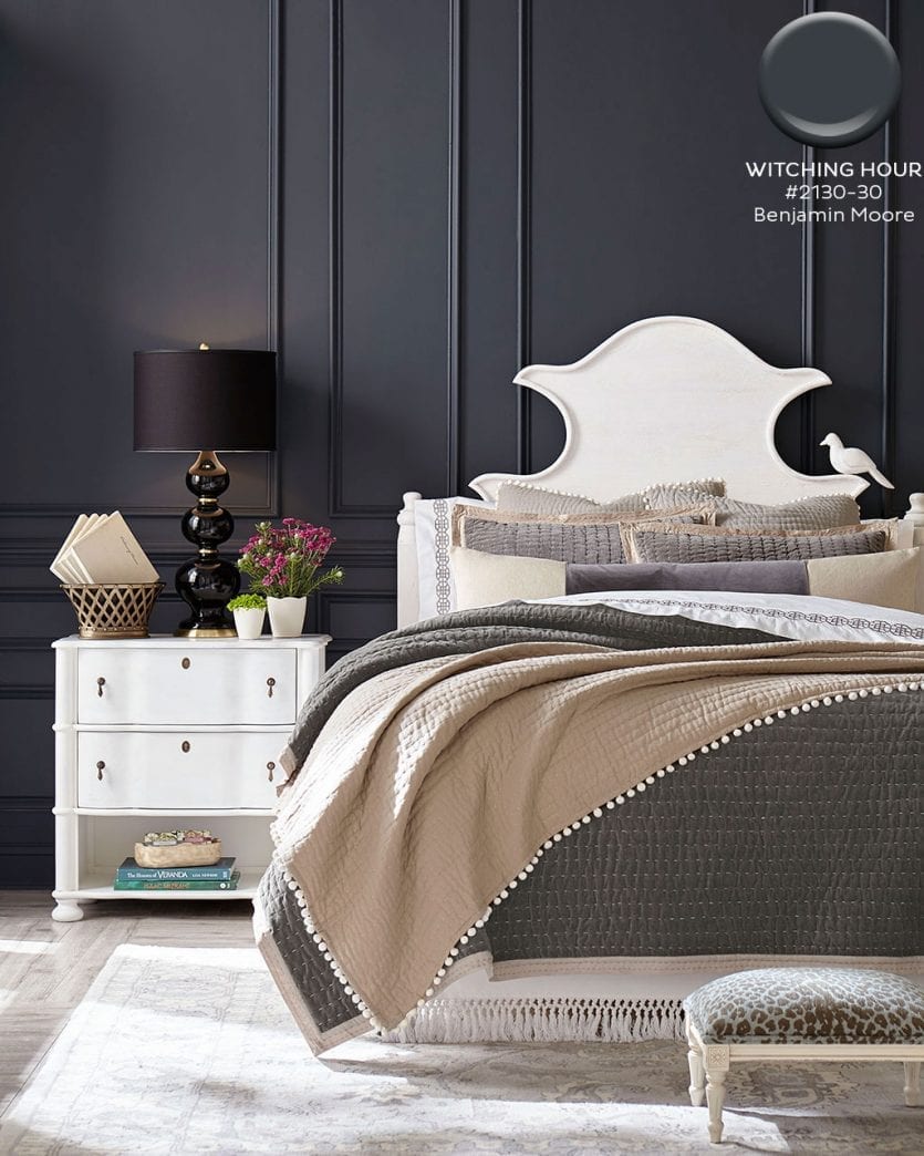
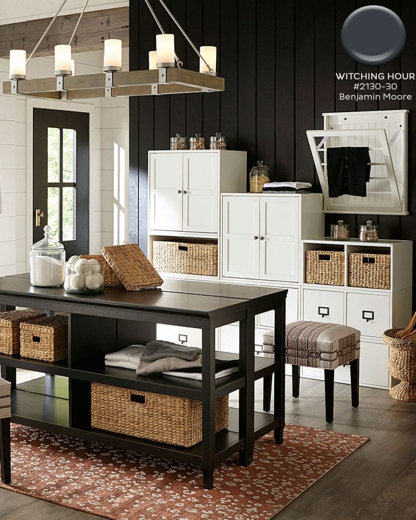
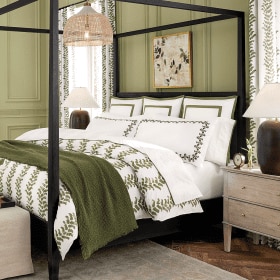
Benjamin Moore’s Witching Hour #2120-30
Nothing creates drama like a dark paint color, but you’d be surprised at how open and welcoming it can feel in a room that gets lots of natural light. Add in white pieces for high impact!
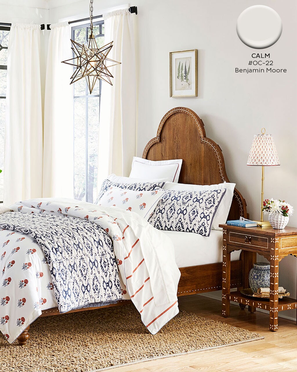
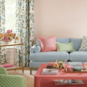
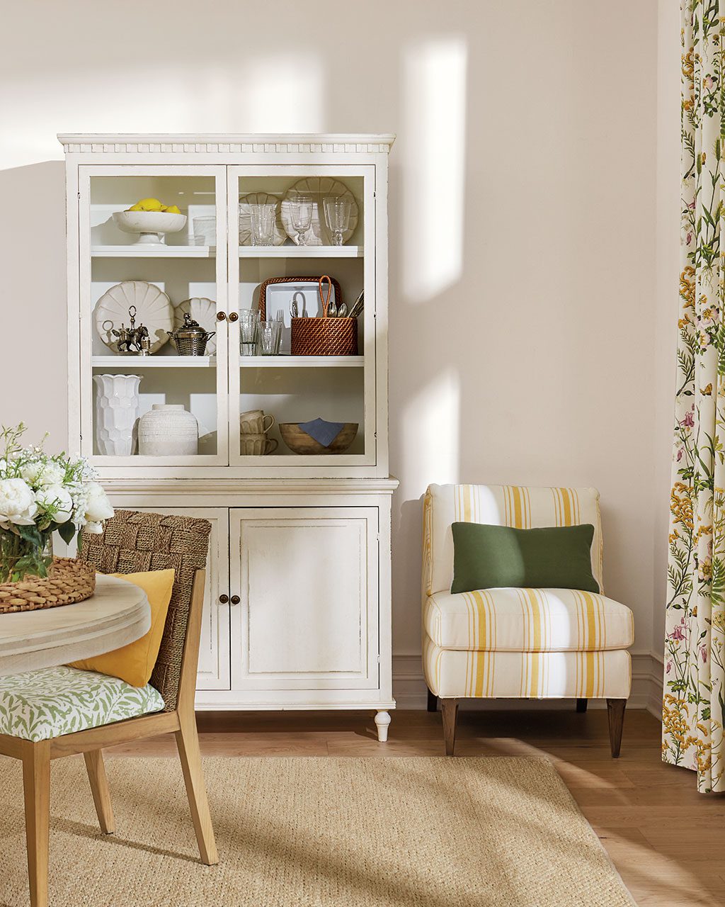
Benjamin Moore’s Calm OC-22
This white is just what you’d expect based on its name. It has a touch of gray without feeling cold, but it’s still warm.
Find our best tips on choosing paint colors, or browse paint colors from past catalogs or decorating inspiration by visiting our Pinterest boards.
Did you like this post and find it helpful? Share your thoughts in the comments!




Mandi
Could you please tell me if the wall color on page 73, September 2020, is paint or grass cloth? What color is it, please, I would love to order.
Abbey Nolte
Hi Mandi,
Could you describe what’s in the room so I can get a better idea of what image you’re talking about? Since we send out different versions of our catalog I don’t know which image you are seeing on page 73.
Thanks!
Abbey
Hunter Walker
Where can I find the bedding in the picture with the calm paint color? I love it!
Caroline McDonald
Hunter,
That is our Liliana Ikat Bedding and our Anais Floral Bedding. So glad you like this room!
Happy Decorating,
Caroline
Angela La Voie Kljunich
What is the paint color, please, on pgs. 68-69 in the September catalogue?
Abbey Nolte
Angela,
Unfortunately I don’t have information on the paint. I would suggest showing this picture at the paint store and they can match it for you.
Best of luck,
Abbey
Valerie
Can you tell me the wall color on page 65 of the Sept issue?
Thanks!
Abbey Nolte
Valerie,
Unfortunately I don’t have information on the paint. I would suggest showing this picture at the paint store and they can match it for you.
Best of luck,
Abbey
Carie Austin
On page 10 of the September catalog is a pretty cabinet called the Salerno Console. I would love to know what white color the cabinet is painted… or one that is comparable!
Abbey Nolte
Carie,
Unfortunately I don’t have information on the paint. I would suggest showing this picture at the paint store and they can match it for you.
Best of luck,
Abbey
Abby
What is the wall color on page 5 of the August 2019 issue?
Abbey Nolte
Abby,
Unfortunately I don’t have information on the paint. I would suggest showing this picture at the paint store and they can match it for you.
Best of luck!
Jan Ogle
I’d love to know the front door color on page 29 of the August 2019 catalogue.
Thank you.
Caroline McDonald
Jan,
It’s Sherwin Williams’ Spiced Cider #7702.
So glad you like it!
Caroline