Photo: Jay Ackerman
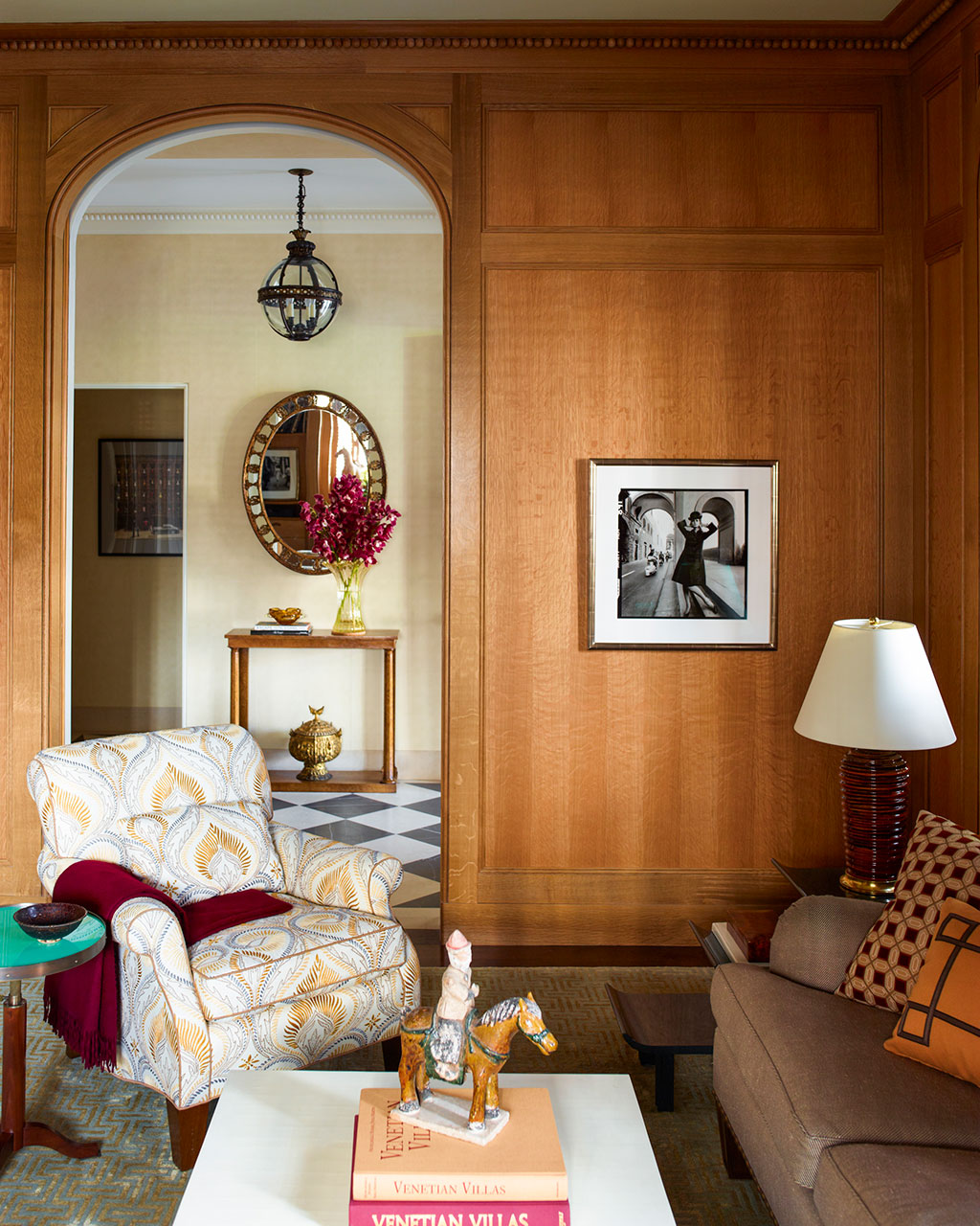
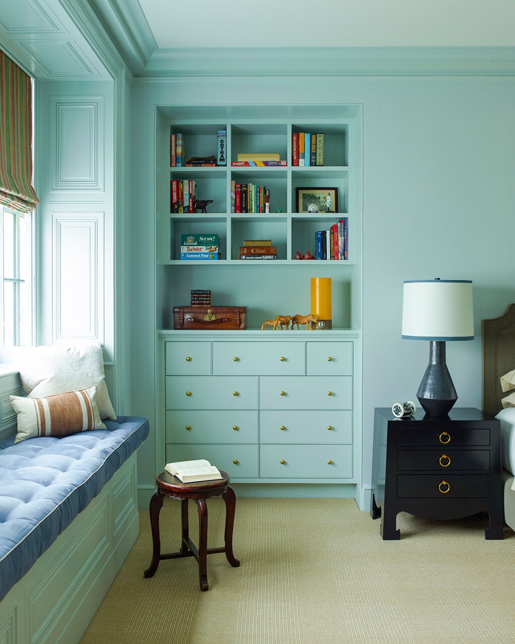
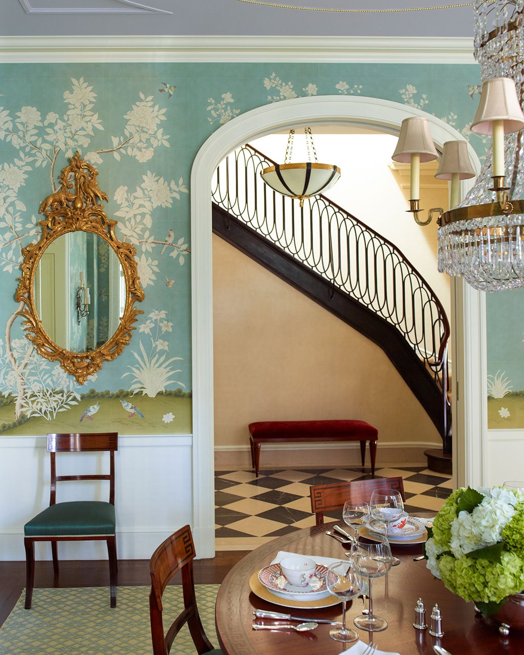
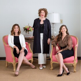
Our special guests this week are renowned architect Peter Pennoyer and the Director of Interior Design of Peter Pennoyer Architects (PPA), Alice Engel. Their work has been featured in Architectural Digest, ELLE Decor, Veranda, Town & Country, and many more. We discuss their love of details and high craftsmanship; especially when they serve a function. We also hear about common mistakes they see from clients, favorite projects and what it’s like to have nearly 10,000 books!
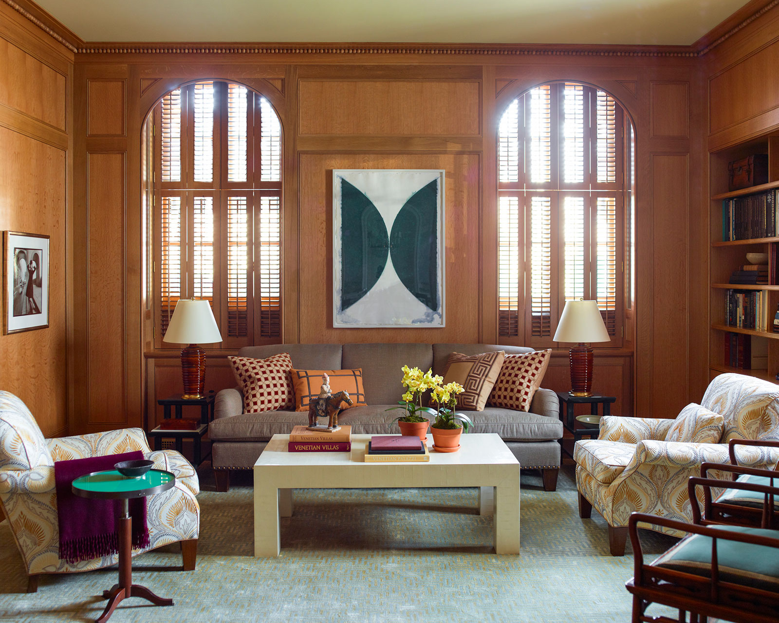
Photo: Eric Piasecki
What You’ll Hear on This Episode:
- How to balance designing for the particular needs of a family while also designing a space that will last for decades or more. Craftsmanship is the key to longevity.
- Ornaments personalize a house and Peter believes it joins art with architecture.
- Alice and Peter both find delight in small design details that improve functionality.
- PPA’s approach is to work early in the process with a designer and always include the design in the architectural plans.
- When meeting with an architect, always have a wish list of how many rooms, and be candid about your lifestyle.
- Peter and Alice get real on the biggest mistakes they see from their clients.
- Peter opens up about realizing his dream when he designed his house in the Hudson Valley as a square villa.
- It’s easy to overdo your design scheme; Peter and Alice remind us that simplistic consistency is often the best approach.
- Different ways to bring in and enhance natural light in a house; including “borrowing light”.
- The impressive lengths Peter and Alice traveled in order to combine traditional and modern on a house in Ohio that was featured in Architectural Digest.
- Why PPA likes to connect to each artisan involved in the process and make it a collaborative process.
- How trends and perspectives on design and architecture have been influenced by the pandemic.
- PPA has an impressive library of nearly 1o,oo0 books that are central to the office both in design and as a resource.
- Why bright red is a color seen throughout PPA’s projects.
- Photo: Eric Piasecki
Decorating Dilemma
Hey friends!!
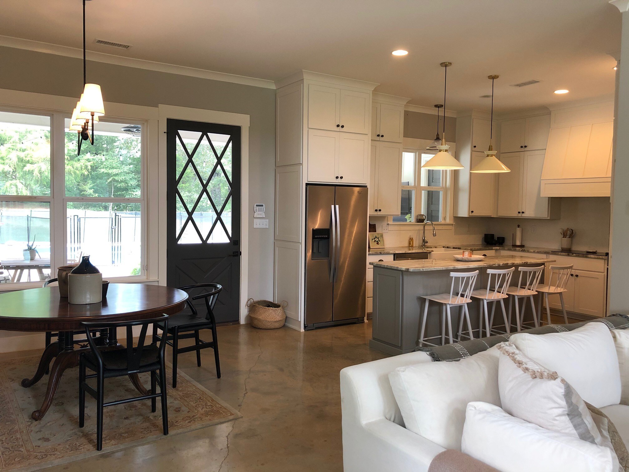
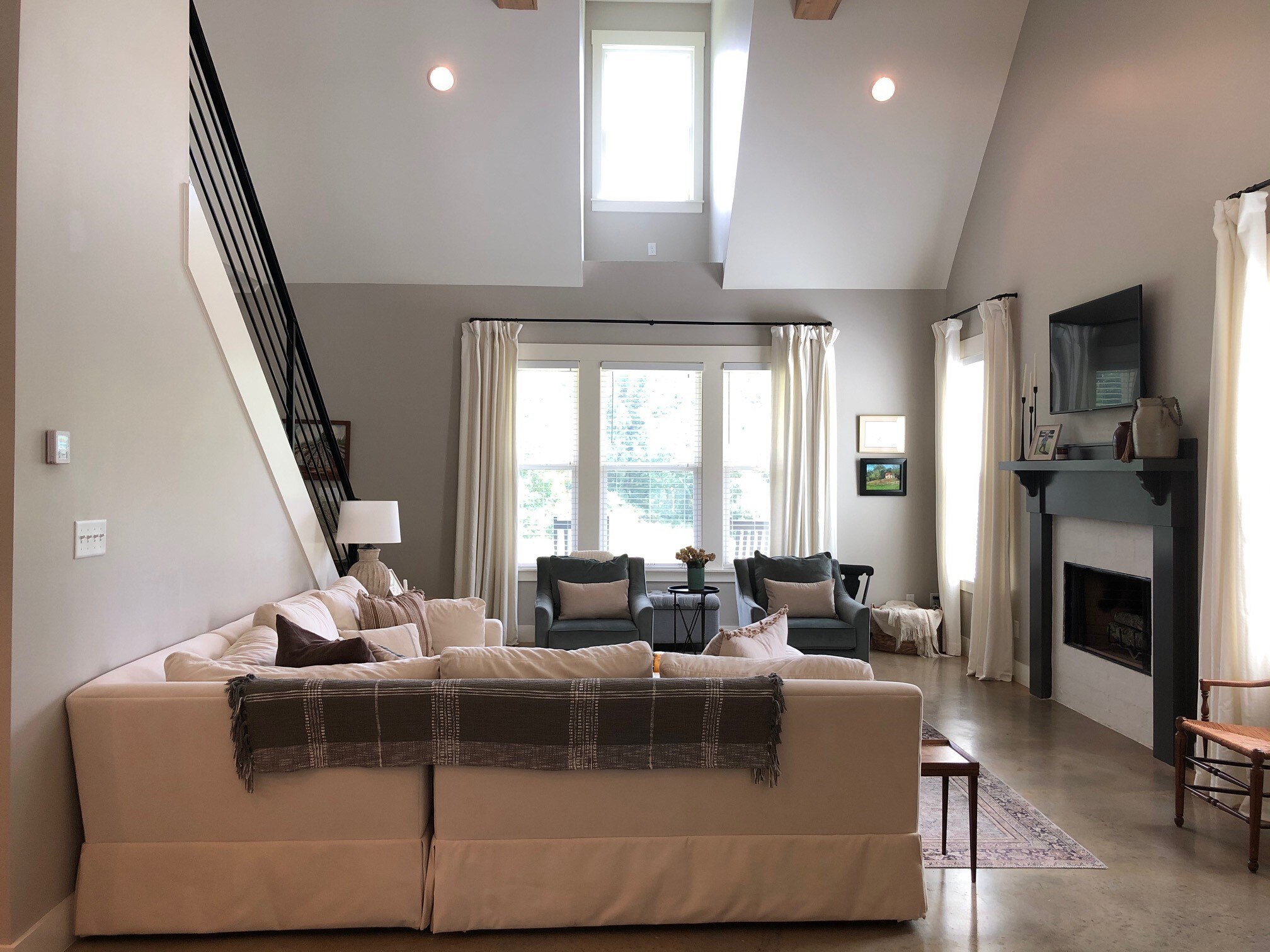
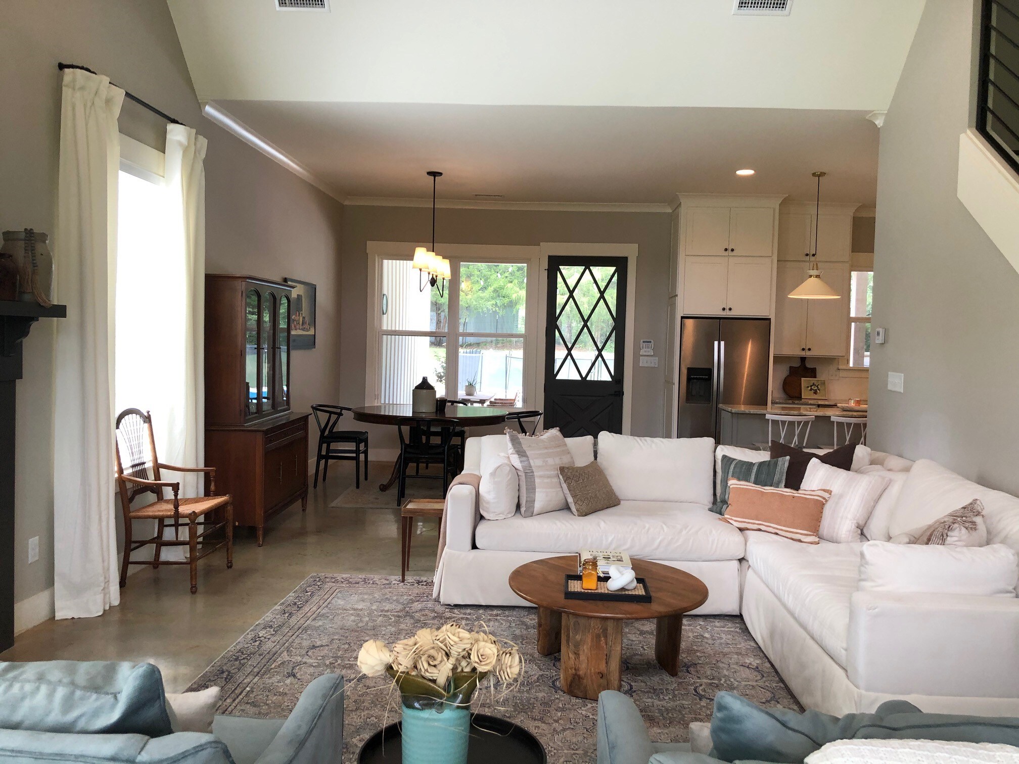
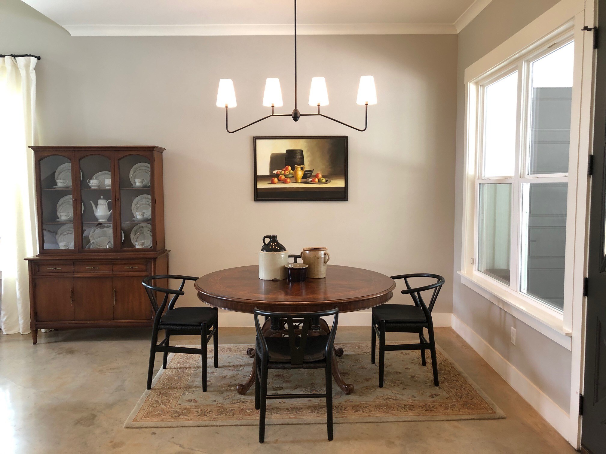
I have been listening to your podcast for a long time and really enjoy all the great tips and inspiration from your very talented guest. We recently moved from a 1920s bungalow to a newer open concept home.
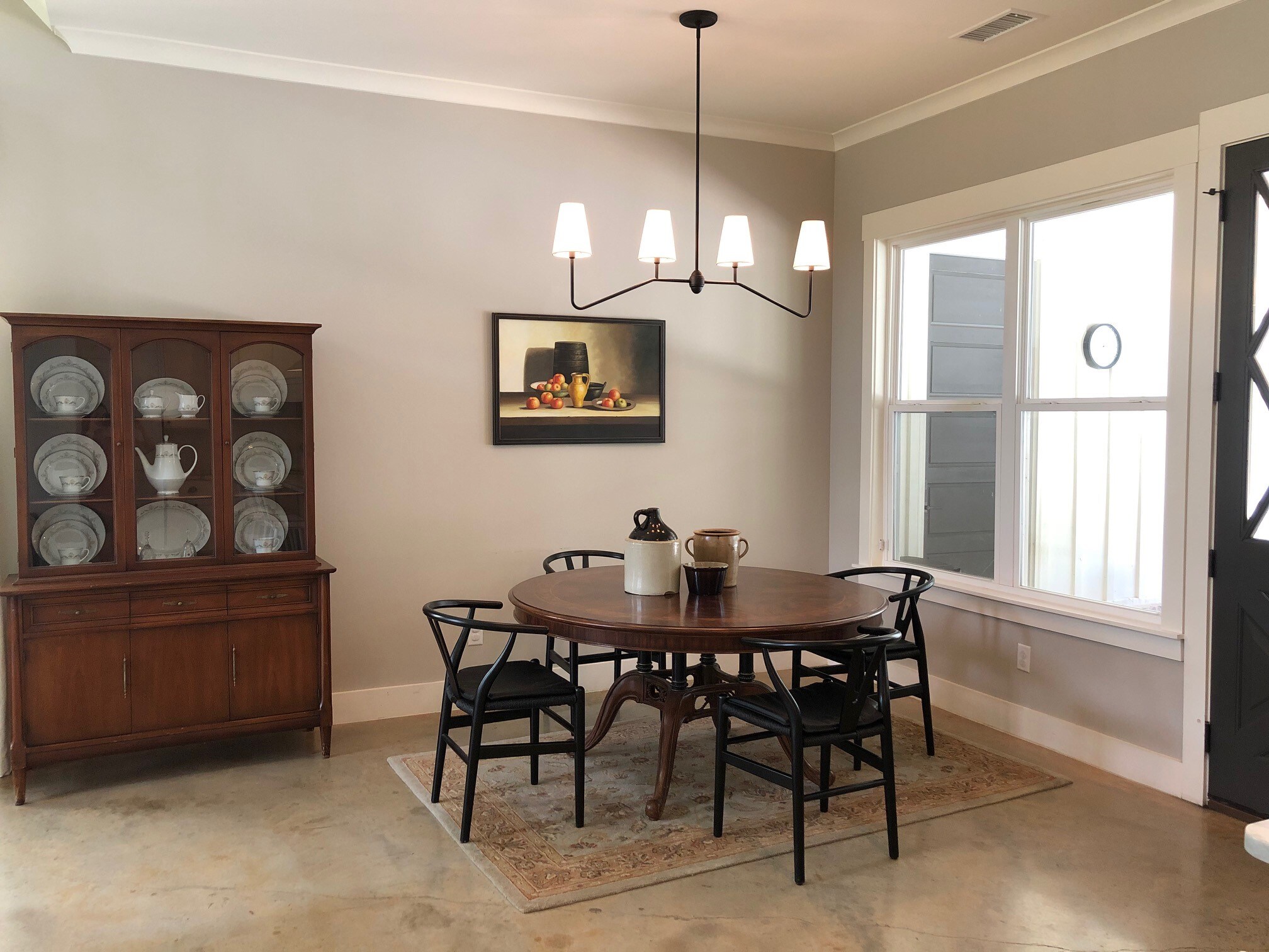
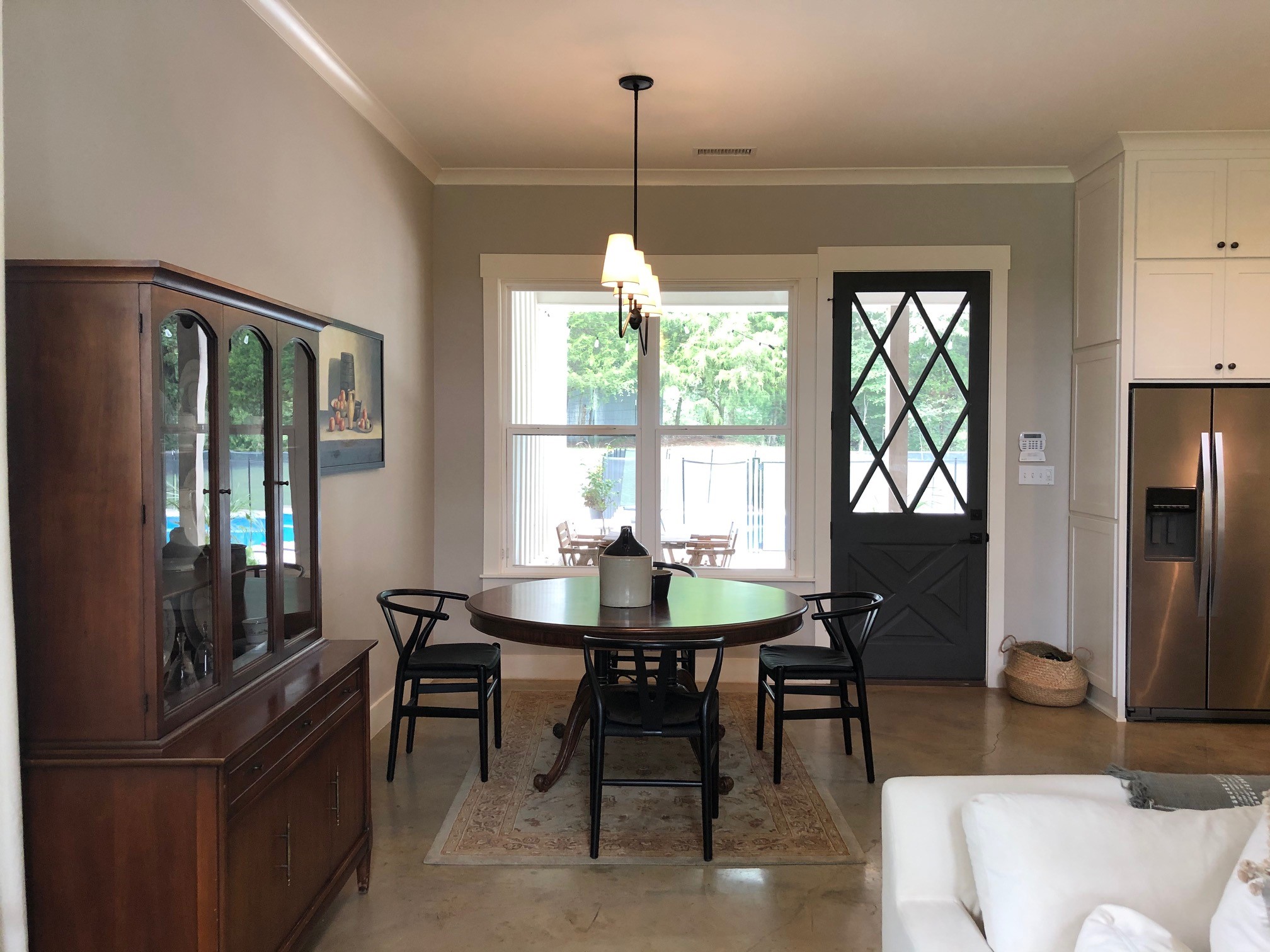
I am struggling with the lack of walls and separate spaces. I am writing about our dining area that is bland and boring. We enter the house mainly from the back door and walk right into this area. I currently have my grandmother’s round dining table, 4 chairs and a rug that is too small but just threw down until I find something else. The area is narrow (7 ft wide) so the hutch is off to the side or you couldn’t pull out the chair in the back. Is this a good spot for a built-in banquette? What kind/size rug should I use? An 8×10 won’t allow the back door to open. When is it ok to use a round rug? Should I keep the chairs or switch them to something with fabric? I know accent walls are out, but could I do some wallpaper, paint, or molding in this area since it does have a different ceiling height from the living space?
Any ideas and advice are greatly appreciated! Also, I am having Roman shades made for the back and kitchen window. I attached a copy of the fabric.
Thank you!
Ginger
You have a lot of possibilities here, Ginger, and Alice likes a lot of your suggestions. One thing you can do is define that dining space with a different wall color or wallpaper. If you do this, just be mindful of capturing that transition with a molding to really separate the space. The windowsill is a little low for a banquette, but Roman shades or curtains would add a layer of softness. You could also paint that door a pop color…maybe red?! You can definitely work with many of the furniture pieces you already have, but she would keep either the chairs or the dining table—not both. Maybe consider a contemporary pedestal table. Alice loves the idea of a round rug that addresses the shape of the table. As far as the chandelier, it could use more presence. So something with more bulk and personality would work really well.
Peter likes Alice’s idea of using painting or wallpaper. You could also anchor the table by painting a 6 foot wide rectangle, floor to ceiling, just to the right of the hutch. Put a painting or mirror in the center of that and it will ground the space. You can put furniture against it, as well. Try to run a molding that aligns with the lower ceiling, so you don’t feel like the ceiling is “hanging down”. This might be a bit whimsical for you, but why not get a stock round molding and place it directly above the round table? You could fill it in with a reflective wallpaper and that’s a great place for a chandelier. You can add small elements of luxury with things like quality furniture hardware and switch plate covers. Another really interesting idea to consider? Painted floors! Use very glossy paint and do the whole floor but test a sample in a closet or something before you commit to it.
Mentioned In This Episode:
- Peter Pennoyer Architects
- PPA on Instagram
- Ohio Home designed by PPA
- New York project with copper dome
Please send in your questions so we can answer them on our next episode! And of course, subscribe to the podcast in iTunes so you never miss an episode. You can always check back here to see new episodes, but if you subscribe, it’ll automatically download to your phone.
Happy Decorating!
Subscribe in iTunes | Stitcher | Google Play | Spotify


