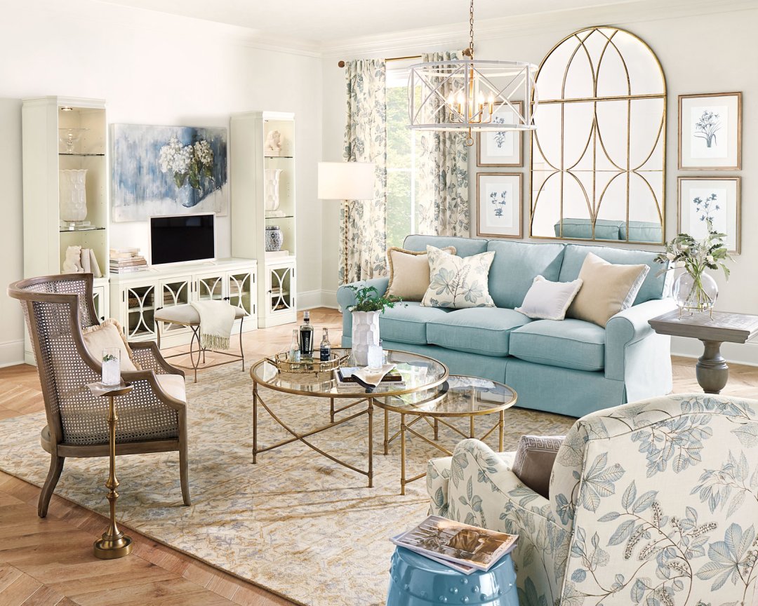
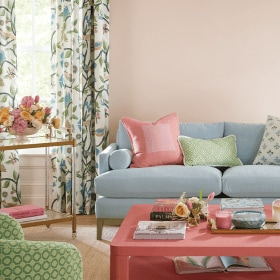
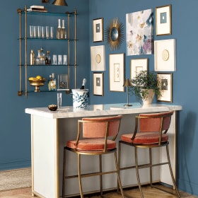
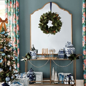
This summer is all about white paints and wallpapers. In most of our rooms we chose white paint colors to set a subtle backdrop to bold patterns in our fabrics, pillows, and drapery. The lighter colors enhance other accents without taking center stage. We also chose to wake up our walls with bold, patterned wallpaper for a summer full of color.
Please be aware that color may vary due to various light conditions, finish and other factors. It’s always a great idea to test a paint sample on your wall first.
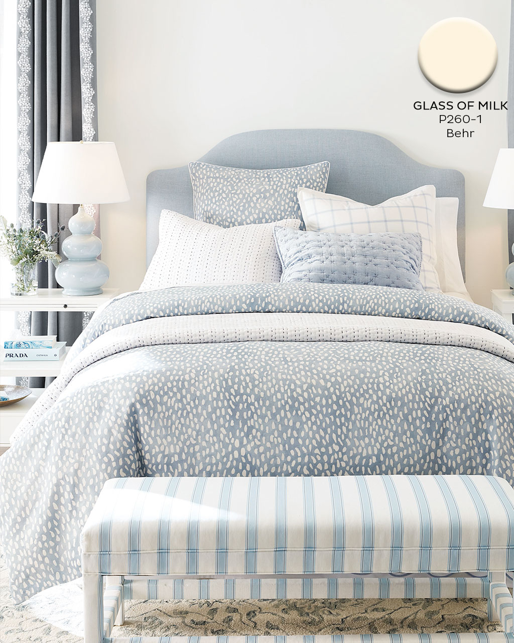
Glass of Milk #P260-1, Behr
We always love using this creamy white wall color from Behr. t’s not too cold and not too yellow, the perfect in-between when you want a crisp, neutral background.
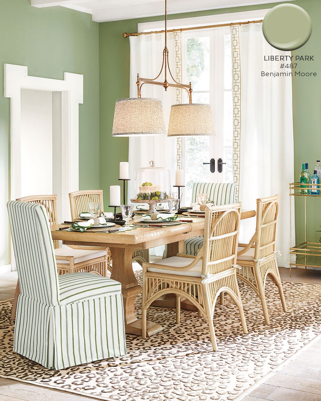
Liberty Park #487, Benjamin Moore
We have been loving green so much this year we had to continue the trend in our summer spaces. This color by Benjamin Moore pairs beautifully with our Conley Stripe Fern Fabric and keeps that fresh feeling rolling all summer long.
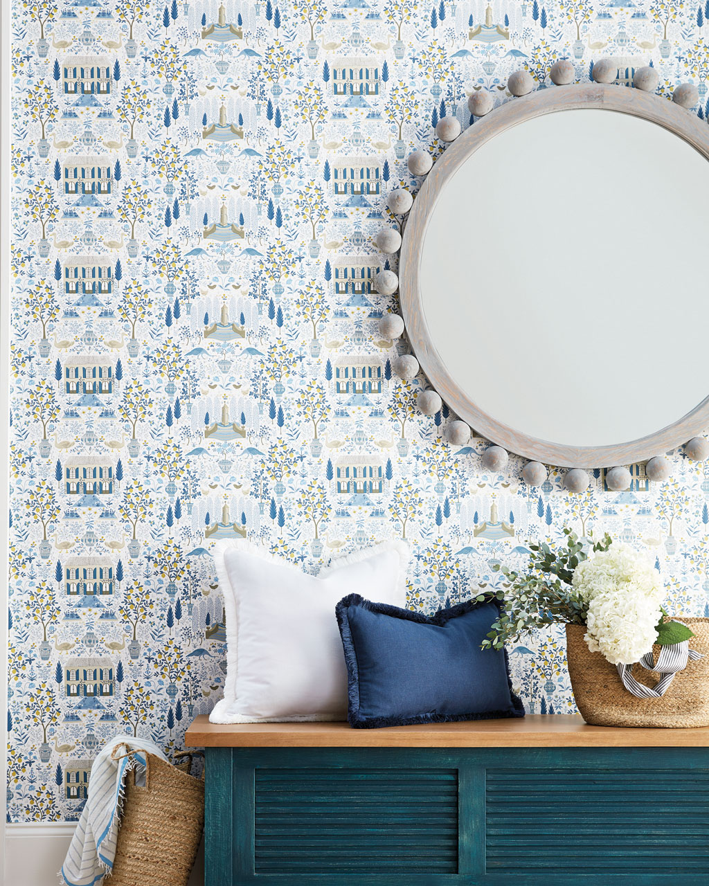
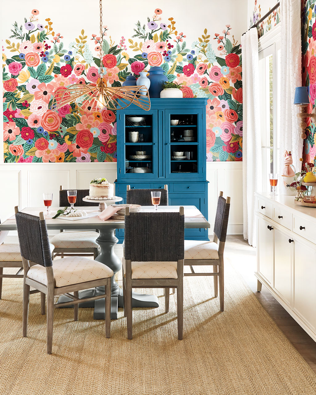
Wild for Wallpapers
This summer we’ve unrolled tons of new wallpaper prints and patterns to wake up any space. Use these playful prints in your bedroom, bathroom, office or living room.
Find our best tips on choosing paint colors or browse paint colors from past catalogs. To stay up to date with all things How to Decorate, sign up for our monthly newsletter.
Did you like this post and find it helpful? Share your thoughts in the comments!


